In the previous article in this series, we introduced some basic iOS design specifications and templates. Now it’s time to explore what makes designing for touch screens and mobile devices so special!
Unlike design for desktop websites and/or applications, the variety of ways you can interact with and get feedback from a mobile devices radically differs from its desktop counterpart. Mobile apps aren't just pretty pictures; you're developing a piece of software. Designing for mobile is a combination of interaction and usability, product development, and graphic design.

Think about all the things a mobile touch screen device can react to: touch, shaking, tilting, vibrating, audio input and feedback, geolocation, and time tracking. With these elements, design takes on an entirely new dimension. It's your job as a mobile designer to consider these features when conceptualizing how an app will work.
It is Easy to be Average
Average applications take average advantage of the iPhone’s capabilities. Extraordinary apps find unique and interesting ways to take ordinary interactions and make them faster, easier and more intuitive to use. Think about how you can push the status quo and come up with interactions that will really engage your audience!
Gestures
To perform actions on a touchscreen device, users use their fingers to swipe, drag, pinch, tap and flick on-screen elements. Apple’s own remote app is a great example of a gesture-based control system.
Planning for and integrating these gestures into your design provide a rich user experience that takes advantage of the unique attributes of touchscreen devices. One thing to keep in mind is users do have expectations with regard to “standard” gestures. These are gestures that Apple has defined in high usage apps like Mail and SMS -you do not want to re-invent them. If there is a gesture that users commonly understand to perform a certain action, stick with that nomenclature. For example, you wouldn't require users to use the pinch gesture to scroll a list view.

photo courtesy of Kyle Buza
Tap
Tapping is the most basic gesture used in iPhone applications, allowing the user to perform practically any function.
Tap + Hold
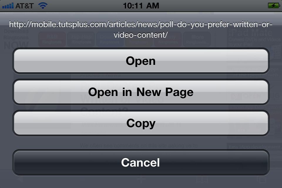
This is a gesture that does not have one standard path of usage. Tap and hold on the springboard icons, and you are able to delete and/or rearrange them. Tap and hold a link in the safari browser and you are prompted to open the link in a new page. Tap and hold an image in an email and you’re prompted to save or copy the image. Generally speaking, tap and hold is helpful in invoking contextual menus that allow you to do what you want with the on-screen element.
Double Tap
Double taps on the iPhone are used most frequently to zoom in or out on content and also to bring up additional context menus. In Safari, for example, when you double tap on a webpage it zooms in to make the text more readable. In the Photos app, double tapping an image triggers a contextual menu that allows you to do more things with the image.
Pinch
Using the pinch gesture allows users to zoom in and out on a piece of content.
Flick
Flicking content is a cool UI gesture that isn’t used often enough!
Horizontal Swipe
The horizontal swipe can be used to shift content horizontally on and off the screen. The current content section is usually indicted with navigational dots along the bottom of the content area. Horizontal swiping is also commonly used with list items in a list view to delete or edit rows.
Accelerometer
The iPhone accelerometer is probably one of the most under-used input elements available to designers. Practically speaking, it is most often used to detect portrait or landscape mode and to light or dim the screen when we put the phone to our ear. Accelerometer data can also detect positioning and location as it relates to the compass and GPS functionality. However, these functions barely scrape the surface of possibilities in creative use of this unique functionality.
Game developers have made the most use of the accelerometer, but, even in game development, execution is sometimes awkward. The user is often left feeling like they’re going to drop the device while trying to play the game. Doodle Jump and Popper! are great examples of addictive, casual games that make great use of the accelerometer.
Shake and Tilt
Shaking and/or tilting the phone has become a fun novelty gesture in a lot of apps. Making music, firing a gun, and getting search results (UrbanSpoon) are all examples of apps that take advantage of this functionality. What if shaking or tilting did something even more unexpected? What if it turned the pages of a book or skipped to the next song in a playlist?
How can designers use the accelerometer in new, cool ways? Think about where people use mobile devices - everywhere! That opens up a lot of options as far as the context in which the accelerometer might be useful.
For example, pretend there’s an app for the restaurant where you’re having lunch. You open the restaurant’s app. After you’re ready to place your order, instead of signaling the waiter or hitting a button in the app for service, you instead just turn your phone over with the screen facing down. The app detects that you’ve turned your phone over and calls the waiter for you. This is faster and easier than looking at the screen and hitting a button, right?
Time/Clock
When thinking about how cellphones have changed the way we interact with time, it is an incredible realization that the change has taken place over just the past few years. The average wristwatch tells you the time, and perhaps the date if you’re lucky. But how much information does it give you about the rest of your day? Zero. Contrast recent history with the information overload we have regarding every minute of our day via mobile smart phones! These devices have dramatically changed our daily routine.

How is this fact relevant to design? Let’s say we’re designing an app that locates retail outlets in a particular area of town. We query for shoe stores. We have our list of stores to visit which is great, but it would be even better If the list sorts based on the days and hours of operation! Why list a store first if it’s not open when we want to go shopping?
Time is incredibly relevant to design. We want to design apps that help users get to the most relevant information available at any given time and date.
GPS
Often you’ll find that time and date brainstorming naturally dovetails into location awareness. Remember, GPS isn’t relevant to just mapping applications. It can also be used to tag content based on location (photos/notes), search for things based on your current location (food/retail), or check into a social networking app for offline socializing (Foursquare).
Other cool uses include documenting the GPS coordinates of items for future reference (cars/keys) or finding/tracking the location of other people. This is a fun area to let your mind dream about how the features of your app could incorporate this technology.
Vibration
Although not available on the iPod touch or the iPad, vibration is still an element of app design worth thinking about. Typically, vibration is used when audio alerts would be a distraction or an annoyance. When designing your app, think about the various ways your app needs to communicate with the user in discreet ways.
How could you replace an audio or text alert with a vibration? When would the user be satisfied with a vibration alert versus an audio alert? Brainstorm elegant and unobtrusive uses of this hardware feature for your app!
Audio Input/Output

Audio is an element with endless possibilities. Typical usage of audio input includes talking on the phone and voice controls like Google’s voice search. Typical audio output includes listening to media (music, video, podcast), phone calls, alerts, or app sound effects. How can you use audio in ways that aren’t so common?
Where audio gets interesting is thinking about when and where users can make use of audio input and/or output. Noise can be a distraction whether it is incoming or outgoing. Ask yourself when is audio feedback appropriate? What traditional interactions could you replace with audio? When is typing impolite or even dangerous?
Opus is an example of an app that relies completely on audiological cues and physical gestures. The app requires zero visual interaction, claiming that it is “safer” to use than competitive products because you are not distracted by looking at the screen.
Conclusion
By now your head may be spinning with ideas, and that’s okay! The best thing to do is to bookmark this post and use it as a reference when your next iPhone design project comes up to get your brain going on the various ways you can use these features. The main point to remember is that you don’t have to do things like everyone else. The primary boundary is not “how other people do it” or a standards guide. If people can jump into your app and easily understand what to do, then THAT is your design goal! Have fun!


Comments