In the previous part of this tutorial, we saw how to plot data fetched from Google BigQuery into our D3.js chart. But there are a few issues, like the fact that the scale doesn't change dynamically, and the circles plotted don't get removed on subsequent searches.
In this tutorial, we'll see how to resolve those issues and use D3.js transitions to animate the graph. We'll also add certain features to make our graph more interactive.
Getting Started
Clone the previous tutorial source code from GitHub.
git clone https://github.com/jay3dec/PythonD3jsMashup_Part3.git
Before getting started, create a new template called displayChart_4.html, which will be the same as displayChart_3.html. Also, add a route for displayChart_4.html. This is done just to keep the demo of the previous tutorial intact, since I'll be hosting it on the same URL.
class DisplayChart4(webapp2.RequestHandler):
  def get(self):
    template_data = {}
    template_path = 'Templates/displayChart_4.html'
    self.response.out.write(template.render(template_path,template_data))


application = webapp2.WSGIApplication([
    ('/chart',ShowChartPage),
    ('/displayChart',DisplayChart),
    ('/displayChart3',DisplayChart3),
    ('/displayChart4',DisplayChart4),
    ('/getChartData',GetChartData),
    ('/', ShowHome),
], debug=True)
D3.js Transitions (Scales)
When a change occurs in our graph, it occurs instantaneously. Using D3.js transitions, we can make the scale change smooth.
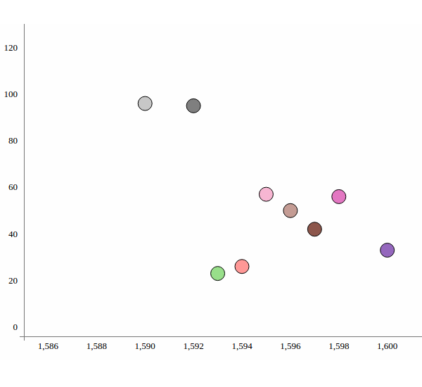
Now, if you have a look at the axes when we search for different keywords, the scales don't get updated. In order to correct that, we'll rebind the new axes to the SVG each time the data is fetched.
Open up displayChart_4.html and inside the CreateChart JavaScript function, after the axes have been added, we'll rebind the scales to the axes as shown below:
vis.select(".x.axis").call(xAxis);
vis.select(".y.axis").call(yAxis);
Update the code to GAE and point your browser to http://YourAppspotURL.com/displayChart_4.html. Try searching for some keywords, say Adam and Caesar, and on each search the scales on the axes get updated but the change is instantaneous.
Let's introduce transitions while updating scales on each of the axes. Let's start by creating a transition.
var transition = vis.transition();
By default the transition created has a duration of 250 ms. We can also set our own choice of delay. Let's make the delay 2,000 ms.
var transition = vis.transition().duration(2000)
Next, we'll use the above created transition while trying to bind the scales to the axes. Modify the scale rebinding code.
vis.select(".x.axis").call(xAxis);
vis.select(".y.axis").call(yAxis);
Use the transition variable created as shown.
transition.select(".x.axis").call(xAxis);
transition.select(".y.axis").call(yAxis);
Save the changes and update the code to GAE, and point your browser to http://YourAppspotURL.com/displayChart_4.html. Try searching for a keyword and observe the change in the scales on both the axes. You should be able to see the animated transition while the scales change.
D3.js Transitions (Circles)
We added transitions to the changing scales. Similarly, we can also add transitions to the circles that are getting plotted on each keyword search.
If you noticed, there is an issue with the search result being plotted. Although the scales get updated, the plotted circles don't get updated accordingly in subsequent searches. So, in order to solve this we'll rebind the new data to the graph. In the CreateChart JavaScript function, add the following code, which will rebind the new data to the circles being plotted.
circles
    .attr("cx", function(d) {
        return xScale(d.year);
    })
    .attr("cy", function(d) {
        return yScale(d.count);
    })
    .attr("r", 10);
Using the data fetched from the Google BigQuery dataset, we transformed the year and count of the data using xScale and yScale, so that it can be plotted in the available SVG space.
Save the changes and update the code to GAE. Point your browser to http://YourAppspotURL.com/displayChart_4.html and try searching for keywords. You can see that the data gets updated, but the change is quite instantaneous. So, let's add transitions while rebinding the new data.
circles.transition().duration(1000)
    .attr("cx", function(d) {
        return xScale(d.year);
    })
    .attr("cy", function(d) {
        return yScale(d.count);
    })
    .attr("r", 10);
As you can see, we just added a transition with a duration of 1,000 ms. So when the data gets plotted it won't be instantaneous, but will be a bit animated. So simply update the code to GAE and try to refresh the displayChart_4.html page. Search for keywords and you should see the transition magic happening.
Now if you observed, after searching a second time for any keyword, the previous search data still coexists with the second search result. So, to resolve this issue we'll use the D3.js exit API to remove the previous result. selection.exit().remove() removes the circles. We'll use a transition while removing the circles too.
circles.exit()
    .transition().duration(1000)
    .remove();
Update the code to GAE and refresh displayChart_4.html. Try searching first for the keyword The, which should return some 19 results, and then search for Adam, which should return 7 results.
Adding Distinct Colors to Circles
To make our graph look a bit more appealing, let's give the plotted circles distinct colors. D3.js provides a scale with a range of 20 colors called d3.scale.category20(). We'll use this scale to give random colors to our circles.
We have styled our circles in red as shown:
.style("fill", "red");
Now, we'll first create a scale using d3.scale.category20.
var color = d3.scale.category20();
Next, while filling the circles we'll pick random colors using the color scale and fill the circles as shown below.
.style("fill", function(d, i) {
    return color(i);
});
Save the changes and upload the code to GAE. Once done, refresh your page and search for the keyword God, and you should see a colorful graph as shown.
Adding Tooltips to the Circles
We'll be using a jQuery plugin called tipsy to add tooltips to our circles. Inside the tooltip, we'll display the works of Shakespeare in which the searched keyword appears. Download and include the tipsy CSS and script in displayChart_4.html.
<link href="css/tipsy.css" rel="stylesheet">

<script src="js/jquery.tipsy.js" type="text/javascript"></script>
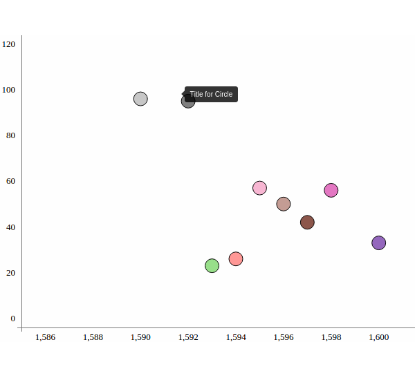
To use tipsy, we need to call the plugin on the circles inside the SVG element.
$('svg circle').tipsy({
    gravity: 'w',
    title: function() {
        return 'Title for Circle'
    }
});
As you can see we have initialized the tipsy plugin on the circles. We have defined two properties for the tooltip, gravity and title. Gravity defines the direction for positioning the tooltip relative to the pointer.
Save the changes and update the code to GAE. Refresh your displayChart_4.html, and search for a keyword. Place the mouse cursor over any circle and it should display the tooltip.
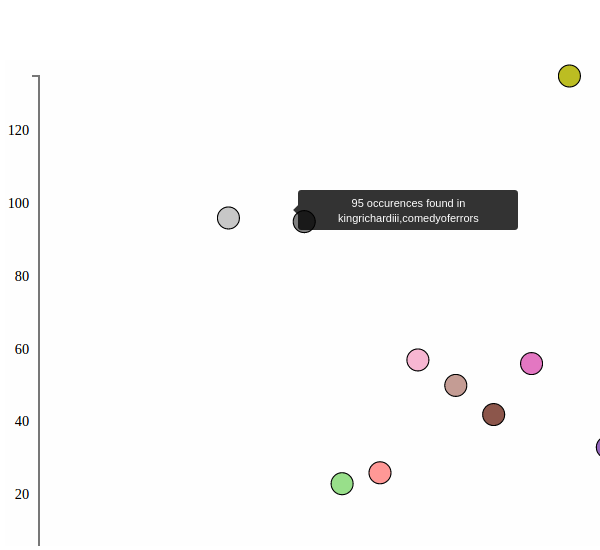
Next, we'll modify the function inside tipsy to parse the corpus name from the Google BigQuery data set and show it as a tooltip.
Inside the title function, this.__data__ gives the data attached with the particular circle. So, we'll concatenate the count and corpus name and show them in our tooltip.
$('svg circle').tipsy({
    gravity: 'w',
    title: function() {
        var d = this.__data__;

        return d.count + ' occurrences found in ' + d.corpus;
    }
});
As you can see, we concatenated the count and corpus names to show as a tooltip. Save the changes and update the code to GAE. Refresh the page, search for any keyword, and place the mouse over any circle to see the tooltip.
Wrapping it Up
This was the last part of the Data Visualization App Using GAE Python, D3.js and Google BigQuery series. D3.js is an effective JavaScript library for creating beautiful and interactive visualizations. What we learned in these series of tutorials is just the tip of the iceberg, and there is a lot more that D3.js has to offer. For in-depth knowledge I would recommend reading the official documentation. A great number of examples can also be found on the official site.
Source code from this tutorial is available on GitHub.
Do let us know your thoughts in the comments below!!

Comments