A couple weeks ago, we learned how to create a comic book theme web design over at our sister-site, Webdesigntuts+. Today, we'll tackle the second part: it's time to slice the design and turn it into a functional HTML layout, ready to be ported to any CMS. Let's get started!
Before We Begin
You can get your very own PSD by following the step by step process at Webdesigntuts+ or just download it here.
Since this isn't a beginner level tutorial, I will skip some basic explanations -- a working knowledge of HTML and CSS is expected as well as a bit of knowledge about slicing images on Photoshop.
Step 1 - HTML Layout
Let's start by creating the work folder; since this tutorial doesn't require the use of a server side language, it can be anywhere on your system. Create a file named index.html, and three initial folders:
/images-
/js /style
The contents of these folders should be fairly self explanatory.
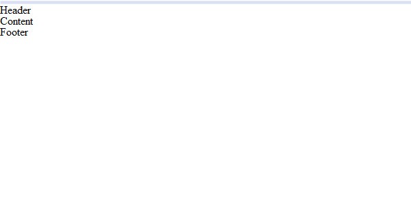
Add the basic containers of the page to index.html. I'm wrapping everything with a div called page. Inside that div, add three more with IDs of header, content and footer respectively.
In the style folder, create a new file called default.css and add a reset to remove all the default styles. I'm using Eric Meyer's but feel free to start with your favorite.
Following the HTML code for this step:
<!DOCTYPE html PUBLIC "-//W3C//DTD XHTML 1.0 Transitional//EN" "http://www.w3.org/TR/xhtml1/DTD/xhtml1-transitional.dtd">
<html xmlns="http://www.w3.org/1999/xhtml">
<head>
<meta http-equiv="Content-Type" content="text/html; charset=utf-8" />
<title>Comicastic</title>
<link href="style/default.css" rel="stylesheet" type="text/css" />
</head>
<body>
<div id="page">
	<div id="header">
   	Header
   </div>
	<div id="content">
   	Content
   </div>
	<div id="footer">
   	Footer
   </div>
</div>
</body>
</html>
And the CSS:
@charset "utf-8";
/* CSS Document */
/* http://meyerweb.com/eric/tools/css/reset/
v2.0 | 20110126
License: none (public domain)
*/
	html, body, div, span, applet, object, iframe,
   h1, h2, h3, h4, h5, h6, p, blockquote, pre,
   a, abbr, acronym, address, big, cite, code,
   del, dfn, em, img, ins, kbd, q, s, samp,
   small, strike, strong, sub, sup, tt, var,
   b, u, i, center,
   dl, dt, dd, ol, ul, li,
   fieldset, form, label, legend,
   table, caption, tbody, tfoot, thead, tr, th, td,
   article, aside, canvas, details, embed,
   figure, figcaption, footer, header, hgroup,
   menu, nav, output, ruby, section, summary,
   time, mark, audio, video {
       margin: 0;
       padding: 0;
       border: 0;
       font-size: 100%;
       font: inherit;
       vertical-align: baseline;
   }

   /* HTML5 display-role reset for older browsers */
   article, aside, details, figcaption, figure,
   footer, header, hgroup, menu, nav, section {
   display: block;
   }
   body {
   		line-height: 1;
   }
   ol, ul {
   		list-style: none;
   }
   blockquote, q {
   		quotes: none;
   }
   blockquote:before, blockquote:after,
   q:before, q:after {
       content: '';
       content: none;
   }
   table {
       border-collapse: collapse;
       border-spacing: 0;
   }
/* End of reset */
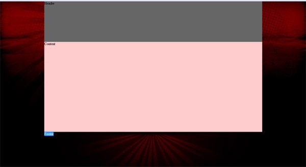
Testing the code in Firefox, you should see something like this:
Step 2 - Basic CSS Layout
Let's style the layout's structure first.
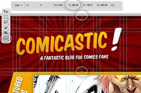
We wrap all the content with a 960px wide container, and then set the heights to the inner divs. To get the exact height of each div you can use the Photoshop ruler tool.
We will slice the background images of the entire page and the footer section now.
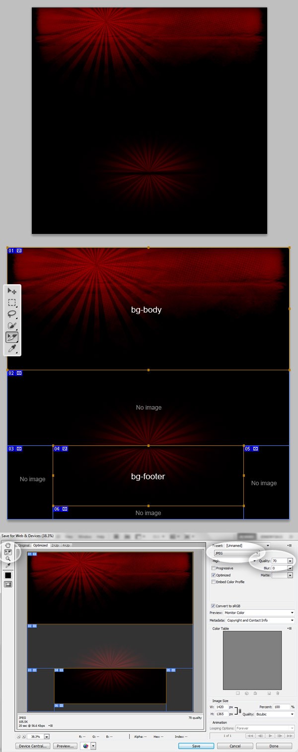
In Photoshop, open Comicastic.psd and hide everything but the Header BG and Footer BG folders. Using the "slice" tool, draw a big slice from the top-left until 575px below the top border. Next, draw another slice from the guide delimiting the footer background (take a look at the image below). Of course, you can use the guides to get an accurate result.
Using the "slice selection" Tool, select the two recently created slices and name each one with their respective names -- bg-body and bg-footer. Then double click on all the auto-slices, and change the "slice type" to No Image.
Next, go to File > Save for Web and Devices. Select the two slices you want to save (Hold the shift key to select more than one), set the "file type" to JPG and set the Quality to 70 and click on Save. Browse for your working directory and chose the root file (this dialog will automatically save your files inside the /images folder).
Now that you have the background images, let's add the CSS for all the containers.
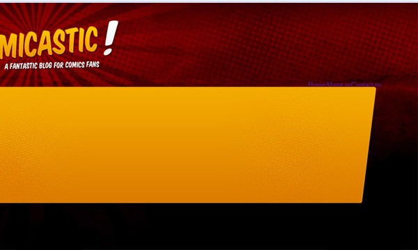
We will set a test height for the divs except the header (which is 180px height actually) and add some temporary background colors for testing purposes.
/*Common*/
body{
	background-color:#000;
	background-image:url(../images/bg-body.jpg);
	background-position:center top;
	background-repeat:no-repeat;
}

/*Containers*/
#page{
   margin:0px auto;
   width:960px;
}
#header{
   width:960px;
   height:180px;
   float:left;
   background-color:#666;
}
#content{
   width:960px;
   height:400px;/* Temporal */
   float:left;
   background-color:#FCC;
}
#footer{
   width:960px;
   height:250px;/* Temporal */
   float:left;

   background-image:url(../images/bg-footer.jpg);
   background-position:top center;
   background-repeat:no-repeat;
}
Testing in a browser, you should have something like the image below.
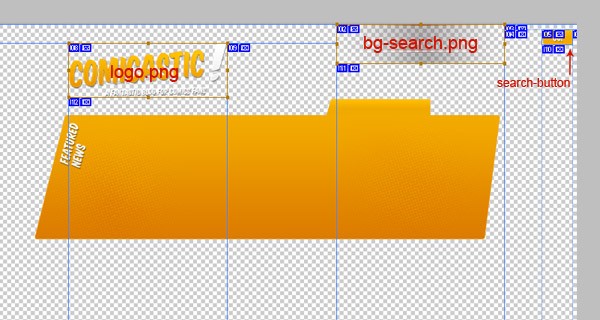
Step 3 - Slice the Header and Content Background Images
Now that you know how to slice the image, let's do the same with all the header and content background (or foreground) images. For the header images, create a copy of the "comicastic.psd" document and hide everything but the Logo folder and the Search background related layers (plus I'm adding the search button in this view after moving it a few pixels right). Now, draw the slices around the visible segments, and name them logo, bg-search and search-button, respectively. Save them as PNGs with transparent backgrounds.
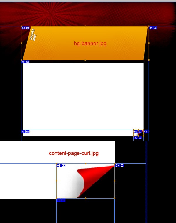
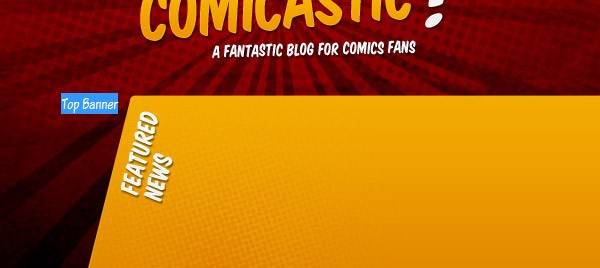
Let's move forward with the content banner.
Show only the Background folder inside Top Banner, show the Page Curl folder and the Page Bg layer under Page Content and show the Header Bg folder including the overall black background. Then, with these layers visible, draw two slices: one for the banner's background named bg-banner and another small one for the page curl named content-page-curl. Then save them both of them as JPEGs.
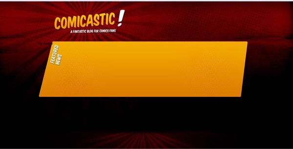
Add a new div named logo inside the "header" and another div named top-banner inside content to our HTML file.
<div id="header">
	<div id="logo">
		<a href="#"><img src="images/logo.png" width="340" height="135" alt="Comicastic" /></a>
	</div>
</div>
<div id="content">
	<div id="top_banner">Top Banner</div>
</div>
And the CSS code to make them look right:
#logo{
     padding-top:32px;
     padding-left:70px;
}

[...]

#top_banner{
     float:left;
     width:960px;
     height:250px;
     background-image:url(../images/bg-banner.jpg);
     background-position:center top;
     background-repeat:no-repeat;
}
Now you should have something like so:
Step 4 - Top Navigation
Let's add the HTML for the top navigation. Add the following code inside the header div, below the logo.
<ul id="main_navigation">
	<li><a href="#">Home</a></li>
	<li><a href="#">About us</a></li>
	<li><a href="#">Contact us</a></li>
</ul>
The hardest work with this div will be the positioning. We'll make it float right, and play with the padding to fit it in its proper place. Add the following CSS:
#main_navigation{
 	float:right;
}
#main_navigation li{
 	display:inline;
}
#main_navigation li a{
 	display:block;
 	float:left;
}
#main_navigation li a:hover{
}
Step 5 - Font Replacement
Since I don't have any intention of using "Comic Sans" for this design, we will use a more interesting typeface. We'll take advantage of CSS3 to make it look great in modern browsers.
First, download the CSS font packages "Komika Title" and "Komika Text" and put them in a new folder, named /fonts. Each kit has a bunch of font files and a .CSS file that we will import to our default.css document, as follows:
/*Font Face Kits*/
@import url("../fonts/komika-text/stylesheet.css") screen;
@import url("../fonts/komika-title/stylesheet.css") screen;
Now that the fonts are imported, we can use them anywhere on our site. Each set has a number of variants to choose from; you can use the ones according to the graphic design. For starters, we will set all the body text with 'KomikaTextTightRegular' as follows:
body{
 	background-color:#000;
 	background-image:url(../images/bg-body.jpg);
 	background-position:center top;
 	background-repeat:no-repeat;

 	font-family:'KomikaTextTightRegular', Arial, Helvetica, sans-serif;
 	font-size:1em;
}
And you can test the result in the browser:
Step 6 - Styling the top Navigation
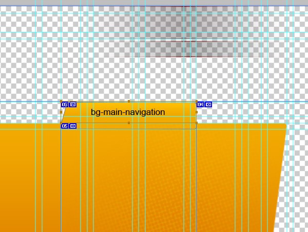
Back to the psd file now. Hide everything but the Tab background, create a new slice for the navigation tab named bg-main-navigation and save it for web as a PNG file.
In our CSS file, let's add the styles for the navigation bar, to achieve the desired hover effect. We will add the background to the hover action and create a similar style for the a.selected instance. Regarding the typography, per the graphic, we will use "KomikaTextItalic" and add a nice text shadow style to make it look better.
#main_navigation{
 float:right;
 margin-top:-18px;
 margin-right:20px;
}

#main_navigation li{
 display:inline;
 width:120px;
}

#main_navigation li a{
 display:block;
 float:left;

 padding-top:7px;
 padding-bottom:8px;
 padding-left:20px;
 padding-right:20px;

 margin-left:5px;

 color:#FFF;
 font-family:'KomikaTextItalic', Arial, Helvetica, sans-serif;
 font-size:18px;
 text-decoration:none;

 text-shadow:2px 2px 2px rgba(0,0,0,.5);

 -webkit-border-top-right-radius: 3px;
 -khtml-border-radius-topright: 3px;
 -moz-border-radius-topright: 3px;
 border-top-right-radius: 3px;
}

#main_navigation li a:hover{
   background-image:url(../images/bg-main-navigation.png);
   background-position:left;
   background-repeat:no-repeat;
}

#main_navigation li a.selected{
   background-image:url(../images/bg-main-navigation.png);
   background-position:left;
   background-repeat:no-repeat;
}
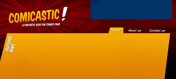
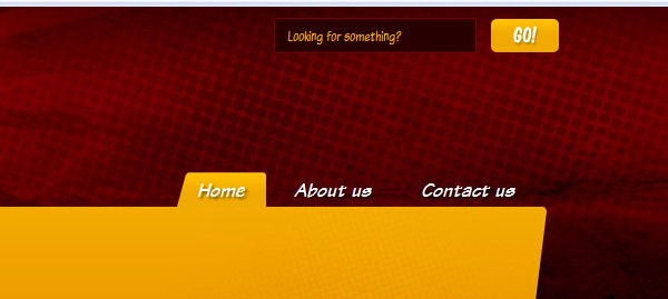
Your page should like so at this stage of development:

Step 7 - Header Content
Besides the logo and the navigation bar, we will need to add the search bar and the social media links to the header section. Let's start by creating the container box in HTML and adding the following div inside the header div.
<div id="header-content">
 	Top Right
</div>
And some necessary styles:
#header-content{
	 background-color:#036;
	 float:right;
	 width:440px;
	 height:105px;
}
When tested in the browser:
Step 8 - Search Bar
Next, we'll begin styling the search area. It's basically a form with an input box and a button (see step 3). For this, add the following code inside the "header-content div:
<div id="search">
    <form>
    <input type="text" class="search_input" value="Looking for something?"/>
    <input type="image" src="images/search-btn.png" />
    </form>
</div>
And the styling to make it look nice:
#search{
 	text-align:right;
 	padding-top:10px;
}

 #search input{
 	vertical-align:middle;
 }

 #search .search_input{
 	width:160px;
 	margin-right:10px;
 	padding:6px 10px;

 	color:#F2AA00;
 	font-family:'KomikaTextTightRegular',Arial, Helvetica, sans-serif;
 	font-size:14px;

	background-color:#280000;
 	border:1px solid #7C0000;

 	-webkit-border-radius: 3px;
 	-khtml-border-radius: 3px;
 	-moz-border-radius: 3px;
 	border-radius: 3px;
 }
That should give us:
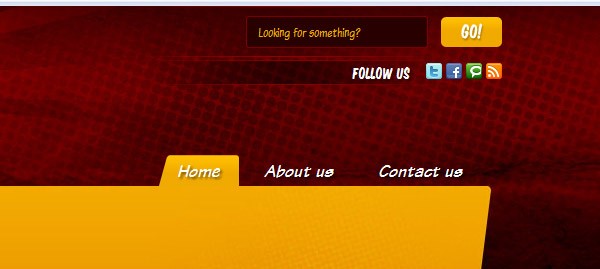
Step 9 - Social Media Links
Below the search div, add a div with an id of social_media. In it, you can insert a list of the social media links of your choice. I'm using Social Media Icon Pack by Komodo Media
<div id="social_media"> Follow us <a href="#"><img src="images/icons/twitter_16.png" width="16" height="16" alt="Twitter" /></a> <a href="#"><img src="images/icons/facebook_16.png" width="16" height="16" alt="Twitter" /></a> <a href="#"><img src="images/icons/technorati_16.png" width="16" height="16" alt="Twitter" /></a> <a href="#"><img src="images/icons/rss_16.png" width="16" height="16" alt="Twitter" /></a> </div>
And on the stylesheet:
#social_media{
	 padding-top:15px;
	 text-align:right;
	 color:#FFF;
	 font-family:'KomikaTitleRegular', Arial, Helvetica, sans-serif;
	 font-size:15px;

	 vertical-align:middle;

	 text-shadow:2px 2px 2px rgba(0,0,0,.5);
}
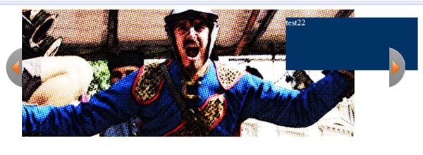
Step 10 - Sliding Banner
We will start with the sliding banner. Begin by downloading Easy Slider 1.5 and paste the files into a folder named Banner.
There are several examples in the library folder-- we will mimic 02.html. Rename the file, if needed, delete all the unnecessary HTML code and replace the images with some sample images.
So, the HTML file for the banner should be something like this:
<!DOCTYPE html PUBLIC "-//W3C//DTD XHTML 1.0 Transitional//EN" "http://www.w3.org/TR/xhtml1/DTD/xhtml1-transitional.dtd">
<html xmlns="http://www.w3.org/1999/xhtml">
<head>
<title>Banner</title>
<meta http-equiv="content-type" content="text/html;charset=UTF-8" />
    <script type="text/javascript" src="js/jquery.js"></script>
    <script type="text/javascript" src="js/easySlider1.5.js"></script>
    <script type="text/javascript">
     $(document).ready(function(){
     $("#slider").easySlider();
     });
     </script>
<link href="css/default.css" rel="stylesheet" type="text/css" />
</head>
<body>
<div id="container">
    <div id="content">
        <div id="slider">
            <ul>
                <li><a href="#"><img src="images/01.jpg" alt="Preview" /><div class="bubble">test</div></a></li>
                <li><a href="#"><img src="images/02.jpg" alt="Preview" /><div class="bubble">test22</div></a></li>
                <li><a href="#"><img src="images/03.jpg" alt="Preview" /></a></li>
                <li><a href="#"><img src="images/04.jpg" alt="Preview" /><div class="bubble">test</div></a></li>
                <li><a href="#"><img src="images/05.jpg" alt="Css Template Preview" /></a></li>
            </ul>
        </div>
    </div>
</div>
</body>
</html>
And here's the CSS
@charset "utf-8";
   /* CSS Document */
   /* image replacement */
img{
   border:0px;
}
.graphic, #prevBtn, #nextBtn{
   margin:0;
   padding:0;
   display:block;
   overflow:hidden;
   text-indent:-8000px;
}
/* // image replacement */
   #container{
   margin:0 auto;
   position:relative;
   text-align:left;
   width:696px;
   background:#fff;
   margin-bottom:2em;
}

#content{
   position:relative;
}

/* Easy Slider */
#slider{
   position:relative;
   width:760px!important;
   background:none;
}
   #slider ul, #slider li{
   	margin:0;
   	padding:0;
   	list-style:none;
   	background:none;
   }
   #slider li{
   	width:760px!important;
   }
   #slider li a{
   	background:none;
   }
   #slider li{
   	/*
   	define width and height of list item (slide)
   	entire slider area will adjust according to the parameters provided here
   	*/
   	width:696px;
   	height:241px;
   	overflow:hidden;
   }
   #prevBtn, #nextBtn{
   	display:block;
   	width:30px;
   	height:77px;
   	position:absolute;
   	left:-30px;
   	top:71px;
   }
   #nextBtn{
   	left:696px;
   }
   #prevBtn a, #nextBtn a{
   	display:block;
   	width:30px;
   	height:77px;
   	background:url(../images/btn_prev.gif) no-repeat 0 0;
   }
   #nextBtn a{
   	background:url(../images/btn_next.gif) no-repeat 0 0;
   }

   .bubble{
   	position:absolute;
   	float:right;
   	background-color:#036;

   	width:250px;
   	height:100px;
   	margin-top:-240px;
   	margin-left:500px;

   	color:#FFF;
   }
/* // Easy Slider */
At this point you should have something like this:
Don't worry if the slider is a little bit buggy, we will fix it in a minute.
Adjust positioning and replace the arrows
Slice the two arrows (prev and next) and save them as PNG files in the images folder of the banner testing directory.
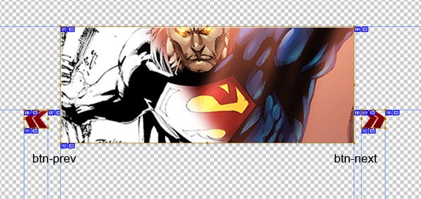
Then adjust the CSS to work properly with the new arrows
#prevBtn, #nextBtn{
    display:block;
    width:50px;
    height:40px;
    position:absolute;
    left:-50px;
    top:71px;
}
#nextBtn{
    left:630px; /* this is the li width*/
}
#prevBtn a{
    display:block;
    width:50px;
    height:40px;
    background:url(../images/btn-prev.png) no-repeat 0 0;
}
#nextBtn a{
    display:block;
    width:50px;
    height:40px;
    background:url(../images/btn-next.png) no-repeat 0 0;
}
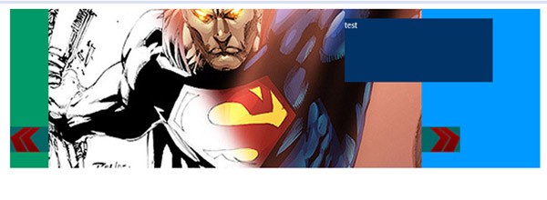
Which produces:
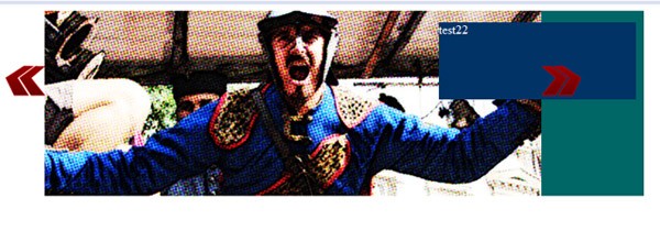
Positioning
Now, we'll set the positioning, width and height of all the banner related divs. We'll also fix the JS library to avoid any problem regarding the additional bubble div.
Here's the modified CSS:
#container{
 	margin:0 auto;
 	width:830px;
 	position:relative;
 	text-align:left;
 	background:#096;
 	margin-bottom:2em;
 	padding-left:65px;
}
#content{
 	position:relative;
}
 /* Easy Slider */
#slider{
 	position:relative;
 	width:830px;
 	overflow:hidden;
 	background:none;
 	background-color:#09F;
}
#slider ul, #slider li{
 	margin:0;
 	padding:0;
 	list-style:none;
 	background:none;
}
#slider li{
 	width:830px;
 	height:250px;
 	overflow:hidden;
}
#slider li a{
 	background:none;
}
#prevBtn, #nextBtn{
 	display:block;
 	width:65px;/*img width +15 padding*/
 	height:40px;
 	position:absolute;
 	left:-65px;
 	top:185px;
}
#nextBtn{
 	left:630px; /*Banner Width*/
}
#prevBtn a{
 	display:block;
 	width:65px; /*img width +15 padding*/
 	height:40px;
 	background:url(../images/btn-prev.png) no-repeat left;
 	background-color:#066;
}
#nextBtn a{
 	display:block;
 	width:65px;/*img width +15 padding*/
 	height:40px;
 	background:url(../images/btn-next.png) no-repeat right;
 	background-color:#066;
}

.bubble{
 	position:absolute;
 	float:right;
 	background-color:#036;

 	width:250px;
 	height:100px;
	 margin-top:-240px;
	 margin-left:500px;

	 color:#FFF;
}
/* // Easy Slider */
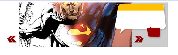
And the result in the browser:
Bubble Background
Now, slice the post content background. With only the talking bubbles visible in your .PSD, draw a Slice named "bg-bubble" and save it as a .png file.
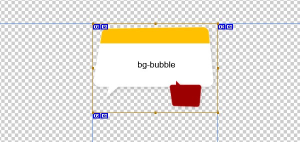
Modify the CSS to add the background and adjust the positioning of the bubble div, accordingly.
.bubble{
 	position:absolute;
 	float:right;
 	width:295px;
 	height:210px;
 	margin-top:-255px;
 	margin-left:535px;
 	background-image:url(../images/bg-bubble.png);
 	color:#FFF;
}
Here is how it looks in the browser; remove all the temporary background colors if you wish.
Post Content
To finish the banner section, let's add the HTML for the post content.
<div class="featured_post">
    <h2 class="post_title">Post title</h2>
    <p class="post_brief">Lorem ipsum dolor sit amet, consectetur adipisicing elit, sed do eiusmod tempor incididunt ut labore et dolore magna aliqua Ut enim ad minim veniam</p>
    <div class="post_info">
        <span class="author">Posted by <a href="#">Admin</a></span>,
        <span class="date">Apr 14</span>
    </div>
    <div class="post_comments">
        <div class="number"><a href="#">29</a></div>
        <div class="comments"><a href="#">Comments</a></div>
	 </div>
</div>
Merge with the Main Template File
It's time to merge the separate module with our main document.
First, copy the banner's /js folder to the template root, then add all the banner images into the /images folder to the template directory.
Next, add the following code inside the <head> tag of our index.html" file:
<script type="text/javascript" src="js/jquery.js"></script>
<script type="text/javascript" src="js/easySlider1.5.js"></script>
<script type="text/javascript">
 $(document).ready(function(){
 $("#slider").easySlider();
 });
</script>
And add the banner divs accordingly inside the top_banner div.
<!-- Top Banner -->
<div id="top_banner">
    <div class="banner_container">
        <div id="slider">
            <ul>
                <li><a href="#"><img src="images/banner/01.jpg" alt="Preview" /></a>
                    <div class="bubble">
                        <div class="featured_post">
                        	<h2 class="post_title">Post title</h2>
                        	<p class="post_brief">Lorem ipsum dolor sit amet, consectetur adipisicing elit, sed do eiusmod tempor incididunt ut labore et dolore magna aliqua Ut enim ad minim veniam</p>
                        	<div class="post_info">
                        		<span class="author">Posted by <a href="#">Admin</a></span>,
                        		<span class="date">Apr 14</span>
                        	</div>
                        	<div class="post_comments">
                        		<div class="number"><a href="#">29</a></div>
                        		<div class="comments"><a href="#">Comments</a></div>
                        	</div>
                        </div>
                    </div>
                </li>
                <li><a href="#"><img src="images/banner/02.jpg" alt="Preview" /></a><div class="bubble">test22</div></li>
                <li><a href="#"><img src="images/banner/03.jpg" alt="Preview" /></a><div class="bubble">test333</div></li>
                <li><a href="#"><img src="images/banner/04.jpg" alt="Preview" /></a><div class="bubble">test4444</div></li>
                <li><a href="#"><img src="images/banner/05.jpg" alt="Preview" /></a><div class="bubble">test55555</div></li>
            </ul>
        </div>
    </div>
</div>
<!-- End of Top Banner -->
And the complete CSS to make the banner work
/* Top Banner */
#top_banner{
     float:left;
     width:830px;
     height:250px;
     padding-left:130px;
     padding-top:10px;
     background-image:url(../images/bg-banner.jpg);
     background-position:center top;
     background-repeat:no-repeat;
}

.banner_container{
     float:left;
     width:860px;
     height:250px;

     position:relative;
     text-align:left;
}

/* image replacement */
     #prevBtn, #nextBtn{
     margin:0;
     padding:0;
     display:block;
     overflow:hidden;
     position:absolute;
     text-indent:-8000px;
}
 /* // image replacement */

 /* Easy Slider */

#slider{
     position:relative;
     width:830px;
     margin-left:100px
     overflow:hidden;
}
#slider ul, #slider li{
     margin:0;
     padding:0;
     list-style:none;
     background:none;
}

#slider li{
     width:830px;
     height:250px;
     overflow:hidden;
}

#slider li img{
     border:1px solid #FFF;
     height:248px;
}

#slider li a{
 	background:none;
}

#prevBtn, #nextBtn{
     display:block;
     width:65px;/*img width +15 padding*/
     height:40px;
     position:absolute;
     left:-65px;
     top:185px;
}
#nextBtn{
	 left:630px; /*Banner Width*/
}
#prevBtn a{
     display:block;
     width:65px; /*img width +15 padding*/
     height:40px;
     background:url(../images/btn-prev.png) no-repeat left;
}
#nextBtn a{
     display:block;
     width:65px;/*img width +15 padding*/
     height:40px;
     background:url(../images/btn-next.png) no-repeat right;
}

.bubble{
     position:absolute;
     float:right;
     width:295px;
     height:210px;
     margin-top:-255px;
     margin-left:535px;
     background-image:url(../images/bg-bubble.png);
     color:#FFF;
}
/* // Easy Slider */
/* End of Top Banner*/
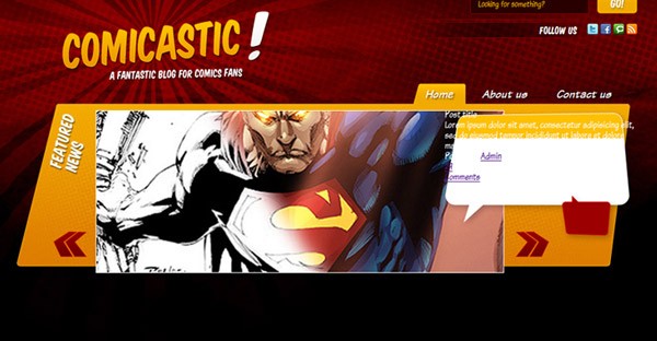
We will style the featured post content shortly. At this point, though, you should have something similar to the following image:
Step 11 - Content Wrapper and Background
Moving forward with the mockup, add a div below the top banner, named content_wrapper, and inside another div named page_content, which will contain the actual information.
<div id="content_wrapper">
	<div id="page_content">
		Page content
	</div>
</div>
Then, in order to make it look like the design, we will use CSS3 to add the rounded corners to the page_content div and the page curl we sliced in Step 3.
/*Page content*/
   #content{
 float:left;
 width:960px;
 }
#content_wrapper{
   float:left;
   width:910px;
   padding-left:10px;
   padding-right:40px;
   padding-top:10px;
}

#page_content{
   float:left;
   width:100%;
   height:350px;/*temporal*/
   background-color:#FFF;
   background-image:url(../images/content-page-curl.jpg);
   background-position:bottom right;
   background-repeat:no-repeat;

   -webkit-border-radius: 5px;
   -khtml-border-radius: 5px;
   -moz-border-radius: 5px;
   border-radius: 5px;

   -webkit-border-bottom-right-radius: 0px;
   -khtml-border-radius-bottomright: 0px;
   -moz-border-radius-bottomright: 0px;
   border-bottom-right-radius: 0px;
}
/*End of Page Content*/
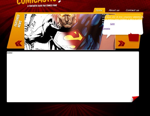
What our page should look like, at this point:
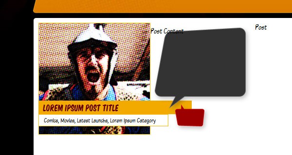
Step 12 - Post Image and Title
Let's mock up a testing post.
Per the design, we will need to have a squared image with the post title and the categories list placed on two stripes above it. Let's deal with the HTML first.
Create a div named post and place it inside the page_content div. Then add an image, a title and some metadata to the container.
<div class="post">
	<img src="images/posts/01.jpg" class="post-image" />
	<h2><a href="#">Lorem Ipsum Post Title</a></h2>
	<div class="met ad at a"><a href="#">Comics</a>, <a href="#">Movies</a>, <a href="#">Latest Launches</a>, <a href="#">Lorem Ipsum Category</a></div>
</div>
The CSS for this part is tricky since each post must be 50% width in reference to the page_content container, plus the stripes should be in front of the picture. We'll need to play around with relative positioning and negative margins to make this happen.
.post{
    float:left;
    width:445px;
    height:230px;
}

.post .post-image{
    position:relative;
    top:0px;
    left:0px;
    border:1px solid #FFB800;
}

.post h2{
    position:relative;
    top:-70px;
    left:0px;
    width:300px;

    padding:5px;
    padding-left:10px;

    font-family:'KomikaTitleRegular', Arial, Helvetica, sans-serif;
    font-size:18px;

    color:#680000;
    background-color:#F2AA00;
}

.post h2 a{
    color:#680000;
    text-decoration:none;
}

.post h2 a:hover{
    color:#FFFFFF;
}

.post .metadata{
    position:relative;
    top:-70px;
    left:0px;
    width:250px;

    padding:5px;
    padding-left:10px;

    font-size:13px;

    background-color:#FFF;
    border:1px solid #FFB800;
}

.post .metadata a{
    color:#000;
    text-decoration:none;
}

.post .metadata a:hover{
    color:#9C0000;
}
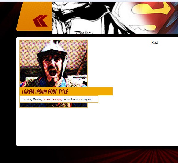
You should now have something like so:
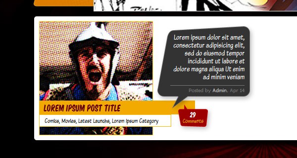
Step 13 - Post Content Background and Position
Now, we will add a div which contains the post content.
<div class="post">
	<img src="images/posts/01.jpg" class="post-image" />
	<h2><a href="#">Lorem Ipsum Post Title</a></h2>
	<div class="metadata"><a href="#">Comics</a>, <a href="#">Movies</a>, <a href="#">Latest Launchs</a>, <a href="#">Lorem Ipsum Category</a></div>

	<div class="post_content">Post Content</div>
</div>
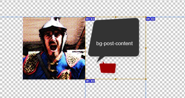
Slice the background image for the post_content div, and save it as a PNG file.
First, we will set its positioning in the CSS file.
.post .post_content{
 	position:relative;
 	top:-275px;
 	left:230px;

 	width:210px;
 	height:220px;
	background-image:url(../images/bg-post-content.png);
   background-position:top left;
   background-repeat:no-repeat;
}
Taking a look in the browser:
Step 14 - Post Content
Let's add the containers for the post brief, post information and comments:
<div class="post_content">
    <div class="post_brief">Lorem ipsum dolor sit amet, consectetur adipisicing elit, sed do eiusmod tempor incididunt ut labore et dolore magna aliqua Ut enim ad minim veniam
    </div>
    <div class="post_info">
        <span class="author">Posted by <a href="#">Admin</a></span>,
        <span class="date">Apr 14</span>
    </div>
    <div class="post_comments">
        <div class="number"><a href="#">29</a></div>
        <div class="comments"><a href="#">Comments</a></div>
    </div>
</div>
And the styling to make everything look nice:
.post .post_content .post_brief{
     width:150px;
     height:98px;
     overflow:hidden;

     padding-left:35px;
     padding-top:15px;
     text-align:right;
     color:#FFF;
}

.post .post_info{
     width:150px;
     margin-left:35px;
     margin-top:8px;
     padding-top:4px;

     text-align:right;

     border-top:1px solid #787878;

     font-family:Tahoma, Geneva, sans-serif;
     font-size:10px;
     color:#787878;
}

.post .post_info a{
     color:#787878;
     text-decoration:none;
}

.post .post_info a:hover{
     color:#D8D8D8;
     text-decoration:none;
}

.post .post_comments{
     width:50px;
     margin-top:37px;
     margin-left:56px;

     text-align:center;
}

.post .post_comments a{
     color:inherit;
     text-decoration:none;
}

.post .post_comments .number{
     font-family:'KomikaTitleRegular', Arial, Helvetica, sans-serif;
     font-size:14px;
     color:#FFF;
}

.post .post_comments .comments{
     font-size:12px;
     color:#F2AA00;
}
And we are done with the post!
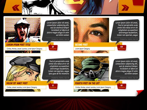
Step 15 - Add More Posts
Let's go ahead and add more posts to your mockup. Duplicate this block for as many times as you want the post div. You should get rid of the temporary height we put on the page_content div. If everything is was executed correctly, the layout will increase its height as we add more posts to the homepage.
Step 16 - Featured Post Content
Now that we have the basic post styling finished, let's style the featured post content. Remember how we had the following code inside the bubble div?
<div class="featured_post">
    <h2 class="post_title">Post title</h2>
    <p class="post_brief">Lorem ipsum dolor sit amet, consectetur adipisicing elit, sed do eiusmod tempor incididunt ut labore et dolore magna aliqua Ut enim ad minim veniam</p>
    <div class="post_info">
        <span class="author">Posted by <a href="#">Admin</a></span>,
        <span class="date">Apr 14</span>
    </div>
    <div class="post_comments">
        <div class="number"><a href="#">29</a></div>
        <div class="comments"><a href="#">Comments</a></div>
	 </div>
</div>
Add the following CSS and replicate the bubble in all the slides of our rotating banner.
/* Post */

.featured_post .post_title{
     height:29px;
     padding-top:18px;

     text-align:right;
     font-family:'KomikaTitleRegular', Arial, Helvetica, sans-serif;
     font-size:18px;

     color:#680000;
}

.featured_post .post_title a{
     color:#680000;
     text-decoration:none;
}

.featured_post .post_title a:hover{
	 color:#FFFFFF;
}

.featured_post .post_brief{
     height:67px;
     padding-left:30px;
     overflow:hidden;
     text-align:right;
     color:#1B1B1B;
}

.featured_post .post_info{
     margin-left:30px;
     text-align:right;
     padding-top:2px;

     font-family:Tahoma, Geneva, sans-serif;
     font-size:10px;
     color:#969696;

     border-top:1px solid #FFC000;
}

.featured_post .post_info a{
     color:#969696;
     text-decoration:none;
}

.featured_post .post_info a:hover{
 	color:#1B1B1B;
}

.featured_post .post_comments{
     text-align:center;
     float:right;
     margin-top:20px;
     margin-right:10px;

     width:65px;
     height:40px;
}

.featured_post .post_comments a{
     color:inherit;
     text-decoration:none;
}

.featured_post .post_comments .number{
     font-family:'KomikaTitleRegular', Arial, Helvetica, sans-serif;
     font-size:24px;
     color:#FFF;
}

.featured_post .post_comments .comments{
     font-size:14px;
     color:#F2AA00;
}

 /* // Post */
I've also added a border and a box-shadow to the sliding image:
#slider li img{
     border:1px solid #FFF;
     height:248px;

     box-shadow: 0px 0px 20px rgba(0,0,0,.5);
     -moz-box-shadow: 0px 0px 20px rgba(0,0,0,.5);
     -webkit-box-shadow: 0px 0px 20px rgba(0,0,0,.5);
}
It should look like so:
Step 17 - Footer Widgets
Instead of the classic sidebar, I wanted to add a widget ready footer. Add the following code inside the footer div. Inside the sidebar, there will be another container named widget, and, inside that div:
- a title
- an unordered list and
- a
divfor the curled corner
We'll take care of the categories list first.
<div id="sidebar">
<div class="widget">
<h3>Categories</h3>
<ul>
<li><a href="#">Lorem ipsum dolor sit amet</a></li>
<li><a href="#">Consectetur adipisicing elit</a></li>
<li><a href="#">Sed do eiusmod tempor</a></li>
<li><a href="#">Incididunt ut labore</a></li>
<li><a href="#">Et dolore magna aliqua</a></li>
<li><a href="#">Ut enim ad minim veniam</a></li>
<li><a href="#">Lorem ipsum</a></li>
<li><a href="#">Dolor sit amet</a></li>
<li><a href="#">Consectetur adipisicing</a></li>
</ul>
<div class="corner"> </div>
</div>
<div class="widget">W2</div>
<div class="widget">W3</div>
</div>
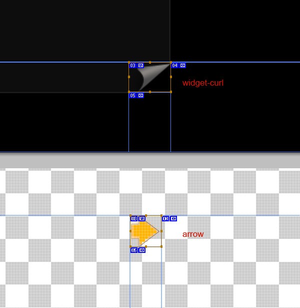
Now in the PSD file, slice the corner, name it widget-curl and save the image for web as a JPG file. Again, slice the tiny arrow next to the links, name it arrow and save it as a PNG file.
And edit the CSS file like so:
/*Footer*/
#footer{
     width:940px;
     padding-left:0px;
     padding-right:10px;
     padding-top:20px;
     height:250px;/* Temporal */
     float:left;

     background-image:url(../images/bg-footer.jpg);
     background-position:top center;
     background-repeat:no-repeat;
}
/*End of Footer*/

/* Footer sidebar */
     #sidebar{
     float:left;
     width:940px;
}
.widget{
     float:left;
     margin-left:10px;
     margin-right:10px;
}
.widget h3{
     color:#F2AA00;

     font-family:'KomikaTitleRegular', Arial, Helvetica, sans-serif;
     font-size:14px;
     padding-bottom:10px;
     padding-left:10px;
}

.widget ul{
     width:200px;
     padding:20px 10px;

     background-color:rgba(26,26,26,.5);
     border:1px solid #252525;

     -webkit-border-radius: 5px;
     -khtml-border-radius: 5px;
     -moz-border-radius: 5px;
     border-radius: 5px;
}

.widget .corner{
     background-image:url(../images/widget-curl.jpg);
     background-position:bottom right;
     background-repeat:no-repeat;

     height:30px;
     margin-top:-30px;
     margin-right:-2px;
}

.widget ul li{
     font-size:16px;
     padding-bottom:3px;
     color:#FFF;
}

.widget ul li a{
     padding-left:20px;
     color:#FFF;
     text-decoration:none;
}

.widget ul li a:hover{
     color:#DC0000;
     background-image:url(../images/arrow.png);
     background-position:0px 6px;
     background-repeat:no-repeat;
}
/* //Footer sidebar */
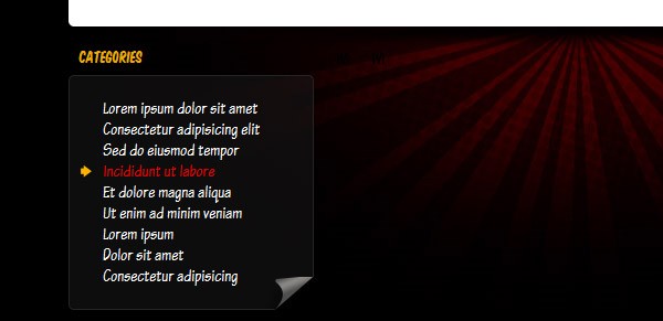
When tested in a browser, you should see something like the following image:
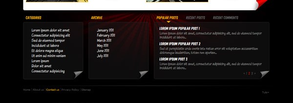
Step 18 - More Widgets
Replicate the HTML code to add a second or even a third list widget. This time, we will add archives to the footer. You can test the layout now adding several copies of the widget div to see how it looks. Optimally, the footer area will increase as you add more widgets.
<!-- Widget -->
<div class="widget">
<h3>Archives</h3>
<ul>
<li><a href="#">January 2011</a></li>
<li><a href="#">February 2011</a></li>
<li><a href="#">March 2011</a></li>
<li><a href="#">May 2011</a></li>
<li><a href="#">June 2011</a></li>
<li><a href="#">July 2011</a></li>
</ul>
<div class="corner"> </div>
</div>
<!-- End of widget -->
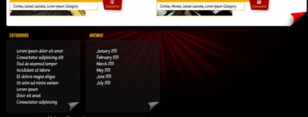
This is how it looks with the archives section added:
Step 19 - Tabbed Pane
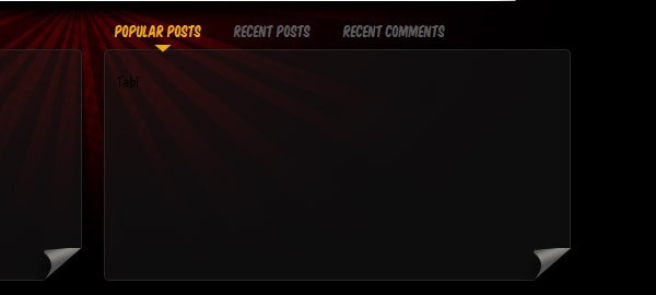
As an example of a more complex widget, let's add a tabbed pane with three different types of content in each tab.
First, add the following HTML code as basic markup: an unordered list for the tabs, and divs with different ids for the content. I'm adding a general class, named tab to all the content divs in order to avoid duplicating the code in the CSS file.
<div class="widget">
<div id="tabs">
<ul>
<li><a href="#tab-1">Popular Posts</a></li>
<li><a href="#tab-2">Recent Posts</a></li>
<li><a href="#tab-3">Recent Comments</a></li>
</ul>
<div class="tab" id="tab-1">
<p>Tab1</p>
</div>
<div class="tab" id="tab-2">
<p>Tab2</p>
</div>
<div class="tab" id="tab-3">
<p>Tab3</p>
</div>
</div>
<div class="corner"> </div>
</div>
Let's create a JavaScript document, named tabs.js, and save it in the /js folder. Include it by adding this line to the <head> tag.
<script type="text/javascript" src="js/tabs.js"></script>
Now, add a basic jQuery tabbed pane by adding the following code to the tabs.js file.
$(document).ready(function(){
   $('#tabs div').hide();
   $('#tabs div:first').show();
   $('#tabs ul li:first').addClass('active');
   $('#tabs ul li a').click(function(){
       $('#tabs ul li').removeClass('active');
       $(this).parent().addClass('active');
       var currentTab = $(this).attr('href');
       $('#tabs div').hide();
       $(currentTab).show();
       return false;
   });
 });
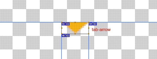
With the JavaScript function working, let's add the styling to make it look pretty. First, we'll need to slice the little arrow that points to the selected tab. Name it tab-arrow, and save it as a PNG.
Now add the following code to the CSS file:
/* Footer Tabbed Pane */
#tabs{
}

#tabs ul{
     background:none;
     border:0px;
     padding:0px;
     margin:0px;
     width:428px;
     min-height:30px;
     height:30px;

     -webkit-border-radius: 0px;
     -khtml-border-radius: 0px;
     -moz-border-radius: 0px;
     border-radius: 0px;
}

#tabs ul li{
     display:inline;
     float:left;
     text-align:left;
}
#tabs ul .active{
     background-image:url(../images/tab-arrow.png);
     background-position:bottom center;
     background-repeat:no-repeat;
}

#tabs ul .active a{
	 color:#F2AA00;
}

#tabs ul li a{
     display:block;
     margin:0px;
     padding:0px;

     color:#5A5A5A;

     font-family:'KomikaTitleRegular', Arial, Helvetica, sans-serif;
     font-size:14px;
     padding-bottom:10px;
     padding-left:10px;
     padding-right:20px;
}

#tabs ul li a:hover{
     background-image:none;
     color:#F2AA00;
}

#tabs .tab{
     width:405px;
     padding:20px 10px;
     min-height:170px;
     /*This is to get the arrow above the tab*/
     margin-top:-6px;

     background-color:rgba(26,26,26,.5);
     border:1px solid #252525;

     -webkit-border-radius: 5px;
     -khtml-border-radius: 5px;
     -moz-border-radius: 5px;
     border-radius: 5px;
}
/* //Footer Tabbed Pane */
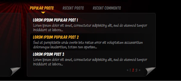
Now you should have the tabbed panel working; let's add the content inside!
Step 20 - Tab Contents
Let's go ahead and add some content to the tab. Taking a look at the graphic, you'll notice that we have a list of three posts (latest and popular) with the title and a brief, and a pager at the bottom to navigate through the posts.
Paste in the following code inside a tab:
<span class="item"> <h4><a href="#">John Doe</a></h4> <p>Lorem ipsum dolor sit amet, consectetur adipisicing elit, sed do eiusmod tempor incididunt ut labore...</p> </span> <span class="item"> <h4><a href="#">Jane Smith</a></h4> <p>Lorem ipsum dolor sit amet, consectetur adipisicing elit, sed do eiusmod tempor incididunt ut labore...</p> </span> <span class="item"> <h4><a href="#">SpiderHuman</a></h4> <p>Lorem ipsum dolor sit amet, consectetur adipisicing elit, sed do eiusmod tempor incididunt ut labore...</p> </span> <span class="pager"><a href="#">«</a><a href="#">1</a><a href="#" class="active">2</a><a href="#">3</a><a href="#">»</a></span>
And now the CSS:
/*Tabs Content*/
.tab .item{
     float:left;
     padding:5px 10px;

     -webkit-border-radius: 7px;
     -khtml-border-radius: 7px;
     -moz-border-radius: 7px;
     border-radius: 7px;
}

.tab .item:hover{
     background-color:#000;

     background-image: -moz-linear-gradient(left, #000000, #0D0D0D);
     background-image: -webkit-gradient(linear, left, right, color-stop(0.00, #000000), color-stop(1.00, #0D0D0D));
}

.tab .item:hover h4 a{
 	color:#F2AA00;
}

.tab .item h4{
     padding-bottom:3px;
     color:#FFFFFF;

     font-family:'KomikaTitleRegular', Arial, Helvetica, sans-serif;
     font-size:14px;
}

.tab .item h4 a{
     color:#FFFFFF;
     text-decoration:none;
}

.tab .item h4 a:hover{
 	color:#F2AA00;
}

.tab .item p{
     color:#909090;
     font-size:15px;
}

.pager{
     float:right;
     text-align:right;
     padding-right:40px;
}

.pager a{
     color:#4A4848;
     padding-left:5px;
}

.pager a:hover{
 	color:#F2AA00;
}

.pager a.active{
 	color:#D11300;
}
/* //Tabs Content*/
Replicate the HTML for each tab. This is how it should look:
Step 21 - Footer
Finally, add the footer navigation bar and the copyright information:
<div id="footer_content">
	<ul id="footer_nav">
		<li><a href="#">Home</a></li>
		<li><a href="#">About us</a></li>
		<li><a href="#">Contact us</a></li>
		<li><a href="#">Privacy Policy</a></li>
		<li><a href="#">Sitemap</a></li>
	</ul>
<div id="copyright">Tuts+</div>
</div>
Now slice the 1px gradient line from the PSD file, name it "bg-footer-line" and save it as a JPG. Lastly, edit the CSS to set everything up.
/* Footer Nav */
#footer_content{
 float:left;
 width:940px;
 height:45px;
 padding:10px;
 margin-top:10px;

 background-image:url(../images/bg-footer-line.jpg);
 background-position:top center;
 background-repeat:no-repeat;

 font-family:Tahoma, Geneva, sans-serif;
 font-size:10px;
 color:#515151;
}

#footer_nav{

}

   #footer_nav li{
   		display:inline;
   }

   #footer_nav li:last-child a{
   		border-right:none;
   }

   #footer_nav li a{
       color:#515151;
       padding-right:5px;
       border-right:1px solid #292929;
   }

   #footer_nav li a:hover{
   		color:#F2AA00;
   }

   #copyright{
       float:right;
       padding-right:30px;
   }
Conclusion
And that's it! We're finished with the conversion process. The code here was tested in all major browsers. If you need IE6 and 7 compatibility, it shouldn't be a big deal to write a few of fixes for them specifically. Our design is now ready to be integrated into any CMS as a skin. Good luck and thank you so much for reading!

Comments