Let’s take a look at Sympli; a collaboration platform for designers and developers. It works with Xcode, Android Studio, Sketch and Photoshop–in this tutorial we’ll cover the designer’s perspective, then in a follow-up post we’ll see how Sympli works from a developer’s viewpoint.
Familiar Pain Points
When you have a team working on an app UI, (be it for an Android, iOS or HTML5 project), the transition phase from design to code often becomes rocky, inefficient, and sometimes a little bit painful.
Once a Photoshop or Sketch-based design is finished it’s typically forwarded, as is, to the dev team. From there the dev team are left to extract image assets, measure up dimensions and manually figure out the colors, font settings and text content that needs to be translated into code. If alterations are made to the original design files, transferring updated documents via Dropbox (or email) is slow, clunky and difficult to keep track of.
All these steps add significant time to the development process, and on top of that, require coders to access and learn design apps they would otherwise have no need for. This means extra money spent on software licenses, and on paying for the time spent manually handling tasks that fall into the “no man’s land” in between designing and coding.
This is where Sympli steps in to propose a solution. Rather than having developers handle these “in between” steps manually, Sympli aims to automate the whole transition process. Once a designer has completed their UI they export it to Sympli, which then automatically handles asset preparation, layout dimension measuring, color palette generation, font setting extraction and more.
Devs can then forget Photoshop or Sketch even exist, and instead view designs via Sympli where everything they require to get straight into the business of coding is available for them.
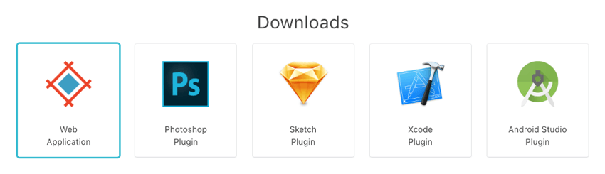
Designers need only install the Sympli plugin for Photoshop or Sketch, both of which are available as free downloads:
Coders have the option of using the plugin for Android Studio, the plugin for Xcode, or Sympli’s web app for HTML5 & CSS based projects. These three are all free to use for a single project, so if you’d like to follow along as we walk through this tutorial head to sympli.io and grab yourself an account.
This article is the first in a two part series. We’ll start by looking at the design side of the equation, covering how best to setup your design documents and export them to Sympli. We’ll also keep a focus on web oriented coding, looking at how the Sympli web app works. In the tutorial subsequent to this one, we’ll step into using Sympli with Android Studio and Xcode.
Let’s start at the very beginning: getting the Sympli plugin installed into your preferred design software.
Sympli Plugin Setup
The first thing you’ll need to do is head to the downloads page, then grab and install the Sympli plugin for your preferred design app; either Sketch or Photoshop.
After installation, in Sketch you can access the plugin under Plugins > Sympli > Export to Sympli. In Photoshop you’ll find it under Window > Extensions > Sympli.
Note that when you run the plugin the first time you’ll need to sign in to enable communication with your Sympli account.
Sympli Projects
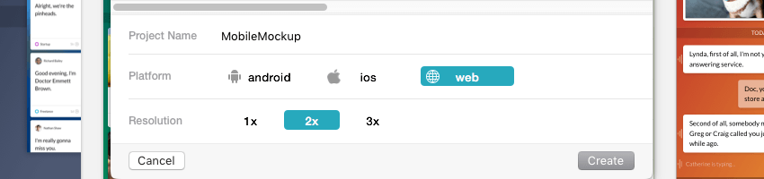
“Projects” are the core of working with Sympli. Each project can contain a number of “Designs”, or screens, and you can have multiple source PSD or Sketch files feeding into a single project if you choose.
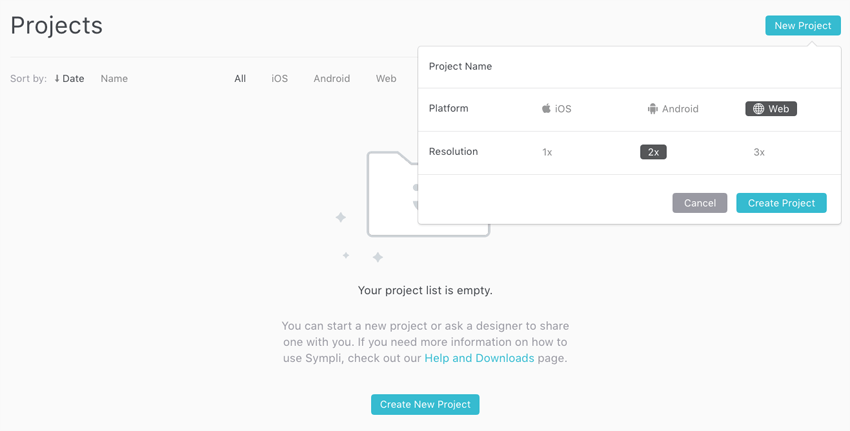
Projects can be created for Web, iOS or Android with 1×, 2× and 3× resolutions supported for each. As mentioned earlier, in this tutorial we’ll be focusing on web, and there will be another tutorial coming soon to focus on iOS and Android projects.
You can create a new project online via the Sympli “Projects” interface:
Alternatively, you can do so from the Projects tab in Photoshop plugin:
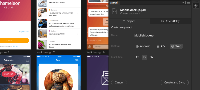
Or in the Sketch plugin, by clicking Create New Project then choosing your preferred options:
Using Artboards
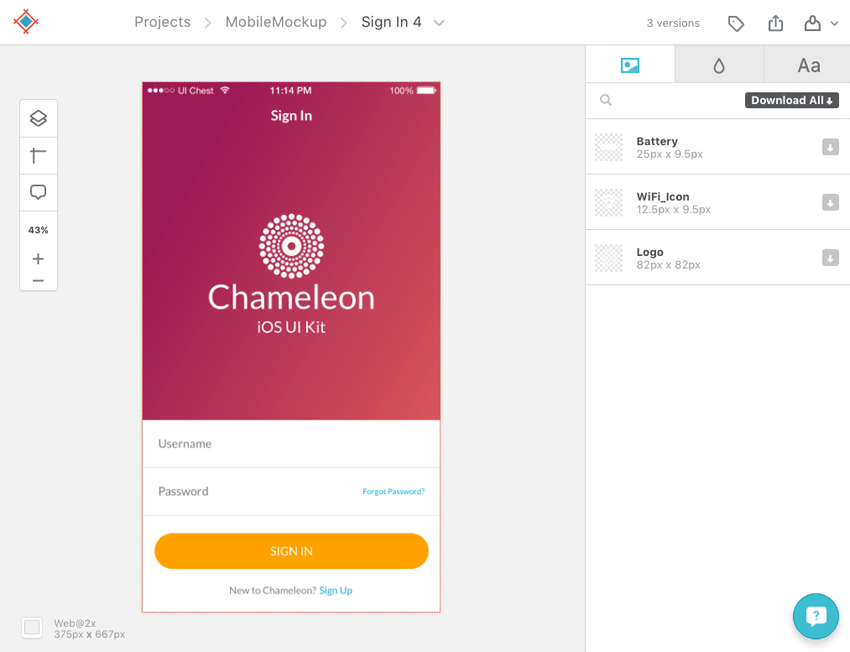
Whether you’re working with Sketch or Photoshop, the best way to prepare designs for syncing with Sympli is through using artboards. Each distinct UI mockup should be in its own artboard, for example:
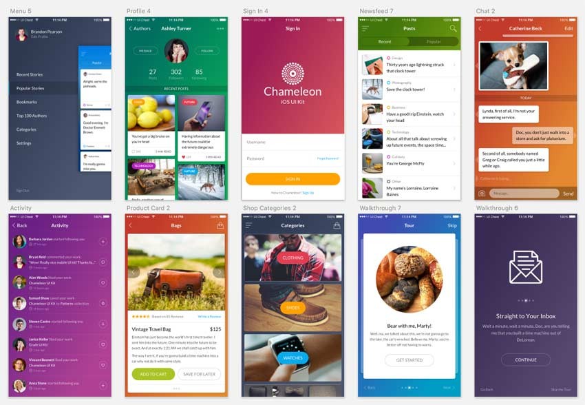
The reason for this is that after exporting to Sympli, (which we’ll cover later), each artboard will be picked up and processed separately. You’ll then be able to access them individually in order to grab their assets and code related information. Each artboard will be visible as a “Design” in the Sympli web interface, like so:
Design Resolution
Sympli is built to be aware of scaling requirements for 1×, 2×, and 3× resolution. It will do things like dividing layout dimensions by two or three where appropriate, so it’s important to know beforehand what scaling factor you need so you get the right results.
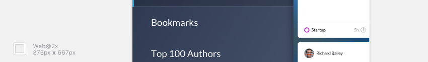
For example, if you are designing a 2× resolution UI for the iPhone 6, which has a display size of 375px by 667px, you’ll need to ensure your artboards are each twice that size at 750px by 1134px.
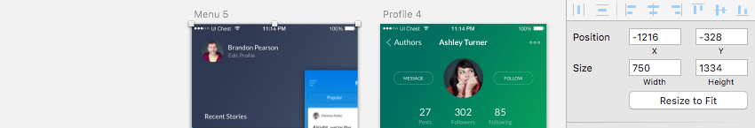
When you export a 2× web project to Sympli it will halve all the dimensions in your layout, including those output in generated CSS code, (we’ll talk more about CSS later). Your 750px by 1134px artboards will be recognized as 375px by 667px Sympli designs with 2× resolution, as pictured in the bottom left corner of the screenshot below.
Preparing Assets for Export
Sympli will automatically extract assets for you at all the required resolutions, but you’ll first need to tell it which parts of the design should be converted into images. The process to do this is a little different between Sketch and Photoshop.
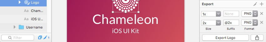
In Sketch, select the layer or group for the element you want to have exported as an image then click the Make Exportable + button at the bottom of the right column.
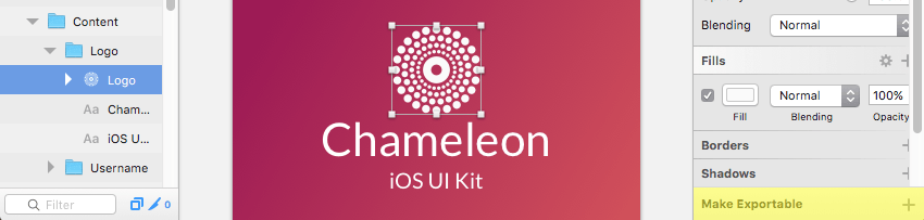
The first time you click the button it will prepare a 1× resolution image for export, so you’ll need to click it additional times for extra resolutions such as 2×, as seen below.
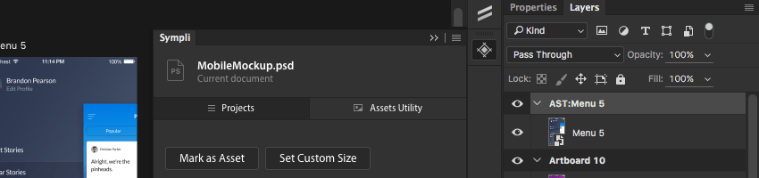
If you’re working with Photoshop, select the item’s layer or group, then in the Sympli plugin panel’s Assets Utility tab click Mark as Asset. It will add the prefix “AST:” to the layer, hence marking it as an asset. You can also manually rename layers to add this prefix instead if you prefer.
Exporting to Sympli
When your UI design is ready, select the artboard(s) you wish to export. If you don’t already have a project setup you can do so now via the Sympli plugin for your design software. As part of this process you’ll be given the option to sync / export your design right away.
If you already have a project setup, be sure you identify the correct one in the Photoshop / Sketch plugin then press the corresponding Sync or Sync Now button.
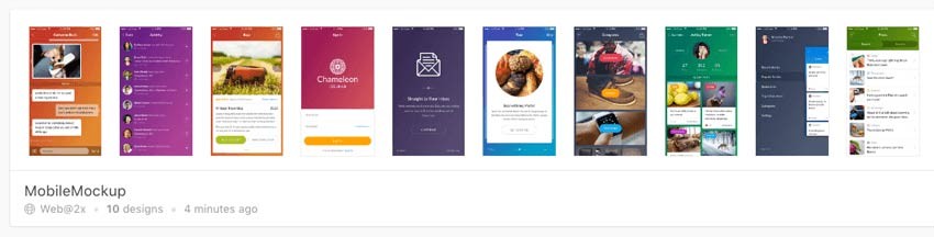
Sympli will spend a moment exporting images and uploading your designs. Once your project is exported you can view it from Sympli’s “Projects” page. From here you can select any design / artboard and go into it via the Web App for closer inspection.
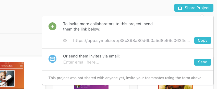
Sharing the Project
Once the project has been exported it’s ready to be handed off to the dev team. Collaborators can access the project via a link which can be copied and emailed directly from the Sympli web app, or from the plugin in Sketch or Photoshop.
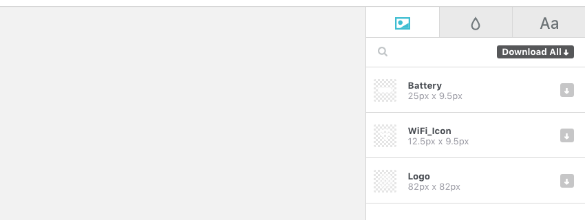
Downloading Assets
During the export process Sympli will have prepared and uploaded all the assets you defined in your source design document. These assets can be downloaded all at once via the Download All button in the Sympli app, or individually by hitting the grey downward pointing arrow icon to the right of the item.
Each asset can be downloaded as a bitmap (PNG) or a vector (SVG) file.
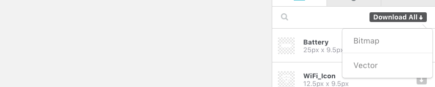
When downloaded as bitmaps the images will be downloaded at each of the resolutions specified during project setup, e.g. 1×, 2×, 3×.
Once exported to Sympli you can also use “mapping” to rename assets on the fly. The “mapping” system will remember the old name of the asset and associate it with the new one you have added, so if the source file is re-exported assets will be updated correctly but retain their new names.
Web App Tools
Inside the web app you’ll see a little bar running down the left side that provides you with some helpful tools.
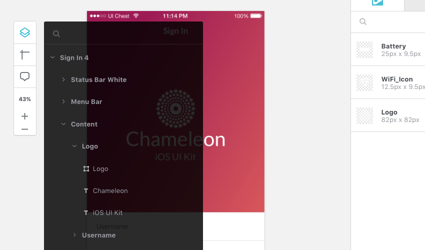
Layers
By expanding the layers tool you’ll get a complete representation of the layers in your original source document. This is particularly helpful for selecting layers that might be obscured behind other layers and hence difficult to select with a mouse.
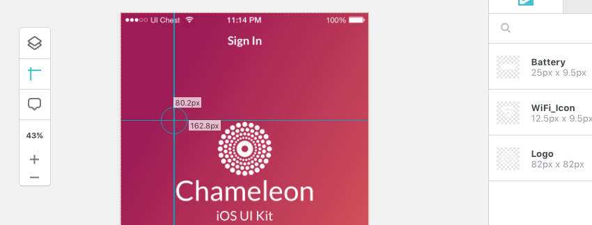
Rulers
The second tool is a set of two intersecting rulers whose crosshair you can drag around the page to measure the distance between the UI’s edges and the rulers’ center point.
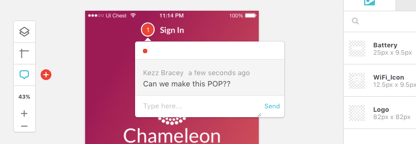
Adding Comments
The third tool provides the ability to add comments through which you can communicate with your team. Activate the comments tool, click a position on the design, then type your message in and click Send.
Sympli CSS Generation
One of the features available in Sympli’s web app is automatically generated CSS. You will probably want to write your own responsive layout code given that Sympli’s CSS is pixel perfect and absolutely positioned, but when working from Sketch designs there is some great copy & paste CSS generated for things like gradients, backgrounds, text settings, shadows, borders and so on.
Allow me to share a couple of quick tips that may be helpful when creating UI elements to be converted into CSS by Sympli.
- The first is to be mindful that CSS can’t handle blending modes in the same way as a design app. For example, CSS drop shadows don’t support the typical design app shadow blending mode of “Multiply” so they should instead be set to “Normal”.
- The second is that when creating borders I found setting them to the “Inside” position gave the most accurate reproduction in Sympli’s CSS.
- Thirdly, if you do want to have Sympli generate CSS for you I recommend working with Sketch; in my experience thus far it will give better results than working from Photoshop documents.
- And finally, with designs from both apps sometimes linear gradients can run in an unintended direction, so double-check on your generated CSS as you go.
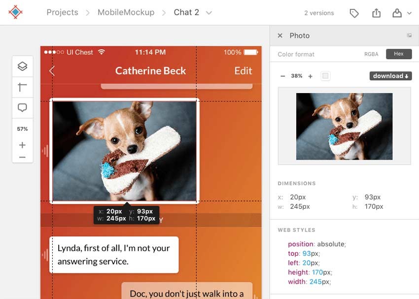
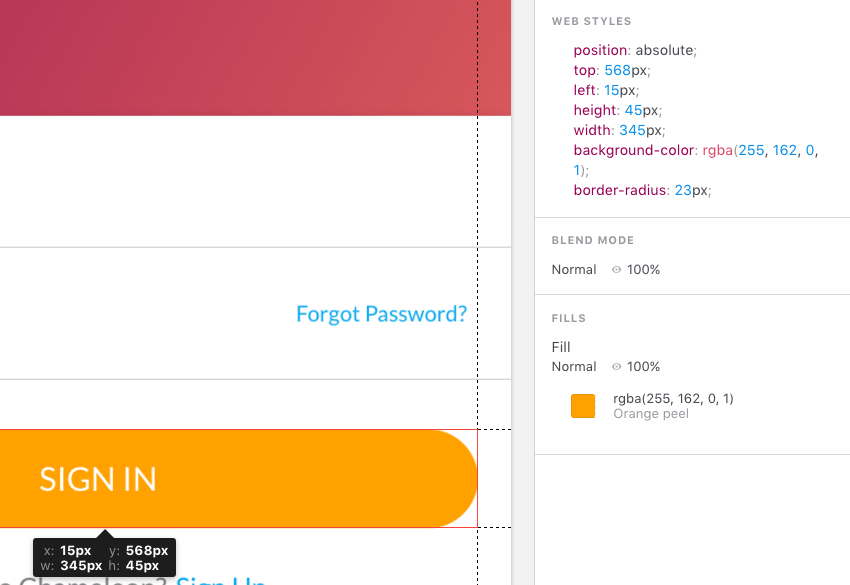
Getting Dimensions
Sympli makes it quite easy to get the size of different design elements as well as the spacing around them. Click on an element in the design, or select it via the “Layers” tool, and you’ll see rulers appear with dimension readouts as seen below:
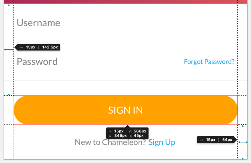
You’ll get the dimensions of the element itself as well as its distance from the edges and near neighbors in the layout.
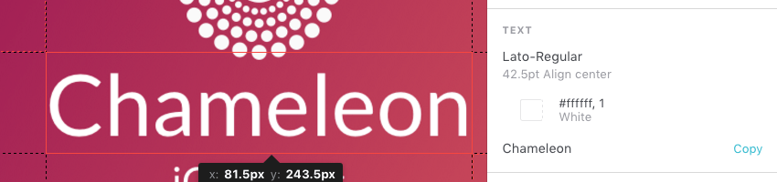
Text and Font Info
When you select any text element, if you look at the display on the right side of the web app you’ll see a readout providing the font family, font size, alignment and text color. You’ll see code with all these items in the auto-generated CSS section as well.
Below the read out, it’s also possible to click the button labelled Copy to grab the content of the text item, ready to be pasted into code.
If you select the third tab on the right labelled Aa you can see all the font families used in the current design.
Additionally all the fonts used in the overall project are visible in the Summary section, which we’ll talk about shortly.
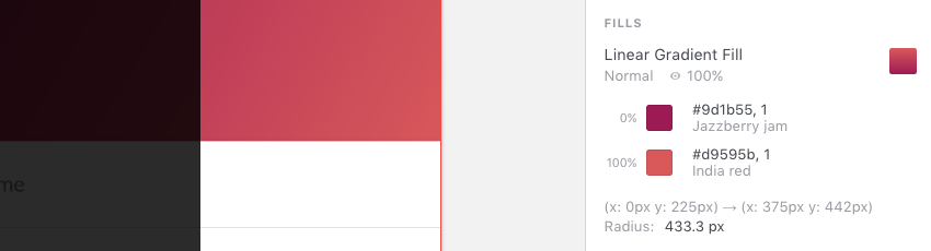
Color Extractions
Color are automatically extracted from your documents and can be accessed in RGB or Hexcode form.
You can view the colors used in any element of your design by clicking it to select then viewing the information in the panel on the right.
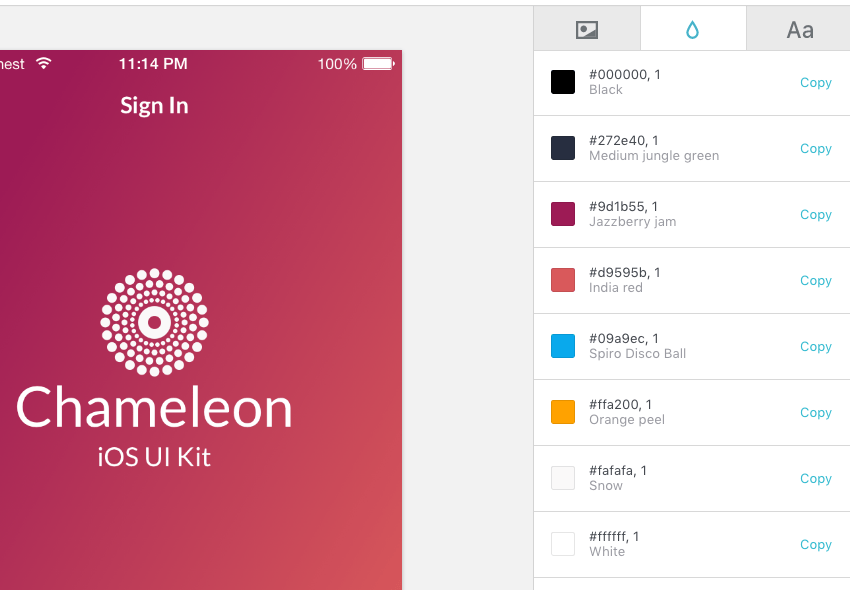
You can also see a complete color palette detected from your design by ensuring nothing is selected, then clicking the second tab on the right panel with the droplet icon.
As with fonts, all the colors across the entire project can be accessed from the Summary area. Let’s take a look at that now.
Summary and Brandbooks
To reach the project Summary screen go to the top level page of the project then select the Summary tab, located after the Designs tab. Here you can see all the colors and fonts used throughout the entire project.
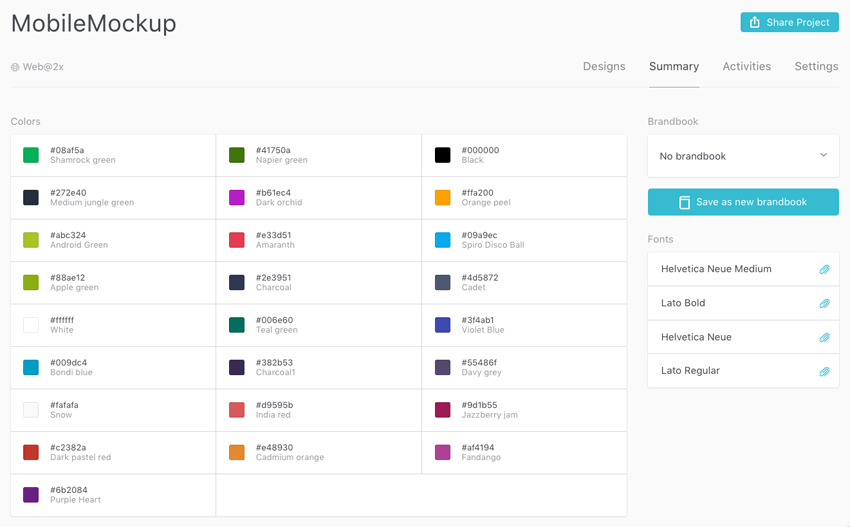
This selection of colors and fonts can be saved out into what is referred to by Sympli as a “Brandbook”. Brandbooks are comparable to style guides, allowing you to keep track of colors and fonts associated with particular brands.
Handling Changes
If changes need to be made to the source documents, adding them to the corresponding Sympli project can be done in essentially the same way as the initial export. Select the artboard that has been modified, then run the export process we described earlier.
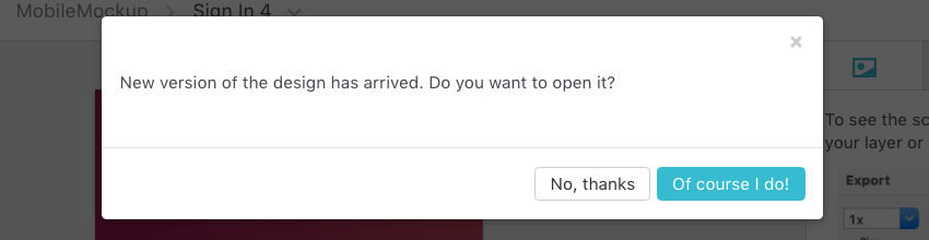
If you are viewing a design via the Sympli web app when a modification is uploaded it will detect the changes and prompt you to open the updated version.
Wrapping Up
Sympli, true to its name, does indeed seem to simplify the “design to dev” collaboration process. To get some more insight into what Sympli does, and why it was created, check out this presentation by its founder, veteran mobile developer Max Ignatyev:
Stay tuned for the next tutorial, where we’ll cover working with Sympli’s plugins for Android Studio and Xcode.
And if you’d like to try Sympli out for yourself, head to sympli.io.

Comments