While Android allows you to create almost any custom view or user interface that you could possibly want, there are a few user interface patterns that have been proven to work well for users in the right situations. In this tutorial, you learn about a few of these patterns and how they can help your users by creating a great experience when using your app.
Do you find it easier to learn with video? Why not check out our course:

1. Home Screen
The first screen that your users see when opening your app is often the most important. From here your user should be able to perform a quick action and move on with their day or dive further into your app to refine whatever they're trying to accomplish.
Pick the user interface design patterns for this screen based on the goal of your app. It is important to note that most apps use more than one pattern on their home screen as long as it supports the overall goal of their app.
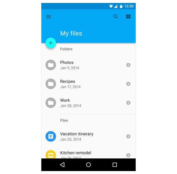
List and Detail
The list and detail pattern is one of the most common patterns you will see on mobile devices. As the name implies, you present data in a list format and, when an item in that list is clicked, it opens to a new screen that displays more details.
While this pattern is called list and detail, there's no reason why you couldn't apply this same logic to a grid design as well. The key feature of this pattern is that each item in the list/grid, when selected, should perform the same action of displaying more details.
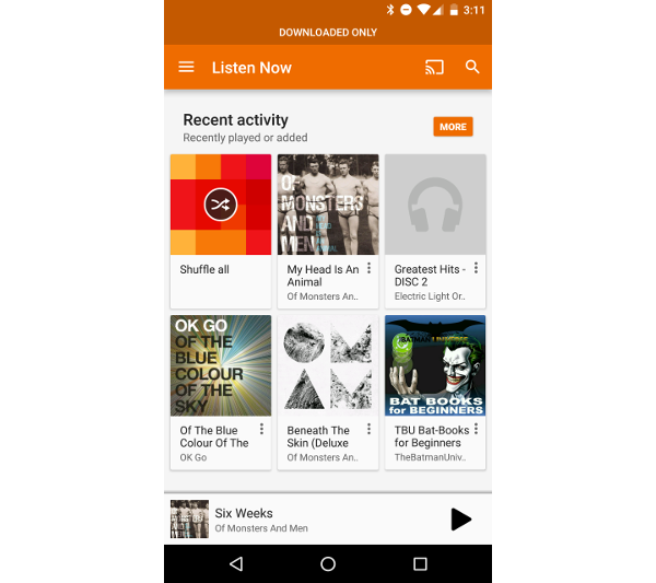
An example of this pattern can be seen in the Google Play Music application, which presents users with a grid of albums that can be selected to display the songs available for that album. Hangouts is another example of the list and detail pattern. Hangouts allows you to select a conversation to see the entire conversation and interact with it.
Carousel
Sometimes, one list isn't going to be enough. If your app has various categories and a way to represent the content well with an image, then the carousel pattern may work for you. In this pattern you take the list and detail pattern and use it multiple times on the same screen. The difference is that the list items can be scrolled through horizontally rather than vertically.
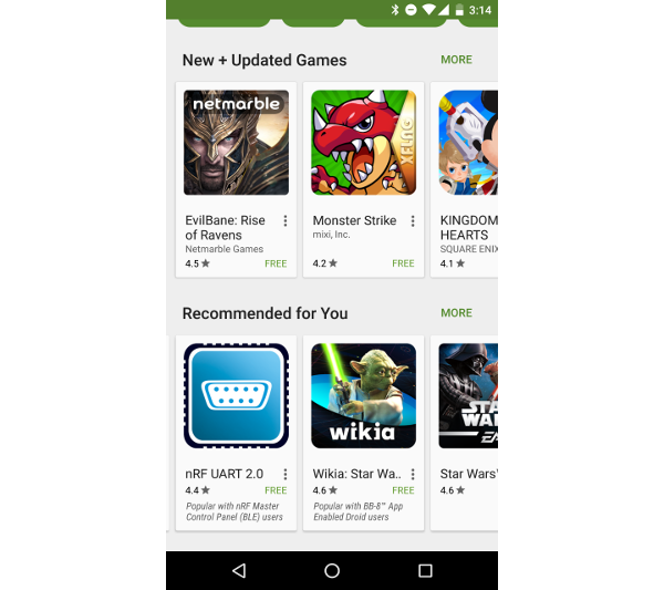
An example of this pattern can be seen in the Google Play Store application, which displays a carousel for multiple categories of apps that you can browse.
Map
Not all apps are built around needing to display a list of data for users. One of the key traits of mobile devices is that they are incredibly useful for finding things while users are out and about in the world. A map often makes a great tool for this purpose.
If your app is built around showing locations, navigation, or traveling, then a map may be perfect for your users. While the obvious example of this pattern is in Google Maps, many other apps, such as Waze and Uber, are also built with a map as their main focus point.

2. Navigation and Actions
While you have just learned about a few of the user interface patterns that you can use on your app's home screen, you probably still need a way to navigate to other sections within your application. Luckily there are a few commonly used navigation patterns that Android users are familiar with to help you create a great app that is to work with.
Tabs
Tabs are often used in combination with the list and detail pattern. If you have multiple lists that are somewhat related, but have different categories, then using a ViewPager with tabs for each category may be an efficient solution for navigating your app.
This pattern is useful when you have just a few sections in your app as it provides a quick and easy way for users to change the view. If, however, you have five or more items that you want to put into tabs, then you should consider moving your navigation operations into a drawer.
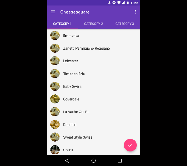
According to the Android material design guidelines, tabs can also exist at the bottom of the screen, as seen in the Google+ application.
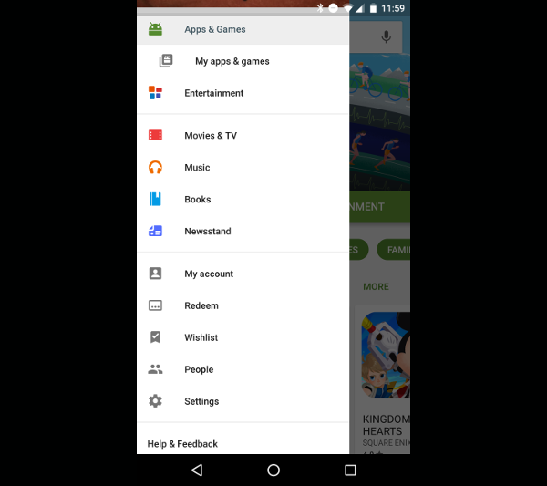
Navigation Drawer
The navigation drawer is a view that can be slid out from the side of an application in order to present a list of options to the user. This design pattern is used fairly regularly in Android apps to provide a way to change sections within an app or to perform global actions that aren't necessarily tied to any one screen.
Since this pattern lends itself well to top level navigation, it can easily be paired with the tabs pattern to create an intricate navigation scheme within your applications.
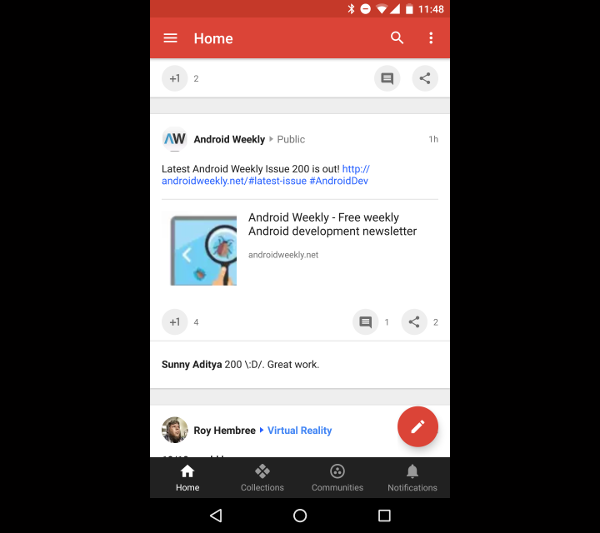
Toolbar
As you have probably noticed, most pages in an Android application include a toolbar at the top of the screen. At the very least, this toolbar contains a title for the section or application, but the toolbar design pattern also facilitates placing action buttons either directly on the toolbar or in an overflow menu that allow users to perform tasks in that section of an application.
An example of this can be found in the Google Keep application, which lets you change the color of a note, add other people to that note, and a number of other actions that are present in the overflow menu.

Floating Action Button
The floating action button pattern allows developers to highlight a single action that your user can perform while in a section of an application. Examples of such actions are a compose floating action button in an email client, a play/pause button in a music app, or an add button in apps that manage events or data.
This pattern should not be used for minor actions or for anything destructive as the floating action button is designed to have a strong presence on screen when used.
3. Android Form Factors
While some of the patterns discussed above lend themselves to other form factors, they mostly pertain to designing phone or tablet applications. Recently, Google has moved to using Android on various other types of devices, including televisions and smartwatches. This calls for new design patterns to get the most out of each form factor.
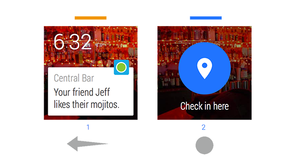
Android Wear
Due to the smaller display screen size, an entirely new set of user interface design patterns were introduced for Android Wear. Wear works with a system of cards and action buttons that users can swipe between by using a GridViewPager.
You can also continue to use the list and detail pattern, but list items will need to be larger and snap into position so that users can access them easily. More information on designing for Android Wear can be found in the official documentation.
Television
While design patterns for Android Wear devices have to take into consideration a much smaller screen size, designing for Android TV has the opposite problem. Screens are much larger and users tend to be much further from them.
Not only do your TV apps need to take these two things into account, televisions also use a D-pad controller rather than touch screens for interaction. For this reason, the carousel approach works amazingly well.
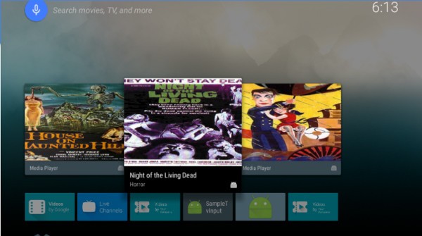
Users can move between rows of items and then scroll horizontally to view the content that's available to them. When a user finds an item that they want to view, they can select it to view the detail screen, which provides a list of actions for that item.
Conclusion
While this is far from an exhaustive list of Android user interface design patterns, you have been introduced to some of the most common patterns on Android and how they are used to make apps more usable.
That being said, not all apps are the same and there may be times when you need to come up with a creative solution for how users interact with your app. The thing that all patterns have in common is that they are simple, usable, and don't get in the user's way.
As you continue to use and learn about Android, you'll gain the experience necessary to know what does and doesn't work in a given situation.

Comments