The Windows Phone 8 platform has its own layout styles that make it stand out from any other mobile platform. These unique layouts are possible thanks to a few convenient built-in controls of the Windows Phone 8 SDK. The controls that we're going to be looking at in this tutorial are the Pivot and Panorama controls.
1. Panorama
What is it?
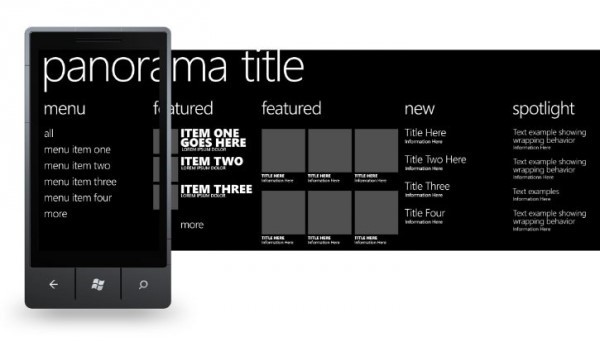
The Windows Phone Panorama layout control offers a unique approach in terms of how content is presented to the user. A Panorama consists of multiple panels or panorama items that each represent a page. At any one time, only one panorama item is visible alongside a small portion of the previous or next panorama item. Using the Panorama control feels like peeking through a keyhole, you can see part of the room behind the door, but not the entire room.

The above screenshot is a great example to demonstrate the Panorama control. The above example contains five panorama items. Each panorama item represent a page with content.
In the above screenshot, the active panorama has a title of menu. At the same time, we can see a glimpse of the next panorama item titled featured. The Panorama control shows the user that more content is waiting to be discovered on the right. Let's find out how to use the Panorama control.
Creating a Panorama Control
Start by creating a new Windows Phone project. To add a Panorama control to the project, choose Add New Item > Windows Phone Panorama Page > Add from the Project menu. This should add a Panorama control with two panorama items. The Panorama control should be visible in Visual Studio's design view.

Let's add some content to the Panorama control. We're going to populate the first panorama item with a list of colors and the second panorama item with a number of colored rectangles that correspond with the list of colors of the first panorama item. Right now, the Panorama control contains a Grid control with a name of LayoutRoot as shown below.
<Grid x:Name="LayoutRoot">
    <phone:Panorama Title="my application">
        <!--Panorama item one-->
        <phone:PanoramaItem Header="item1">
            <Grid/>
        </phone:PanoramaItem>

        <!--Panorama item two-->
        <phone:PanoramaItem Header="item2">
            <Grid/>
        </phone:PanoramaItem>
    </phone:Panorama>
</Grid>
The Grid control named LayoutRoot is the main container of the current page of our application, holding every other element of the page. Remember that in XAML controls are structured in hierarchically, very similar to XML.
The Panorama control is nested in the Grid control and has a Title property of "my application". The Panorama control contains the panorama items. As you can see in the above XAML snippet, the Panorama control currently contains two panorama items. The Header property of the panorama items is item1 and item2 respectively.
The Header property of a panorama item is similar to the Title property of the Panorama control and you can change them to whatever you like.
Adding Colors
Let's now populate the panorama items with some content like we've discussed earlier. Update the content of the two panorama items as shown below.
<!--LayoutRoot contains the root grid where all other page content is placed-->
<Grid x:Name="LayoutRoot">
    <phone:Panorama Title="my application">
        <!--Panorama item one-->
        <phone:PanoramaItem Header="color names">
            <StackPanel>
                <TextBlock Text="Red" FontSize="30"></TextBlock>
                <TextBlock Text="Yellow" FontSize="30"></TextBlock>
                <TextBlock Text="Blue" FontSize="30"></TextBlock>
                <TextBlock Text="Green" FontSize="30"></TextBlock>
                <TextBlock Text="White" FontSize="30"></TextBlock>
            </StackPanel>
        </phone:PanoramaItem>

        <!--Panorama item two-->
        <phone:PanoramaItem Header="colors">
            <StackPanel>
                <Rectangle Height="50" Fill="Red" Margin="0 0 0 10"></Rectangle>
                <Rectangle Height="50" Fill="Yellow" Margin="0 0 0 10"></Rectangle>
                <Rectangle Height="50" Fill="Blue" Margin="0 0 0 10"></Rectangle>
                <Rectangle Height="50" Fill="Green" Margin="0 0 0 10"></Rectangle>
                <Rectangle Height="50" Fill="White" Margin="0 0 0 10"></Rectangle>
            </StackPanel>
        </phone:PanoramaItem>
    </phone:Panorama>
</Grid>
As you can see I've changed the Header property of the panorama items to color names and colors respectively. To the first panorama item, I've added a StackPanel control containing five TextBlock controls. Each of the TextBlock controls has its Text property set to the name color. I've also set the FontSize property of each TextBlock control to 30px to make the text larger.
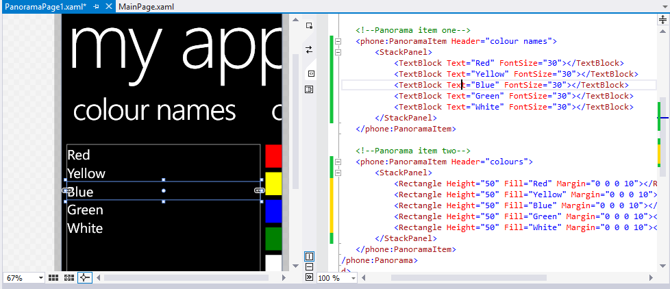
The second PanoramaItem control also contains a StackPanel control, containing five Rectangle controls. Each Rectangle control is filled with a color listed in the first panorama item using its Fill property. The Height property of the rectangles is set to 50px and the Margin property is set to 0, 0, 0, 10, which translates to a bottom margin of 10px. You can see the result of your work in the design view of your IDE as shown below.

Now that we've populated the Panorama control with some content, it's time to focus on the second control of this tutorial, the Pivot control.
2. Pivot
What is it?
The Pivot control is another way to present content to the user, unique to the Windows Phone platform. The Pivot control is similar to the Panorama control in some ways, but it has a number of features that set it apart.

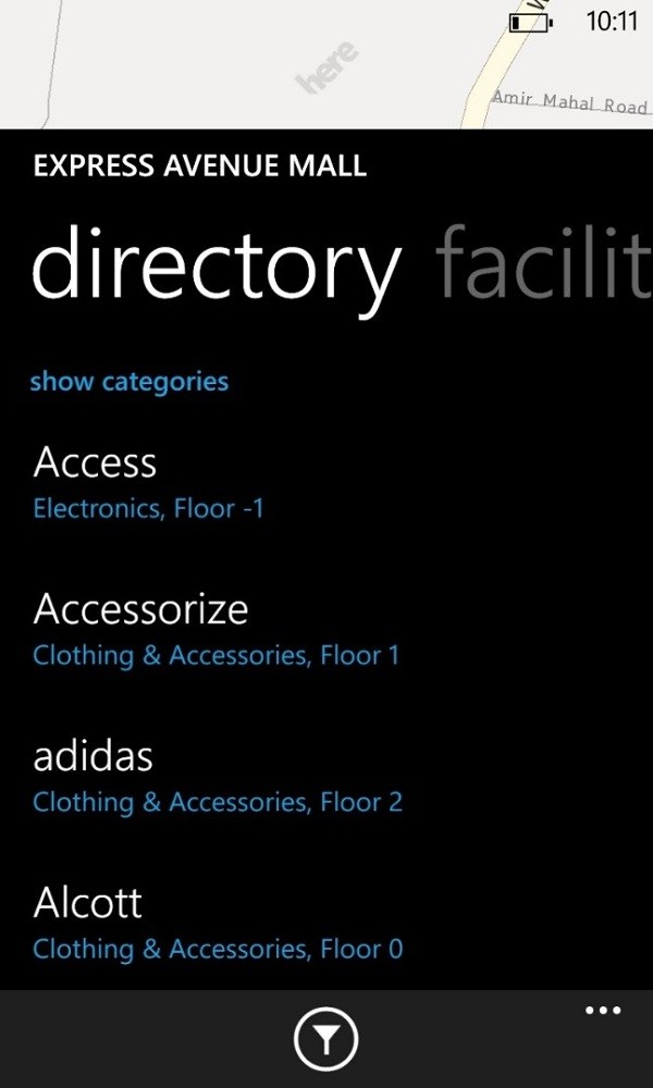
Like a Panorama control, a Pivot control can consist of multiple PivotItem controls. Each pivot item can contain other controls, such as Grid and StackPanel controls. The above screenshot shows a Pivot control with two PivotItem controls, directory and facility.
While the Panorama control shows a sneak peek of the next page, the Pivot control does the same for the Header at the top of the Pivot control. This is clearly shown in the above example in which you can see the first letters of the word facility, the title of the second pivot item. To illustrate that the second pivot item is not in focus, its title is greyed out.
Creating a Pivot Control
Let's create a Pivot control by following the same steps we took to create a Panorama control. Instead, select the Windows Phone Pivot Page option. Like the Panorama control, populate the Pivot control with the list of colors and their names as we did earlier. The resulting XAML code for the Pivot control should look similar to what is shown below.
<Grid x:Name="LayoutRoot" Background="Transparent">
    <!--Pivot Control-->
    <phone:Pivot Title="MY APPLICATION">
        <!--Pivot item one-->
        <phone:PivotItem Header="colour names">
            <StackPanel>
                <TextBlock Text="Red" FontSize="30"></TextBlock>
                <TextBlock Text="Yellow" FontSize="30"></TextBlock>
                <TextBlock Text="Blue" FontSize="30"></TextBlock>
                <TextBlock Text="Green" FontSize="30"></TextBlock>
                <TextBlock Text="White" FontSize="30"></TextBlock>
            </StackPanel>
        </phone:PivotItem>

        <!--Pivot item two-->
        <phone:PivotItem Header="colours">
            <StackPanel>
                <Rectangle Height="50" Fill="Red" Margin="0 0 0 10"></Rectangle>
                <Rectangle Height="50" Fill="Yellow" Margin="0 0 0 10"></Rectangle>
                <Rectangle Height="50" Fill="Blue" Margin="0 0 0 10"></Rectangle>
                <Rectangle Height="50" Fill="Green" Margin="0 0 0 10"></Rectangle>
                <Rectangle Height="50" Fill="White" Margin="0 0 0 10"></Rectangle>
            </StackPanel>
        </phone:PivotItem>
    </phone:Pivot>
</Grid>
Before we can build and run the application to see both controls in action, we need to implement a way to navigate the application's pages. That will be the focus of the next section.
3. Page Navigation
If you run the application in its current form, you will see the MainPage.xaml page, the default entry point for every Windows Phone application. Let's change this.
Adding Buttons
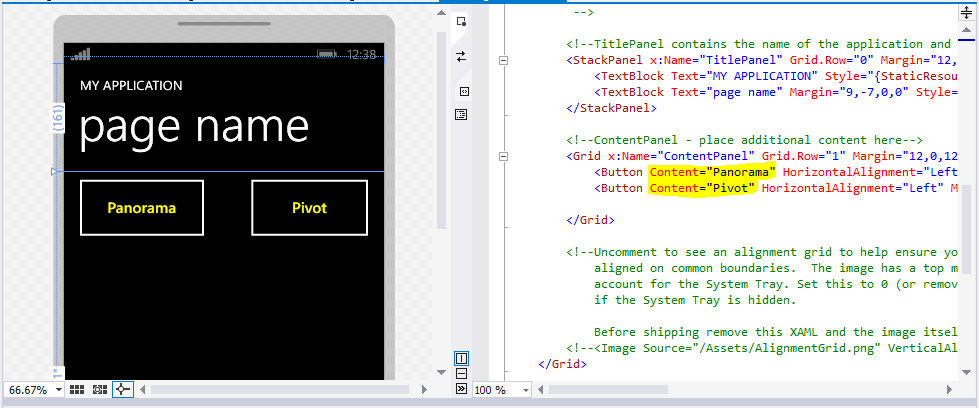
To navigate to the Panorama and Pivot control we implemented earlier, we need to add two Button controls to the MainPage.xaml page. Double-click MainPage.xaml in your IDE and drag two Button controls from the Toolbox to the page in Visual Studio's design view.
As you can see below, I've also changed the Content properties of the Button controls to read Panorama and Pivot.

Implementing the Button Controls
When the use taps a Button control, we want the application to navigate to either the Panorama or the Pivot control. Let's start with the left button first.
Panorama
Start by double-clicking the left Button control in the design view. This should take you to MainPage.cs, which contains the class that is linked to MainPage.xaml. Visual Studio has already created a method for us, Button_Click, which is invoked when the user taps the button labeled Panorama.
private void Button_Click(object sender, RoutedEventArgs e) {}
When the user taps the first button, the application should take them to the Panorama control. We accomplish this by updating the Button_Click method as shown below.
private void Button_Click(object sender, RoutedEventArgs e) {
  NavigationService.Navigate(new Uri("/PanoramaPage1.xaml", UriKind.Relative));
}
We invoke the Navigate method on NavigationService, passing in the destination, a Uri instance, and the type of destination, UriKind.Relative. Note that the name of the destination page needs to match the first page of the Panorama control, PanoramaPage1.xaml in the above example. Don't forget the leading forward slash.
Pivot
Navigating to the Pivot control is very similar. Open MainPage.xaml, double-click the Button control labeled Pivot, and implement the event handler, Button_Click_1, as shown below. The only difference is the destination we navigate to, PivotPage1.xaml.
private void Button_Click_1(object sender, RoutedEventArgs e) {
  NavigationService.Navigate(new Uri("/PivotPage1.xaml", UriKind.Relative));
}
Build and run the application to test the buttons as well as the Panorama and Pivot controls. Use the physical back button of your device or emulator to navigate back to the previous page.
Conclusion
In this tutorial, we've covered two important layout controls of the Windows Phone platform, the Panorama and Pivot controls. We also revisited navigation and used some of the common controls on Windows Phone, such as Button, TextBox, and Rectangle controls. In the next article, we will conclude this introductory series on Windows Phone and look ahead at what's next for you.


Comments