In this tutorial, you will be learning about some of the more popular Windows Phone controls. You will also be learning about the properties controls can have and see how they can be used to describe controls.
1. What are controls?
Controls are the building blocks of a Windows Phone application. There are many types of controls, differing in their functionality and how they look. For example, there are controls that we can use to contain and arrange other controls like the StackPanel and the Grid controls. There are also controls that we can use to build features of our application like the Button, TextBox and TextBlock controls. Everything you see in a Windows Phone application is a control in one way or another.
There is a wide range of controls included in the Windows Phone SDK. Let's take a look at some of the most common controls.
- Button This is easily the most used control. As its name implies, this control is used to create a button and it detects gestures, such as tapping and holding.
- TextBlock This is the control that you use when you want to display a block of text in a view.
- TextBox Like the name suggests, with the TextBox control, the user can enter text. This is used to collect user input within a Windows Phone application.
-
StackPanel This control is used to collect or organize one or more other controls. The controls it contains can be arranged or stacked horizontally or vertically.
- Grid A grid works very similar like an HTML Table. Other controls can be placed in it, arranged in rows and columns that we define.
- LongListSelector This control lets us display a list of controls. For example, if we want to show a list of pictures or names in an application, then the LongListSelector is the best choice.
2. Sample Application
To get a better understanding of Windows Phone controls, we'll create a new Windows Phone project and play around with some of the controls listed above. To create a new Windows Phone 8 project, follow the same steps as outlined in Creating Your First Application.
In Visual Studio, you should see the design and the XAML views for the MainPage.xaml page. There
should also be some menu options on to the left, one of
which is the ToolBox menu. Open the ToolBox menu to see a list of controls that are included in the Windows Phone SDK.
.jpg)
In the list of controls, find the Button control and drop an instance of it onto the Visual Studio design preview. Do the same for the TextBlock and TextBox controls. You should now have something similar to what I have below.
.png)
3. Properties
Properties are values that we can use to customize or describe the look and feel of a control. Properties take the following format, Property="Value". For example, if you take a closer
look at the XAML code of your project, you'll see that each control has a number of properties with corresponding values.
Take the Button you created as an example. If
you want to edit the button's text, then you need to change the value of its Content
property. To change the text of the TextBlock control, you change its Text property.
There are also properties
that control the control's positioning, such as Margin and Padding properties. Visual
Studio has a Properties tab that makes setting properties very easy. By default, the Properties tab is positioned at the bottom right, but that may be different for you and depends on how you've set up Visual Studio.
.png)
The Properties menu comes in very handy when setting properties for a control, because it shows you what properties are available for a particular control.
4. StackPanel & Grid
The StackPanel and Grid controls are very important controls for building layouts in Windows Phone. Almost every application you'll build will make use of them so it's important to understand how they work.
As I mentioned earlier, the StackPanel and Grid controls contain other controls and arrange them in a particular way. If you have experience with HTML, then you can compare the StackPanel and Grid controls to HTML's div and table elements respectively.
StackPanel
The StackPanel control lets us arrange controls
as a stack of items. The controls placed within a StackPanel can
be arranged horizontally or vertically, depending on the value of its Orientation property.
Let's take look at the StackPanel control in action. If you refer back to our project's XAML view for the MainPage.xaml page, you should already see a StackPanel control holding two TextBlock instances that make up the header of the page.
 <!--TitlePanel contains the name of the application and page title-->
        <StackPanel x:Name="TitlePanel" Grid.Row="0" Margin="12,17,0,28">
            <TextBlock Text="MY APPLICATION" Style="{StaticResource PhoneTextNormalStyle}" Margin="12,0"/>
            <TextBlock Text="page name" Margin="9,-7,0,0" Style="{StaticResource PhoneTextTitle1Style}"/>
        </StackPanel>
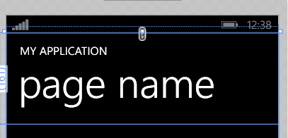
By default, the orientation of a StackPanel instance is set to vertical. We only need to set this property if we need a horizontal StackPanel. Play around with the StackPanel by changing its orientation to horizontal. To sum up, whenever you need to arrange controls linearly, the StackPanel control is probably what you're looking for.
Grid
Like the StackPanel, the Grid control arranges one or more controls. Unlike the StackPanel, the Grid control arranges its children using rows and columns, similar to an HTML table.
Let's take another look at our project's XAML view to see the Grid control in action. Our application already contains two Grid instances. The first one is the top level container of our application and it contains a second Grid instance.
.png)
From the image above, you can see that the first Grid, LayoutRoot, contains two rows, indicated by Grid.RowDefinition. The StackPanel named TitlePanel has a Grid.Row property set to 0, which tells it to occupy the first row of the Grid it is in.
The second Grid, ContentPanel, has its Grid.Row property set to 1, which means it's placed in the second row of the Grid it is in.
.png)
The Grid control is very useful when creating complex layouts. We won't be covering every aspect of the Grid control, but I encourage you to read more about it in the documentation.
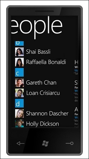
5. LongListSelector
The LongListSelector control is a very powerful control that has a host of capabilities. The People application, shown below, is a good example of this control in action. We won't be covering the LongListSelector control in this article, but if you'd like to learn more about this powerful control, then have a look at the documentation.
Conclusion
In this tutorial, we covered some of the more common controls used in Windows Phone applications. We've learned about properties and other aspects of controls, and we taken a closer look at the StackPanel and Grid controls.
In
the next tutorial, we'll be focusing on events on Windows Phone and how you can handle them.

Comments