Not too long ago, Google introduced Material Design, a brand new set of guidelines for designers and developers alike. Material Design introduces a fresh perspective on user interfaces, motion, and interaction states, and are a great foundation for you to build a product upon.
Introduction
In essence, you can summarize Google's Material Design by two components:
- Material
- Motion
Material
Material provides context in design, the surface and edge of a "material" provides us visual cues. Let's compare this to real life. We understand the dimensions of a room, because we see walls. At the same time, the interior provides us an understanding of the context of the room. Your kitchen looks very different than your bathroom for example.
The same is applied in Material Design. The combination of style and content provides context to the user in a digital space, much like physical walls and interiors. A user has a better understanding of the user interface, because the designed material provides context for the interface.
Motion
The concept of Motion in Material Design has a very similar story. Motion provides context in a design through the flow of an application, especially when it comes to the continuity of a product, a user has the feeling of being uninterrupted. There are no obstacles, such as inconsistency in design or a confusing navigation.
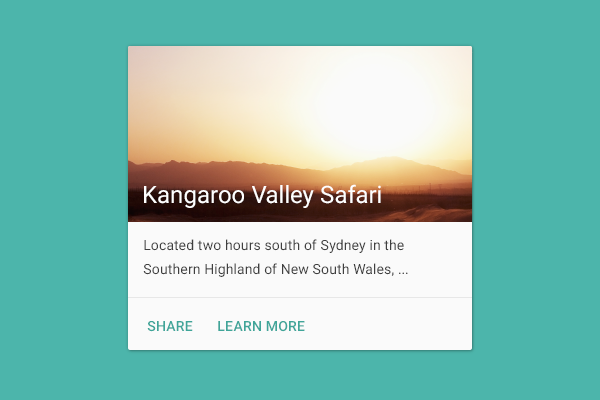
How exactly does motion work? Here's an example. There's a home feed that consists of a list of cards. When you tap a single card, the material of the card expands to become the full width and height of the screen instead of the dimensions of a single card.
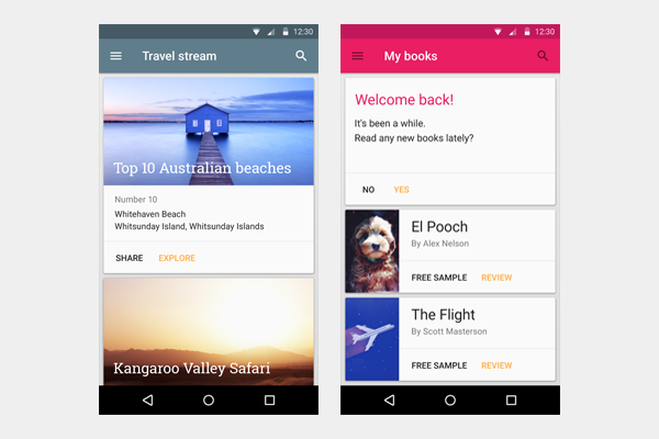
Notice how this example applies both material and motion. A card is the material. When a user interacts with it, through motion it will expand to show more content. This provides continuity to the user as it shows how their input affects the user interface.
Material
Let's explore material a little bit more. In essence, material is the combination of your static design elements. Think of shapes, color, typography, and the variety of tools you use to create designs. All of this together forms a material.
Color
Color is a great matter for designers as well as users. It has a tremendous amount of influence on the look and feel of a design, as well as the psychological effects on a user. Color can make a design trustworthy, exciting, utilitarian, and much more. In Material Design, we have access to a large palette of colors, which we can use as the foundation for designing a product.
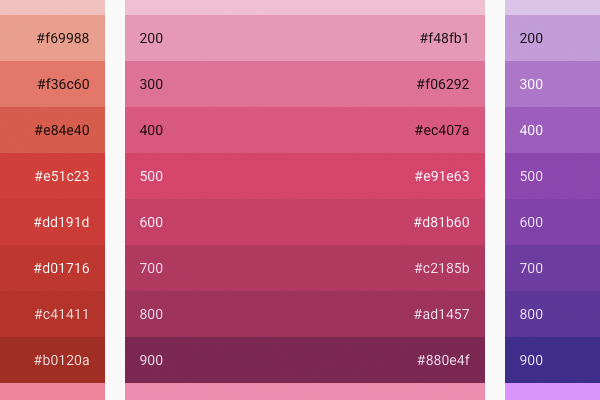
I highly recommend having the following reference of colors saved as a bookmark, it's a convenient reference to design a color palette for a user interface.
Typography
Roboto, the standard font for Android, has been polished to improve it for cross platform usage. For designers who aren't very familiar with typography, Material Design provides guidelines that handle the design of typography for you.
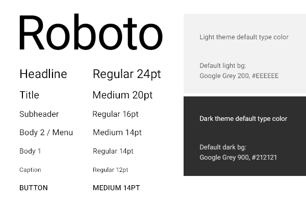
The easiest way for yourself to get started with this grid is to download the following sticker sheet. The guidelines will provide you with a structure for your typography when you start a new design.
Layout
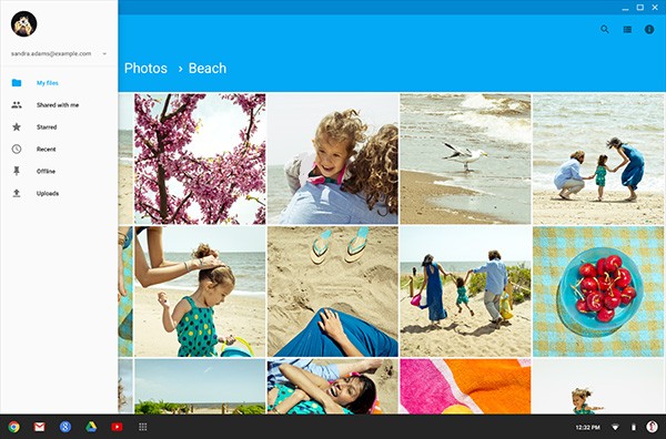
Designing a layout in Material Design uses some of the core principles of print design, which Google indicates as a source of inspiration for Material Design. There's a strong emphasis on building user interfaces that scale well between different types of devices. As you're aware, scalability has become crucial for designing products that are successful on multiple devices.
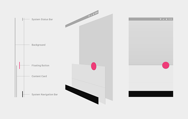
One of the core concepts is stacking. When you're designing a user interface with Material Design, you use drop shadows, contrast in color, and z-positioning to give the user a sense of depth in the user interface. Depth creates context for users. Floating elements on top of stacks, such as a button, emphasizes the call-to-action in a user interface.
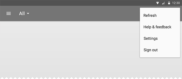
For more advanced designers, the guidelines include baseline grids. The metrics and keylines page in the Material Design guidelines go in great detail and provide you with resources to experiment with.
If you'd rather work with a pre-made layout, you can download Google's white frames template.
Motion
Motion goes hand in hand with material as described earlier in the card example. Motion is what makes designed material come alive.
Easing
When you start learning the basics of motion design, one of the first principles you'll learn about is easing.
When you ease an animation, you attempt to make a motion more natural. Instead of animating the movement of an object at a consistent speed, you increase the speed in the very beginning of the animation and reduce the speed at the end of the animation.
Think of a moving car in traffic and how a car accelerates and brakes, it's a very natural movement. Easing tries to replicate that so a user deems the movement of an object as natural.
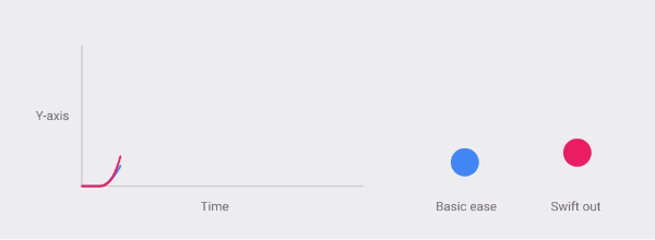
The easiest way to get acquainted with easing is to see some design examples. The following resources are a great bookmark:
- Animation Principles in UI Design: Understanding Easing (Medium, by Suresh Selvaraj). This is an excellent piece to learn the basics of easing.
- Authentic Motion (Google). This is a more extensive reference and includes several examples.

Responsive Interaction
When a user interacts with a design element, in most cases the element should provide feedback. In Material Design, the goal is to delight the user with motion feedback as well as provide context for the material the user interacts with. The beauty of responsive motion is that you acknowledge the action of the user, which improves the usability of your product.
The most beautiful example I've seen is the touch ripple, a visual highlight when the user interacts with a particular element.
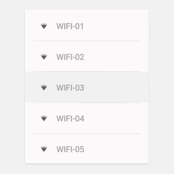
Another example is opening or expanding elements. When you tap a particular element to expand it, new material expands from the point the user touched. The growth of an element feels natural when it grows directly from the center of the user's touch. For more examples of responsive interaction, visit Google's Material Design website.
Last but not least, the transitions between interfaces is important for responsive interaction. It's the most crucial form of motion to design continuity for the user. For incoming and outgoing screens, the point of origin provides context. A user interface can dynamically grow and expand, which gives designers plenty of room to play with beautiful transitions. And best of all, they can make them meaningful.
Useful Resources
- Material Design Reel (YouTube, by Google)
- Default Design Themes: Light & Dark (.ai)
- Iconography Reference Sheet (By Google)
- Card Design Reference Sheet (By Google)
- 750 System Icons (.zip)
Inspiration
Below are a few great examples of Material Design created by excellent designers.
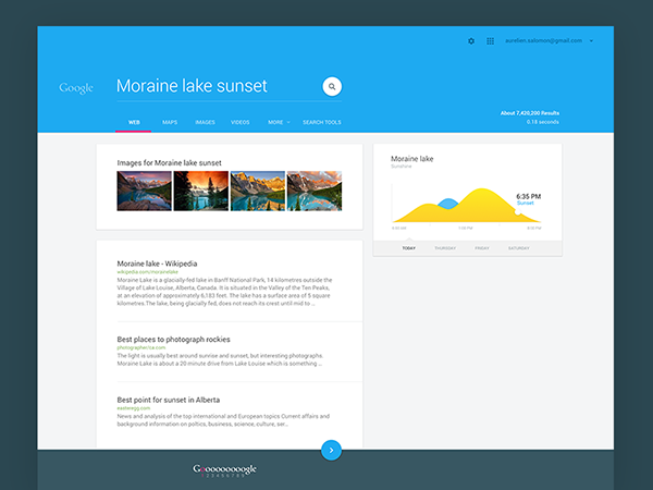
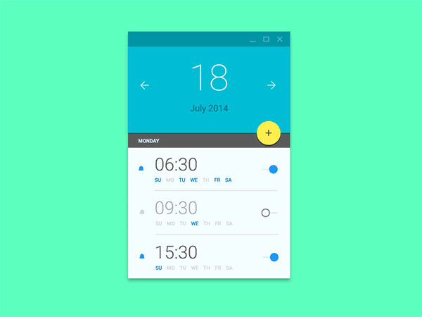
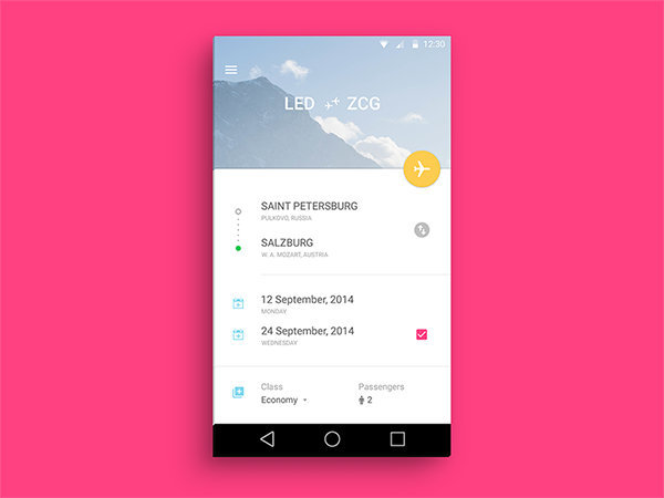
Conclusion
This is a brief introduction to Material Design. If any of the above sparked your interest, I highly recommend to read more in the official guidelines by Google.
Please approach Material Design with a creative mindset. A lot of what is presented is a reminder of what makes great design great. Simultaneously, they are only guidelines, which means that for the sake of growing as a designer you are more than welcome to give it your own twist.
I encourage all of you to create a design with these set of guidelines in mind. It might mean you're taking a different approach than usual, which is great to keep your skills at the edge and grow as a designer.
What do you think of Material Design? What have your experiences been so far? Please share it below in the comments, I'm very curious and I'm sure many others are as well.


Comments