Making your website ready for Retina display doesn’t have to be a hassle. Whether you are building a new website or upgrading an existing one, this guide is designed to help you get the job done smoothly.
By the way, if you're looking for a quick solution, check out the Retina-ready themes on Envato Market, such as Rebound - Responsive Multipurpose Retina Theme.
Make it Retina First
The easiest and most time-saving way to add Retina support is to create one image that is optimized for Retina devices, and serve it to non-Retina devices as well.
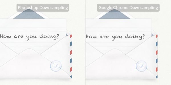
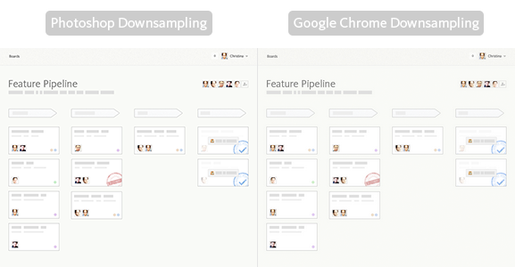
By now, every modern browser uses bicubic resampling and does a great job with downsampling images. Here's a comparison of downsampling in Photoshop vs. Google Chrome, using an image from our Growth Engineering 101 website.
There are two ways to let the browser downsample images for you: img tags or CSS background images.
You can have img tags serve the Retina-optimized image, and set the width and height attributes to half of the resolution of the actual image (e.g. 400x300 if the image dimensions are 800x600).
<img src="http://www.example.com/Retina-image-800x600-2x.png" width="400" height="300">
If you use images as CSS backgrounds, you may use the CSS3 background-size property to downsample the image for non-Retina devices.
<div class="photo"></div>
.photo {
    background-image: url(Retina-image-800x600-2x.png);
    background-size: 400px 300px;
    background-repeat: no-repeat;
    display: block;
    width: 400px;
    height: 300px;
}
In both cases, be sure to use even numbers in both dimensions to prevent displacement of pixels when the image is being downsampled by the browser.
When Downsampling is Not Good Enough
Usually, browser downsampling should work quite well. That said, there are some situations where downsampling in the browser might make images blurry.
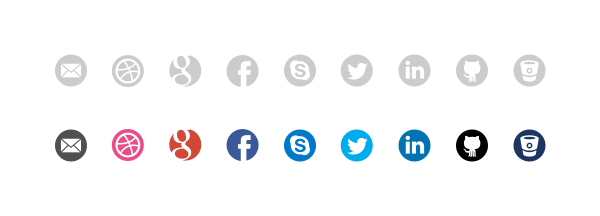
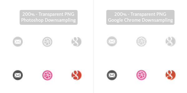
Here we have a bunch of 32px social icons.
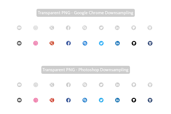
And here is how they will appear, when downsampled to 16px by Photoshop’s as well as Google Chrome’s bicubic filter. It seems that we get better results from Photoshop in this case.
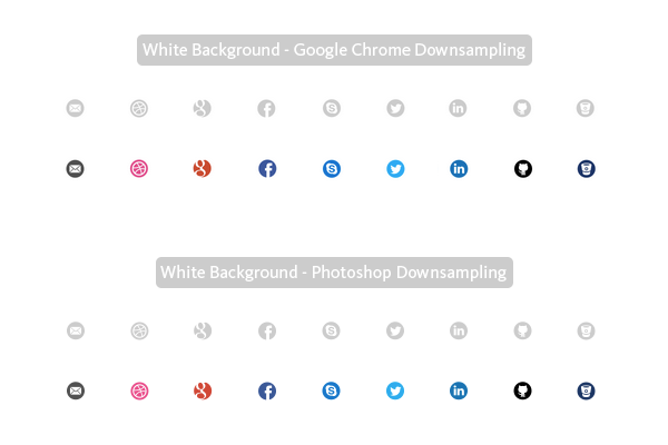
To get the best results for our users, we can create two versions of the same image: one for Retina devices, and another one that has been downsampled by Photoshop for non-Retina devices.
Now, you can use CSS media queries to serve Retina or non-Retina images, dependent upon the pixel density of the device.
/* CSS for devices with normal screens */
.icons {
    background-image: url(icon-sprite.png);
    background-repeat: no-repeat;
}
/* CSS for high-resolution devices */
@media only screen and (-Webkit-min-device-pixel-ratio: 1.5),
only screen and (-moz-min-device-pixel-ratio: 1.5),
only screen and (-o-min-device-pixel-ratio: 3/2),
only screen and (min-device-pixel-ratio: 1.5) {
    .icons {
        background-image: url(icon-sprite-2x.png);
        background-size: 200px 100px;
        background-repeat: no-repeat;
    }
}
If you use a background color for small icons, on the other hand, downsampling by the browser works rather well. Here is the same downsampling example with a white background.
Polishing Your Downsampled Images
If you’re still not satisfied with the results from Photoshop’s downsampling, you can go the extra mile and hand-optimize the non-Retina version to get super crisp results.
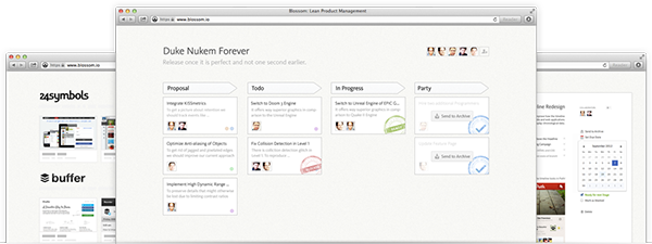
Below are some examples of images from the Blossom product website that I hand-optimized for those who are still on non-Retina devices.
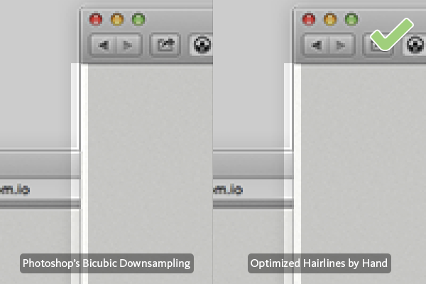
Borders and Strokes
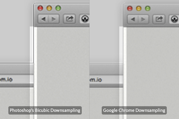
Here's an example of downsampling issues with hairlines, where I re-draw the lines of the downsampled image.
View the Retina Version of this Image on Dribbble.
Text
Next, we come to an example of downsampling issues with text. In this case, I manually re-wrote the text “Feature Pipeline” to make the result as crisp as possible.
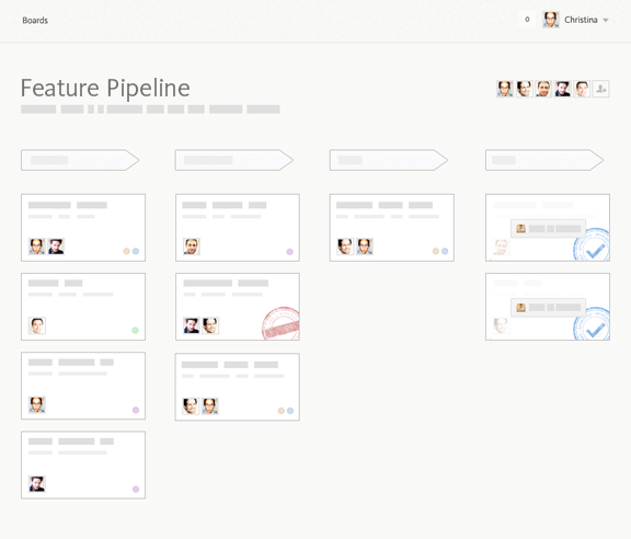
Retina Version
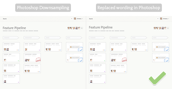
When details, crisp fonts, and clean hairlines are important, you might want to go the extra mile.
Try to Avoid Images
The main disadvantages of rasterized images are their considerable file size and that they don’t scale well to different sizes without affecting the image quality. Great alternatives to rasterized graphics are CSS, Scalable Vector Graphics (SVG), and Icon Fonts.
If you have any chance to build the graphical elements for your website in CSS, go for it. It can be used to add gradients, borders, rounded corners, shadows, arrows, rotate elements and much more.
Here are a few examples of interaction elements in Blossom that are implemented in CSS. The subtle gradient is powered by CSS gradients, and the custom font in use on this button is Kievit, served via Typekit. No images.

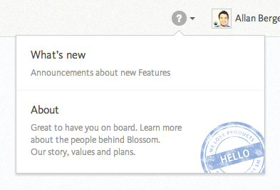
In the following screenshot, the only two images used are the user avatar and the blue stamp. Everything else – the circled question mark, the dark grey arrow next to it, the popover, its shadow and the arrow on top of it – is pure HTML and CSS.
Here, you can see how projects in Blossom appear. It’s a screenshot of a project’s website used as cover on a stack of paper sheets. The paper sheets are implemented with divs that are rotated using CSS.

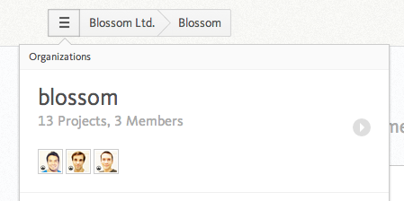
Also, the circled arrow in the right-hand side of the screenshot below is pure CSS.
Tools
Here are some awesome tools that will help save time when creating effects with CSS.
- CSS Generator: Cross browser CSS3 syntax by @RandyJensen.
- CSS Arrows: CSS for tooltip arrows by @ShojBerg.
- Generating CSS for Sprites: Sprite Cow helps you get the background-position, width and height of sprites within a spritesheet as a nice bit of copyable css. It’s built by TheTeam, and is a real time saver - definitely worth a try.

The primary advantage to SVG is that, unlike rasterized graphics, they scale reasonably well to various sizes. If you're working with simple shapes, they typically are smaller than PNGs. Often, they are used for things like charts.

Icon Fonts are frequently used as a replacement for image sprites. Similar to SVG, they can be scaled up infinitely without any loss of quality and are usually smaller in size, when compared to image sprites. On top of that, you can use CSS to change their size, color and even add effects, such as shadows.
Both SVG and Icon Fonts are well supported by modern browsers.
Retina-Ready Favicons
Favicons are really important for users who need an easy way to remember which website belongs to which browser tab. A Retina-ready Favicon will not only be easier to identify, but it will also stand out among a crowd of pixelated Favicons that haven't yet been optimized.
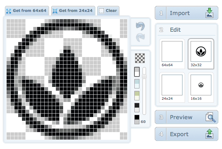
To make your Favicon Retina-ready, I highly recommend X-Icon Editor. You can either upload a single image and let the editor resize it for different dimensions, or you can upload separate images optimized for each size to get the best results.
How to Make Existing Images Retina-Ready
If you want to upgrade a website with existing images, a bit more work is required, as you'll need to re-create all images to make them Retina-ready, but this doesn’t have to waste too much time.
First, attempt to identify images that you can avoid by using alternatives like CSS, SVG and Image Fonts, as noted previously. Buttons, Icons and other common UI widgets usually can be replaced with modern solutions that don’t require any images.
In case you actually need to re-create rasterized images, you'll of course want to return to the source files. As you might assume, simply resizing your rasterized bitmap images to be twice as big doesn’t get the job done, because all of the details and borders will become pixelated.
No need to despair – image compositions which mostly contain vectors (i.e. in Adobe Photoshop or Illustrator) are quite easy to scale up. That said, don’t forget to verify if your Photoshop effects in the blending options, such as strokes, shadows and bevels, still appear as you intended.
In general, making Photoshop compositions directly out of vectors (shapes) and Photoshop’s Smart Objects will save you a great deal of time in the future.
How to Optimize the File Size of Images
Last, but not least, optimizing the file size of all images in an application or website could effectively save up to 90% of image loading times. When it comes to Retina images, the file size reduction gets even more important, as they have a higher pixel density that will increase their respective file sizes.
In Photoshop, you can optimize the image file size, via the “Save for Web” feature. On top of that, there is an excellent free tool, called ImageAlpha, which can reduce the size of your images even more with just a minor loss of quality.
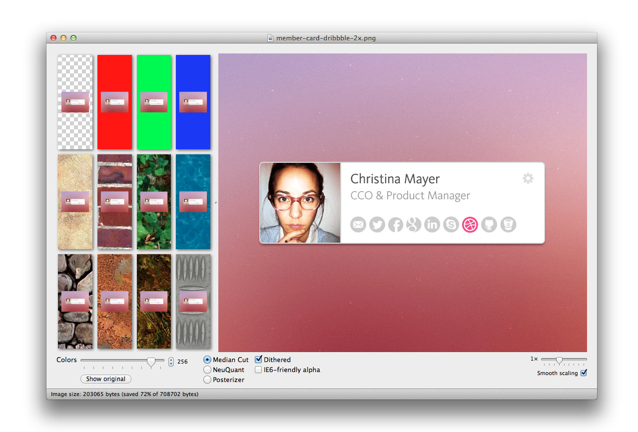
Unlike Photoshop, ImageApha can convert 24-bit alpha channel PNGs to 8-bit PNGs with alpha channel support. The icing on the cake is that these optimized images are cross-browser compatible and even work for IE6!
You can play around with different settings in ImageAlpha to get the right trade-off between quality and file size. In the case below, we can reduce the file size by nearly 80%.
When you're finished setting your desired compression levels, ImageAlpha’s save dialog also offers to “Optimize with ImageOptim” - another great and free tool.
ImageOptim automatically picks the best compression options for your image and removes unnecessary meta information and color profiles. In the case of our stamp file, ImageOptim was able to reduce the file size by another 34%.

After we updated all assets at Blossom.io for high resolution displays and used ImageAlpha and ImageOptim to optimize the file size, we actually ended up saving a few kilobytes in comparison to the assets we had before.
Save Time, Read This Book

If you want to learn more about how to get your apps and websites ready for Retina displays, I highly recommend "Retinafy your web sites & apps", by Thomas Fuchs. It’s a straight-forward step by step guide that saved me a lot of time and nerves.
Awesome Retina-Ready Sites on the Web
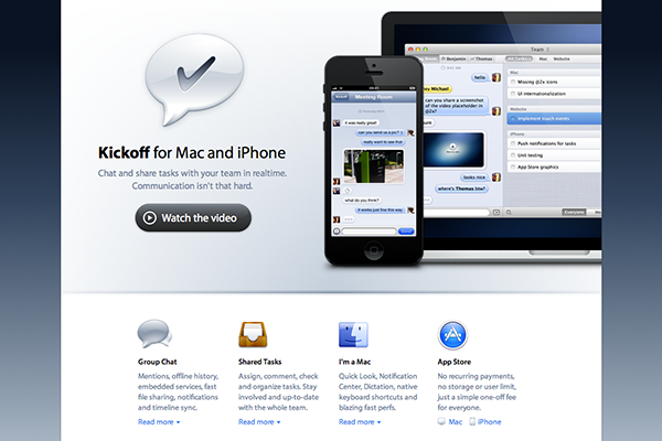
http://kickoffapp.com/
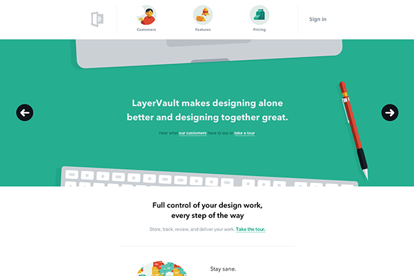
http://www.layervault.com
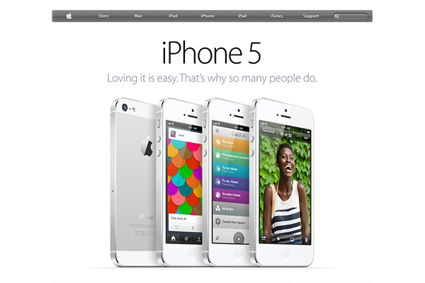
http://www.apple.com
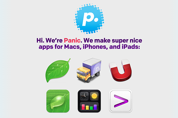
http://www.panic.com
Thanks for reading! Any questions?


Comments