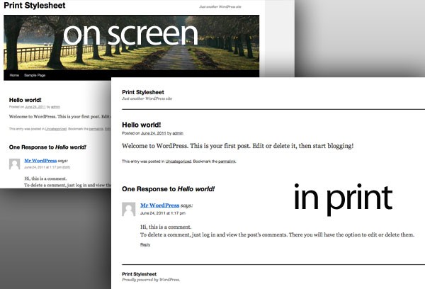
Adding a print stylesheet to your Wordpress site is a wise move. The environment will thank you for applying this article to your website. It's such a simple feature to implement, and most people just overlook it. I'll show you how easy it is to add a simple print stylesheet to your Wordpress site. I'm going to give you a great foundation of one you can use in your site immediately, and show you a few tips so you can take it to the next level.
Step 1. Implementing a Print Stylesheet
You'll need to update your theme's header.php file to let it know that the stylesheet we'll be updating will be used for printing as well. Open up header.php, look for:
<link rel="stylesheet" type="text/css" media="screen" href="<?php bloginfo( 'stylesheet_url' ); ?>" />
We need to update the media attribute to include print. Screen is telling the browser "This is the stylesheet you should use to know how to display the elements within the browser". We need to tell it "You can also use this stylesheet when the user is printing". So now it looks like:
<link rel="stylesheet" type="text/css" media="screen, print" href="<?php bloginfo( 'stylesheet_url' ); ?>" />
Next, open up your stylesheet, style.css. At the end of the document, add:
@import "print.css";
It's key that the code is at the bottom of the stylesheet to be sure that your screen styles don't inherit styles we're using for printing and so that the printing styles won't be overridden with the styles of your site. After that's done, create a file in the same directory with the name print.css. This is where we'll add all our style for printing.
Step 2. Adding the Print Styling
Below is a modified version of the print style for Wordpress' Default theme "TwentyTen". A lot of websites share these same elements, so there's no need to reinvent the wheel with developing one. What I'm going to do is break down the key elements, so you know why they were included and what styles you should be on the look out for to add it to your own custom elements.
@media print {
	body {
		background: #fff none !important;
		color: #000;
	}
	#wrapper {
		clear: both !important;
		display: block !important;
		float: none !important;
		position: relative !important;
	}
	#header {
		border-bottom: 2pt solid #000;
		padding-bottom: 18pt;
	}
	#colophon {
		border-top: 2pt solid #000;
	}
	#site-title,
	#site-description {
		float: none;
		line-height: 1.4em;
		margin: 0;
		padding: 0;
	}
	#site-title {
		font-size: 13pt;
	}
	.entry-content {
		font-size: 14pt;
		line-height: 1.6em;
	}
	.entry-title {
		font-size: 21pt;
	}
	#access,
	#branding img,
	#respond,
	.comment-edit-link,
	.edit-link,
	.navigation,
	.page-link,
	.widget-area {
		display: none !important;
	}
	#container,
	#header,
	#footer {
		margin: 0;
		width: 100%;
	}
	#content,
	.one-column #content {
		margin: 24pt 0 0;
		width: 100%;
	}
	.wp-caption p {
		font-size: 11pt;
	}
	#site-info,
	#site-generator {
		float: none;
		width: auto;
	}
	#colophon {
		width: auto;
	}
	img#wpstats {
		display: none;
	}
	#site-generator a {
		margin: 0;
		padding: 0;
	}
	#entry-author-info {
		border: 1px solid #e7e7e7;
	}
	#main {
		display: inline;
	}
	.home .sticky {
		border: none;
	}
}
Step 3. Understanding the Print Styling
Wrap Your Tags for Print
First, you should notice how all your print styles are wrapped inside:
@media print {
}
All objects that correspond to the print functionality are styled between these brackets. Should you add any style, be sure it's within these brackets. If it's outside, CSS won't know any better and will assume it's part of the screen media.
Make Everything Black and White
	body {
		background: #fff none !important;
		color: #000;
	}
This is one of the key elements to creating a print style. Typically, anything print friendly should not have a background to it, and all coloring should be black and white.
Block Your Elements and Make Sure They Don't Overlap
	#wrapper {
		clear: both !important;
		display: block !important;
		float: none !important;
		position: relative !important;
	}
These are basic styles that are making sure everything shows up one on top of the other. Clearing it will make sure everything in #wrapper will fall under the previous element, and anything after it will fall after the wrapper so that things don't get shoved beside one another. It shouldn't have a float and the position should remain relative. What this will do is make sure the content reads left to right, and that no objects will overlap one another; it will be one flowing document.
Use Borders and Spacing for Separation
	#header {
		border-bottom: 2pt solid #000;
		padding-bottom: 18pt;
	}
You'll notice a few properties that actually style the element throughout the print stylesheet. These are absolutely acceptable. A lot of times, color will separate elements in a design. Since everything is in black and white, it is hard to do that. So things like adding a black border to the bottom of an element, and adding some space underneath it will help clearly separate them.
Keep Font and Line Size in Mind
	.entry-content {
		font-size: 14pt;
		line-height: 1.6em;
	}
	.entry-title {
		font-size: 21pt;
	}
It's a great idea to consider the text size of the content you're printing. The size you see on the screen compared to what eyes are able to read are very different. Consider a smaller font size, 14 pt is plenty I feel. I may consider even going smaller than that. Having a line height that helps the content flow is also very helpful. Be sure to give some space between your lines so that the printed text isn't illegible. Also, giving titles a larger font size will help to distinguish them from the content.
Hide Unnecessary Elements
	#access,
	#branding img,
	#respond,
	.comment-edit-link,
	.edit-link,
	.navigation,
	.page-link,
	.widget-area {
		display: none !important;
	}
This will be one of your most used element attributes. 'display:none' is going to hide the element entirely. The printed page will treat it like it wasn't even there to begin with, so if you hide all your images it won't show a blank spot where they would be normally; the element will be taken completely away from the layout and the next available content will render. I use this a lot for unnecessary elements to include in my print like images, navigation, and sidebars.
Take the Full Page Width
	#container,
	#header,
	#footer {
		margin: 0;
		width: 100%;
	}
This element is making sure that all your elements that wrap the content of the page have a width of 100% so that they'll take up the entire available margin on the printed document. Sometimes designers will set a width of 900px or the likes there of, which would only allow print to happen in a 900px area.
Elements are Allowed Different Emphasis in Print
	#content,
	.one-column #content {
		margin: 24pt 0 0;
		width: 100%;
	}
In the screen stylesheet, this would be the left chunk of content. It would have a sidebar to its right. You'll notice now that it no longer has a width limited to that space, it will take up the full available margin on the printed document. It has a width of 100% and the sidebar will no longer be able to fit beside it. In fact, the sidebar should have a display:none somewhere in the print stylesheet. There's also a margin attribute that will separate it from the content around it so that it will stand out.
Find Out Which Images You Can Remove
	img#wpstats {
		display: none;
	}
This is a great example of hiding images that have the ID of "wpstats". You can create your own class called hideInPrint to add to images that you want to remove when printing. The code for that would look like:
	img.hideInPrint {
		display: none;
	}
Conclusion
This article is just a foundation - you can obviously add your own unique brand styles to this to create a customized print style. Here, we've shown you the elements you should keep in mind when implementing a print stylesheet into your own project; The rest of the styling will be up to you in your own project! Knowing the thought behind "why" certain attributes were used, will help your insight as to what your project will need.

Comments