One of the biggest sources of buzz this past week has been Adobe's announcement of the Edge preview. People have been talking about it a lot but few seem to really grasp some of the ideas or technology behind this.
Today, I'd like to talk to you a little about the Edge preview and why you should be cautiously optimistic at this juncture.
A Little History
Creating content using a standards based approach is hard. This is where Edge comes in.
Flash's birth and history can make for a very, very confusing read: it's incredibly loved or hated depending on who you speak to. The undeniable fact is that Flash is one of the main reasons behind the proliferation of video and interactive media on the web. On the flip side, it's criticized for its closed nature and performance issues.
While the platform itself isn't going anywhere in the near future, you can't help but notice that Flash's hold on the web has been loosening lately.
Chalk it up the rise of HTML5 and an increasing number of developers embracing open standards or a certain fruit flavored company leading a crusade against Flash, the bottomline is that the web has been looking for an open, standards based alternative to Flash for sometime now. One of the big reasons for the arrival and rise in popularity of HTML5 along with libraries like jQuery can be attributed to antagonism and apathy towards the Flash platform.
Creating content with the new technologies though has been far from smooth. This is where Edge comes in.
What is Edge?
Edge is Adobe's attempt at being relevant in the post-Flash world.
Edge is touted as an animation tool ideal for designers who want to create web content replete with animations but based on the open standards that prop up the web. According to their site:
Adobe Edge is a new web motion and interaction design tool that allows designers to bring animated content to websites, using web standards like HTML5, JavaScript, and CSS3.
Basically, Edge is your ticket to adding animated content without having to resort to external plugins like Flash or Silverlight.
Do We Really Need Another Tool?
In this case, oh, yes we do!
I certainly feel so. Before you look for your pitchforks, let me explain!
Flash developers have access to very mature and very sophisticated design tools. Want to create a simple animation? A few clicks here, some input there and you're done! They really do enjoy the use of a complete environment when it comes to authoring their content.
What happens when you want to go the standards based way?
It's not that easy, I can tell you that much. You have to poke around with code, learn a little JavaScript, get bored, learn to use a library like jQuery, get excited again and then find out that you still have to hand code every single animation.
While it's ok for us dev types, it's much more of a chore for the artsy designers. Standards based development really doesn't have to be hard! I realize that enterprising developers have come up solutions for these but none have appeared from the bigwigs of big content.
Edge seeks to streamline this process by reusing common concepts of media creation such as timelines and stages to make the learning curve more gentler, easier and thus, more accessible.
Initial Impressions
The preview is a svelte 65MB download and installs quite quickly. Getting access to the download requires an Adobe account though. It's free, sure, but adds an unnecessary step to the process. 1999 called, they want their frivolous signups back.
And oh, if you're still lost as to where to download your copy, you can get it here.
The Interface

First impressions of the preview are quite positive. It looks clean, composed and uncluttered. If you've used GoLive in the past, or even Flash, the interface should look mostly familiar.

The stage or canvas acts as the first DIV and when you add elements to your canvas, they're added hierarchically with the type of element being displayed on the side.

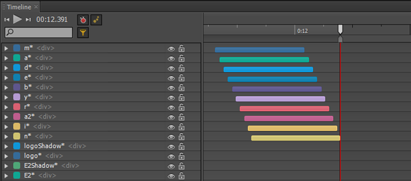
The timeline pane is one of the key portions of any animation suite and Edge doesn't disappoint. The entire lower portion of the interface is dominated by the timeline pane.
You can view all the properties of the elements you've added so far to the canvas in the timeline. Creating an animation is as simple as adding a keyframe, supplying it with the info for the frame and Edge will fill in the rest -- tweening works as expected, excellently.
Functionality of the Current Preview Version
This preview is obviously in alpha mode -- the first preview's main focus is on adding simple shapes and animations. That's pretty much all there's present in the interface as well.
Users can add text, images and simple shapes with relative ease -- just point, click and drag. You can also customize assorted characteristics of the content including color, skewing, opacity, rotation and much more. Take a quick look at the image below to get an idea of what I'm talking about. If you've at all been introduced to animation software in the past, you should feel right at home.

You can also import premade assets, including images, into your current canvas.
Under the Hood
Since this isn't really a tutorial on how to use Edge, I'm going to skip ahead and download a premade demo which you can get from here.
Let's take a look at the directory structure of a sample Edge project:

No surprises here. Your animations are now created from your familiar trifecta of web technologies -- HTML, CSS and JavaScript.
As opposed to popular opinion, Edge uses a mix of jQuery and CSS3 to animate the contents of its canvas. Yes, you heard that right - jQuery does a lot of the grunt work behind Edge.
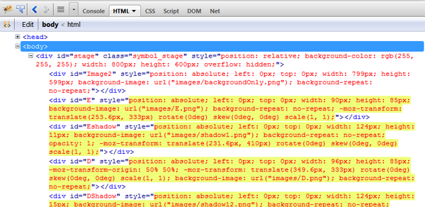
Digging into the code with Firebug, you'll notice that there are a lot of DIV elements being moved around with jQuery. For example, here is the actual code being injected in the example I linked above. Not entirely pretty.

Basically, any animation that CSS3 can do is left to it since all CSS3 effects are hardware accelerated, and thus will perform well. The rest is left for jQuery to handle.

Digging further into the code, you'll see that all your element, their properties, tweening information and the rest are stored as a JSON file. I'm assuming the engine basically parses this information and constructs the DOM and attaches the handlers.
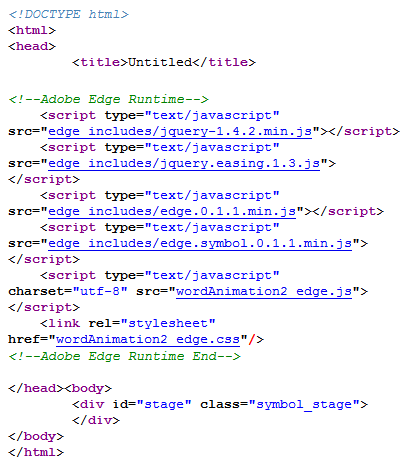
As a quick experiment, let's look at what the browser sees:

Uh, oh. There's literally nothing that makes semantic sense in there. Disable JavaScript and you're left with a big blob of nothingness. Fans of graceful degradation, get your pitchforks.
Where the Heck is HTML5?
It's being marketed as a HTML5 tool and well... this is not HTML5 powered. Yet.
I went in expecting to be dazzled by the splendor of canvas or SVG. After a look at the DOM, it's quite apparent there isn't even a tiny bit of either in there. Just to make sure, I did a quick search of the JavaScript files searching for the canvas related keyword, getContext . Needless to say, nothing turned up. The biggest blob of HTML5 here is the doctype. Sure, you can import SVG content but you can't touch the markup so it's a moo point.
It's a little puzzling why Edge doesn't use any of the modern technologies instead. If anything, it's being marketed as a HTML5 tool and well... this is not HTML5 powered. Disingenuous marketing or signs of features to come? I'm leaning towards the latter whilst really, really hoping the former isn't true.
Is this Approach the Best Option Moving Forward?
Nope.
From a development perspective, animating DIVs is the equivalent of using tables for layout -- it works but at the cost of elegance and semantics. Canvas and SVG are precision engineered to do exactly what Edge does here and make more sense in the long run.
Even if canvas performance is piddling on the current mobile devices, there's no way for the performance to go but up and it really shouldn't hamper the adoption of new technology.
While one would ideally like to see cutting edge apps actually make use of similar cutting edge technologies, keep in mind that this is still a preview, an early alpha version.
In the words of one of the engineers behind Edge regarding DIV based animation:
We started with DIVs because we wanted to get something out there quickly that folks could play with. I say we 'started' there because Edge will be evolving rapidly — the product is by no means feature complete.
That's a little encouraging! While I'm disappointed with their initial, see what sticks approach, it's good to know that this is just how they're kicking off things, not how they plan to do things ultimately.
Remember, this is Still a Preview
The thoughts above may come off as a little negative but that's not my intention. I, and the rest of the community, have high hopes for this tool and thus very high expectations.
And Adobe on their part isn't lazing around. They're already working on the feedback provided by the community so far and have a road map in place for future versions.

With Adobe embracing open standards and focusing on producing creative tools instead of boxed-in application platforms, I can't help but feel they're on the path towards becoming as relevant to the progress of the web as they were in the past during the height of Flash.
Let us know how you feel about the Edge preview in the comments and thank you so much for reading!


Comments