I first used Shopify not long after it launched in 2006. I loved that it was a simple to use and competitively priced hosted e-commerce platform. But above all, its theming feature is what I liked most. Let's look at a few simple techniques that give you control over your Shopify themes and deliver an even more crafted experience to your clients.
Shopify themes (hereafter referred to as simply themes) are easy to construct. In addition to our everyday tools of HTML, CSS, JavaScript, themes use a template language called Liquid. I want to move beyond the basics in this article to show you a few techniques I recently employed to super charge your Shopify theme development. If you aren't familiar with themes, you can learn more on the Shopify Wiki.
Controlling the Collections Page
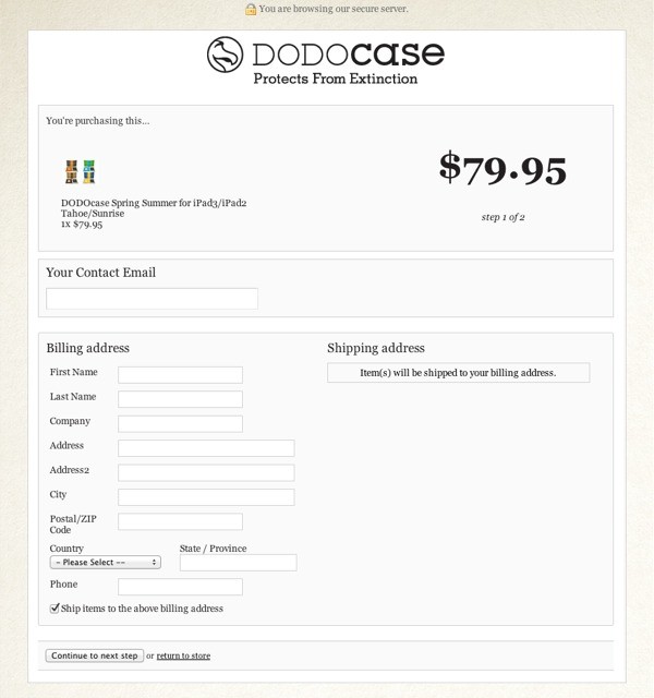
All Shopify checkouts are securely hosted on the Shopify domain.
Themes allow you to control your home, collections, and individual product pages. Here's a typical Shopify URL displaying a single product:
http://store.theheadsofstate.com/products/chicago-travel-poster
"The Heads of State" is a lovingly produced Shopify site that showcases their products really well. The above URL takes you to their Chicago Travel Poster, but if you, like me, are a bit of a URL pedant, then you might be tempted to hack back to:
http://store.theheadsofstate.com/products/
This URL takes you to a page that looks undesigned in comparison to the rest of the site. I very much doubt that this is due to a lack of thought from the designers. It's actually Shopify's fault; themes currently do not support a native template for the page available at /products (or /collections - the two are interchangeable in this context). Instead, the default layout file renders a list of the available collections.

Thankfully, one can quickly regain control of this page and use it to their advantage. In the theme's layout.liquid file, you can replace {{ content_for_layout }} with the following code snippet:
{% if template == 'list-collections' %}
{% include 'collection-listing' %}
{% else %}
{{ content_for_layout }}
{% endif %}
Next, create a file called collection-listing.liquid and save it into your snippets folder. If a someone visits the /collections or /products page, our layout file renders and includes our own snippet instead of the default listing.
Here's a quick example of how you can restyle the collections list using your own markup. Note that we have access to the Shopify collections identifier on this page:
<div id="collections-listing">
  <h2>Product Collections</h2>
  <ul>
  {% for collection in collections %}
  {% unless collection.handle == 'frontpage' %}
    <li><a href="{{ collection.url }}">{{ collection.title }}</a>
  {% endunless %}
  {% endfor %}
  </ul>
</div>
You can find more information about the variables available to you in the collections collection on the excellent Shopify cheat sheet. Note how we use Liquid logic to exclude the collection with a handle of fronptage. This is an often used collection in themes for displaying items on the home page, but we're excluding it because it is used more for administration purposes than a logical grouping of related products. This technique allows you to keep the styling consistent and add in extra data or design elements as you see fit.
Alternate Layouts
...word slugs are known as handles.
When you first get started with themes, you are introduced to the concept of layouts. By default, Shopify looks for a default layout file called layout.liquid, which lives in the appropriately named layout folder.
There may be occasions when your design demands an alternative layout. One approach is to use conditional statements to show/hide content depending on a variable, such as a particular product or collection page. But an another alternative is to use a completely different layout file. This may be a much simpler solution if your need different mark up. All you need to enforce an alternative layout is add the following code to the top of your template:
{% layout "product" %}
This forces your template to use a layout file called product.liquid located in your theme's layouts folder.
You can also specify that no layout be used by specifying none, like this:
{% layout "none" %}
Product Specific Templates
If you have used WordPress, you will likely be familiar with the idea of a slug. It's a unique name given to a specific post or page that is used in a URL. For example: "my-first-page". In Shopify, word slugs are known as handles. These are auto generated when you create a product, but of course, you can change them if you desire to do so. Our product handles are also available to us in our product.liquid template. We can use handles to dictate our product template. Here's one way we could do this:
{% if product.handle == 'my-new-t-shirt' %}
{% include 'my-new-t-shirt' %}
{% else %}
// Your standard product.liquid code goes here
{% endif %}
In this example we check to see if the product handle of the current request is "my-new-t-shirt" and include a snippet called "my-new-t-shirt" if true. This equates to including a file called my-new-t-shirt.liquid that resides in the snippets folder.
To take this one step further, you could turn the standard product.liquid into a snippet. I like this approach because it keeps your main template as a logic controller, nicely isolating presentation markup in their own files.
This pattern can be slightly modified to use the assign and case methods, like this:
{% assign handle = product.handle %}
{% case handle %}
{% when 'big-t-shirt' %}
{% include 'big-t-shirt' %}
{% when 'small-t-shirt' %}
{% include 'small-t-shirt' %}
{% else %}
{% include 'product-standard' %}
{% endcase %}
You can also use the product handle to assign different CSS classes to the <body> tag in your layout files. For example:
{% case template %}
{% when 'product' %}
<body class="{{ product.handle }}">
{% else %}
<body>
{% endcase %}
You could of course extend this technique to customize the <body> tag based on any number of criteria.
Checkout CSS
All Shopify checkouts are securely hosted on the Shopify domain. For some, being directed to a generic checkout page can be a bit jarring in terms of the user experience. You can, however, style your checkout using CSS. Here's what you need to do:
- Create a file called
checkout.cssin your theme's asset folder. - Visit your checkout page and work out which styles you want to override using a tool such as the Chrome Inspector. You may need to use the
!importantrule to achieve the desired results.

Make sure you check out the wiki for complete examples.
You can also use Liquid in your checkout.css file. First, rename your CSS file to checkout.css.liquid. Then you can start using Liquid filters. Here's an example:
/* Insert your own logo (upload separately to your asset folder) */
#logo {
	height: 65px;
	background: url({{ 'logo-checkout.png' | asset_url | replace: 	'http://','https://' }}) center no-repeat;
}
It's amazing how a few changes to the basic CSS can align the generic checkout with your own design. Make sure to check out all the templates of the checkout process; your CSS will apply to a number of screens.
Theme Settings
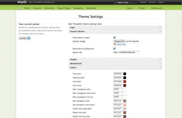
Theme settings allow us to use the Shopify Admin to control data we can use in our themes. Common use cases are strap lines, site-wide color schemes, and selecting bespoke images to appear in slider galleries around the site. To enable settings in your theme, simply create a settings.html file (note no .liquid extension) and start adding the relevant form elements. For example, you can include the following in your settings.html file allow editing of the site's strap line:
<tr>
  <th>
     <label for="site_strapline">Site Strap Line</label>
  </th>
  <td>
     <input type="text" id="site_strapline" name="site_strapline" class="text" value="Default Strap Line" />
  </td>
</tr>
Notice how I set the default value. This is important, especially when dealing with CSS values. In order to access this value in our theme, we simple reference it in Liquid as follows:
<h2>{{ settings.site_strapline }}</h2>

We can also leverage theme settings in our main CSS files by adding the .liquid extension to our main CSS file. For example:
body {
	color: {{ settings.text_color }};
	background-color: {{ settings.bg_color }};
}
It's really important to provide default values for these colors in your settings.html file. Failing to do so causes your standard CSS file to be created without a value. Read more at the wiki: http://wiki.shopify.com/Theme_Settings
cart.js
Shopify also provides a JavaScript API, and the "cart" information for the current user is directly available to us via a very simple URL. Simply add the .js extension to the cart URL to get a JSON representation of the cart. Here's an example:
{
    "token": "7b0f09aca710a4ce688325a8add36c6b",
    "note": null,
    "attributes": null,
    "total_price": 0,
    "total_weight": 100.0,
    "item_count": 1,
    "items": [{
        "id": 229848636,
        "title": "Insites: The Tour Coasters",
        "price": 0,
        "line_price": 0,
        "quantity": 1,
        "sku": "",
        "grams": 100,
        "vendor": "Viewport Industries",
        "properties": null,
        "variant_id": 229848636,
        "url": "/products/insites-the-tour",
        "image": "http://cdn.shopify.com/s/files/1/0151/6407/products/png_1.png?783",
        "handle": "insites-the-tour",
        "requires_shipping": true
    }],
    "requires_shipping": true
}
This gives you an extreme amount of flexibility and creative power. You could create a JavaScript pop up showing the contents of the cart or inject a slide show highlighting their chosen products. Of course, you could do these things in your templates, but this gives you more options to provide a better user experience.
Conclusion
As with all platforms, there are many different ways to approach the same problem, but I hope that these six tips prove useful and helpful for you when developing your next Shopify theme.


Comments