The official release of jQuery Mobile 1.0 was recently announced, and this tutorial will provide you with an overview of how this popular framework can assist you in your cross-platform and web based app development!
jQuery Mobile is an extension to the popular jQuery JavaScript framework. As the name suggests, it is an implementation specifically geared toward mobile devices, and over the last year it has come a long way. It is now one of the more popular frameworks for developing web based applications on mobile devices. In addition to providing a great solution for standalone web based apps, it is also often wrapped in an SDK like PhoneGap to serve as an essential component to many native applications.
The team behind jQuery Mobile has been working hard to get the framework where it is today, and the last three months specifically have taken it from a beta to an official release.
Let's take a look at some of the features that jQuery Mobile offers so you can see just quickly you can set up a basic app with this great solution!
Create Your Page
Before we begin, we need to make sure that we have a couple of things in the right place. First, we need to make sure that we are setting the viewport for our device using the meta tag.
<meta name="viewport" content="width=device-width, initial-scale=1">
Then, just so that we can use this as a home page on iOS, we can set the meta tag for app-capable.
<meta name="apple-mobile-web-app-capable" content="yes" />
The above meta tags aren't strictly necessary, but I think they're often a good idea.
Next we need to include the CSS and Javascript for jQuery Mobile. At the moment, we will use the default CSS, although later on we will discuss seperating the structure from the style. For the JavaScript, we need to make sure that we include version 1.6.4 of jQuery and jQuery mobile 1.0. jQuery is a dependency of jQuery Mobile, so you must include the core library first. At the time of this writing, the latest verison of jQuery Core is 1.7, but jQuery Mobile currently only offers support for 1.6.4. However, according to the team behind the project, support for 1.7 is coming soon!
	<link rel="stylesheet" href="http://code.jquery.com/mobile/1.0/jquery.mobile-1.0.min.css" />
	<script src="http://code.jquery.com/jquery-1.6.4.min.js"></script>
	<script src="http://code.jquery.com/mobile/1.0/jquery.mobile-1.0.min.js"></script>
Now we can move into the body of the document and create the typical structure of a page. jQuery Mobile uses the HTML5 data- atrribute to assign specific behaviors to elements, data-role being the most popular as it defines the elements role within the application. Add the attribute data-role="page" to your first element on the page.
<div data-role="page">
<!-- all page content -->
</div>
It doesn't have to be a div, it can be a section if preferred, but the end result is the same - you will have created your first page with jQuery Mobile.
For now, you can build your page using just the data-role attributes. You can use data-role="header" and data-role="footer" for the header and footer respectively, and data-role="content" for the main body content.
<!DOCTYPE html>
<html>

<head>
	<meta charset="utf-8">
	<meta name="viewport" content="width=device-width, initial-scale=1">
	<title>jQuery Mobile Page</title>
	<link rel="stylesheet" href="http://code.jquery.com/mobile/1.0/jquery.mobile-1.0.min.css" />
	<script src="http://code.jquery.com/jquery-1.6.4.min.js"></script>
	<script src="http://code.jquery.com/mobile/1.0/jquery.mobile-1.0.min.js"></script>
</head>

<body>

<div data-role="page">

	<div data-role="header">
		<h1>The Header</h1>
	</div><!-- /header -->

	<div data-role="content">
		<p>This is a single page boilerplate template that you can copy to build you first jQuery Mobile page. Each link or form from here will pull a new page in via Ajax to support the animated page transitions.</p>
		<p>Just view the source and copy the code to get started. All the CSS and JS is linked to the jQuery CDN versions so this is super easy to set up. Remember to include a meta viewport tag in the head to set the zoom level.</p>
		<p>This template is standard HTML document with a single "page" container inside, unlike a <a href="multipage-template.html" data-ajax="false">multi-page template</a> that has multiple pages within it. We strongly recommend building your site or app as a series of separate pages like this because it's cleaner, more lightweight and works better without JavaScript.</p>
	</div><!-- /content -->

	<div data-role="footer">
		<h4></h4>
	</div><!-- /footer -->

</div><!-- /page -->

</body>
</html>
Your app should now resemble the following.
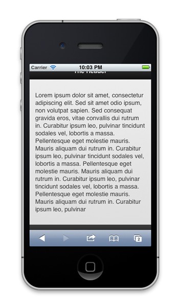
And the full code for this is below:
<!DOCTYPE html>
<html>

<head>
	<meta charset="utf-8">
	<meta name="viewport" content="width=device-width, initial-scale=1.0, user-scalable=0, minimum-scale=1.0, maximum-scale=1.0">
	<meta name="apple-mobile-web-app-capable" content="yes" />
	<title>Single page template</title>
	<link rel="stylesheet" href="http://code.jquery.com/mobile/1.0/jquery.mobile-1.0.min.css" />
	<script src="http://code.jquery.com/jquery-1.6.4.min.js"></script>
	<script src="http://code.jquery.com/mobile/1.0/jquery.mobile-1.0.min.js"></script>
</head>

<body>

<div data-role="page" id="one">

	<div data-role="header">
		<h1>The Header</h1>
	</div>

	<div data-role="content">
		<p>Lorem ipsum dolor sit amet, consectetur adipiscing elit. Sed sit amet odio ipsum, non volutpat sapien. Sed consequat gravida eros, vitae convallis dui rutrum in. Curabitur ipsum leo, pulvinar tincidunt sodales vel, lobortis a massa. Pellentesque eget molestie mauris. Mauris aliquam dui rutrum in. Curabitur ipsum leo, pulvinar tincidunt sodales vel, lobortis a massa. Pellentesque eget molestie mauris. Mauris aliquam dui rutrum in. Curabitur ipsum leo, pulvinar tincidunt sodales vel, lobortis a massa. Pellentesque eget molestie mauris. Mauris aliquam dui rutrum in. Curabitur ipsum leo, pulvinar</p>
	</div>

	<div data-role="footer">
		<h4>The Footer</h4>
	</div>

</div>

</body>
</html>
Now this is pretty simple as far as web apps go, but it is a start. Everything with jQuery Mobile can be done pretty quickly, and it's superb for both rapid development of a prototype and development of full featured apps.
Creating Multiple Pages
Of course, using an entire library for a single page app is a little overkill, so let's start getting down to the sweet stuff and add a few pages to our app.
You can add two additional div containers after the closing tag of the div with data-role="content" and data-role="page", but the page data-role should have the id attribute set to "two" and "three" respectively. I'm sure you see where we're going with this, so go ahead and add an id of "one" to our first page too. Add headers, contents, and footers to the additional pages as desired.
The additional code should look something like the following:
<div data-role="page" id="two">

	<div data-role="header">
		<h1>The Header</h1>
	</div>

	<div data-role="content">
		<p>This is the second page</p>
	</div>

	<div data-role="footer">
		<h4>The Footer</h4>
	</div>

</div>

<div data-role="page" id="three">

	<div data-role="header">
		<h1>The Header</h1>
	</div>

	<div data-role="content">
		<p>This is the third page contents</p>
	</div>

	<div data-role="footer">
		<h4>The Footer</h4>
	</div>

</div>
If you check your app now, you won't see any difference. That is because we need to go ahead and link to those pages from the first page before they will be displayed. Add some arbitrary links in the first page, like this:
<a href="#two">Page Two</a>
<a href="#three">Page Three</a>
If you open up the first link to page two, you will see your first paging animation, but at the moment there is no way to get back to the first page. Go ahead and add a link to pages two and three going back to page one.
Everything should be paging nicely back and forth now. Sweet!
Buttons
Now, at the moment our links are a little boring, but without too much effort we can go ahead and change these to some nice looking buttons.
If you add the attribute data-role="button" to the links in each of the pages and refresh your app, you should now have some nice looking buttons.
Themes
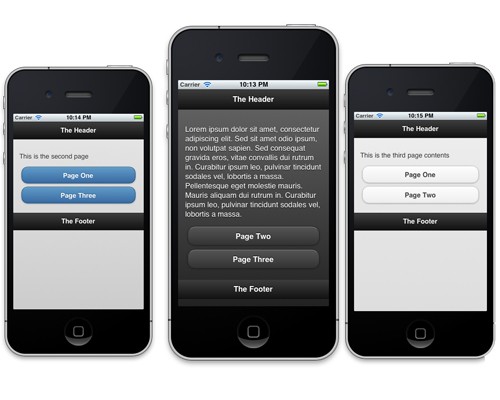
At the moment, our page rendering fine and we are able to navigate through a couple of pages, but it all does look a bit dull. Thankfully, jQuery Mobile comes bundled with themes. These themes enable the developer to change colors and the general look and feel of the app very quickly. This is done by the data-theme attribute. Go ahead and add data-theme="a", data-theme="b" and data-theme="a" to each of the page divs we created above. Refresh your app and you'll see what's happened. Each of your pages should look slightly different!
Until recently, the only way to roll your own custom theme was to include an additional stylesheet and override the CSS imported with the jQuery CSS. Thankfully, when the second Release Candidate for jQuery Mobile came out in October, the stylesheet was seperated into two seperate entites, making room for the newly released ThemeRoller. The first stylesheet deals with the structure of the application and the second will handle all the themeing for the app.
Head over to the Theme Roller page and you'll be greeted by the screen below:
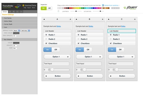
On the left hand side, you have your theme settings. You can choose to filter through each of the sections one at a time and adjust what you want, or, as I like to do, go ahead and drag and drop the colors from above to style what you want, and then refine your selection using the side menu. You can build up your themes, with a maximum of 26, and then download your theme file to be used within your application.
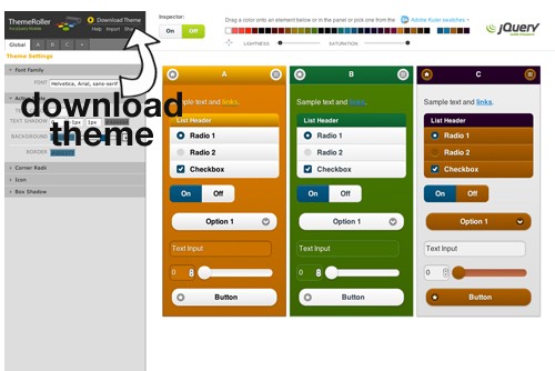
When you download the ZIP file and extract its contents, you will have an index.html file which contains some basic styles and a confirmation that your stylesheet has been downloaded correctly. You will then have a themes folder and inside you will find an images folder and two stylesheets named with the name you gave the theme on export. There is a minified version for production or a full version for any edits you might want to make.
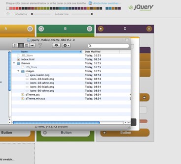
Now, when you are beginning your mobile project, just include this Theme Roller stylesheet rather than the default theme CSS.
<!DOCTYPE html>
<html>
<head>

  <title>jQuery Mobile</title>
  <meta charset="utf-8" />
  <meta name="viewport" content="width=device-width, initial-scale=1">
  <!-- INSERT CUSTOM THEME CSS-->
  <link rel="stylesheet" href="css/themes/my-custom-theme.css" />
  <!-- INSERT STRUCTURE CSS -->
  <link rel="stylesheet" href="http://code.jquery.com/mobile/1.0/jquery.mobile.structure-1.0.min.css" />

</head>
Now, when you access the swatches you created through the usual way with jQuery Mobile above by setting the data-theme attribute, you will be referencing the Theme Roller CSS you created instead of the defaults.
<!DOCTYPE html>
<html>
<head>

  <title>jQuery Mobile</title>
  <meta charset="utf-8" />
  <meta name="viewport" content="width=device-width, initial-scale=1">
  <!-- INSERT CUSTOM THEME CSS-->
  <link rel="stylesheet" href="css/themes/my-custom-theme.css" />
  <!-- INSERT STRUCTURE CSS -->
  <link rel="stylesheet" href="http://code.jquery.com/mobile/1.0/jquery.mobile.structure-1.0.min.css" />
  <!-- INSERT jQuery -->
  <script type="text/javascript" src="http://code.jquery.com/jquery-1.6.4.min.js"></script>
  <!-- INSERT latest jQuery Mobile -->
  <script type="text/javascript" src="http://code.jquery.com/mobile/1.0/jquery.mobile-1.0.min.js"></script>

</head>

<body>

<div data-role="page" data-theme="a">

	<div data-role="header">
		<h1>The Header</h1>
	</div>

	<div data-role="content">
		<p>Page content goes here.</p>
	</div>

	<div data-role="footer">
		<h4>The Footer</h4>
	</div>
</div>

</body>
</html>
You can add the data-theme attribute to any element on the page. If you add it to the div with the data-role="page" element, then that theme swatch is applied to all the elements within that page. You probably won't go all the way up to 26 different swatches, but you will most likely use 3 or 4 different swatches to get a nice mix of different colors in your application. Have a play with the ThemeRoller, there are many more options than just dragging and dropping the default colors! You can adjust gradients, drop shadows, and even change the lightness and saturation of the colors.
jQuery Mobile 1.0 Additions
Over the past three RC releases, there have been some significant additions to the framework, so if you are still using one of the beta releases or simply didn't know that RC1, RC2, or RC3 had been released, the following is a little catch-up on the changes.
Release Candidate 1
RC1 introduced some design tweaks to the Collapsibles, removing the extra button style around the +/- icon and adding the ability to the collapsable content container. Adding the attribute data-content-theme to the collapsable container also squared off the corners of the header at the bottom, giving the look of the container a more fluid aesthetic.
If you want to get started with collapsables, here is the basic code. The following will give you a single collapsable container:
	<div data-role="collapsible">
	   <h3>Header in the title bar</h3>
	   <p>Content within the collapsable container.</p>
	</div>
If you want to group a bunch of collapsable containers together and achieve the popular accorrdion effect, all you need to do is wrap a group of collapsable containers into a wrapper div with the data-role of collapsible-set.
The iOS 5 position fixed options were improved from the beta release with this RC, but they were still switched off by default. In order to use this feature you will have to apply the override when the mobileinit event is triggered. By default, jQuery Mobile applies some markup enhancements when it's loaded, and it's loaded before document.ready fires. Fortunately, one of the great things about jQuery Mobile is that the settings are easily configurable by using jQuery's $.extend method and binding to the mobileinit event. Ensure that the script file containing your options are included after jQuery, but before jQuery Mobile. To do this, your code would look something like below:
$(document).bind("mobileinit", function(){
  $.extend($.mobile , {
    touchOverflowEnabled : true
  });
});
There are a whole bunch of configurable options that you can read about here. Some of the ones that I have used regularly are :
-
loadingMessagewhich is a string and by default it is set to "loading". -
pageLoadErrorMessageagain is a string and by default it is set to "Error Loading Page". -
defaultPageTransitionis a string and by default it is set to "slide".
Release Candidate 2
RC2 was relased mid October and bought along some good key changes. There were additions to the HTML5 support for input types including time, date and color. This was just ensuring that those elements were styled when appearing on the page. The ability to have custom selects as part of a group - so that they looked more integrated- was introduced. If you wrap your fieldset in a div with the data-role="controlgroup" attribute, your fields will appear grouped together in a single module. Adding data-type="horizontal" will group them horizonatally.
One of the biggest changes in the last release was seperating the stylesheets for themeing and structure. It used to be that you would include one stylesheet from jQuery that included all the structured CSS and the styles for the different themes. If you wanted to add customization to the CSS, you would have to have your own stlyesheet that would override anything already set. Of course, as we are developing for mobile and bandwidth is important, the structure and theme stylesheets have now been seperated.
There were other additions and bug fixes including making forms 100% width by default, dialogs having a max-width, and a new helper class for hiding elements in a way so that they can still be accessed by assistive technologies such as screen readers. Checkout the release notes and the change log for all the details.
Release Candidate 3 / 1.0 Final
The release of RC3 came as a shock to some on November 13th, as the team had said that the official 1.0 release would come right after RC2. RC3 was well worth it, as there were a whole bunch of performance enhancements made, the team just wanted to make sure that the code was all running well before they put out a final version. You can read about the RC3 release here, and the first thing you will notice is the performance improvements. There were also a few new additions:
You can now set linkBindingEnabled to false (true by default) if you wanted to handle all click events with another library or using some custom code. You can also style the overlay that appears with the dialog by setting data-overlay-theme on either the overlay page wrapper or on the select module.
Finally, the documentation got a well needed overhaul and was update with demos of all the features, some tips on getting started, and a few tips on building jQuery apps together with Phonegap which can be found here.
Final Thoughts
jQuery Mobile has come a long way in the past few months, let alone the past year, and if it's anything like it's parent library, it will rise to become the number one choice for many developers to dive right into building mobile web apps. The learning curve is far less than a solution like SenchaTouch or Titanium Mobile, and in my opinion that fact will cause adoption to skyrocket. ThemeRoller and the global configuration options also offer a level of customization that is so easy to use that even the most amature of coders should find it quick to pick up and get started with custom themes.
There are some things that I am sure we'd all like to see added, and over time - just as with jQuery - I have no doubt that additional improvements will be made. I urge you to go and check out jQuery Mobile if you haven't yet, and if you are using an older version of it, make sure that you check the changelog for the release notes for each version you are behind on before upgrading.
We'll certainly keep you up-to-date on Mobiletuts+ as jQuery Mobile progresses, but if you'd like to see more jQuery Mobile tips and tutorials, let us know in the comments!


Comments