Previously, you learned about design patterns and how they applied to the iOS platform. In this article, we take a closer look at design patterns on the Android platform and they differ from design patterns on iOS. If you're unfamiliar with design patterns on Android, then this article is for you.
If you haven't read my previous article about design patterns on iOS, then I encourage you to take a few minutes to read that article before continuing. Some of the concepts and terminology used in this article were introduced in Introduction to iOS Design Patterns.
Android Design Principles

Every operating system or platform has guidelines for design. Consistent design helps to create a distinct look and feel for the operating system or platform. When you’re working on an application that will target both iOS and Android, for example, you'll learn that there are a number of subtle—and not so subtle—differences regarding the vision that underlies the design. These are some examples of aspects which are emphasized differently than other mobile operating systems.
- Personalization: The Android guidelines recommend that you include a level of personalization within an application as it helps make users feel at home. Giving the user the ability to theme an application is a good example of this concept.
-
Icons Over Words: If you can communicate something through visuals, such as icons or images, then that should be the preferred method of communication. If you come across a scenario in which words are absolutely necessary, then make sure to keep it concise and actionable.
-
Every User Is An Expert: Mobile applications should always be easy to use. At the same time, you should give the user the impression that they're a power user. This can be accomplished by providing shortcuts or by implementing a powerful onboarding process.
Standard Android Interface Themes
As a starting point, the Android platform currently provides two standard themes when you want to design applications for the platform. These themes are useful and recommended when you're just starting out, but they are by no means mandatory.
The themes are called Holo Light and Holo Dark, a light and a dark theme, depending on the visual style you aim to achieve in your application.
Using one of the standard themes will help you when you're just starting out and learning more about Android's design patterns. Because the standard themes are a part of Android, you start from a solid foundation that conforms to the standards of the operating system. It’s also a great starting point for custom designs.
Application Icons

Of course, it's not just about the application's interface. Even since flat design became popular on iOS, a clear difference has emerged between application icons on Android and iOS.
Most Android applications have application icons that create a sense of depth to mimic the real world. Many application icons on Android have a subtle 3D effect applied to them to create that sense of depth. Another noticeable difference between icons on Android and iOS is the use of transparency.
If you're developing an application that target both Android and iOS, then it's important to create a concept that works well on both platforms.
Interaction Design
When a user interacts with an application's user interface, she expects some form of visual feedback. This feedback is generally more explicit on Android than it is on iOS.
Visual feedback is great for improving the user experience, because it creates a feeling of responsiveness and control, which are two aspects users have come to expect of mobile applications.
I encourage you to download some of the popular applications of each platform and explore how they respond to your input.
Differences Between Android & iOS
It shouldn't be a surprise that a number of components are unique to or different on the Android platform.
Note that these are just a few examples. The best advice I can give you when you’re creating an application for a platform you’re not familiar with is to get input from users and developers who are familiar with the platform. They can quickly point out what feels odd or wrong and what isn't.
Fixed Tabs
In iOS, a tab bar is usually found at the bottom of the screen in an application's user interface. In Android, however, tabs are positioned at the top. Android supports multiple and scrollable tabs while iOS has specific guidelines in which use cases tabs are a good fit and the guidelines even specify the maximum number of tabs.
The result is that a user interface designed for the Android platform may not always work on iOS due to technical limitations. Scrollable tabs, for example, are unique to Android and not supported by the iOS SDK.
Drop-Down Menu

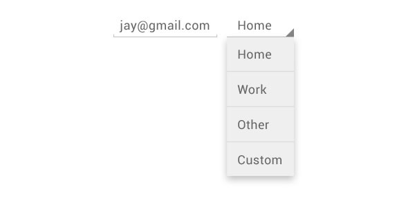
A drop-down menu is something you only find on Android. There are different use case in which a drop-down menu is a good fit. When you have many functionalities or a lot of content groups with inconsistent navigation, a drop-down menu is a viable solution to tackle the problem.
Back & Up

Since Android 4.0, there is a sticky navigation bar at the bottom of the screen. Apart from the recent button, the navigation bar also contains a back and up button. Tapping back bring the user to the previous screen while tapping up brings you to the upper level in the application's hierarchy.
For example, I could be swiping through different pieces of content in an application. The back button would bring me back to the previous item while tapping up would navigate me to the selection menu from which I’m able to select a new item. This is a powerful feature, which you should take into account while creating the information architecture of an application.
In Android, you generally don't see custom back buttons like the ones we usually see in the navigation bar in iOS applications.
Widgets
Android also supports widgets, which are completely absent on the iOS platform.
Exploring Design Patterns

Let's dive deeper in some of the design patterns on Android. In general, the best practices to create a user interface is to see how other applications solve a particular design problem and how standard interface elements can solve it.
For example, how do other applications display content? How do they handle user input? Or implement e-commerce? By looking at a few examples, you get an idea of the possible solutions to solve the design problem you're facing. Does this mean you should blatantly copy an existing application? Not really.
A well thought out app tries to solve a specific problem. Usually, your app tries to tackle a unique problem, which means that you need to figure out a suitable user flow.
The following list should give you an introduction to think about possible design patterns for your application:
- Show, don’t tell. Teaching users about the functionalities of your app should happen through actions rather than telling users. In general, tutorials should be avoided if possible.
- Focus. A screen should preferably have a single goal from the user's perspective.
- Encourage the exploration of diverse features through efficient navigation. Open five applications and see how each implements navigation. Learn the benefits and downsides of each implementation.
- Define the data model and user flow before building and designing your application.
- When building a new application, search for similar applications to learn from. What does the user flow look like? How is the user interface designed and how can it be improved?
- Applying design patterns boils down to thinking abstractly about building the most efficient application with a strong focus on the user flow and interface.
- Involve Android users in the design process to get early feedback and a fresh look on the current state of your design.
Conclusion
Learning more about Android design patterns means that you need to become more familiar with the Android platform. Creating a user interface that closely resembles the standards of the operating system means users have a greater sense of familiarity and an improved user experience.
Keep in mind that we only briefly touched the subject. There are many resources available that will help you improve your understanding of design patterns on Android. However, you learn most by creating user flows and user interfaces.


Comments