As a researcher who writes publications regularly, I'm frequently faced with the issue of producing neat graphs. This wasn't always easy for me, and I had to use the available tools in the best way I could, but I wasn't satisfied with the graphs I produced most of the time. I always used to wonder how other researchers produced their neat graphs!
This issue started to diminish after I came across Python's library, matplotlib, which produces such neat graphs. As mentioned on the library's website:
matplotlibis a python 2D plotting library which produces publication quality figures in a variety of hardcopy formats and interactive environments across platforms.matplotlibcan be used in python scripts, the python and ipython shell (ala MATLAB®* or Mathematica®), web application servers, and six graphical user interface toolkits.matplotlibtries to make easy things easy and hard things possible. You can generate plots, histograms, power spectra, bar charts, errorcharts, scatterplots, etc, with just a few lines of code.
In this tutorial, I'm going to show you how to install matplotlib, and then I'll walk you through some examples.
If you're interested in digging deeper into Python and learning how to use of the power of Python to handle data, why not check out these two courses:
Installing matplotlib
Installing matplotlib is very simple. I'm currently working on a Mac OS X machine, so I will show you how to install the library on that operating system. Please see the matplotlib installation page for more information on installing matplotlib on other operating systems.
matplotlib can be installed by running the following commands in your Terminal (I'm going to use pip, but you can use other tools):
curl -O https://bootstrap.pypa.io/get-pip.py
python get-pip.py
pip install matplotlib
That's it. You now have matplotlib up and running. Just as simple as that!
Drawing Basic Plots
Let's now look at some examples of using matplotlib. The first set of examples will be on drawing some basic plots.
Line Plot
Let's consider a simple example of drawing a line plot using matplotlib. In this case, we are going to use matplotlib.pyplot, which provides a MATLAB-like plotting framework. In other words, it provides a collection of command-style functions that enable matplotlib to work like MATLAB.
Let's say we wanted to plot a line for the following set of points:
x = (4,8,13,17,20)
y = (54, 67, 98, 78, 45)
This can be done using the following script:
import matplotlib.pyplot as plt
plt.plot([4,8,13,17,20],[54, 67, 98, 78, 45])
plt.show()
Notice that we represented the x and y points as lists.
In this case, the result will be as follows:
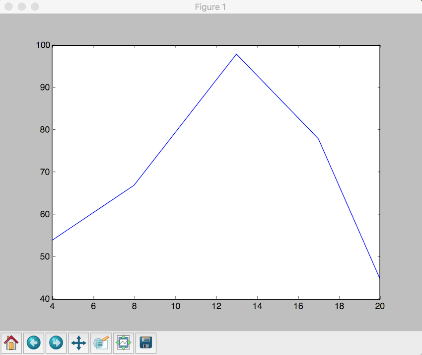
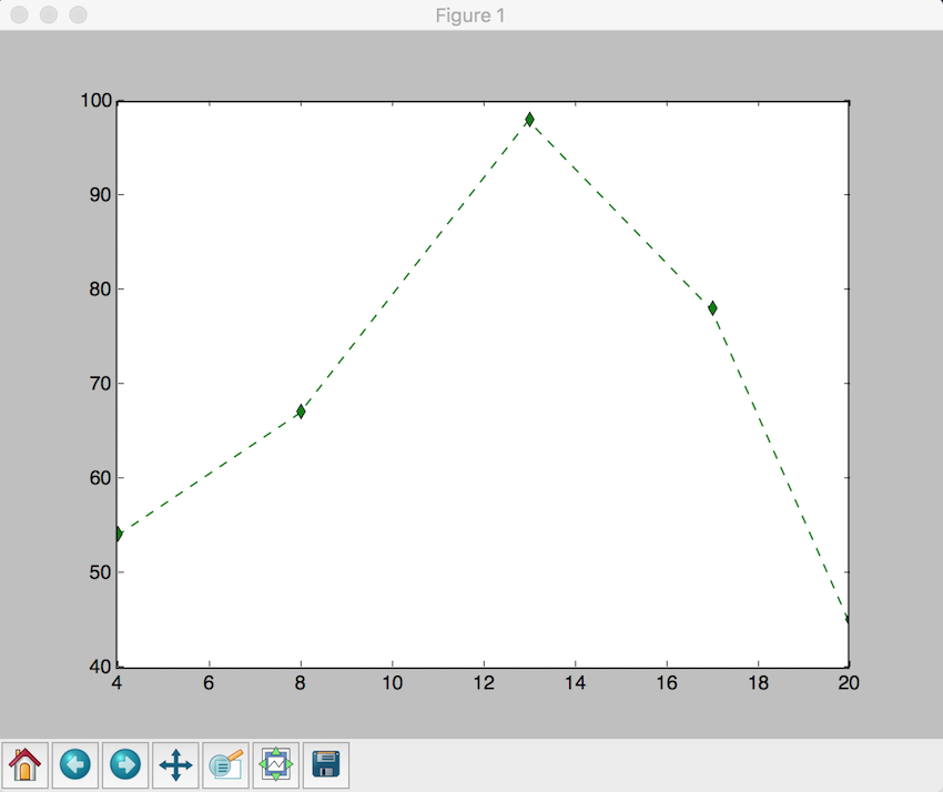
The line in the figure above is the default line that gets drawn for us, in terms of shape and color. We can customize that by changing the shape and color of the line using some symbols (specifiers) from the MATLAB plot documentation. So let's say we wanted to draw a green dashed line, with diamonds markers. The specifiers we need in this case are: 'g--d'. In our script above, we place the specifiers as follows:
plt.plot([4,8,13,17,20],[54, 67, 98, 78, 45],'g--d')
In which case, the figure line plot will look as follows:
Scatter Plot
A scatter plot is a graph that shows the relationship between two sets of data, such as the relationship between age and height. In this section, I'm going to show you how we can draw a scatter plot using matplotlib.
Let's take two sets of data, x and y, for which we want to find their relationship (scatter plot):
x = [2,4,6,7,9,13,19,26,29,31,36,40,48,51,57,67,69,71,78,88]
y = [54,72,43,2,8,98,109,5,35,28,48,83,94,84,73,11,464,75,200,54]
The scatter plot can be drawn using the following script:
import matplotlib.pyplot as plt
x = [2,4,6,7,9,13,19,26,29,31,36,40,48,51,57,67,69,71,78,88]
y = [54,72,43,2,8,98,109,5,35,28,48,83,94,84,73,11,464,75,200,54]
plt.scatter(x,y)
plt.show()
The output of this script is:
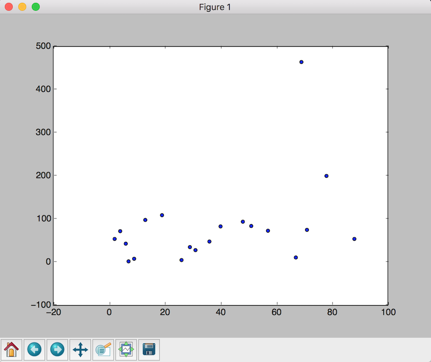
Of course, you can change the color of the markers in addition to other settings, as shown in the documentation.
Histograms
A histogram is a graph that displays the frequency of data using bars, where numbers are grouped in ranges. In other words, the frequency of each data element in the list is shown using the histogram. The grouped numbers in the form of ranges are called bins. Let's look at an example to understand this more.
Let's say that the list of data we want to find the histogram for is as follows:
x = [2,4,6,5,42,543,5,3,73,64,42,97,63,76,63,8,73,97,23,45,56,89,45,3,23,2,5,78,23,56,67,78,8,3,78,34,67,23,324,234,43,544,54,33,223,443,444,234,76,432,233,23,232,243,222,221,254,222,276,300,353,354,387,364,309]
The Python script we can use to display the histogram for the above data is:
import matplotlib.pyplot as plt
x = [2,4,6,5,42,543,5,3,73,64,42,97,63,76,63,8,73,97,23,45,56,89,45,3,23,2,5,78,23,56,67,78,8,3,78,34,67,23,324,234,43,544,54,33,223,443,444,234,76,432,233,23,232,243,222,221,254,222,276,300,353,354,387,364,309]
num_bins = 6
n, bins, patches = plt.hist(x, num_bins, facecolor = 'green')
plt.show()
When you run the script, you should get something similar to the following graph (histogram):
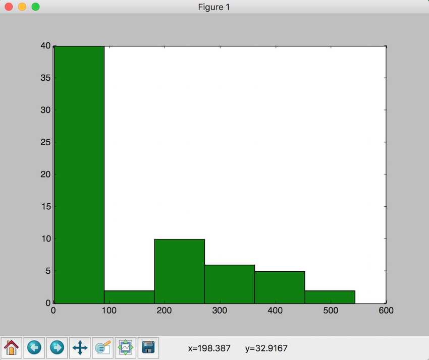
There are of course more parameters for the function hist(), as shown in the documentation.
Further Reading
This tutorial was a scratch on the surface for working with graphs in Python. There is more to matplotlib, and you can do many interesting things with this library.
If you want to learn more about matplotlib and see other types of figures you can create with this library, one place could be the examples section of the matplotlib website. There are also some interesting books on the topic, such as Mastering matplotlib and Matplotlib Plotting Cookbook.
Conclusion
As we saw in this tutorial, Python can be extended to perform interesting tasks by utilizing third-party libraries. I have shown an example of such a library, namely matplotlib.
As I mentioned in the introduction of this tutorial, producing neat-looking graphs wasn't an easy task for me, especially when you want to present such graphs in scientific publications. matplotlib gave the solution to this issue, because you are able not only to produce nice-looking graphs in an easy manner, but also to have the control (i.e. parameters) over such graphs since you are using a programming language to generate your graphs—in our case, Python.



Comments