Ever wondered how a large site like Tuts+ keeps its CSS, HTML and JavaScript in order over continued development and iteration? I’m going to show you the process we’ve implemented to keep it all tidy and maintainable.
Problems with CSS
The first step in this process was finding a way to build the large amount of CSS we need that won’t inevitably end in chaos.
Traditionally with CSS, you build up styles as you need them, and strive to make your selectors broadly applicable so that they can be reused throughout the site. For example, here’s some simple CSS rules that would not feel out of place in most stylesheets:
h1 { font-size: 22px; }
.subtitle { font-size: 18px; }
If you need to override these selectors in a specific part of a page, you might use nested rules to construct selectors that target more specific elements:
.site-header h1 { font-size: 40px; }
.site-header .subtitle { font-size: 28px; }
.site-header a.navigation { color: #136FD2 }
...
This approach feels intuitively correct, however it can have some significant problems once you get to a site that has more than a few pages, and which more than one developer is working on.
What happens when we change the styling of h1 or .subtitle at a global level? font-size is already being overridden by a more specific style, but if we add a font-weight or line-height it won’t be. Any changes made to the global styles can ripple out and affect more specific styles in ways that aren’t predictable without an intimate knowledge of all styles on the site.
The more styles built this way, the more pronounced the “side effects” of interacting CSS styles will be, requiring tiresome trial and error to put right, and ultimately resulting in a loss of productivity and more bugs creeping through to production.
BEM Modules
To help prevent this problem, we adopted an approach to CSS based on the BEM methodology. Instead of defining styles which apply globally, all styles are siloed into self-contained “blocks” by way of a naming convention. A “block” is defined, more or less, as a single free-standing unit of content that is potentially reusable (although it’s not mandatory that it actually be reused).
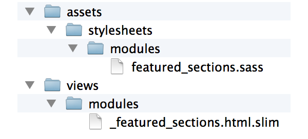
For example, let’s take a look at the “featured-sections” block:

According to our naming convention, this block has a root div element with the class name featured-sections. It contains elements with class names such as featured-sections__title and featured-sections__section-link.
We’re using a matching naming convention for our source code, as such all the styles for this featured-section block are stored in modules/featured_section.sass:
.featured-sections
  margin: 0 0 $gutter-width 0
  padding-top: 8px
  border-top: 4px solid #dae1e5

.featured-sections__title
  color: #8fa6b3
  font: bold 14px/1.2em $font
This naming convention ensures that styles no longer conflict and intermingle. As long as our naming convention is followed, with the block name at the start of each class name, it’s impossible for a style to affect something outside of its own block.
It also makes it super easy to work out where to look in the codebase for the styles corresponding to an element. You can simply look at the element’s class name, and you’ll know the name of the stylesheet to open.
Modular View Code
We’ve chosen to go further and apply this naming convention to our views, too. Each block has a view partial with the same name, stored under views/modules. For example the HTML view for our featured-sections block lives in views/modules/_featured_sections.html.slim:
In the same way that having a naming convention for our CSS files makes it easy to find a CSS style, having this naming convention for our views makes it easy to find view code. This comes in handy when you’re viewing a page in a browser and notice a specific part that needs some changes made. You can just do an “Inspect Element” and use the block name clearly visible in an element’s CSS class to help you jump right to the relevant view file.
Modular JavaScript
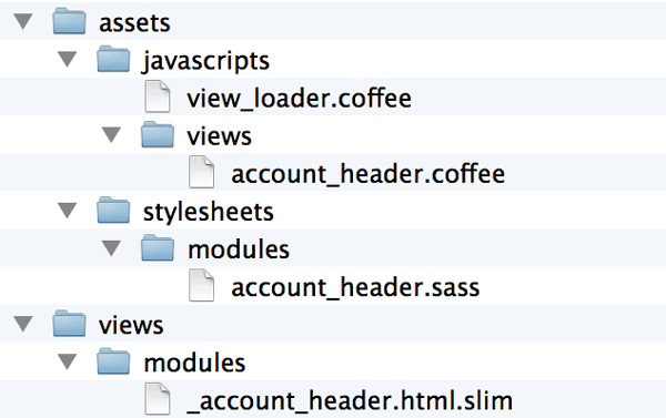
We’ve also gone ahead and adopted the same naming conventions for our JavaScript code, with a bit of help from Backbone.js.
Each block that needs JavaScript behavior applied gets a Backbone view object using this same block name:
class window.AccountHeader extends Backbone.View
  events:
    'change .account-header__mobile-menu-select': 'mobileMenuChange'

  mobileMenuChange: ->
    document.location = @_selectedOption().data('url')

  _selectedOption: ->
    @$ 'option:selected'
We’ve written some view loading code that gets applied on page load, so the appropriate Backbone view is automatically loaded for each element with a CSS class that matches a list of blocks names with associated JS.
We use the same file naming convention for our JavaScript code too, resulting in the structure for a fully-featured block looking like this:
General Applicability
I’d highly recommend this approach for any project. I think it’s invaluable when working on a large project, and even if you’re working on a much smaller site, there’s really no downside to structuring your front-end code in a modular way.
That said, you may encounter problems trying to use this strategy if you already have a significant amount of global CSS styles, or if you rely on CSS libraries like Twitter Bootstrap. Since BEM styles use a single class name as their selector, they have a very low CSS “specificity” value, and tend to get trampled on by global CSS styles that often have multiple levels of nested selectors, as well as tag names and IDs.
It’s definitely still possible to move from a global CSS style to a more modular BEM style, and I’d argue highly worth it in the long term. However, do expect to have a slightly harder time building your BEM styles for a while, and be prepared to live with adding a at least a few temporary !important declarations throughout your CSS, until you’re able to completely get rid of your global styles.

Comments