Twice a month, we revisit some of our readers’ favorite posts from throughout the history of Nettuts+.
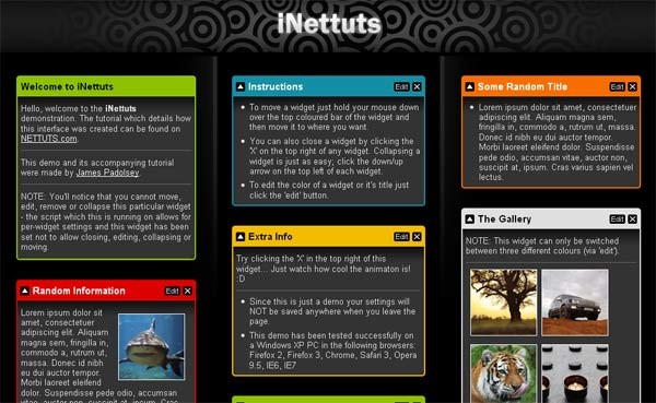
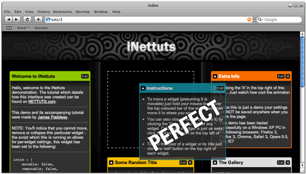
In this tutorial, I'll show you how to create a customizable interface with widgets. The finished product will be a sleek and unobtrusively coded iGoogle-like interface, which has plenty of potential applications!
The Plan
First, let's list exactly what we'll be creating here and what features it'll have:
- This interface will contain several widgets.
- Each widget can be collapsed, removed and edited.
- The widgets can be sorted into the three seperate columns by the user (using a drag and drop technique).
- The user will be able to edit the color and title of each widget.
- Each widget can contain any amount of regular HTML content, text, images, flash etc.
Please note that we will only be covering the front-end aspect of the project in this tutorial. Obviously you could integrate this UI with a solid server-side system which could take care of saving preferences and customised widgets.
Since it's all about the user and because the idea was influenced by iGoogle we're going to be calling this project 'iNettuts'.
The layout of iNettuts
The layout is a simple three column one; each column contains widgets:
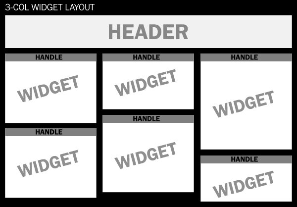
Each widget has a "handle" which the user can use to move the widget around.
jQuery UI
As well as the jQuery core library we're also going to make use of the jQuery's UI library and specifically the "sortable" and "draggable" modules. This will make it quite simple to add the drag-and-drop functionality that we want. You should get a personalized download of the UI library which has what we need in it. (Tick the 'sortable' box)
Step 1: XHTML markup
Each column will be an unordered list (UL) and each widget within the columns will be a list item (LI):
First column:
<ul id="column1" class="column">

    <li class="widget red">
        <div class="widget-head">
            <h3>Widget title</h3>
        </div>
        <div class="widget-content">

            <p>The content...</p>
        </div>
    </li>
    <li class="widget blue">
        <div class="widget-head">

            <h3>Widget title</h3>
        </div>
        <div class="widget-content">
            <p>The content...</p>

        </div>
    </li>
</ul>
The above code represents the first column, on the left and two widgets each within a list item. As shown in the plan, there will be three columns - three unordered lists.
Step 2: CSS
We'll be using two CSS StyleSheets, one of them will contain all the main styles and the second StyleSheet will only contain styles required by the JavaScript enhancements. The reason we seperate them like this is so that people without JavaScript enabled do not waste their bandwidth downloading styles which they're not going to use.
Here is inettuts.css:
/* Reset */
body,img,p,h1,h2,h3,h4,h5,h6,ul,ol {margin:0; padding:0; list-style:none; border:none;}
/* End Reset */

body {font-size:0.8em; font-family:Arial,Verdana,Sans-Serif; background: #000;}
a {color:white;}

/* Colours */
.color-yellow {background:#f2bc00;}
.color-red    {background:#dd0000;}
.color-blue   {background:#148ea4;}
.color-white  {background:#dfdfdf;}
.color-orange {background:#f66e00;}
.color-green  {background:#8dc100;}
.color-yellow h3,.color-white h3,.color-green h3
	{color:#000;}
.color-red h3,.color-blue h3,.color-orange h3
	{color:#FFF;}
/* End Colours */

/* Head section */
#head {
    background: #000 url(img/head-bg.png) repeat-x;
    height: 100px;
}
#head h1 {
    line-height: 100px;
    color: #FFF;
    text-align: center;
    background: url(img/inettuts.png) no-repeat center;
    text-indent: -9999em
}
/* End Head Section */

/* Columns section */
#columns .column {
    float: left;
    width: 33.3%;
		/* Min-height: */
		min-height: 400px;
		height: auto !important;
		height: 400px;
}

/* Column dividers (background-images) : */
	#columns #column1 { background: url(img/column-bg-left.png) no-repeat right top; }
	#columns #column3 { background: url(img/column-bg-right.png) no-repeat left top; }

#columns #column1 .widget { margin: 30px 35px 30px 25px; }
#columns #column3 .widget { margin: 30px 25px 30px 35px; }
#columns .widget {
    margin: 30px 20px 0 20px;
    padding: 2px;
    -moz-border-radius: 4px;
    -webkit-border-radius: 4px;
}
#columns .widget .widget-head {
    color: #000;
    overflow: hidden;
    width: 100%;
    height: 30px;
    line-height: 30px;
}
#columns .widget .widget-head h3 {
    padding: 0 5px;
    float: left;
}
#columns .widget .widget-content {
    background: #333 url(img/widget-content-bg.png) repeat-x;
    padding: 5px;
    color: #DDD;
    -moz-border-radius-bottomleft: 2px;
    -moz-border-radius-bottomright: 2px;
    -webkit-border-bottom-left-radius: 2px;
    -webkit-border-bottom-right-radius: 2px;
    line-height: 1.2em;
    overflow: hidden;
}
/* End Columns section */
There's nothing too complicated in the above StyleSheet. Normally it would be better to use images instead of the CSS3 border-radius property to create rounded corners (for cross-browser benefits) but they're not really an integral part of the layout - adding a border-radius is quick and painless.
Just a note about the colour classes: Ideally, elements should be named according to their semantic meaning or content, not their appearance. The problem is that the widgets can mean/contain many different things so having classes like this really is the best alternative, unless you're willing to add the colour styles inline. Each colour class is prefixed with 'color-'; it'll become clear why I've done this later in the tutorial.
In the above CSS we're also using a min-height hack for each column so that the background images (the dividers) remain intact and so that an empty column can still have widgets dragged back into it:
#columns .column {
    float: left;
    width: 33.3%;

	/* Min-height: */
		min-height: 400px;
		height: auto !important;
		height: 400px;
}
We'll focus on the second stylesheet later when we've added the JavaScript.
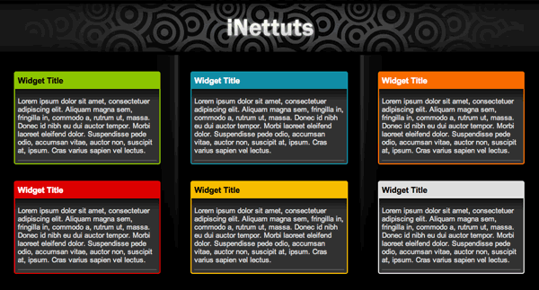
Here's a preview of what we've got so far, just CSS/HTML (and some images):
Step 3: JavaScript
Introduction
As I've said, we'll be using jQuery. It's the library of choice not only because of the UI modules it offers but also because it will help in speeding up the development process while keeping everything cross-browser operable.
The final product will have endless possibilities, some of which have already been explored by the likes of NetVibes and iGoogle. So, we want to make sure our code is easily maintainable, allows for expandability and is reusable; we want it to be future-proof!
We'll begin with a global object called "iNettuts" - this will act as the sole occupied namespace of the project (plus dependencies such as jQuery). Under it we will code up the main functionality of the site which utilises jQuery and its UI library.
inettuts.js:
var iNettuts = {
	settings : {
	   // Some simple settings will go here.
	},
	init : function(){
		// The method which starts it all...
	}
};
The init method will be called when the document is ready for manipulation (i.e. when the DOM is loaded and ready). While there are various methods available it has been proven that the quickest way to initialise your code upon this event is to call it from the bottom of your document. It also makes sense to link to all the scripts at the bottom so as not to slow down the loading of the rest of the page:
<body>

    <!-- page content -->


    <!-- Bottom of document -->
    <script type="text/javascript" src="http://jqueryjs.googlecode.com/files/jquery-1.2.6.min.js"></script>
    <script type="text/javascript" src="inettuts.js"></script>

    <script type="text/javascript" src="jquery-ui-personalized-1.6rc2.min.js"></script>

</body>
Settings
As I've said, there will be a settings object which will contain all of the global settings required to make this functional. We'll also have individual widget settings objects, this means it will be possible to create per-widget settings.
settings object (under iNettuts):
settings : {
	/* Specify selectors */
	columns : '.column',
	widgetSelector: '.widget',
	handleSelector: '.widget-head',
	contentSelector: '.widget-content',
	/* Settings for the Widgets: */
	widgetDefault : {
		movable: true,
		removable: true,
		collapsible: true,
		editable: true,
		colorClasses : ['yellow','red','blue','white','orange','green']
	},
	/* Individual Widget settings: */
	widgetIndividual : {
		intro : {
			movable: false,
			removable: false,
			collapsible: false
		},
		gallery : {
			colorClasses : ['yellow','red','white']
		}
	}
}
Yes, there are quite a lot of settings, but if we want maximum code reusability this is a necessity. Most of the above is self explanatory. As you can see we've setup a widgetDefault object which contains the default settings for each widget; if you want to override these settings then the script will require you to give the widget an id (in the HTML) and then create a new ruleset. We've got two rule-sets (objects) which override their defaults, 'intro' and 'gallery'. So, those rules specified in the "gallery" object will only apply to this widget:
<li class="widget blue" id="gallery">
    <div class="widget-head">
        <h3>Instructions</h3>
    </div>

    <div class="widget-content">
        <ul>
            <li>To move a widget...</li>
        </ul>
    </div>

</li>
Retrieving the settings
getWidgetSettings object (under iNettuts):
getWidgetSettings : function(id) {
	var settings = this.settings;
	return (id&&settings.widgetIndividual[id]) ?
		$.extend({},settings.widgetDefault,settings.widgetIndividual[id])
		: settings.widgetDefault;
}
This method will return an object with the settings of any particular widget. If a widget has no id (HTML attribute) then it will just return the default settings, otherwise it will look to see if that widget has settings of its own, if it does then it will return the default settings and that widget's settings merged into a single object (the widget's individual settings have precedence).
Attaching a CSS file using JavaScript
I mentioned earlier that we have an additional stylesheet which the JavaScript enhancements will require.
Here's the StyleSheet (inettuts.js.css):
/* JS-Enabled CSS */

.widget-head a.remove  {
    float: right;
    display: inline;
    background: url(img/buttons.gif) no-repeat -24px 0;
    width: 14px;
    height: 14px;
    margin: 8px 4px 8px 0;
    text-indent: -9999em;
    outline: none;
}

.widget-head a.edit  {
    float: right;
    display: inline;
    background: url(img/buttons.gif) no-repeat;
    width: 24px;
    height: 14px;
    text-indent: -9999em;
    margin: 8px 4px 8px 4px;
    outline: none;
}

.widget-head a.collapse  {
    float: left;
    display: inline;
    background: url(img/buttons.gif) no-repeat -52px 0;
    width: 14px;
    height: 14px;
    text-indent: -9999em;
    margin: 8px 0 8px 4px;
    outline: none;
}

.widget-placeholder { border: 2px dashed #999;}
#column1 .widget-placeholder { margin: 30px 35px 0 25px; }
#column2 .widget-placeholder { margin: 30px 20px 0 20px; }
#column3 .widget-placeholder { margin: 30px 25px 0 35px; }

.edit-box {
    overflow: hidden;
    background: #333 url(img/widget-content-bg.png) repeat-x;
    margin-bottom: 2px;
    padding: 10px 0;
}

.edit-box li.item {
    padding: 10px 0;
    overflow: hidden;
    float: left;
    width: 100%;
    clear: both;
}

.edit-box label {
    float: left;
    width: 30%;
    color: #FFF;
    padding: 0 0 0 10px;
}

.edit-box ul.colors li {
    width: 20px;
    height: 20px;
    border: 1px solid #EEE;
    float: left;
    display: inline;
    margin: 0 5px 0 0;
    cursor: pointer;
}
The elements targetted in the above StyleSheet have yet to be coded, but eventually we will write the JavaScript which dynamically adds these elements to the page, thus making use of the StyleSheet.
The method which attaches this StyleSheet is called 'attachStylesheet':
attachStylesheet : function (href) {
    return $('<link href="' + href + '" rel="stylesheet" type="text/css" />').appendTo('head');
}
The above method appends a link to the head of the document. When a new link element is added to the document through the DOM the browser will load it and apply its CSS rules as it would for any regular hard-coded linked StyleSheet. When doing this, remember that the rules of CSS inheritance and specificity still apply.
Making the widgets work

The next part of the tutorial is probably the hardest, so take it slowly.
We want to add another method to our global iNettuts object, we'll call it makeSortable:
makeSortable : function () {
    // This function will make the widgets 'sortable'!
}
By the way, 'method' is just a fancy name given to 'functions' which have been assigned to object properties. In this case our object is called 'iNettuts' so 'makeSortable' is a method of 'iNettuts'...
This new method will take the settings we specified in the 'settings' object and make the required element sortable.
First, we want to make sure everything we need is easily accessible within this new method:
makeSortable : function () {
    var iNettuts = this, // *1
        $ = this.jQuery, // *2
        settings = this.settings; // *3
}
*1: There will only be one instance of our global object, but just encase multiple instances need to be made or if we want to rename the global object it's a good idea to set a new variable (in this case 'iNettuts') to the 'this' keyword which references the object that this method is within. Be careful, the 'this' keyword is a bit of a beast and doesn't always reference what you think it does!
*2: At the very top of the iNettuts object we've placed a new property: 'jQuery : $'. In the pursuit of maximum code reusability we don't want our script to conflict with any other libraries that also make use of the dollar-sign symbol (e.g. The Prototype library). So, for example, if you renamed jQuery to JQLIB then you could change the 'jQuery' property to JQLIB and the script would continue to function properly. The 2nd line in the above code isn't necessary at all, - if we didn't want it we could just use this.jQuery().ajQueryFunction() instead of $() within this method.
*3: Again, this isn't really necessary, we're just creating a bit of a shortcut, so instead of having to type out 'this.settings' within this method we only need to type out 'settings'.
The next step is to define a set of sortable items (i.e. the widgets that will be movable). Remember, back in the settings we made it possible to set a property called 'movable' to true or false. If 'movable' is set to false, either by default or on individual widgets we have to cater for that:
/*
 * (using the dollar prefix on $sortableItems is a convention when a variable references a jQuery object)
 */

$sortableItems = (function () {

    // Define an empty string which can add to within the loop:
    var notSortable = '';

    // Loop through each widget within the columns:
    $(settings.widgetSelector,$(settings.columns)).each(function (i) {

        // If the 'movable' property is set to false:
        if (!iNettuts.getWidgetSettings(this.id).movable) {

            // If this widget has NO ID:
            if(!this.id) {

                // Give it an automatically generated ID:
                this.id = 'widget-no-id-' + i;

            }

            // Add the ID to the 'notSortable' string:
            notSortable += '#' + this.id + ',';
        }

    });

    /*
    * This function will return a jQuery object containing
    * those widgets which are movable.
    */
    return $('> li:not(' + notSortable + ')', settings.columns);
})();
Now we've got a set of DOM elements referenced in the jQuery object which is returned from the above functions. We can make immediate use of this:
$sortableItems.find(settings.handleSelector).css({
	cursor: 'move'
}).mousedown(function (e) {
	$(this).parent().css({
		width: $(this).parent().width() + 'px'
	});
}).mouseup(function () {
	if(!$(this).parent().hasClass('dragging')) {
		$(this).parent().css({width:''});
	}
});
So, we're looking for what has been defined as the 'handle' within the movable widgets (within sortableItems) and then we're applying a new CSS cursor property of 'move' to each one; this is to make it obvious that each widget is movable.
The mousedown and mouseup functions are needed to work around some issues with dragging and dropping... Since we want this page and all the elements inside it to expand when the browser is resized we haven't set any explicit widths on the widgets (list items). When one of these list items is being sorted it becomes absolutely positioned (while being dragged) which means that it will stretch to its content's composite width. Here's an example:
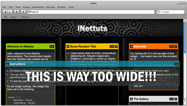
This is what should be happening:
To make this happen we have explicitly set the widget's width to what it was before dragging had begun. The UI 'sortable' module does have a property in which you can put a function that will run when a widget starts being sorted (i.e. when it starts being dragged), unfortunately this is not good enough for us because it runs too late; we need to set the width before the 'sortable' module takes hold - the best way to do this is by running a function on mousedown of the handle (the 'handle', in this case, is the bar at the top of each widget).
// mousedown function:
// Traverse to parent (the widget):
$(this).parent().css({
    // Explicitely set width as computed width:
    width: $(this).parent().width() + 'px'
});
If we leave it like this then when you drop the widget in a certain place and res
the browser the widget will not change in size. In order to prevent this we need to write a function to be tied to the mouseup event of the handle:
// mouseup function:
// Check if widget is currently in the process of dragging:
if(!$(this).parent().hasClass('dragging')) {
    // If it's not then reset width to '':
    $(this).parent().css({width:''});
} else {
    // If it IS currently being dragged then we want to
    // temporarily disable dragging, while widget is
    // reverting to original position.
    $(settings.columns).sortable('disable');
}
The 'dragging' class is added on that 'start' property of the sortable module which we talked about earlier. (we'll write that code later)
This is what our makeSortable method looks like so far:
makeSortable : function () {
    var iNettuts = this,
        $ = this.jQuery,
        settings = this.settings,

        $sortableItems = (function () {
            var notSortable = '';
            $(settings.widgetSelector,$(settings.columns)).each(function (i) {
                if (!iNettuts.getWidgetSettings(this.id).movable) {
                    if(!this.id) {
                        this.id = 'widget-no-id-' + i;
                    }
                    notSortable += '#' + this.id + ',';
                }
            });
            return $('> li:not(' + notSortable + ')', settings.columns);
        })();

    $sortableItems.find(settings.handleSelector).css({
        cursor: 'move'
    }).mousedown(function (e) {
        $sortableItems.css({width:''});
        $(this).parent().css({
            width: $(this).parent().width() + 'px'
        });
    }).mouseup(function () {
        if(!$(this).parent().hasClass('dragging')) {
            $(this).parent().css({width:''});
        } else {
            $(settings.columns).sortable('disable');
        }
    });
}
Next, still within 'makeSortable' we need to initialise the 'sortable' module:
makeSortable : function () {
    // ...........................
    // BEGINNING OF METHOD (above)
    // ...........................

    // Select the columns and initiate 'sortable':
    $(settings.columns).sortable({

        // Specify those items which will be sortable:
        items: $sortableItems,

        // Connect each column with every other column:
        connectWith: $(settings.columns),

        // Set the handle to the top bar:
        handle: settings.handleSelector,

        // Define class of placeholder (styled in inettuts.js.css)
        placeholder: 'widget-placeholder',

        // Make sure placeholder size is retained:
        forcePlaceholderSize: true,

        // Animated revent lasts how long?
        revert: 300,

        // Delay before action:
        delay: 100,

        // Opacity of 'helper' (the thing that's dragged):
        opacity: 0.8,

        // Set constraint of dragging to the document's edge:
        containment: 'document',

        // Function to be called when dragging starts:
        start: function (e,ui) {
            $(ui.helper).addClass('dragging');
        },

        // Function to be called when dragging stops:
        stop: function (e,ui) {

            // Reset width of units and remove dragging class:
            $(ui.item).css({width:''}).removeClass('dragging');

            // Re-enable sorting (we disabled it on mouseup of the handle):
            $(settings.columns).sortable('enable');

        }

    });

}
The above options setup the behaviour we want for our sortable widgets. There are plenty more available options for this module but those above will be sufficient for now.
Editing, removing and collapsing widgets
The next step is to make it possible for the user to collapse widgets, close (remove) widgets and edit certain elements within each widget.
We're going to put this all within one method, we'll call it 'addWidgetControls':
addWidgetControls : function () {
    // This function will add controls to each widget!
}
As with 'makeSortable' we want to set the following variables at the start:
addWidgetControls : function () {
    var iNettuts = this,
        $ = this.jQuery,
        settings = this.settings;
}
We need to loop through every widget on the page and add functionality dependent on the default settings or the settings made for any particular widget.
// Loop through each widget:
$(settings.widgetSelector, $(settings.columns)).each(function () {

	/* Merge individual settings with default widget settings */
	var thisWidgetSettings = iNettuts.getWidgetSettings(this.id);

	// (if "removable" option is TRUE):
	if (thisWidgetSettings.removable) {

		// Add CLOSE (REMOVE) button & functionality

	}

	// (if "removable" option is TRUE):
	if (thisWidgetSettings.editable) {

		// Add EDIT button and functionality

	}

	// (if "removable" option is TRUE):
	if (thisWidgetSettings.collapsible) {

		// Add COLLAPSE button and functionality

	}

});
As you can see from the above code, we're checking the settings before adding any one of the three buttons and each button’s corresponding functionality.
Before we write out exactly what will happen within each of three conditions let's list exactly what each of these buttons will do:
- CLOSE (remove): This button will remove the widget from the DOM. Instead of just removing it immediately we'll apply an effect which will fade out he widget and then slide up its occupied space.
- EDIT: This button, when clicked, will bring up an 'edit box' section within the widget. Within this 'edit' section the user can change the title of the widget and its colour. To close the 'edit' section the user must click on the same 'edit' button again - so basically this button toggles the 'edit' section.
- COLLAPSE: This button switches between an up-arrow and a down-arrow dependent whether the widget is collapsed or not. Collapsing a widget will simply hide its content, so the only viewable of the widget will be the handle (the bar at the top of each widget).
We know what we want now, so we can start writing it: (The snippets below are riddles with comments so make sure you read through the code!)
CLOSE (remove):
// (if "removable" option is TRUE):
if (thisWidgetSettings.removable) {

    // Create new anchor element with class of 'remove':
    $('<a href="#" class="remove">CLOSE</a>').mousedown(function (e) {

        // Stop event bubbling:
        e.stopPropagation();

    }).click(function () {

        // Confirm action - make sure that the user is sure:
        if(confirm('This widget will be removed, ok?')) {

            // Animate widget to an opacity of 0:
            $(this).parents(settings.widgetSelector).animate({
                opacity: 0
            },function () {

                // When animation (opacity) has finished:
                // Wrap in DIV (explained below) and slide up:
                $(this).wrap('<div/>').parent().slideUp(function () {

                    // When sliding up has finished, remove widget from DOM:
                    $(this).remove();

                });
            });
        }

        // Return false, prevent default action:
        return false;

    })

    // Now, append the new button to the widget handle:
    .appendTo($(settings.handleSelector, this));

}
EDIT:
/* (if "editable" option is TRUE) */
if (thisWidgetSettings.editable) {

    // Create new anchor element with class of 'edit':
    $('<a href="#" class="edit">EDIT</a>').mousedown(function (e) {

        // Stop event bubbling
        e.stopPropagation();

    }).toggle(function () {
        // Toggle: (1st state):

        // Change background image so the button now reads 'close edit':
        $(this).css({backgroundPosition: '-66px 0', width: '55px'})

            // Traverse to widget (list item):
            .parents(settings.widgetSelector)

                // Find the edit-box, show it, then focus <input/>:
                .find('.edit-box').show().find('input').focus();

        // Return false, prevent default action:
        return false;

    },function () {
        // Toggle: (2nd state):

        // Reset background and width (will default to CSS specified in StyleSheet):
        $(this).css({backgroundPosition: '', width: ''})

            // Traverse to widget (list item):
            .parents(settings.widgetSelector)

                // Find the edit-box and hide it:
                .find('.edit-box').hide();
        // Return false, prevent default action:
        return false;

    })

    // Append this button to the widget handle:
    .appendTo($(settings.handleSelector,this));

    // Add the actual editing section (edit-box):
    $('<div class="edit-box" style="display:none;"/>')
        .append('<ul><li class="item"><label>Change the title?</label><input value="' + $('h3',this).text() + '"/></li>')
        .append((function(){

            // Compile list of available colours:
            var colorList = '<li class="item"><label>Available colors:</label><ul class="colors">';

            // Loop through available colors - add a list item for each:
            $(thisWidgetSettings.colorClasses).each(function () {
                colorList += '<li class="' + this + '"/>';
            });

            // Return (to append function) the entire colour list:
            return colorList + '</ul>';

        })())

        // Finish off list:
        .append('</ul>')

        // Insert the edit-box below the widget handle:
        .insertAfter($(settings.handleSelector,this));

}
COLLAPSE:
// (if 'collapsible' option is TRUE)
if (thisWidgetSettings.collapsible) {

    // Create new anchor with a class of 'collapse':
    $('<a href="#" class="collapse">COLLAPSE</a>').mousedown(function (e) {

        // Stop event bubbling:
        e.stopPropagation();


    }).toggle(function () {
        // Toggle: (1st State):

        // Change background (up-arrow to down-arrow):
        $(this).css({backgroundPosition: '-38px 0'})

            // Traverse to widget (list item):
            .parents(settings.widgetSelector)
                // Find content within widget and HIDE it:
                .find(settings.contentSelector).hide();

        // Return false, prevent default action:
        return false;

    },function () {
        // Toggle: (2nd State):

        // Change background (up-arrow to down-arrow):
        $(this).css({backgroundPosition: ''})

            // Traverse to widget (list item):
            .parents(settings.widgetSelector)

                // Find content within widget and SHOW it:
                .find(settings.contentSelector).show();

        // Return false, prevent default action:
        return false;

    })

    // Prepend that 'collapse' button to the widget's handle:
    .prependTo($(settings.handleSelector,this));
}
What is "Event Bubbling"?
Event bubbling or 'propagation' is when, upon clicking on an element, the event will bubble up through the DOM to the highest level element with an event the same as the event you just triggered on the original element. If we didn't stop propogation in the above snippets (e.stopPropagation();) on the mouseDown event of each added button then the mouseDown event of the handle (parent of the buttons) would also trigger and thus the dragging would would begin just by holding your mouse down over one of the buttons - we don't want this to happen; we only want dragging to begin when the user puts their mouse directly over the handle and pushes down.
Edit-box events/functionality
We've written the code which will inject the edit boxes into the document in the correct places. - We added an input box so users can change the title of a widget and we also added a list of available colours. So, we now need to loop through each new edit-box (hidden from view) and specify how these elements can be interacted with:
// Loop through each edit-box (under each widget that has an edit-box)
$('.edit-box').each(function () {

    // Assign a function to the onKeyUp event of the input:
    $('input',this).keyup(function () {

        // Traverse UP to widget and find the title, set text to
        // the input element's value - if the value is longer
        // than 20 characters then replace remainder characters
        // with an elipsis (...).
        $(this).parents(settings.widgetSelector).find('h3').text( $(this).val().length>20 ? $(this).val().substr(0,20)+'...' : $(this).val() );

    });

    // Assing a function to the Click event of each colour list-item:
    $('ul.colors li',this).click(function () {

        // Define colorStylePattern to match a class with prefix 'color-':
        var colorStylePattern = /\bcolor-[\w]{1,}\b/,

            // Define thisWidgetColorClass as the colour class of the widget:
            thisWidgetColorClass = $(this).parents(settings.widgetSelector).attr('class').match(colorStylePattern)
        // If a class matching the pattern does exist:
        if (thisWidgetColorClass) {

            // Traverse to widget:
            $(this).parents(settings.widgetSelector)

                // Remove the old colour class:
                .removeClass(thisWidgetColorClass[0])

                // Add new colour class (n.b. 'this' refers to clicked list item):
                .addClass($(this).attr('class').match(colorStylePattern)[0]);

        }

        // Return false, prevent default action:
        return false;

    });
});
The edit-boxes are entirely functional now. All the above code resides in the 'addWidgetControls' method.
addWidgetControls : function () {
    var iNettuts = this,
        $ = this.jQuery,
        settings = this.settings;

    $(settings.widgetSelector, $(settings.columns)).each(function () {
        var thisWidgetSettings = iNettuts.getWidgetSettings(this.id);

        if (thisWidgetSettings.removable) {
            $('<a href="#" class="remove">CLOSE</a>').mousedown(function (e) {
                e.stopPropagation();
            }).click(function () {
                if(confirm('This widget will be removed, ok?')) {
                    $(this).parents(settings.widgetSelector).animate({
                        opacity: 0
                    },function () {
                        $(this).wrap('<div/>').parent().slideUp(function () {
                            $(this).remove();
                        });
                    });
                }
                return false;
            }).appendTo($(settings.handleSelector, this));
        }

        if (thisWidgetSettings.editable) {
            $('<a href="#" class="edit">EDIT</a>').mousedown(function (e) {
                e.stopPropagation();
            }).toggle(function () {
                $(this).css({backgroundPosition: '-66px 0', width: '55px'})
                    .parents(settings.widgetSelector)
                        .find('.edit-box').show().find('input').focus();
                return false;
            },function () {
                $(this).css({backgroundPosition: '', width: ''})
                    .parents(settings.widgetSelector)
                        .find('.edit-box').hide();
                return false;
            }).appendTo($(settings.handleSelector,this));
            $('<div class="edit-box" style="display:none;"/>')
                .append('<ul><li class="item"><label>Change the title?</label><input value="' + $('h3',this).text() + '"/></li>')
                .append((function(){
                    var colorList = '<li class="item"><label>Available colors:</label><ul class="colors">';
                    $(thisWidgetSettings.colorClasses).each(function () {
                        colorList += '<li class="' + this + '"/>';
                    });
                    return colorList + '</ul>';
                })())
                .append('</ul>')
                .insertAfter($(settings.handleSelector,this));
        }

        if (thisWidgetSettings.collapsible) {
            $('<a href="#" class="collapse">COLLAPSE</a>').mousedown(function (e) {
                e.stopPropagation();
            }).toggle(function () {
                $(this).css({backgroundPosition: '-38px 0'})
                    .parents(settings.widgetSelector)
                        .find(settings.contentSelector).hide();
                return false;
            },function () {
                $(this).css({backgroundPosition: ''})
                    .parents(settings.widgetSelector)
                        .find(settings.contentSelector).show();
                return false;
            }).prependTo($(settings.handleSelector,this));
        }
    });

    $('.edit-box').each(function () {
        $('input',this).keyup(function () {
            $(this).parents(settings.widgetSelector).find('h3').text( $(this).val().length>20 ? $(this).val().substr(0,20)+'...' : $(this).val() );
        });
        $('ul.colors li',this).click(function () {

            var colorStylePattern = /\bcolor-[\w]{1,}\b/,
                thisWidgetColorClass = $(this).parents(settings.widgetSelector).attr('class').match(colorStylePattern)
            if (thisWidgetColorClass) {
                $(this).parents(settings.widgetSelector)
                    .removeClass(thisWidgetColorClass[0])
                    .addClass($(this).attr('class').match(colorStylePattern)[0]);
            }
            return false;

        });
    });

}
Almost finished
Now that we've written most of the JavaScript we can write the initiating method and intialise the script!
// Additional method within 'iNettuts' object:
init : function () {
	this.attachStylesheet('inettuts.js.css');
	this.addWidgetControls();
	this.makeSortable();
}
Now, to start it all:
// Right at the very end of inettuts.js
iNettuts.init();
Just so we're clear, this is the overall structure of our iNettuts object with each of its methods explained:
var iNettuts = {

    /* Set's jQuery identifier: */
    jQuery : $,

    settings : {

		/*    Name : settings
		 *    Type : Object
		 * Purpose : Object to store preferences for widget behaviour
		 */

    },

    init : function () {

		/*    Name : init
		 *    Type : Function
		 * Purpose : Initialise methods to be run when page has loaded.
		 */

    },

    getWidgetSettings : function (id) {

		/*      Name : getWidgetSettings
		 *      Type : Function
		 * Parameter : id of widget
		 *   Purpose : Get default and per-widget settings specified in
		 *             the settings object and return a new object
		 *             combining the two, giving per-widget settings
		 *             precedence obviously.
		 */

    },

    addWidgetControls : function () {

		/*    Name : settings
		 *    Type : Function
		 * Purpose : Adds controls (e.g. 'X' close button) to each widget.
		 */

    },

    attachStylesheet : function (href) {

		/*      Name : settings
		 *      Type : Function
		 * Parameter : href location of stylesheet to be added
		 *   Purpose : Creates new link element with specified href and
		 *             appends to <head>
		 */

    },

    makeSortable : function () {

		/*    Name : settings
		 *    Type : Function
		 * Purpose : Makes widgets sortable (draggable/droppable) using
		 *           the jQuery UI 'sortable' module.
		 */

    }

};
Finished!

We're totally finished, the interface should be totally operable now. I've tested it on my PC (running Windows XP) in the following browsers: Firefox 2, Firefox 3, Opera 9.5, Safari 3, IE6, IE7 & Chrome.
Note: There are a couple of issues in IE. Specifically, it doesn't set the placeholder size correctly plus there are some CSS issues in IE6 (to be expected).
At first glance this interface's potential applications seem limited to those like iGoogle or NetVibes but it can, in fact, be used for many different things.
- You could, for example use it on your blog by giving the user the option to sort your blog's widgets in the sidebar - you could then save their preference to a cookie so that the widgets would be in the same order when the user returns.
- If you add a user authentication system and a database then you've got yourself a simple iGoogle.
- The 'sortable' plugin itself can be used for sorting any elements, they don't have to be widgets.
Regardless of whether you're going to use this in a project or not I hope you've learnt something today!


Comments