Web Components are currently and excitedly being talked about as an upcoming "tectonic shift for web development" with the promise of permanently reshaping the web design landscape. Big players are moving forward to bring web components into reality. Both Google and Mozilla are already gradually rolling out native browser support.
What are web components you ask? In a nutshell, web components give you a way to create your own custom HTML elements which can do just about anything you need them to. Instead of loading up your sites with verbose markup, long scripts and repetitive code, you wrap everything up into nice, neat little custom HTML elements.
Understanding Web Components
The easiest way to understand how web components allow for custom HTML elements is to first look at an existing element we already know from HTML5: the <video> tag. Using this element you can place a video with just a few of lines of code, for example:

You may only be seeing a few lines of HTML above, but here's what the <video> element really looks like behind the scenes:
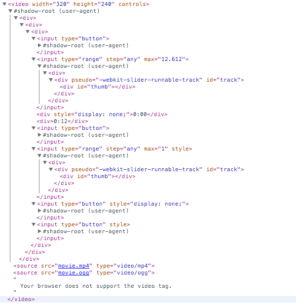
By default, the browser hides all that verbose code so you don't need to see it or worry about writing it when you want to place a video. You just whack in your <video> and <source> tags and you're up and running.
Previously, only browser vendors could create elements in this way. But imagine if you could use this same approach yourself with other types of content?
Take an image slideshow for example. Typically you would need a few rounds of nested divs bearing specific class names to handle wrapping the slideshow, wrapping each slide and adding captions and thumbnails. You'd also need to set any overall slideshow options for things like slide transition effects via some inline jQuery / JavaScript.
What if you could skip all that and instead just use:
<slide-show transition="fade">
<slide src="slideone.jpg" thumb="slideone_thumb.jpg" caption="Look at this image">
<slide src="slidetwo.jpg" thumb="slidetwo_thumb.jpg" caption="Look at this other image">
</slide-show>
With web components, that's exactly what you can do.
Create Your Own HTML Elements
If you want to provide a concise, easy to interact with method of placing content that would otherwise be bloated and unwieldy you can go ahead and create your own web component.
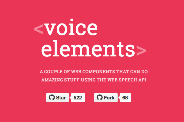
Web components can also be easily shared, so as developers get on board there's a good bet you'll be able to just grab a prebuilt web component for the most common project requirements. Already we're seeing freely shared components pop up for everything from voice recognition..
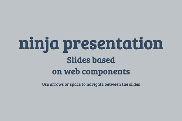

Let's take a look at what's behind the curtain of web components.
What Makes a Web Component
Web components, as they exist at the moment, are made up of four pieces:
- Custom Elements
- Shadow DOM
- Templates
- HTML Imports
Custom Elements
Custom elements are exactly what they sound like: elements that can be named anything you choose, and operate in any way you want. And when I say anything any way, I really mean it. For example, I present the <x-gangnam-style> element:

Custom elements are declared, in their simplest form, like so:
<element name="x-gangnam-style">
...
</element>
When you create a custom element you can do it completely from scratch, or you can extend an existing HTML element, such as <button> for example, and give it the modified functionality or presentation you need.
<element name="custom-button" extends="button">
...
</element>
Note: it's worth pointing out that the <element> tag was deprecated in 2013 because of complications. It may make a return, but in the meantime there are polyfill options, which we'll talk about in a moment. Thanks to Addy Osmani for pointing that out!
The Shadow DOM
The Shadow DOM is really the core aspect of how web components work. Earlier, we looked at the HTML5 <video> element and showed how, despite only seeing a few lines of code, in reality there is quite a bit of code hidden by default. The place this hidden code lives is called the "Shadow DOM".
Browser vendors have been using this shadow DOM for years to natively implement elements such as input, audio, video and so on. Through web components it can now be utilized by any developer.
The general idea is that you take all the code that doesn't really need to be seen during markup placement and obscure it in the Shadow DOM so it doesn't get in the way. This leaves you only having to deal with the pertinent information, for example the height, width and source file locations when using the <video> element.
One of the coolest things about working with the Shadow DOM is that each instance is its own little self contained world. So if you have styling and scripts inside the element they won't accidentally leak out and effect anything else on the page.
Conversely, CSS and JavaScript elsewhere on the page won't effect your web component, with the exception of style hooks you might specifically create in order to allow external CSS targeting. All that means no more worrying about namespacing your ID and class names to avoid conflicts.
If you want to see what the shadow DOM looks like, it's easy. Make sure you're running an up to date installation of Chrome, open the Dev Tools, click the gear icon to open settings and check the box labelled Show user agent shadow DOM:
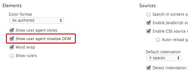
Then when you inspect any element with a shadow DOM you'll see its full code. Try it out by inspecting the <x-gangnam-style> element with and without the shadow DOM showing: http://html5-demos.appspot.com/gangnam
For a full rundown on the shadow DOM check out: Intro to Shadow DOM
Templates
We've already covered how custom elements allow just the pertinent information to be focused on while all the remaining code is obscured in the shadow DOM. A template within a web component is what holds all the presentational elements of that remaining code.
As part of the code that defines the web component the tags <template>...</template> are placed, and in between those tags any HTML and CSS the component needs is included.
For example, take a look at the code that created the <x-gangnam-style> web component. Its opening <template> tag is on line 4 and its closing </template> tag is on line 201. In between those tags you'll see all the CSS responsible for creating the positioning and animation, and the HTML that places each of the images involved.
HTML Imports
HTML imports allow you to take everything described above and actually make it work on your page. Web components are defined within an external HTML file, so that file needs to be imported in order for a custom element to work. HTML imports handle this via a <link> tag, which you'll be familiar with from importing external CSS files.
For example, before you could use the <x-gangnam-style> web component you'd have to import the HTML file that defines it, like so:
<link rel="import" href="/components/x-gangnam-style.html">
Browser Support and Polyfills
The possibilities offered by web components make the idea of diving head first into using them very appealing, however at the moment the browser support is not yet workable. The current state of support looks like this:
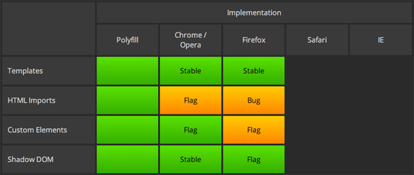
Native support is in the process of being implemented for Chrome, Opera and Firefox but is not yet complete. IE and Safari haven't yet made their plans known, however it's thought that given the majority of browsers will support web components ultimately the other browsers will probably follow suit.
Right now, if you want to start working with web components you'll need to use one of the available polyfills. The good news is two of the most popular solutions are created by Google and Mozilla, so we can expect to see some consistency with how native support will ultimately operate.
Polymer by Google
It's hard not to lean towards using Polymer given Chrome is now the most widely used browser, and you might assume consideration will be given during development as to how web component code will be indexed by Google.

Polymer comes with a full library of prebuilt web components. It includes the "Polymer Core elements" which are functionally oriented, and the "Paper elements" which are design oriented.
When creating custom elements with Polymer, instead of using the format <element name="..."> you use <polymer-element name="...">.
Polymer describes itself as being in "developer preview" rather than absolutely production ready, however they also say
...despite the label many people have already had success using Polymer in production.
Browser Support
- Chrome Android
- Chrome
- Canary
- Firefox
- IE 10+
- Safari 6+
- Mobile Safari
If you need to cater for IE9, which is estimated to hold around 1.9% to 5.11% of market share, unfortunately you're out of luck with Polymer. However, you can still go with Mozilla's X-Tags instead.
X-Tags by Mozilla
X-Tags is a JavaScript library created by Mozilla that, currently, has an advantage over Polymer in that its browser support is wider reaching. If that's a major consideration for you X-Tags may be your preference.

Browser Support
- Firefox 5+ desktop & mobile
- Chrome 4+
- Chrome Android 2.1+
- Safari 4+ desktop & mobile
- IE9+
- Opera 11+ desktop & mobile
IE8 Support
Right now, if you need to support IE8 then unfortunately web components aren't likely to be for you as the available polyfills support IE9+. Estimates are that IE8 users are at around 2.1% to 3.82%, but of course if your own stats say differently you'll have to make a judgement call on how far back your browser support should stretch.
Ember.js and AngularJS Components
One possible way you can prepare yourself to transition into using web components is to work with Ember.js or AngularJS for the time being. Both have their own systems of component creation and both promise to transition into utilizing native web component code when it becomes fully available.
Community Created Components
Learn More
- WebComponents.org
- Using Polymer to Create Web Components
- Sharing Polymer Components: Part 1
- Sharing Polymer Components: Part 2
- Web Components: A Tectonic Shift for Web Development
- Introduction to Web ComponentsIntro to Shadow DOM
Conclusion
I hope you enjoyed reading this rundown of what web components are and why you should care! There's a lot more to dive into, but with these fundamentals covered, we have plenty of opportunity for tutorials on actually building custom web components. What do you think? Under what circumstances could you see yourself using them?


Comments