To begin, I am not even going to touch the inevitable flame war here. Joomla vs WordPress vs... who cares? And frankly, neither should you. You wouldn't hammer a nail with a saw, would you? So let's bear in mind that every job requires the correct tool.
That being said, this tutorial will demonstrate how to proceed from design to deployment of a complete Joomla template theme, including core override and template option parameters that you can use and abuse to your hearts content.
Getting Around
- The PSD
- The HTML
- The CSS
- The JavaScript
- Joomla Conversion
- Frontpage Override
- Dynamic Parameters
- Installation
My goal is to provide something useful -- not ammunition. There are so many wonderful WordPress resources and so few for Joomla. This is my attempt to aid in the effort; I hope you find it useful. So let's begin!
The PSD

Here is the design I am starting with. I found a free PSD file online here, and modified it for this tut. The easiest and fastest way I have found to get from PSD to HTML is how I will demonstrate here. Begin by making sure auto select layers is enabled in Photoshop, and then make note of which images you need to grab. Concentrate on parts that either you cannot, or do not want to duplicate, via CSS. This includes things, such as actual imagery, logo, and buttons (possibly). Shadows and gradients are your call, considering the new CSS3 properties, and should be decided on a case by case basis. For this tut, we will achieve those effects with CSS.
Old browsers get solid colors...fine with me!
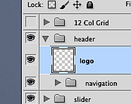
Start by clicking on the logo to highlight its corresponding layer in the layers panel. Now, move the cursor to the thumbnail and option+click it to auto select the entire layer; you should should see ants dancing around it now.

Next, hit copy, create a new file, (cmd+c, cmd+n if you are rocking a Mac) and you will notice that the height and width are automatically set; so simply hit enter, then paste (cmd+v) and you have the logo. You may not see it as the background blends with the text, so the next step, for all images you copy that have transparency, is to turn off the background layer.
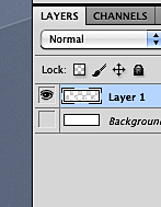
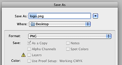
Next, save it as a .png file to preserve the pretty see-through-ness and name it something obvious like "logo" or such. BAM! Image one is done. Rinse and repeat for all the images you need to grab.
A tricky one can be the button dots used for the slider navigation. The easiest way that I've found to do this is to copy the layer or group that makes up one of the dots, and then put it into a new file, bigger than its actual size. Then turn off the background layer, go to trim in the edit menu,
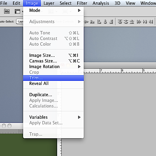
and get rid of the transparent pixels so that the size is precise.
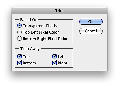
Continuing on, edit the image canvas size to be 200% height, and simply copy, (option+click) the layer or group and drag it down to duplicate it. Make a change to this one and you now have an active state! Easy as pie right? Save this new image and our buttons are now ready!
Once you have gathered the pics, drop them into a folder, called images, and now it is time to begin building the HTML structure; let's dig into some HTML.
The HTML
So we have our design and images; now it's time to turn them into something usable. You can skip this step, and very well may learn to as you become more adept at templating a site; however, I still find it helpful to construct the static version before full conversion into a theme. Create a simple folder structure like so, and then in index.html, build a standard HTML skeleton with a structure.

<!DOCTYPE html>
<html lang="en" class="no-js">
<head>
<meta charset="utf-8">

<!--[if IE]><![endif]-->

<meta http-equiv="X-UA-Compatible" content="IE=edge,chrome=1">

<title>Joomla! Template Tutorial</title>

<link rel="stylesheet" href="css/style.css">

<script src="js/modernizr-1.5.min.js"></script>

</head>

<!--[if lt IE 7 ]> <body class="ie6"> <![endif]-->
<!--[if IE 7 ]>    <body class="ie7"> <![endif]-->
<!--[if IE 8 ]>    <body class="ie8"> <![endif]-->
<!--[if IE 9 ]>    <body class="ie9"> <![endif]-->
<!--[if (gt IE 9)|!(IE)]><!--> <body> <!--<![endif]-->

<header id="header">
    <section id="header_container" class="clearfix">

    </section>
</header>

<section id="wrapper" class="clearfix">

</section>

<footer id="footer">
    <section id="footer_container" class="clearfix">

    </section>

</footer>

<script src="http://ajax.googleapis.com/ajax/libs/jquery/1.4.3/jquery.min.js"></script>

<script src="js/plugins.js"></script>
<script src="js/script.js"></script>

</body>
</html>
This is the base HTML5 we are going to use to create this site. It's based on the HTML5 Boilerplate. You will notice the inclusion of the Moderizr script, so be sure to download it there if you need it. Starting from the top, let's go ahead and add in our logo and navigation sections, so inside the header_container, add the following chunk:
<h1 class="logo">
    <a href="/" title="Custom Template">Custom Template</a>
</h1>

<nav id="main_nav">
    <ul>
        <li><a href="#">Home</a></li>
        <li><a href="#">About</a>
            <ul>
                <li><a href="#">Sub Link</a></li>
                <li><a href="#">Sub Link</a></li>
                <li><a href="#">Sub Link</a></li>
                <li><a href="#">Sub Link</a></li>
                <li><a href="#">Sub Link</a></li>
                <li><a href="#">Sub Link</a></li>
            </ul>
        </li>
        <li><a href="#">Blog</a></li>
        <li><a href="#">Contact</a></li>
    </ul>
</nav>
This covers the logo link and a simple menu system, complete with dropdown goodness. I used the new tag, nav, for the semantic HTML5 markup. Up next is our featured content slider area, so, inside of our wrapper section, add the following to create an image list:
<article id="featured">
    <ul class="slider">
        <li class="first">
            <img src="images/slide1.jpg" />
            <div class="slide_caption">
                <p>Testing Caption!</p>
            </div>
        </li>

        <li>
            <img src="images/slide1.jpg" />
            <div class="slide_caption">
                <p>Testing Caption!</p>
            </div>
        </li>

        <li>
            <img src="images/slide1.jpg" />
            <div class="slide_caption">
                <p>Testing Caption!</p>
            </div>
        </li>

        <li>
            <img src="images/slide1.jpg" />
            <div class="slide_caption">
                <p>Testing Caption!</p>
            </div>
        </li>

    </ul>
</article>
Feel free, obviously, to change the text and image links to suit your own setup, or simply follow along here. Be sure that you are not hopping into a browser to check this out yet, because it will look dreadful!
The list of elements inside the slider ul will all start out hidden, except for the first one, which is why it has a class assigned to it: first. This way, we keep all of the images from briefly displaying on page load, bypassing that annoying flicker.
Next, we add some main content stuff; drop in these two sections. I am simply duplicating what was in the PSD when we started.
<section id="main" class="clearfix">
    <aside id="why">
        <h3>Why Joomla?</h3>
        <img class="alignright" src="images/joomla.png" />
        <p>Well it is pretty awesome. How about that? Also, the model - view - controller structure is a strong base for construction.</p>
    </aside>

    <article id="content">
        <h3>Why Am I Writing This Stuff?</h3>
        <p>I don't know! I should just use some Lorem Ipsum and be done with it here, right? But hey, I thought this would be fun too! Plus, I get to say stuff about what we are making. Ok ok ok, here is your precious Lorem text.</p>
        <p>Pellentesque habitant morbi tristique senectus et netus et malesuada fames ac turpis egestas. Vestibulum tortor quam, feugiat vitae, ultricies eget, tempor sit amet, ante. Donec eu libero sit amet quam egestas semper. Aenean ultricies mi vitae est. Mauris placerat eleifend leo.</p>

    </article>

</section>
I gave the first chunk an aside tag as I feel it tangentially relates to the rest of the content, and the main content gets the article tag as it would be the main area.
Now to incorporate our tri-column section:
<section id="columns" class="clearfix">
    <article class="col left">
        <h3>Base Info</h3>
        <ul>
            <li>Did I design this?</li>
            <li>Nope, not really.</li>
            <li>It is based off a free PSD</li>
            <li>You can find <a href="http://theodin.co.uk/blog/design/everlyn-marketing-and-pr-site-template.html" title="Everlyn - Flexible Marketing, PR, Agency Site | the odin">here!</a></li>
        </ul>
    </article>

    <article class="col center">
        <h3>More Stuffs</h3>
        <ul>
            <li>This will be HTML5 based!</li>
            <li>Probably some CSS3 too :)</li>
            <li>jQuery enhancements? Oh yeah!</li>
            <li>Working slider? Check.</li>
            <li>More Lorem Ipsum over there →</li>
        </ul>
    </article>

    <article class="col right">
        <h3>Blah Blah</h3>
        <ul>
            <li>Lorem ipsum dolor sit amet</li>
            <li>consectetuer adipiscing elit</li>
            <li>Aliquam tincidunt mauris eu risus</li>
            <li>Vestibulum auctor dapibus neque</li>
        </ul>
    </article>

</section>

<hr />
I aptly named the section with an ID of columns, and, inside, have three articles with a class to style them properly later. I added in a horizontal rule to break it up a bit as well.
Finally, we arrive at our images section:
<section id="images" class="clearfix">
    <h3>Fun With Lightboxes!</h3>
    <figure class="zoom_out">
        <a rel="prettyPhoto[gallery]"  href="images/img1_full.jpg"><img src="images/img1.jpg" /><span></span></a>
    </figure>

    <figure class="zoom_out">
        <a rel="prettyPhoto[gallery]" href="images/img2_full.jpg"><img src="images/img2.jpg" /><span></span></a>
    </figure>

    <figure class="zoom_out">
        <a rel="prettyPhoto[gallery]" href="images/img3_full.jpg"><img src="images/img3.jpg" /><span></span></a>
    </figure>

</section>
Worth noting here is the inclusion of the rel attribute on the image links inside of the figure tags. I did this to incorporate the PrettyPhoto plugin we will be using to spice these pics up a bit. The image displayed is the smaller, thumbnail size one, and the actual href points to the full-sized image.
Now, down to the bottom, inside of the footer_container, drop in these sections to give us our three columns and associated content:
<aside class="foot_col">
    <h4>Some Links</h4>
    <ul>
        <li><a href="/">PSD Base</a></li>
        <li><a href="/">thatryan.com</a></li>
        <li><a href="/">myappshelf.com</a></li>
        <li><a href="/">twitter.com/ryanolson</a></li>
    </ul>
</aside>

<aside class="foot_col">
    <h4>More Links</h4>
    <ul>
        <li><a href="/">Lorem</a></li>
        <li><a href="/">Ipsum</a></li>
        <li><a href="/">Ipsum</a></li>
        <li><a href="/">Lorem</a></li>
    </ul>
</aside>

<aside id="about">
    <h4>About This Template</h4>
    <p>So a few fun things should work in this bad boy. We will have a cool animated menu, some sweet popup lightbox images, a featured image slider that is rocking, and more!</p>
</aside>
And finally, just outside of the closing section tag for the footer_container, paste in our lower copyright area that includes the link to jump back to top.
<section id="copyright" class="clearfix">
    <a href="#header">Go Up!</a>
    <p>Copyright yo!</p>
</section>
Notice how the href points to the header ID; this will allow a click here to jump the page right back up to the top-most section. Later, we will enhance this with some scrolling fun.
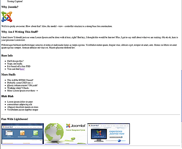
Onto some styling now; if you take a look in a browser, you will find something similar to this -- but don't worry, we are about to rectify the situation!
The CSS
Let's work on the styling a bit. Inside your style.css file, begin by dropping in this base here. It contains a reset and basic setup of the elements, and of course, the ubiquitous clearfix.
/*
 *Reset
*/
html, body, div, span, object, iframe,
h1, h2, h3, h4, h5, h6, p, blockquote, pre,
abbr, address, cite, code,
del, dfn, em, img, ins, kbd, q, samp,
small, strong, sub, sup, var,
b, i,
dl, dt, dd, ol, ul, li,
fieldset, form, label, legend,
table, caption, tbody, tfoot, thead, tr, th, td,
article, aside, figure, footer, header,
hgroup, menu, nav, section, menu,
time, mark, audio, video {
  margin:0;
  padding:0;
  border:0;
  outline:0;
  font-size:100%;
  vertical-align:baseline;
  background:transparent;
}

article, aside, figure, footer, header,
hgroup, nav, section { display:block; }

nav ul { list-style:none; }

blockquote, q { quotes:none; }

blockquote:before, blockquote:after,
q:before, q:after { content:''; content:none; }

a { margin:0; padding:0; font-size:100%; vertical-align:baseline; background:transparent; }

ins { background-color:#ff9; color:#000; text-decoration:none; }

mark { background-color:#ff9; color:#000; font-style:italic; font-weight:bold; }

del { text-decoration: line-through; }

abbr[title], dfn[title] { border-bottom:1px dotted #000; cursor:help; }

table { border-collapse:collapse; border-spacing:0; }

hr { display:block; height:1px; border:0; border-top:1px solid #ccc; margin:1em 0; padding:0; }

input, select { vertical-align:middle; }

body { font:14px sans-serif; *font-size:small; *font:x-small; line-height:1.22; }

table { font-size:inherit; font:100%; }

select, input, textarea { font:99% sans-serif; }

pre, code, kbd, samp { font-family: monospace, sans-serif; }

h1,h2,h3,h4,h5,h6 { font-weight: lighter; text-rendering: optimizeLegibility; }

html { -webkit-font-smoothing: antialiased; }

a:hover, a:active { outline: none; }

a, a:active, a:visited { color:#37592f;text-decoration:none; }
a:hover { color:#036; }

small { font-size:85%; }
strong, th { font-weight: bold; }

td, td img { vertical-align:top; }

sub { vertical-align: sub; font-size: smaller; }
sup { vertical-align: super; font-size: smaller; }

input[type="radio"] { vertical-align: text-bottom; }
input[type="checkbox"] { vertical-align: bottom; *vertical-align: baseline; }
.ie6 input { vertical-align: text-bottom; }

label, input[type=button], input[type=submit], button { cursor: pointer; }

::-moz-selection{ background: #FF5E99; color:#fff; text-shadow: none; }
::selection { background:#FF5E99; color:#fff; text-shadow: none; }

a:link { -webkit-tap-highlight-color: #FF5E99; }

html { overflow-y: scroll; }

button {  width: auto; overflow: visible; }

.alignleft{float: left; margin: 0px 20px 10px 0px;}
.alignright{float: right; margin: 0px 0px 10px 20px;}

.clearfix:after { content: " "; display: block; height: 0; clear: both; visibility: hidden; }
.clearfix { display: inline-block; }
* html .clearfix             { zoom: 1; } /* IE6 */
*:first-child+html .clearfix { zoom: 1; } /* IE7 */
.clearfix { display: block; }
Ok, that part is done... yay; now let's add in our own styling!
Here we have some basic typography setup, colors and sizes.
body, select, input, textarea {font-family:"Helvetica Neue", Arial, Helvetica, sans-serif;color:#111; }
h1,h2,h3,h4,h5,h6{font-family:Garamond, "Hoefler Text", Palatino, "Palatino Linotype", serif;color:#37592f;margin:5px 0;}
h1{font-size:36px;}
h2{font-size:32px;}
h3{font-size:28px;}
h4{font-size:24px;}
h5{font-size:18px;}
h6{font-size:14px;}
Now, give some styling to the top region.
body
{
	background: #e8e8e8;
}
hr
{
	border-top: 1px inset #37592f;
	margin: 10px;
}
#header
{
	background: #37592f;
	width: 100%;
}
#header_container
{
	height: 220px;
	margin: 0 auto;
	position: relative;
	width: 940px;
	z-index: 5;
}
.logo
{
	background: url(../images/logo.png) no-repeat;
	float: left;
	height: 49px;
	margin-top: 40px;
	width: 170px;
}
.logo a
{
	display: block;
	height: 100%;
	text-indent: -9999px;
	width: 100%;
}
Note the image in the logo styling; if you did not name yours the same, be sure to change it here.
The menu comes next. Here, we take care of positioning and text sizing, as well as handling multi-level lists!
#main_nav
{
	float: right;
	margin-top: 40px;
	position: relative;
	z-index: 6;
}
#main_nav ul
{
	margin: 0;
	padding: 0;
}
#main_nav ul li
{
	float: left;
	list-style: none;
	margin-left: 10px;
	position: relative;
}
#main_nav ul li a
{
	color: #fff;
	font-size: 22px;
	text-decoration: none;
	text-shadow: 0px -1px 0px #37592f;
}
#main_nav ul li a:hover
{
	color: #999;
}
#main_nav ul li ul
{
	background: #37592f;
	border-bottom: 1px solid #555;
	border-left: 1px solid #555;
	border-right: 1px solid #555;
	display: none;
	left: -10px;
	margin: 0;
	moz-border-radius-bottomleft: 10px;
	moz-border-radius-bottomright: 10px;
	padding: 10px;
	position: absolute;
	top: 100%;
	webkit-border-bottom-left-radius: 10px;
	webkit-border-bottom-right-radius: 10px;
	width: 140px;
	z-index: 7;
}
#main_nav ul li:hover ul
{
	display: block;
}
#main_nav ul li ul li
{
	margin: 5px 0;
	padding: 0;
}
#main_nav ul li ul li:hover
{
	margin-left: 1px;
}
There's some scary CSS3 in there, but it adds a pretty little curve to the bottom part of the drop down list, so take it or leave it
Also, note how initially we start with the submenu ul as hidden, and only display it when we hover over its parent list item. This ensures that the menu is still accessible for folks without JavaScript enabled, because we will enhance this later on.
We'll next add in more structure styles to handle the main wrapper and the uber fancy slider component we are putting to use.
#wrapper
{
	margin: 0px auto 20px auto;
	position: relative;
	width: 940px;
	z-index: 1;
}
#wrapper p
{
	text-shadow: 0px -1px 0px #f1f1f1;
}
#wrapper h3
{
	text-shadow: 0px -1px 0px #f9f9f9;
}
#columns h3, #images h3
{
	margin-left: 10px;
}
#featured
{
	background: #e8e8e8;
	border: 1px solid #555;
	box-shadow: 0px 5px 15px #666;
	height: 280px;
	margin-top: -100px;
	moz-box-shadow: 0px 5px 15px #666;
	position: relative;
	webkit-box-shadow: 0px 5px 15px #666;
	width: 940px;
	z-index: 2;
}
.slider
{
	margin: 0;
	padding: 0;
}
.slider li
{
	display: none;
	list-style: none;
	position: relative;
}
.slider .first
{
	display: block;
}
.slider li img
{
}
.slide_caption
{
	background: rgba(0,0,0,.5);
	bottom: 3px;
	height: 40px;
	left: 0;
	position: absolute;
	width: 940px;
}
.slide_caption p
{
	color: #fff;
	font-size: 24px;
	margin: 5px 10px;
	text-align: right;
	text-shadow: none;
}
.slide_nav
{
	bottom: 10px;
	left: 10px;
	position: absolute;
	width: 200px;
	z-index: 9;
}
.slide_nav a
{
	background: url(../images/dots.png) no-repeat;
	float: left;
	height: 17px;
	margin: 0 2px;
	text-indent: -9999px;
	width: 16px;
}
.slide_nav a:hover,.slide_nav a.activeSlide
{
	background-position: 0px -18px;
}
Continuing, we'll configure the footer section.
#footer
{
	background: #393939;
	margin-top: 40px;
	padding-top: 20px;
	width: 100%;
}
#footer hr
{
	border-bottom: 1px solid #565656;
	border-top: none;
	margin: 10px 0 20px 0;
	width: 100%;
}
#footer_container
{
	margin: 0 auto;
	width: 940px;
}
#footer_container h4,#footer_container p
{
	color: #fff;
}
#footer_container h4
{
	border-bottom: 1px solid #000;
}
#footer_container p
{
	margin: 10px 0;
}
#footer_container ul
{
	margin: 10px 0 0 0;
	padding: 0;
}
#footer_container ul li
{
	border-bottom: 1px dotted #e8e8e8;
	font-size: 14px;
	line-height: 20px;
	list-style: none;
}
#footer_container ul li a
{
	color: #fff;
	text-decoration: none;
}
#footer_container ul li a:hover
{
	margin-left: 1px;
}
.foot_col
{
	float: left;
	margin-right: 30px;
	width: 15%;
}
#about
{
	float: right;
	width: 58%;
}
#copyright
{
	border-top: 1px solid #000;
	clear: both;
	margin: 30px auto 0 auto;
	padding-top: 10px;
	width: 940px;
}
#copyright a
{
	background: url(../images/home.png) no-repeat;
	float: left;
	height: 16px;
	text-indent: -9999px;
	width: 18px;
}
#copyright p
{
	color: #fff;
	float: right;
}
Finally, let's style some of the main text.
#main
{
	margin: 40px 0 20px 0;
}
#why
{
	float: left;
	width: 30%;
}
#content
{
	float: right;
	width: 59%;
}
#columns
{
	clear: both;
	margin: 40px 0;
	width: 100%;
}
.col
{
	float: left;
	margin: 0 1%;
	padding: 0;
	width: 30%;
}
.left ul li
{
	list-style-image: url(../images/info_bullet.png);
}
.center ul li
{
	list-style-image: url(../images/more_bullet.png);
}
.right ul li
{
	list-style-image: url(../images/warn_bullet.png);
}
#images
{
	margin: 40px 0;
	width: 100%;
}
#images figure
{
	float: left;
	margin: 0 10px;
	position: relative;
	width: width:290px;
	z-index: 2;
}
#images figure a
{
	text-decoration: none;
}
.zoom_out
{
	position: relative;
	z-index: 3;
}
.zoom_in
{
	background: url(../images/img_zoom.png) no-repeat;
	display: block;
	filter: alpha(opacity=0);
	height: 141px;
	left: 0;
	moz-opacity: 0;
	opacity: 0;
	position: absolute;
	top: 0;
	width: 290px;
	z-index: 9;
}
Take a note of the final classes in the code above, zoom_out and zoom_in. This is another enhancement for the popup images, to add a little flare -- you will see soon enough!
At this point you should have something along the lines of this:

Hey, that isn't too bad, but note that some parts may not work as awesomly yet, because the scripts to make them function we have not yet been created! So, time to get on that.
The JavaScript
This part should be a snap! Mostly, because we are going to use a couple of awesome plugins. First up is the Cycle plugin, by @malsup. We will use this to build our slider, and also the PrettyPhoto plugin, by @scaron will be used for our lightboxing. Enhancing this will be the easing plugin for some more spice, and localscroll to handle our ups and downs. Each of the links above should link to the author's page where you can find and download the script you wish. Once we have the plugins downloaded, we need to include them within our code, like so:
<script src="js/plugins.js"></script>
<script src="js/jquery.prettyPhoto.js"></script>
<script src="js/jquery.cycle.all.min.js"></script>
<script src="js/jquery.easing.1.1.1.js"></script>
<script src="js/jquery.scrollTo-1.4.2-min.js"></script>
<script src="js/jquery.localscroll-1.2.7-min.js"></script>
<script src="js/script.js"></script>
Note that, at the time of production, try to group these scripts into one file, in order to limit the number of HTTP requests.
Be sure to put this in the footer "after" we include the jQuery library, in order for this to all function. Bear in mind we will be combining all of these shortly. Now to make these take effect, we have to write a small bit of scripting.
<script>
$(document).ready(function(){
});

</script>
Firstly, drop in this line of code to handle the hash tag scrolling:
$.localScroll({duration:600});
This ensures that our "back to top" button will smoothly glide back up. Next, let's work with the slider core.
$('.slider')
.after('<div class="slide_nav">')
.cycle({
    fx:     'scrollHorz',
    timeout: 4000,
    slideExpr:'li',
    easing: 'bounceout',
    pager:  '.slide_nav'
});
This will add the bullet navigation for the slides, and setup the duration and easing parameters. Next, we handle the lightbox with the prettyphoto code, like so:
$("a[rel^='prettyPhoto']").prettyPhoto({animationSpeed:'slow',theme:'light_rounded'});
This instructs each image, that we assign the prettyPhoto rel to, to behave in the proper manner. In order to spruce up the images, add in the following,
$('#images figure').animate({'opacity' : 1}).hover(function() {
	$(this).animate({'opacity' : 0.5}).find('span').addClass("zoom_in").animate({'opacity' : 1});
}, function() {
	$(this).animate({'opacity' : 1}).find('span').removeClass("zoom_in");
});
This will add a nice hover in, fade out effect when we mouse over the images. Pretty!
And finally the menu; add the following snippet, still in between the document ready tags.
    var mainLi = $('#main_nav ul li');

    mainLi
    .find('ul')
    .hide()
    .end()
    .hover(function () {
		$(this).find('> ul').stop(true, true).slideDown('slow');
	}, function() {
		$(this).find('> ul').stop(true, true).fadeOut('fast');
	});
This simply makes sure that the submenu is hidden on page load, and then sets up the animations to take place when we hover over the corresponding menu items. Simple and fun!
Okay, now check the page and make sure that all the functions and JavaScripts are working as expected. We are now going to combine these multiple files. Go ahead and open the file named plugins.js and inside paste the following:
// remap jQuery to $
(function($){

})(window.jQuery);
We will pass all of the plugin source code in between this function. Granted, these plugins are by good developers and have been created the right anyway, but this is a good habit to prevent potential conflicts with the jQuery namespace. Grab the source for cycle, easing, localscroll, scrollto and prettyphoto and paste each one in, one at a time, in between the remap function in plugins.js. Once that is done, save the file and open up script.js. Here, we will take all the code in between the script tags in our footer and paste it in, inside one document ready function.
Now, we only need to import these two files and are good to go. Once done, be sure to recheck and make sure that everything still works correctly on the page.
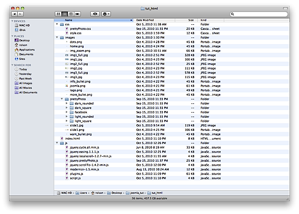
So we installed the PrettyPhoto plugin and its script, but we also need to grab its default images and styling. So grab the folder named prettyPhoto from the plugin file you downloaded; it will be in the images folder. Simply copy that folder in its entirety to your templates images folder. While you are there, copy the prettyPhoto.css into your template's css folder as well. At this point, your file structure should look something close to:
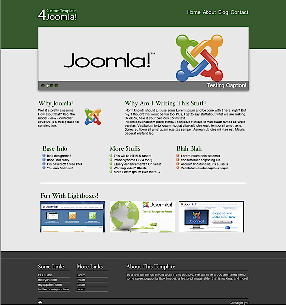
Now, hey, guess what? Refresh your html page to see some pretty sweet stuff going on! Hopefully, you have a functional menu, slider, and scrollable and lightbox imagery. Take a moment to revel in the fact that you just made some awesomeness happen.
Back? Okay, now it's time to tear this boy apart and templatize it for the homestretch of our Joomla Template tutorial!
Joomla Construct
We now have a fully functional static HTML site, and it is time to templatize this monster. Joomla has a standard file structure that we need to adhere to. Create a folder structure like so, and be sure to include all the files -- I will explain what each of them do shortly.
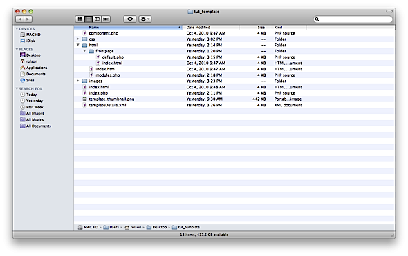
Starting with component.php; this file is a structure template that Joomla uses to display content called with the component parameter. Essentially, when you want to see part of the site that is just its content, and not the header/footer etc. For now, you will simply be copying mine for the default usage. The CSS folder will hold, you know, CSS and the same with the images. Index.html is simply a generic page that display nothing, and it is a good practice to keep one of these empty index files in the root of each folder you create to keep prying eyes away.
Index.php will be the main file; nearly everything will take place in here. Template_thumbnail.png is, you guessed it, an image of the template itself that will show in the admin section of Joomla, and template_details.xml is the main control file that Joomla reads to install your template. It contains basic information about the file structure of your theme, as well as template parameters and module position names.
The Params.ini file needs to be here and can remain blank for now. This will be a writeable file that stores the template parameter data that Joomla can access later on.
Finally, the HTML folder is where we will store files to override the default Joomla behavior for certain display types, such as the frontpage. So inside, you will find another folder named frontpage, which itself holds a few more files. Each one will take precedence over the default core files that would be used to display the frontpage content. The benefit of this is that we can alter the structure here completely, or simply remove a line we don't want or need. Be sure to copy over your CSS and Images folders into this directory for your template as well.
Sidestep
To gain an idea of where the files and folders inside the HTML folder come from, head to your root installation of Joomla and look in the administrator folder, then in the components folder and finally open the com_content folder. You will find a nice list of core components -- components being the way Joomla displays information in an abstract way from logic. This is only an overview; you can override just about every aspect of Joomla output by adding a folder to the HTML folder in your theme root and creating a new view file. For example, to override the main menu output, you would create a path such as [YOUR_TEMPLATE_NAME]/html/mod_mainmenu/default.php where mod_mainmenu is the name of the core module you wish to override.
Breaking Into Pieces
So, easiest thing first; take a snapshot of your HTML page and save it as template_thumbnail.png. This should be placed in the root of the template folder. For index.html, simply open it up and paste the following inside:
<html><body bgcolor="#FFFFFF"></body></html>
Make a few copies of this file and put them in the root of each folder.
Wow, two files down already!
Now, for component.php, I suggest you use the one from the accompanying download, as it is too much to paste in here, and it is just default behavior we are not going to touch, but is helpful to have in your theme, depending on usage. Again, for the HTML folder, use the provided download and drop the entire folder and contents into your template root.
I like to break things up a bit more, so create a folder called includes, and, inside two more folders, one named sections, and the other named scripts. You guessed correctly: inside the scripts folder, copy all of the contents of your HTML folder version's js folder. Now, head into the sections folder and create a few new files:
- head.php
- header.php
- footer.php
- scripts.php
- setup.php
It seems like a lot, but it is really not. This is simply a good method to separate content and keep things as modularized as possible. We'll start with setup.php, so open that one up and paste the following in:
    <jdoc:include type="head" />

    <?php
    unset($this->_scripts[$this->baseurl .'/media/system/js/mootools.js']);
    unset($this->_scripts[$this->baseurl .'/media/system/js/caption.js']);
    unset($this->_scripts[$this->baseurl .'/media/system/js/validate.js']);
    ?>
This is really a personal preference, but, for the sake of ease, I suggest you follow along with it. First, we instruct Joomla to include the hook for its head, thus enabling core functions access. Following that, I manually unset the mootools that is loaded by default.
Save and done! For now, we are finished with the set up, so open head.php and add:
    <link rel="stylesheet" href="<?php echo JURI::base()."templates/".$this->template; ?>/css/style.css">
    <link rel="stylesheet" href="<?php echo JURI::base()."templates/".$this->template; ?>/css/prettyPhoto.css">

    <script src="<?php echo JURI::base()."templates/".$this->template; ?>/includes/scripts/modernizr-1.5.min.js"></script>
All we do here is point to the base stylesheet we will use, and load up the Modernizr script. This is the only Javascript that gets loaded into the head section. The href attributes may look odd, and that is to keep them as dynamic as possible. The PHP statement,
echo JURI::base()."templates/".$this->template;
simply prints out the absolute base URL of the site as Joomla knows it, and then concatenates it with the templates folder and points it to our own template. This way, we can easily access our own files and folders.That's it! Save head.php and move along to header.php.
Inside header paste in the following,
    <!--[if lt IE 7 ]> <body class="ie6"> <![endif]-->
    <!--[if IE 7 ]>    <body class="ie7"> <![endif]-->
    <!--[if IE 8 ]>    <body class="ie8"> <![endif]-->
    <!--[if IE 9 ]>    <body class="ie9"> <![endif]-->
    <!--[if (gt IE 9)|!(IE)]><!--> <body> <!--<![endif]-->

        <header id="header">
            <section id="header_container" class="clearfix">
            <h1 class="logo">
                <a href="/" title="Custom Template">Custom Template</a>
            </h1>
            <?php if($this->countModules('main_nav')) : ?>

            <nav id="main_nav">

                <jdoc:include type="modules" name="main_nav" style="raw" />

            </nav>

            <?php endif;?>
            </section>
        </header>
        <section id="wrapper" class="clearfix"
This code opens the body tag in an awesome way that allows us to target individual versions of Internet Explorer. Then, it creates our top header section and navigation area. Finally, we open the main wrapper.
The new code here is the statement,
<?php if($this->countModules('main_nav')) : ?>
This is a native to Joomla that runs a check before the page renders on the specific module position. It determines if there is anything setup to go there. So, if we have not created a menu and assigned it to the position "main_nav" then this statement will not execute. Be sure to close the if statement.
Ok save it; we're done for now. While we are here, open footer.php, and add:
        </section>

        <footer id="footer">
            <hr />
    <section id="footer_container" class="clearfix">
        <?php if($this->countModules('footer')) : ?>
        <jdoc:include type="modules" name="footer" style="raw" />
       <?php endif;?>
    </section>

    <?php if($this->countModules('copyright')) : ?>

    <section id="copyright" class="clearfix">
        <jdoc:include type="modules" name="copyright" style="raw" />

    </section>
    <?php endif;?>
        </footer>

    </body>
    </html>
You already know what's happening in here now. Again, we simply create our sections and close out the site. We also do a few more checks for module positions so we can append their contents when needed.
And here, we come to index.php, the main attraction. Add the following code:
    <!DOCTYPE html>
    <html lang="en" class="no-js">
    <head>
    <meta charset="utf-8">

    <!--[if IE]><![endif]-->
    <meta http-equiv="X-UA-Compatible" content="IE=edge,chrome=1">

    <?php include_once(JPATH_ROOT . "/templates/" . $this->template . '/includes/sections/setup.php'); ?>
    <?php include_once(JPATH_ROOT . "/templates/" . $this->template . '/includes/sections/head.php'); ?>

    </head>

    <?php include_once(JPATH_ROOT . "/templates/" . $this->template . '/includes/sections/header.php'); ?>

           <section id="main" class="clearfix">

               <jdoc:include type="component" />

           </section>

    <?php include_once(JPATH_ROOT . "/templates/" . $this->template . '/includes/sections/footer.php'); ?>
    <?php include_once(JPATH_ROOT . "/templates/" . $this->template . '/includes/sections/scripts.php'); ?>

    </body>
    </html>
Yup, it is everything that was left over! Now top to bottom: we start by declaring the new Doctype in HTML5 fashion. Next, we've added the no-js class to the html tag if you are using Modernizr. We immediately include two of the files we already setup: our head.php and setup.php. This time, note how we use a new variable, jPATH_ROOT to concatenate our way into our template. Once again, we're keeping things as dynamic as possible so that we can transport this code across multiple templates. After we include the top section, we close out the head and start building our page. Including the header.php kicks that off and brings in the top section of our soon to be awesome website.
Now, open the main section and drop in another Joomla call:
<jdoc:include type="component" />
This call to component essentially tells Joomla to output right here exactly what is put into the WYSIWYG editor for the page currently being viewed.
Next we include the footer.php file to end things up, and then the last file we created in the sections folder, scripts.php.
What? Yes I know that file is empty still! So, let's go fill it up. Open scripts.php and paste in the following:
    <script src="http://ajax.googleapis.com/ajax/libs/jquery/1.4.2/jquery.min.js"></script>

    <script src="<?php echo JURI::base()."templates/".$this->template; ?>/includes/scripts/plugins.js"></script>
    <script src="<?php echo JURI::base()."templates/".$this->template; ?>/includes/scripts/script.js"></script>
Again, this is reading in our script files, and keeping them segmented away from other code. Now, we add in the functions code like so:
    <script>
        $(document).ready(function(){
      		$("a[rel^='prettyPhoto']").prettyPhoto({animationSpeed:'slow',theme:'light_rounded'});
        $.localScroll({duration:600});

        $('.slider')
        .after('<div class="slide_nav">')
        .cycle({
            fx:     'scrollHorz',
            timeout: 4000,
            slideExpr:'li',
            easing: 'bounceout',
            pager:  '.slide_nav'
        });

        $(document).ready(function() {

        	$('.zoom_out').animate({'opacity' : 1}).hover(function() {
        		$(this).animate({'opacity' : 0.5}).find('span').addClass("zoom_in").animate({'opacity' : 1});
        	}, function() {
        		$(this).animate({'opacity' : 1}).find('span').removeClass("zoom_in");
        	});

        		$('#main_nav ul li ul').hide();

        	    $('#main_nav ul li').hover(function () {
        				$(this).find('> ul').stop(true, true).slideDown('slow');
        	 		}, function() {
        	 			$(this).find('> ul').stop(true, true).fadeOut('fast');
        			});

        });

      	});

    </script>
And we are good to go. Moving on!
The Frontpage
You may have noticed that index.php seems to be quite lacking in, stuff -- like everything that we built into index.html for the first version. Why is that? Well, because that is for our homepage. Now, we are going to override Joomla's frontpage to show our custom homepage. Head into the html folder, and then into com_content and the frontpage directory. Inside should be two PHP files; make one called default.php and one called default_item.php. We are going to rip 95% of the guts from these to make our own, so open up default_item.php. If anything is there, delete it and replace it with:
<?php echo JFilterOutput::ampReplace($this->item->text); ?>
Nice, right? This is setting up the output for whatever text was entered into the homepage component. Now open default.php and again, delete all that may be there and paste in:
    <?php
    defined('_JEXEC') or die('Restricted access');

        global $mainframe;
        jimport('joomla.filesystem.file');
        $slider = new JParameter(JFile::read(JPATH_BASE.DS.'templates'.DS.$mainframe->getTemplate().DS.'params.ini'));

        $slide_path = 'templates/' . $mainframe->getTemplate().DS.'images/slides/';

        $image1 = $slider->get( 'image1' );
        $caption1 = $slider->get( 'caption1' );

        $image2 = $slider->get( 'image2' );
        $caption2 = $slider->get( 'caption2' );

        $image3 = $slider->get( 'image3' );
        $caption3 = $slider->get( 'caption3' );

        $image4 = $slider->get( 'image4' );
        $caption4 = $slider->get( 'caption4' );

        $document	= &JFactory::getDocument();
        $renderer	= $document->loadRenderer('modules');
        $options	= array('style' => 'xhtml');
        $columns	= 'columns';
        $images	= 'images';

    ?>

    <article id="featured">

        <ul class="slider">
            <li class="first">
                <img src="<?php echo $slide_path . $image1; ?>" />
                <div class="slide_caption">
                    <p><?php echo $caption1; ?></p>
                </div>
            </li>

            <li>
                <img src="<?php echo $slide_path . $image2; ?>" />
                <div class="slide_caption">
                    <p><?php echo $caption2; ?></p>
                </div>
            </li>

            <li>
                <img src="<?php echo $slide_path . $image3; ?>" />
                <div class="slide_caption">
                    <p><?php echo $caption3; ?></p>
                </div>
            </li>


            <li>
                <img src="<?php echo $slide_path . $image4; ?>" />
                <div class="slide_caption">
                    <p><?php echo $caption4; ?></p>
                </div>
            </li>

        </ul>

    </article>

    	<?php $i = $this->pagination->limitstart;
    	$rowcount = $this->params->def('num_leading_articles', 1);
    	for ($y = 0; $y < $rowcount && $i < $this->total; $y++, $i++) : ?>
    			<?php $this->item =& $this->getItem($i, $this->params);
    			echo $this->loadTemplate('item'); ?>
    	<?php endfor; ?>

        <section id="columns" class="clearfix">
            <?php echo $renderer->render($columns, $options, null); ?>

        </section>

        <hr />

        <section id="images" class="clearfix">
        <?php echo $renderer->render($images, $options, null); ?>

        </section>
There's lots of new stuff here, and this is a pretty complicated page override; so let's go through it all.
Because the frontpage is actually displayed via a component, the override does not have access to the standard Joomla directives; we have to instantiate them. So we create an object and use it to grab the params list that is set when we update the template setting parameters. Once we have that, we can grab the chosen parameters as we normally would. We then use the variables to output the info into the slider list markup.
The modules class is not included by default either. We need to create an object for it and load its renderer that will allow us to output our custom modules where they need to go. Two variables are created after that: columns and images, which are then set equal to their respective module positions, so that, later down the page, they can be called, using:
<?php echo $renderer->render($columns, $options, null); ?>
Finally, the ugly part in the middle,
    <?php $i = $this->pagination->limitstart;
	$rowcount = $this->params->def('num_leading_articles', 1);
	for ($y = 0; $y < $rowcount && $i < $this->total; $y++, $i++) : ?>
			<?php $this->item =& $this->getItem($i, $this->params);
			echo $this->loadTemplate('item'); ?>
	<?php endfor; ?>
This is the only part kept from the original default.php for the frontpage, as it is how Joomla communicates with default_item.php, and decides if it is okay to output whatever we had in the page. I know there is a lot to this file, but hopefully it makes some level of sense.
If you have been working along, you should noe have a file hierarchy that looks like so:
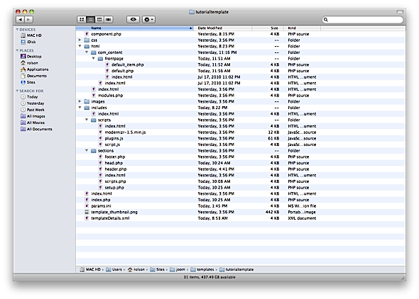
All that is left appears to be the XML file. Let's handle that now.
    <?xml version="1.0" encoding="utf-8"?>
    <!DOCTYPE install PUBLIC "-//Joomla! 1.5//DTD template 1.0//EN" "http://www.joomla.org/xml/dtd/1.5/template-install.dtd">
    <install version="1.5" type="template">
    	<name>Tutorial Template</name>
    	<creationDate>10/05/10</creationDate>
    	<author>Ryan Olson</author>
    	<authorEmail>[email protected]</authorEmail>
    	<authorUrl>http://thatryan.com</authorUrl>
    	<copyright></copyright>
    	<license></license>
    	<version>1.0</version>
    	<description>Template from tutorial creation</description>
    </install>
Obviously, feel free to change the name and URLs to fit your needs. This file sets up the install process to get our template into the database, so that Joomla will recognize it. After you have this info in, we need to tell Joomla what to expect from our template folder. Before the closing </install> tag, paste in:
    <files>
		<filename>component.php</filename>
		<filename>index.html</filename>
		<filename>index.php</filename>
		<filename>template_thumbnail.png</filename>
		<filename>templateDetails.xml</filename>

		<folder>css</folder>
		<folder>html</folder>
		<folder>images</folder>
		<folder>includes</folder>
	</files>
Remember the module positions we were querying earlier? Here is where we inform Joomla what positions to expect by default:
    <positions>
		<position>main_nav</position>
		<position>columns</position>
		<position>images</position>
		<position>footer</position>
		<position>copyright</position>
	</positions>
Dont worry if you miss a position, because you can enter new ones later from the administration area if needed. Finally, add:
<params>

</params>
Wait, what's that? Glad you asked. Wouldn't it be cool if we could change stuff in our template on the fly from the backend? Yes, it would! This is where we get the opportunity to setup some template parameters. In all honesty, you can go nuts here, but for the purposes of this tutorial, I will only add some basic parameters.
Let's start with a simple text parameter to set the copyright in our footer. I know this looks like backtracking, but, this way, we learn a second way of doing things, and a better way to integrate it! Add this in between the params tags:
	<param type="spacer" default="<b>Template Parameters</b>" />

        <param name="copyright" type="text" default="" label="Copyright" description="Enter Copyright Text" />
The first param type is the spacer in which we can put a label. Make note of the ASCII, however, if you wish to bold or italicize the text in there.
How about a second stylesheet? If so, add this parameter:
    <param name="style" type="radio" default="style" label="Style Sheet" description="Choose Color Style">
            	<option value="style">Default</option>
            	<option value="dark">Dark</option>
    </param>
Once again, note how the name of the parameter is style, and the radio button allows one stylesheet to be chosen at a time. Now before we jump into the big one, let's first finish setting up these parameters. So open up setup.php and add:
    $copyright = $this->params->get( 'copyright' );
    $style = $this->params->get( 'style' );
This creates two variables we can use that hold the input data for copyright and style, respectively. Now, open head.php and replace the call to the style.css with this line:
<link rel="stylesheet" href="<?php echo JURI::base()."templates/".$this->template."/css/".$style;?>.css">
Here, we use the variable we just created to concatenate into the string to our second CSS file. Don't forget to create one! It will use the actual value from the parameter, so the default will output style.css, and dark will output dark.css. Create a second CSS file, named dark.css and change anything in it for the time being -- only for the sake of reviewing difference. I made the header and footer all black.
Now open footer.php and replace
    <?php if($this->countModules('copyright')) : ?>

    <section id="copyright" class="clearfix">
        <jdoc:include type="modules" name="copyright" style="raw" />

    </section>
    <?php endif;?>
...with:
    <section id="copyright" class="clearfix">
        <a href="#header">Go Up!</a>
        <p>
            <?php echo $copyright;?>
        </p>
    </section>
Now we have one less module to make, and we allow the copyright data to be set inside a parameter. Sweet! Head back into tempate_details.xml, and remove the copyright position. Then, back into the parameter area, let's setup our slider.
    <param type="spacer" default="<b>Feature Slider</b>" />

    <param name="image1" type="imagelist" default="" label="Select an image" description="Slide 1 Image" directory="/templates/tutorialtemplate/images/slides/" exclude="" stripext="" />
    <param name="caption1" type="text" default="" label="Caption" description="Enter Image Text" />

    <param name="image2" type="imagelist" default="" label="Select an image" description="Slide 2 Image" directory="/templates/tutorialtemplate/images/slides/" exclude="" stripext="" />
    <param name="caption2" type="text" default="" label="Caption" description="Enter Image Text" />

    <param name="image3" type="imagelist" default="" label="Select an image" description="Slide 3 Image" directory="/templates/tutorialtemplate/images/slides/" exclude="" stripext="" />
    <param name="caption3" type="text" default="" label="Caption" description="Enter Image Text" />

    <param name="image4" type="imagelist" default="" label="Select an image" description="Slide 4 Image" directory="/templates/tutorialtemplate/images/slides/" exclude="" stripext="" />
    <param name="caption4" type="text" default="" label="Caption" description="Enter Image Text" />
Here, we create another spacer to segment our slider and then a few parameter fields. One will be a drop down list for choosing the image to display, and the second one, the caption for each slide. The drop down image list works as a path; so inside your template images folder, create a new folder, named slides, and insert the images that you want to be made available to the slider section. Be sure to change where it says "tutorialtemplate" to the name of your template folder.
Dynamic Parameters
I debated including this part, but it is just too cool not to! You noticed that PrettyPhoto has multiple folders and lots of CSS right? That is because it has a few built in themes, which makes it ideal for a situation where you can change stylesheets. We can make some dynamic parameters to change the theme that PrettyPhoto will use!
Within template_details.xml, add the following section for parameters:
    <param name="pretty" type="radio" default="style" label="prettyphoto" description="Choose popup Style">
            	<option value="dark_rounded">Dark Rounded</option>
            	<option value="dark_square">Dark Square</option>
            	<option value="facebook">Facebook Style</option>
            	<option value="light_rounded">Light Rounded</option>
            	<option value="light_square">Light Square</option>
    </param>
So, we create a new section label and a dropdown list to choose the available themes. The value returned will be a string that corresponds to the parameter PrettyPhoto expects. To handle this, we need to make two more edits. First open up setup.php and add the following to grab the parameters that we can now set:
    $pretty = $this->params->get( 'pretty' );
    $pretty_settings = array('theme' => $pretty);
The first line above sets a variable to the parameter we will choose, and then we add that parameter to an array with a key of theme -- you will learn why in a minute. Save and close this, then open scripts.php.
Find the code:
$("a[rel^='prettyPhoto']").prettyPhoto({animationSpeed:'slow',theme:'light_rounded'});
And add this above it:
var pretty_settings = <?php echo json_encode($pretty_settings)?>;
This is why we put the parameter into an array. We can use the magic json_encode function to create a parameter list that we can send into a jQuery function. Awesome! So replace the prettyPhoto function parameter with this new variable, like so:
$("a[rel^='prettyPhoto']").prettyPhoto(pretty_settings);
We can now dynamically change the theme from the template parameter section! Awesome indeed.
Idea!
Feel free to take this a step further and add multiple transition options to the slideshow.
Install Template
We should be all done! Wow, how exciting. Now, zip up this folder and install it to your Joomla installation. With any luck, there will be no errors!
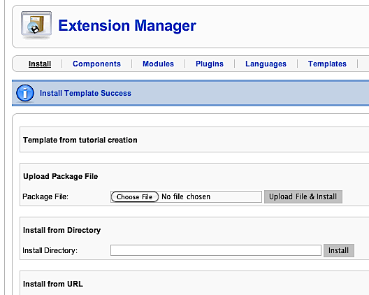
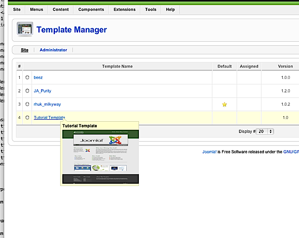
Jump into template manager, and set your new template as the default.
Be sure to create a new page, called home and assign it as frontpage. In it, you can paste the following, which will be output from the Joomla "component" module that we reviewed earlier in this tutorial. Please note: be sure to enter this into the HTML view, not the WYSIWYG view, to preserve the tags.
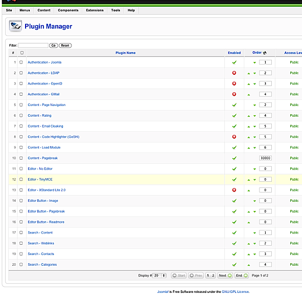
Speaking of tag preservation, we need to set it up so that the TinyMCE editor does not eat our code! Navigate to the plugins section and click on TinyMCE.
On the right, you will find an option to instruct Joomla to never perform "code cleanup on save." Check it, and save.
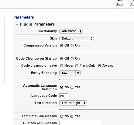
Phew, code is safe now! Okay, into the article manager and back to edit your frontpage:
    <aside id="why">
        <h3>Why Joomla?</h3>
        <img class="alignright" src="images/joomla.png" />
        <p>Well it is pretty awesome. How about that? Also, the model - view - controller structure is a strong base for construction.</p>
    </aside>

    <article id="content">
        <h3>Why Am I Writing This Stuff?</h3>
        <p>I don't know! I should just use some Lorem Ipsum and be done with it here, right? But hey, I thought this would be fun too! Plus, I get to say stuff about what we are making. Ok ok ok, here is your precious Lorem text.</p>
        <p>Pellentesque habitant morbi tristique senectus et netus et malesuada fames ac turpis egestas. Vestibulum tortor quam, feugiat vitae, ultricies eget, tempor sit amet, ante. Donec eu libero sit amet quam egestas semper. Aenean ultricies mi vitae est. Mauris placerat eleifend leo.</p>
    </article>
Sweet. You may notice that your image did not appear. That is because the paths have changed and /images no longer goes to where it used to. Be sure to alter your image paths to account for this; simply add to the front of the path, templates/YOUR_TEMPLATE_NAME/, and voila, images shall appear once more!
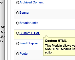
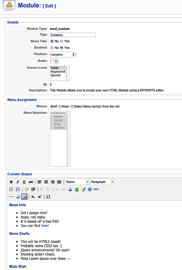
Inside the modules section, create a new custom html module, and in the HTML view, paste in the code and text from the columns section:
    <h3>Base Info</h3>
    <ul>
    <li>Did I design this?</li>
    <li>Nope, not really.</li>
    <li>It is based off a free PSD</li>
    <li>You can find <a href="http://theodin.co.uk/blog/design/everlyn-marketing-and-pr-site-template.html" title="Everlyn - Flexible Marketing, PR, Agency Site | the odin">here!</a></li>
    </ul>
    <h3>More Stuffs</h3>
    <ul>
    <li>This will be HTML5 based!</li>
    <li>Probably some CSS3 too :)</li>
    <li>jQuery enhancements? Oh yeah!</li>
    <li>Working slider? Check.</li>
    <li>More Lorem Ipsum over there →</li>
    </ul>
    <h3>Blah Blah</h3>
    <ul>
    <li>Lorem ipsum dolor sit amet</li>
    <li>consectetuer adipiscing elit</li>
    <li>Aliquam tincidunt mauris eu risus</li>
    <li>Vestibulum auctor dapibus neque</li>
    </ul>
Set the position on it to columns and save. Do the same thing for a new images module, and be sure to update the image paths!
    <h3>Fun With Lightboxes!</h3>
    <p><a href="templates/tutorialtemplate/images/img1_full.jpg" rel="prettyPhoto[gallery]"><img src="templates/tutorialtemplate/images/img1.jpg" border="0" /></a> <a href="templates/tutorialtemplateimages/img2_full.jpg" rel="prettyPhoto[gallery]"><img src="templates/tutorialtemplate/images/img2.jpg" border="0" /></a> <a href="templates/tutorialtemplate/images/img3_full.jpg" rel="prettyPhoto[gallery]"><img src="templates/tutorialtemplate/images/img3.jpg" border="0" /></a></p>
We are so close... homestretch!
Create one more custom html module, named footer, assign it to the footer position, and drop in:
    <aside class="foot_col">
           <h4>Some Links</h4>
           <ul>
               <li><a href="/">PSD Base</a></li>
               <li><a href="/">thatryan.com</a></li>
               <li><a href="/">myappshelf.com</a></li>
               <li><a href="/">twitter.com/ryanolson</a></li>
           </ul>
       </aside>

       <aside class="foot_col">
           <h4>More Links</h4>
           <ul>
               <li><a href="/">Lorem</a></li>
               <li><a href="/">Ipsum</a></li>
               <li><a href="/">Ipsum</a></li>
               <li><a href="/">Lorem</a></li>
           </ul>
       </aside>

       <aside id="about">
           <h4>About This Template</h4>
           <p>So a few fun things should work in this bad boy. We will have a cool animated menu, some sweet popup lightbox images, a featured image slider that is rocking, and more!</p>
       </aside>
Before we leave the module section, click on the main menu module that was there by default, and reassign its position to main_nav. Now, jump into template admin and click on our template. You should be greeted by the following screen:
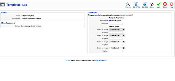
Go ahead and pick a style and add some copyright text. Then, pick your images and set some captions for the slider. Hit save, and guess what, time to check this bad boy out! Point to the upper right and hit preview.
With any luck, you'll see a sweet frontpage with some great functionality. I hope this has been a useful read and resource for you. Please leave a comment below, if you need any help. Thanks for reading.


Comments