
The modern web demands faster and faster development cycles. With this greater demand, there is a need for tools to help meet these deadlines. Webknife is a web development framework to help in creating nice layouts and designs with the least amount of coding. In this tutorial, I am creating a web-based application to help instructors at Tuts+ create their course paperwork in Markdown more easily.
Wireframing
Before coding, it is a good practice to get an idea of the application layout and how you want it to work. This application creates a properly formatted Markdown document for placing a video course into the Envato CMS. Therefore, it will mostly consist of input fields.
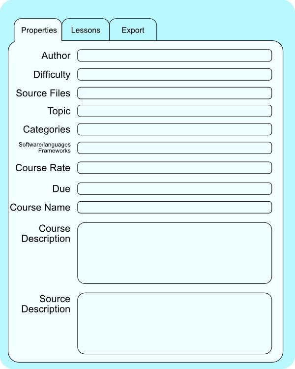
I used Affinity Designer to create a wireframe of the application. Here is the main Properties tab. This is the main information needed to create the CMS entry for the course.
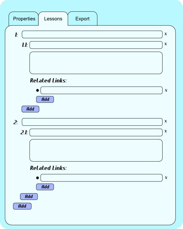
Selecting the Lessons tab shows this form. This is where the instructor can input the chapter headings, lesson titles, lesson descriptions, and lesson links. The numbering will be automatically calculated by the program. This tutorial only shows enough demo items in order to see the layout.
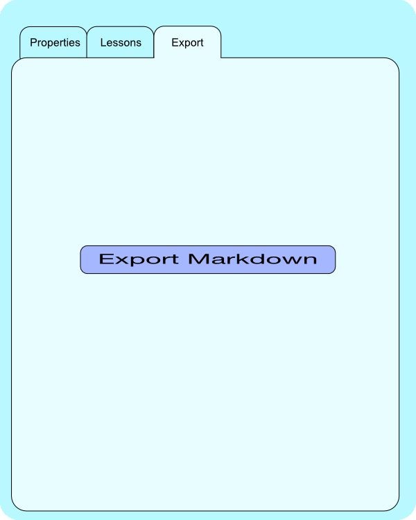
The Export tab has a single element: a button to export the course to a Markdown document.
Getting Started With Webknife
To download the library, go to the website for Webknife and download the latest version. While writing this tutorial, the latest version is 1.4.0. Unzip the file in your working directory.
Webknife is a group of style sheets and some JavaScript files that make creating HTML sites fast and easy. Therefore, I will walk through the creation of the HTML first, show its outcome, and then add just enough CSS to make it look the way I want it. The Webknife toolkit does most of the work.
The top of the HTML will be the header that loads the style sheets and sets the title. Create the file index.html and add the following:
<!doctype html>
<!-- MOTW-DISABLEDsaved from url=(0014)about:internet -->
<!-- delete MOTW-DISABLED to enable Mark of the Web (http://msdn.microsoft.com/en-us/library/ms537628%28VS.85%29.aspx)-->
<html>
 <head>
   <meta http-equiv="X-UA-Compatible" content="IE=edge" ><!--Prevent IE using compatibility mode on local or intranet pages. Do not put scripts before this line.-->
   <meta name="viewport" content="width=device-width, user-scalable=yes"><!--Mobile device scaling-->
   <meta charset="UTF-8">
     <title>Envato Course Sheet Generator</title>

	 <!-- Style Sheets Used -->
	 <link type="text/css" rel="stylesheet" href="webknife-1.4.0/framework/framework.min.css" />
	 <link type="text/css" rel="stylesheet" href="webknife-1.4.0/framework/highlight.min.css" />
     <link rel="stylesheet" type="text/css" href="css/basic.css" />
 </head>
 <body>
    <section>
        <div  id="main" class="w-fixed-width">
    	</div>
    </section>
 </body>
</html>
That is the beginning of the HTML file for the project. Everything else goes on between the <div id="main"></div> tags.
Tabs
The first part is the tabs. They will have icons and some text describing what that tab does. Place this piece of code in the main div:
<!-- Tabs Definition -->
<ul class="w-tab">
    <li id='propertiesTab' class="w-active">
		<a href="#" onclick="propertiesTabClick();">
			<span class="w-icon" data-name="clipboard"></span>
			<span>Properties</span>
		</a>
	</li>
	<li id='lessonsTab'>
		<a href="#"  onclick="lessonsTabClick();">
			<span class="w-icon" data-name="compose"></span>
			<span>Lessons</span>
		</a>
 	</li>
	<li id='exportTab'>
		<a href="#"  onclick="exportTabClick();">
			<span class="w-icon" data-name="share"></span>
			<span>Export</span>
		</a>
	</li>
</ul>
The unordered list has a class of w-tab. This Webknife class formats the list items to be tabs. The first list item has the class of w-active. Webknife uses this to change the color of the tab to be the active colorization. All the rest do not, so they will be inactive.
Each list item has an anchor with an onclick function. These functions I will create to support switching of content panel contents.
Inside the anchor tabs, there are two spans. The first span has a class of w-icon. All spans with this class have a data-name selector with the name of the icon to insert inside that span. The Properties span has the data-name="clipboard". The Lessons span has the data-name="compose". The Export span has the data-name="share". Webknife has 77 svg icons to choose from. Refer to the HTML Reference Guide for more details.
Messages
After the Tabs Panel, place this code:
<div id="panelContainer" class='w-tab-content'>
<!-- Warning Messages and Comments. -->
    <div id="message">
        <span class="w-icon large" data-name="alert_circled" title="alert_circled"></span>
        <p class="w-message w-information">Saved Okay!</p>
    </div>

    <div id="alert">
        <span class="w-icon large coloured" data-name="alert_circled" title="alert_circled"></span>
        <p class="w-message w-error">There was an Error!</p>
    </div>
This section begins with a div that contains all of the panel contents for all three tabs. This div also contains two message areas: one for save completion and another for error messages.

Webknife has the CSS style large for making the icon larger and the CSS style coloured to color it red. In both messages, I am using the data-name:"alert_circled" for a rounded triangle with an exclamation mark icon. Each message has the Webknife class w-message to have the message styling. The saved message uses w-information, and the error message uses w-error.
In the source files for this tutorial, I have these lines commented out. I will use JavaScript to inject this code into the DOM as needed.
Properties Panel
For the Properties Panel, add this code:
<!-- Properties Panel -->
<div id='propertiesPanel' class="w-form w-active">
    <div class="w-form-group">
        <label for="author">Author: </label>
        <input type="text" name="author" id="author" / />
    </div><div class="w-form-group">
        <label for="difficulty">Difficulty: </label>
        <select name="difficulty" id="difficulty">
            <option>Beginner</option>
            <option>Intermediate</option>
            <option>Advanced</option>
        </select>

    </div><div class="w-form-group">
        <label for="topic">Topic: </label>
        <select name="topic" id="topic">
            <option>3D & Motion Graphics</option>
            <option>Computer Skills</option>
            <option>Crafts & DIY</option>
            <option>Design & Illustration</option>
            <option>Game Development</option>
            <option>Music & Audio</option>
            <option>Web Design</option>
            <option>Code</option>
            <option>Photo & Video</option>
        </select>

    </div><div class="w-form-group">
        <label for="Categories">Categories: </label>
        <input type="text" name="Categories" id="Categories" />
    </div><div class="w-form-group">
        <label for="frameworks">Software/Languages/Frameworks:</label>
        <input type="text" name="frameworks" id="frameworks" />
    </div><div class="w-form-group">
        <label for="courseRate">Course Rate: </label>
        <input type="text" name="courseRate" id="courseRate" />
    </div><div class="w-form-group">
        <label for="due">Due: </label>
        <input type="text" name="due" id="datedue" />
    </div><div class="w-form-group">
        <label for="courseName">Course Name: </label>
        <input type="text" name="courseName" id="courseName" />
    </div><div class="w-form-group">
        <label for="courseDescription">Course Description: </label>
        <textarea rows="5" type="text" name="courseDescription" id="courseDescription" class="multipleLineProperties"> </textarea>
    </div><div class="w-form-group">
        <label for="sourceDescription">Source Description: </label>
        <textarea rows="5" type="text" name="sourceDescription" id="sourceDescription" class="multipleLineProperties"> </textarea>
    </div>
</div>
The Properties Panel div contains two classes: w-form and w-active. w-form defines the styling for a form and w-active designates it as being actively displayed. Since the application should start on this panel, it is set from the beginning.
Inside this div, there are divs with the class w-form-group. This class keeps everything inside it on one line. Each of these divs contains a label and an input or a textarea. Each input has a unique identifier to get the information easily from JavaScript. There is a w-form-group dev for each of the inputs on this panel.
Lessons Panel
After the div for the Properties Panel, place this code:
<div id='lessonsPanel' class='w-form '>
    <div class="w-form-group">
        <label for="headingtitle1">1</label>
        <input id="headingtitle1" type="text" name="headingtitle1" />
        <span class="w-icon closeIcon" data-name="close_circled"></span>
        <div class="w-form-group lessonGroup">
            <label for="lessontitle1">1.1</label>
            <input id="lessontitle1" type="text" name="lessontitle1" />
            <span class="w-icon closeIcon" data-name="close_circled"></span>
            <div class="w-form-group lessonDescriptionGroup">
                <textarea id="lesson1description1"></textarea>
                <div class="w-form-group linksGroup">
                    <h3 class="w-no-underline">Related Links:</h3>
                    <div class="w-form-group">
                        <span class="w-icon linkIcon" data-name="earth"></span>
                        <input id="lesson1-1link1" type="text" name="lesson1-1link1" />
                        <span class="w-icon closeIcon" data-name="close_circled"></span>
                    </div>
                    <div class="w-form-group">
                        <button class="w-small w-colored addButton" type="button">Add Link</button>
                    </div>
                </div>
            </div>
            <div class="w-form-group">
                <button class="w-small w-colored addButton" type="button">Add Lesson</button>
            </div>
        </div>
    </div>
    <div class="w-form-group">
        <label for="headingtitle2">2</label>
        <input id="headingtitle2" type="text" name="headingtitle2" />
        <span class="w-icon closeIcon" data-name="close_circled"></span>
        <div class="w-form-group lessonGroup">
            <label for="lesson2title1">2.1</label>
            <input id="lesson2title1" type="text" name="lesson2title1" />
            <span class="w-icon closeIcon" data-name="close_circled"></span>
            <div class="w-form-group lessonDescriptionGroup">
                <textarea id="lesson2description1"></textarea>
                <div class="w-form-group linksGroup">
                    <h3 class="w-no-underline">Related Links:</h3>
                    <div class="w-form-group">
                        <span class="w-icon linkIcon" data-name="earth"></span>
                        <input id="lesson2link1" type="text" name="lesson2-1link1" />
                        <span class="w-icon closeIcon" data-name="close_circled"></span>
                    </div>
                    <div class="w-form-group">
                        <span class="w-icon linkIcon" data-name="earth"></span>
                        <input id="lesson2-1link2" type="text" name="lesson2-1link2" />
                        <span class="w-icon closeIcon" data-name="close_circled"></span>
                    </div>
                    <div class="w-form-group">
                        <button class="w-small w-colored addButton" type="button">Add Link</button>
                    </div>
                </div>
            </div>
            <div class="w-form-group">
                <button class="w-small w-colored addButton" type="button">Add Lesson</button>
            </div>
        </div>
        <div class="w-form-group">
            <button class="w-small w-colored addButton" type="button">Add Heading</button>
        </div>
    </div>
</div>
The structure of the Lessons Panel is the same for the Properties Panel. The labels indicate different section numbers and lesson numbers. The inputs are text inputs for the headings and titles, and are textareas for the descriptions.
Each header, lesson title, and link has a span element with the data-name of close_circled. This places a circle with an ‘x’ in the middle for deleting those items.
Each link input has a span element with the data-name of earth. This places an icon that looks like a globe.
All of the buttons have the Webknife classes w-small and w-colored. The addButton class is for adding specific styling in the CSS file.
The ids are not the final ones, but the JavaScript code will create them as needed. These just show the basic format.
Exporting Panel and JavaScript Importing
After the div for the Lessons Panel, place this code:
            <div id='exportPanel' class='w-form'>
                <div class="w-for-group w-center">
                    <button class="w-large w-colored" type="button">Export Markdown File</button>
                </div>
            </div>
        </div>
        <!-- Load the Scripts last. -->
        <script type="text/javascript" src="webknife-1.4.0/framework/framework.min.js"></script>
        <script type="text/javascript" src="webknife-1.4.0/framework/framework.icons.js"></script>
        <script type="text/javascript" src="webknife-1.4.0/framework/highlight.min.js"></script>
        <script type="text/javascript" src="js/basic.js"></script>
    </body>
</html>
The Export Panel has a simple button. The Webknife classes of w-large and w-colored make the button larger and a darker blue.
After the closing divs for the panels, the three script tags load JavaScript files from Webknife and my JavaScript file. My JavaScript file contains the functions needed to switch the tabs and display the date picker, and the modal dialog for adding a link.
JavaScript Code
In the file js/basic.js, add this code:
function onLoadFunctions() {
    //
    // WebKnife:  instantiate an svg injector to show SVG icons
    // or use injector.inject('#foo') to only inject inside the
    // matching elements
    //
    var injector = new svgInject();
    injector.inject();

    //
    // Setup the datepicker for the due date.
    //
    var dateDue = $('#datedue').pikaday({
    	    firstDay: 1,
		    minDate: new Date('01-01-2015'),
		    maxDate: new Date('12-31-2015'),
        format: 'MM/DD/YYYY',
		    yearRange: [2015,2099]
    });
}
window.onload = onLoadFunctions;

//
// These Global variables and functions are for quickly changing the
// states of the tabs and their contents.
//
var propPan = $("#propertiesPanel");
var lessPan = $("#lessonsPanel");
var expPan = $("#exportPanel");
var propTab = $("#propertiesTab");
var lessTab = $("#lessonsTab");
var expTab  = $("#exportTab");

function propertiesTabClick() {
    propPan.addClass("w-active");
    lessPan.removeClass("w-active");
    expPan.removeClass("w-active");

    propTab.addClass("w-active");
    lessTab.removeClass("w-active");
    expTab.removeClass("w-active");
}

function lessonsTabClick() {
    propPan.removeClass("w-active");
    lessPan.addClass("w-active");
    expPan.removeClass("w-active");

    propTab.removeClass("w-active");
    lessTab.addClass("w-active");
    expTab.removeClass("w-active");
}

function exportTabClick() {
    propPan.removeClass("w-active");
    lessPan.removeClass("w-active");
    expPan.addClass("w-active");

    propTab.removeClass("w-active");
    lessTab.removeClass("w-active");
    expTab.addClass("w-active");
}

function getLink(addButton) {
    //
    // Create the modal dialog for entering the web address.
    //
    var modalOptions = {
        'width' : 600,
        'height' : 220,
        'title' : 'Enter Title and Web Address for Link',
        'html' : '<div style="text-align: center;"><p style="font-size: 30px;">[<input type="text" id="linkTitle" size="25" />](<input type="text" id="linkAddress" size="25" />)</div><button class="w-small w-colored" type="button" >Set Link</button>'
    };
    $(addButton).modal(modalOptions);
}
The first function is an onload function. It will execute when the page load finishes. This function sets up the svg icon injector with the Webknife framework. After that, it sets up the date picker, also from Webknife, for the due date of the course.
The global variables and the three functions following perform the tab switching. I use the variables to keep the jQuery wrapper for the different tab elements and panels. That way, they aren’t created each time the functions are run.
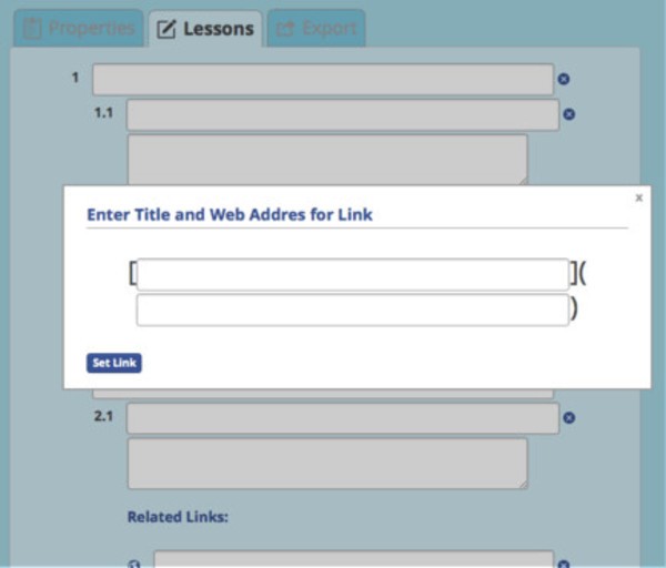
The last function is for popping up the modal dialog on the Add Links button. When the user clicks the button, the following dialogue gets displayed:
More code needs to be written to get the application fully functional, but this is enough for this tutorial.
Custom CSS
Before adding the custom CSS, the application looks like this:
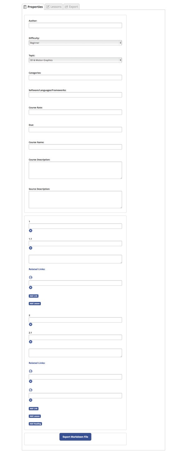
This doesn’t look too bad, except that all the panels show at once and the background colors are not what I wanted. But this is easy to fix. In the file css/basic.css, place this code:
body {
  overflow-x: hidden;
  background-color: lightblue;
}

#main {
  background-color: lightblue;
  overflow-x: hidden;
  padding-left: 10px;
  padding-top: 10px;
  margin: 0px;
  width: 720px;
}

section {
    padding: 0px;
}

#panelContainer {
  width: 700px;
  box-sizing: border-box;
  border-radius: 5px;
  border: 1px solid #bbb;
  height: 855px;
  overflow-y: auto;
}

#propertiesPanel {
    height: 0px;
}

#lessonsPanel {
    height: 0px;
}

#exportPanel {
    height: 0px;
}

#exportPanel div {
    top: 200px;
    position: relative;
}

.w-tab {
    margin-left: 5px;
}

.w-tab li {
  background-color: #86c5da;
}

.w-tab li.w-active {
  background-color: #d4ebf2;
  border-bottom: 0px;
}

.w-tab-content {
  background-color: #d4ebf2;
}

.w-form {
    top: 0px;
    border: 0px;
    padding: 0px;
    margin: 0px;
    visibility: hidden;
}

#propertiesPanel .w-form-group .w-file-input, #propertiesPanel .w-form-group input[type=text], #propertiesPanel .w-form-group input[type=password], #propertiesPanel .w-form-group select, #propertiesPanel .w-form-group textarea, #propertiesPanel .w-form-group label {
    display: inline;
    width: 55%
}

.w-form .w-form-group {
  margin: 0;
}

#propertiesPanel .w-form-group label {
    display: inline-table;
    width: 42%;
    text-align: right;
    padding-right: 10px;
}

#lessonsPanel .w-form-group .w-file-input, #lessonsPanel .w-form-group input[type=text], #lessonsPanel .w-form-group input[type=password], #lessonsPanel .w-form-group select, #lessonsPanel .w-form-group textarea, #lessonsPanel .w-form-group label {
    display: inline;
    width: 80%
}

#lessonsPanel .w-form-group label {
    display: inline-table;
    width: 5%;
    text-align: right;
    padding-right: 10px;
}

.lessonGroup {
    padding-left:  40px;
}

.lessonDescriptionGroup {
    padding-left: 45px;
}

.linksGroup {
    padding-left:  0px;
}

.closeIcon {
    vertical-align: middle;
}

.closeIcon svg {
    width: 15px;
    margin-top: 5px;
    vertical-align: middle;
}

.linkIcon {
    vertical-align: middle;
}

.linkIcon svg {
    width: 15px;
    margin-top: 5px;
    vertical-align: middle;
}

.addButton {
    margin-top: 10px;
}

#message {
    display: inline-flex;
    width: 600px;
    overflow: hidden;
    top: -100;
}

#message p {
    width: 550px;
    margin-left: 20px;
}

#message span svg {
    margin-top: 20px;
}

#message span {
    height: 45px;
}

#alert {
    display: inline-flex;
    width: 600px;
    overflow: hidden;
}

#alert p {
    width: 550px;
    margin-left: 20px;
}

#alert span svg {
    margin-top: 20px;
}

#alert span {
    height: 45px;
}

.w-active {
    visibility: visible !important;
    height: auto;
}
This is all the CSS needed to get the look that I wanted. Most of it is getting the icons in the proper location, properly hiding the panels that are not visible with the tab selection, and setting the background colors.
With the CSS in place, the Properties tab looks like this:
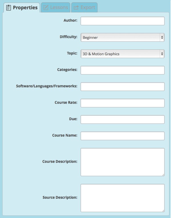
The Lessons tab looks like this:
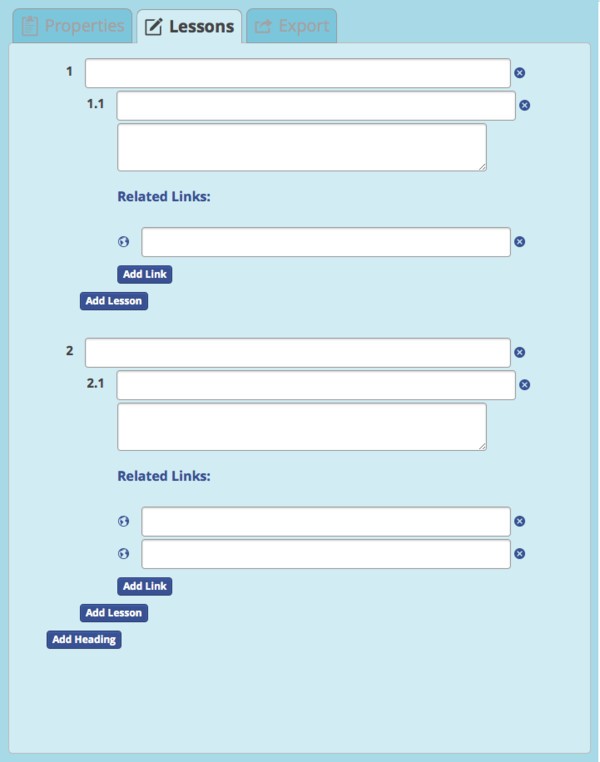
And, the Exports tab looks like this:
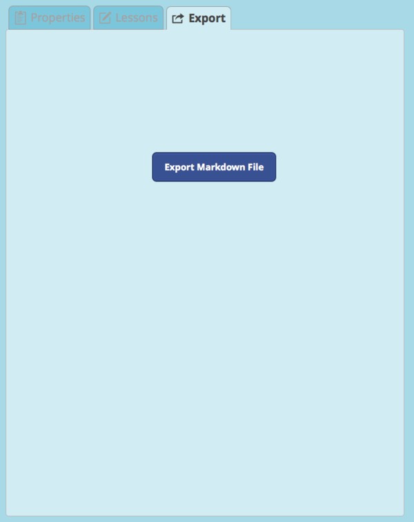
They are not exactly like the wireframe, but I like the way this looks.
Conclusion
In this tutorial, I walked you through the creation of a basic web application for creating course sheets in Markdown for Envato. This project just shows the front-end graphics, but demonstrates how to use Webknife to quickly create the look and feel of your web application or web site. There are many more elements to use than I was able to make use of in this project. It’s up to you to experiment now. So, go create something new in Webknife.


Comments