Welcome to the fifth installment in our series on how to both design and build a 1980s version of the iOS "Phone" app. In this tutorial we will be using Xcode and Interface Builder to skin the "Phone" screen of our application using the graphics we sliced from part four in this series.
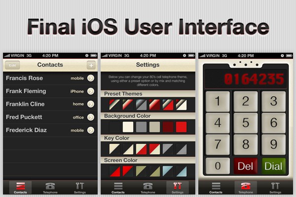
Final App Preview
This is a snapshot of what we will be building over the course of this series:
Before You Begin. . .
This is a multi-part series designed to teach intermediate iOS SDK topics. The content will become increasingly complex as the series progresses. If at any point you find yourself lost in following this series, you might need to take a step back and work your way through our Learn Objective-C series or our Beginning iOS SDK Development series.
If you've been following this series closely, you may notice a big change between today's tutorial and part three: this series now features Xcode 4! All subsequent tutorials in this series will be written using the latest and greatest IDE from Apple.
Step 1: Import the Design Slices Into Xcode
Before we can begin to skin the app Phone screen, we need to import all of the graphics sliced for us in part 4 of this series, Design Comp Slicing. If you didn't slice the images in Photoshop yourself, you'll need to download the resources attached with this post and look for the "Design Slices" folder.
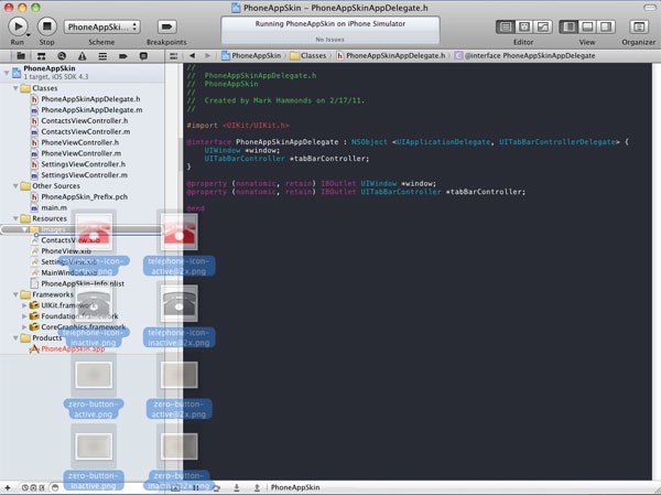
After you have all the image slices needed for our app, create a new folder in the Xcode 4 Navigator window and name the folder "Images". Next open the "Design Slices" folder, select all of the images within, then drag-and-drop the assets into the "Images" folder in Xcode.
Be sure to check the option to actually copy these files into the folder instead of simply adding them as a reference.
Step 2: Add the Phone View Background Image
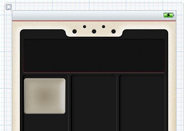
We'll begin our customization of the Phone screen by adding a custom background image to the main view. Open the PhoneView.xib file from the navigator. Delete the "Phone View" UILabel currently on the view and drag a UIImageView object from the object library in the Xcode utility area.
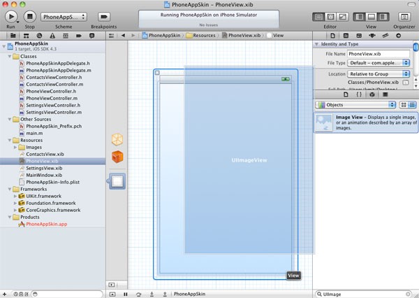
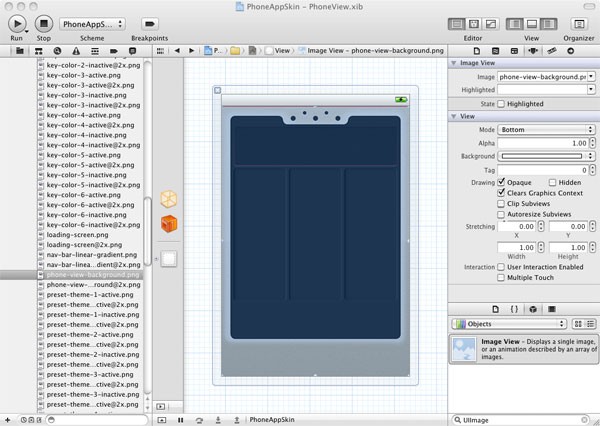
Select the UIImageView object just added onto the view and go to the Attributes Inspector tab in the Xcode Inspector pane. Set the "image" property to "phone-view-background.png" and set the "view mode" property to "bottom". In order to correctly display the full-screen background image when the app is built, you'll also need to uncheck the "Autoresize Subviews" option..
Perfect, our app is starting to look more like an 80s phone already!
Step 3: Add the Phone Buttons
Our next step is to drag a UIButton on top of our new background UIImage. At first, it will look rather unimpressive:
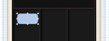
To fix this, go back to the Attributes Inspector with the button object selected. Change the "Type" property to "Custom". Next, make sure that the "State Config" attribute is set to "Default" and update the "Background" attribute to "dialpad-button-inactive.png". You should now see our custom button background in Interface Builder, but the height and length dimensions aren't what we need. To make the dimensions of the button automatically fit the background image specified, select Editor > Size to Fit from the Xcode application menu. You should now see something like this:
Now we need to add a number as the button title. Back in the Attributes Inspector, change the UIButton "title" attribute to "1" and set the "font" attribute to Helvetica Neue, 48.0 point, regular. Now change the "text color" attribute to black (Licorice if you're using the Crayons selector).
Next we need to configure the button to change the background image when tapped. We can do this entirely in Interface Builder by switching the "State Config" attribute to "Highlighted" and then selecting the pressed state options. For the "Highlighted" state, set the "Background" attribute to "dialpad-button-active.png".
With the button configured, make 9 duplicates of the button to represent numbers 2-9 and 0. You can make a duplicate of an object by either selecting the object and pressing CMD + D or by selecting the object and choosing Edit > Duplicate from the Xcode application menu.
After you have 1-9 positioned on the view, you'll need to make a small modification for the 0 button. In order to match the other buttons that will appear on the bottom row, update the "Default" state "background" attribute to the value "zero-button-inactive.png" and the "Highlighted State" background to "zero-button-active.png".
With the 0-9 buttons in place, follow the same procedure just established to create the "dial" and "del" buttons. For the "dial" button, use "dial-button-inactive.png" for the default state background attribute and "dial-button-active.png" for the highlighted state background attribute. For the "del" button, use "delete-button-inactive.png" and "delete-button-active.png". Set the title attribute of each button to "Dial" and "Del" respectively, and then drop the font size down to 36.0 point. Finally, change the text color attribute for both buttons to white ("snow" if using the Crayons selector). Be sure to adjust the size of the button to fit the background image by selecting Editor > Size to Fit and position each button in line with the number pad columns.
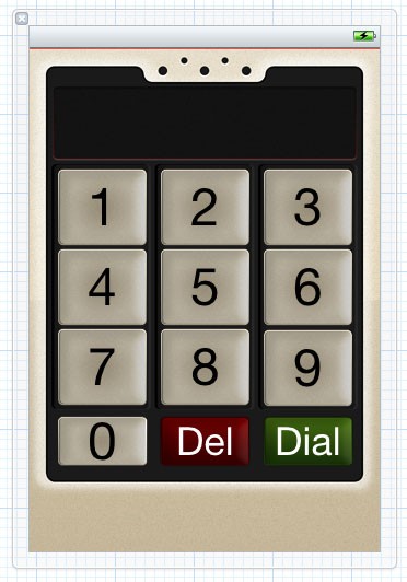
After completing this step, your screen should look something like this:
Step 4: Add the Number Entry Label
Our phone design is shaping up nicely! The final Interface Builder skinning step is to position a UILabel object onto the view that will be used to display the numbers entered by the user.
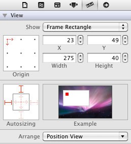
Drag a UILabel from the Objects Library and position it to span the width and height of the appropriate space on the background image. I placed the label at (23x, 49y) with a width of 275 and a height of 40. You can set these values directly in the Size Inspector of the Inspector pane:
In the attributes tab with the newly added UILabel selected, open the text color attribute window and select the "Color Sliders" tab. Change the default drop down from "Gray Scale Slider" to "RGB Sliders", and use the sliders to select 141 for red, 0 for green, and 0 for blue.
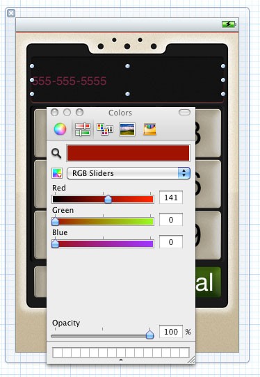
NOTE: For some reason, setting the RGB values directly in the text input boxes results in the background color being changed, not the text color. This seems to be a bug in the recently released Xcode 4 and has been reported as such to Apple. For now, you'll have to use the sliders to change these values!
Now we need to adjust the text display to match the design comp. First, set the alignment attribute in the attributes inspector to "center". Next you'll need to adjust the font family and size.
If you've been working through this series from the beginning, you may have noticed that the font selected for the number entry was Krungthep Regular, the Latin characters of which are identical to Chicago, the font used by Apple Inc. from 1984 to 1997. This was a fitting choice for the project, but, unfortunately, this font isn't available under a creative commons license that would allow us to distribute it in this series. A quick look at the default iOS font list also doesn't show Chicago as an option, so we'll need to choose an alternative font for this series. For now, set the label's font attribute to Arial, Bold, 36 point. We'll try to find a more appropriate, creative-commons font that we can embed in a future tutorial (Know of a good font? Leave a comment below!).
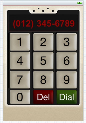
With any luck, your phone screen should now look something like this:
Step 5: Add the App Icon & Launch Image
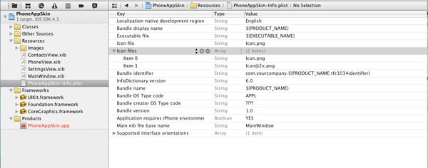
Before we build and run our application, let's set the dock icon for the app. Open the "PhoneAppSkin-Info.plist" property file and look for the "Icon file" entry. Set this field to "Icon.png". In Xcode 3.x, this was the only step necessary to get the dock icon to display correctly. However, Xcode 4 seems to require that the "Icon Files" field is specified in addition to the "Icon File" field. With the "Icon File" field selected, click the "+" symbol to add a new PLIST entry. Scroll through the list of available options until you find "Icon files" and add it to the list. This is an array value, so set the first key, "Item 0", to the 57x57 version, Icon.png. Add another field, "Item 1", and set the value to the 114x114 retina version, [email protected].
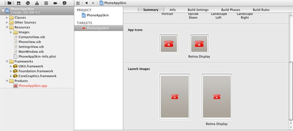
To verify that the dock icons have been configured correctly, select the "PhoneAppSkin" project file from the Xcode navigator pane to open the general project settings. Next, select the PhoneAppSkin target. A display with many of the settings for our target will be presented, and you should notice that both the app icons and the loading image are displayed. How was the loading image set? Xcode will automatically use any image file named "Default.png" as the loading image, so this setting was configured simply by importing the image slices at the beginning of this tutorial.
Conclusion
We're now ready to build our project and see the fruit of our labor! Select Product > Build from the main Xcode menubar to launch the app!
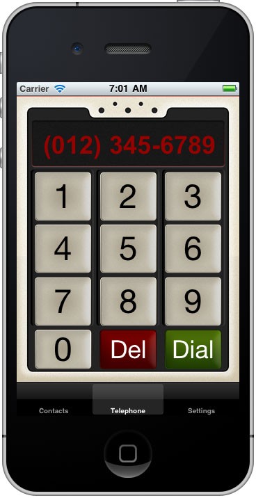
If everything went as planned, you should now have a "Phone" tab like the one above. The buttons 0-9, del, and dial should all respond to taps on the screen by highlighting, but will otherwise be inoperable until we start actually programming this screen.
Next Time. . .
In the next tutorial in this series, I'll be demonstrating how to use Objective-C / Cocoa Touch to complete the functionality of the Phone screen. Specifically, I'll demonstrate how to make the label respond to taps on the dial pad, and I'll also show how to launch a phone call from within the application. Stay tuned and subscribe via RSS or Twitter to be notified when the next tutorial in this series is available!

Comments