In the first five parts of this series, I showed you how to customize the WordPress admin in a variety of ways, including customizing the login screen, dashboard and post editing screen.
In this tutorial you'll learn how to add some styling and branding to your admin screens. Specifically you'll learn how to:
- customize the admin screen footer and style it
- style admin menus
- style links and buttons
I'm going to create a plugin to do this - if you've already created a plugin after following Parts 1 to 5 of this series you may prefer to add the code from this tutorial to that plugin, giving you one plugin with all of your admin customizations.
What You Will Need to Complete This Tutorial
To complete this tutorial you will need:
- A WordPress installation
- Access to your site's plugins folder to add your plugin
- A text editor to create your plugin
Setting Up the Plugin
As I'll be including images and stylesheets with this plugin, I'm creating a folder for it rather than a single PHP file. Inside that folder I'll create a PHP file which will contain the core functions in my plugin.
This means that I have a folder called wptutsplus-customizing-admin6-styling, in which I have two folders - images and css, and one PHP file.
At the beginning of that file, I'm adding the following lines:
/*
Plugin Name: WPTutsPlus Customize the Admin Part 6 - styling and branding the dashboard
Plugin URI: http://rachelmccollin.co.uk
Description: This plugin supports the tutorial in wptutsplus. It customizes the WordPress dashboard screen.
Version: 1.0
Author: Rachel McCollin
Author URI: http://rachelmccollin.com
License: GPLv2
*/
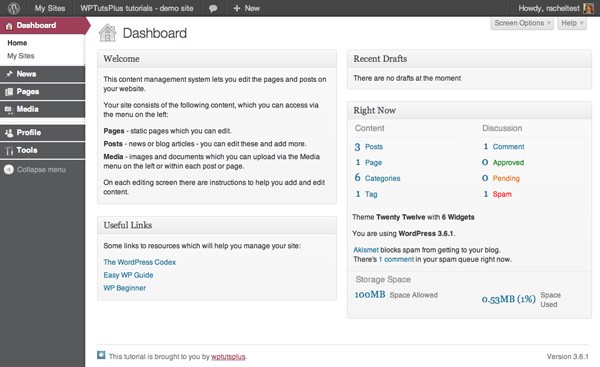
The Starting Dashboard
Because I've already made some modifications to the dashboard in the earlier parts of this series, it doesn't look the same as the default dashboard. The screenshot below shows what I'm starting with:

In this tutorial I'll add some styling to incorporate different colors, which could be used to reflect your own brand.
1. Setting Up the Stylesheet
Before I do anything else I'm going to set up the stylesheet properly. Instead of using the wp_enqueue_scripts hook as you would if adding a stylesheet for use in your website's front end, you use admin_enqueue_scripts instead.
So, in your plugin, add the following:
// let's start by enqueuing our styles correctly
function wptutsplus_admin_styles() {
	wp_register_style( 'wptuts_admin_stylesheet', plugins_url( '/css/style.css', __FILE__ ) );
	wp_enqueue_style( 'wptuts_admin_stylesheet' );
}
add_action( 'admin_enqueue_scripts', 'wptutsplus_admin_styles' );
You'll also need to create a stylesheet in the /css directory in your plugin's folder, which is where you'll add styling later on in this tutorial.
2. Amending the Footer Text
The default footer text in WordPress reads 'Thank you for creating with WordPress'. If you're running a multisite installation or developing for clients, you may want to refer to your own brand here instead. Luckily this can be done using the admin_footer_text filter.
I'm going to change the text and add a logo as well, so I'll create an /images directory in my plugin's folder and add my logo to that.
In your plugin's main file add the following:
//change the footer text
function wptutsplus_admin_footer_text () {
	echo '<img src="' . plugins_url( 'images/wptutsplus-icon.png' , __FILE__ ) . '">This tutorial is brought to you by <a href="http://wp.tutsplus.com">wptutsplus</a>.';
}
add_filter( 'admin_footer_text', 'wptutsplus_admin_footer_text' );
This adds the new image and footer text as shown in the screenshot:
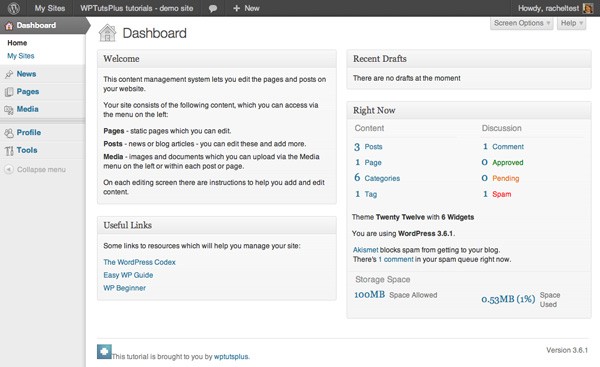
However the image is a little large, even though I've uploaded a small one. It's also way too close to the text. To correct that, you add some styling to the stylesheet which you've already registered.
In the stylesheet you've created for your plugin, add the following:
/* styling for the footer */
#wpfooter #footer-left img {
	height: 1.2em;
	width: auto;
	margin-right: 0.5em;
}
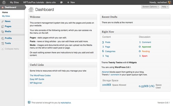
Now the image is the correct size:
3. Styling the Admin Menu
In Part 3 of this series, I showed you how to customize the content of the admin menu - now I'll demonstrate how to customize the styling. I'm going to change the colors quite drastically - you may or may not like the result, but it shows how to do it!
In the stylesheet you've created, add the following:
/* styling for admin menu */

/* background and text color */
#adminmenuback, #adminmenuwrap {
	background-color: #58595b;
	border-color: #fff;
}
#adminmenu li.menu-top:hover, #adminmenu li.opensub > a.menu-top, #adminmenu li > a.menu-top:focus {
	background-color: #58595b;
	color: #d54e21;
	text-shadow: 0 1px 0 rgba(255,255,255,0.4);
}
#adminmenu li.wp-menu-separator {
	background: #fff;
	border-color: #fff;
}

/* links in admin menu */
#adminmenu a,
#adminmenu li.menu-top:hover,
#adminmenu li.opensub > a.menu-top,
#adminmenu li > a.menu-top:focus {
	color: #fff;
}
#adminmenu a:hover,
#adminmenu a:active {
	color: #fff;
	text-decoration: underline;
}
#adminmenu .wp-submenu a {
	color: #58595b;
}

/* change color of arrow to submenus */
#adminmenu li.wp-not-current-submenu .wp-menu-arrow,
#adminmenu li.wp-not-current-submenu .wp-menu-arrow div {
	background: #58595b;
}

/* active screen as seen in menu - change the background and arrow colour */
#adminmenu li.wp-has-current-submenu a.wp-has-current-submenu,
#adminmenu li.current a.menu-top,
.folded #adminmenu li.wp-has-current-submenu,
.folded #adminmenu li.current.menu-top,
#adminmenu .wp-menu-arrow,
#adminmenu .wp-has-current-submenu .wp-submenu .wp-submenu-head {
	background: #9e4059;
}
#adminmenu li.wp-has-current-submenu .wp-menu-arrow,
#adminmenu li.wp-has-current-submenu .wp-menu-arrow div {
	background: #9e4059;
}
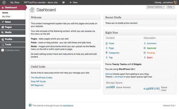
This results in some very different colours for the admin menu:
- the background is dark grey
- submenus are white with grey text
- links are white
- the active page has a red background
The trickiest element to restyle is the arrow pointing to the current page or to a submenu - this is styled using the .wp-menu-arrow element and the .wp-menu-arrow div element inside it. The great thing is that WordPress uses pure CSS to achieve this arrow and not an image, so once you've identified the elements to target, you can change its color using CSS.
The dashboard now looks like this:
4. Styling Links
I want my links to reflect the brand colors I've used for the dashboard menu - in particular I want to change the shade of red used when links are hovered over or active.
In the stylesheet, add the following:
/* links elsewhere */
a:hover, a:active {
	color: #9e4059;
}
This tweaks the red of my links as shown in the screenshot:

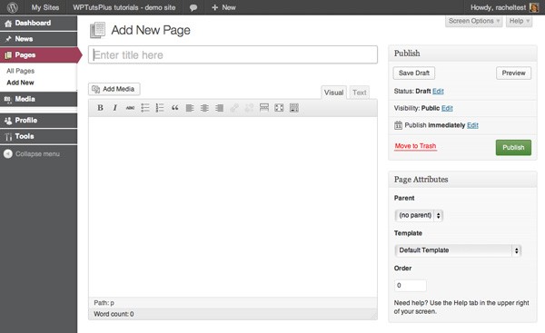
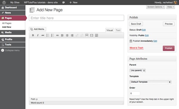
5. Styling Buttons
The final styling change I want to make is to buttons. I'm going to change the color of buttons in the admin screens, both when they're active and inactive. This is to draw attention to them and also to tie in with the menu colors.
In the stylesheet, add the code below:
/* buttons */
.wp-core-ui .button-primary {
	background: #4b8938;
	background-image: -webkit-gradient(linear,left top,left bottom,from(#7ea367),to(#4b8938));
	background-image: -webkit-linear-gradient(top,#7ea367,#4b8938);
	background-image: -moz-linear-gradient(top,#7ea367,#4b8938);
	background-image: -ms-linear-gradient(top,#7ea367,#4b8938);
	background-image: -o-linear-gradient(top,#7ea367,#4b8938);
	background-image: linear-gradient(to bottom,#7ea367,#4b8938);
	border-color: #4b8938;
	color: rgba(255,255,255,0.95);
	-webkit-box-shadow: inset 0 1px 0 rgba(0,0,0,0.1);
	box-shadow: inset 0 1px 0 rgba(0,0,0,0.1);
	text-shadow: 0 1px 0 rgba(0,0,0,0.1);
}
.wp-core-ui .button-primary.active,
.wp-core-ui .button-primary:hover,
.wp-core-ui .button-primary:active {
	background: #9e4059;
	background-image: -webkit-gradient(linear,left top,left bottom,from(#ba7582),to(#9e4059));
	background-image: -webkit-linear-gradient(top,#ba7582,#9e4059);
	background-image: -moz-linear-gradient(top,#ba7582,#9e4059);
	background-image: -ms-linear-gradient(top,#ba7582,#9e4059);
	background-image: -o-linear-gradient(top,#ba7582,#9e4059);
	background-image: linear-gradient(to bottom,#ba7582,#9e4059);
	border-color: #9e4059;
	color: rgba(255,255,255,0.95);
	-webkit-box-shadow: inset 0 1px 0 rgba(0,0,0,0.1);
	box-shadow: inset 0 1px 0 rgba(0,0,0,0.1);
	text-shadow: 0 1px 0 rgba(0,0,0,0.1);
}
This changes the background and border colors for buttons both in their default state and when they're hovered over or active. The screenshot below shows the default state:
And this is the color when a button is hovered over or clicked:
And that's all of my styling - done!
Summary
In this series I've shown you six different techniques for customizing the WordPress admin.
I've covered:
- Creating a custom login screen with your own logo and colors
- Customizing the dashboard by adding and removing content
- Creating custom admin menus to help your users
- Adding help text to editing screens to help your users edit their site
- Customizing the listings screens to display only what your users need
- Styling the admin screens to reflect your brand and/or make color chnages for UI or to tie on with a site's front end
Hopefully, this has given you some inspiration to come up with ideas of your own.
WordPress is a truly great Content Management System, with some customization you can make it your own, and give your users and clients an experience which is adds extra help for them and also reflects your brand.


Comments