Welcome back to this series, in which you're learn how to use React Native to create page layouts commonly used in mobile apps. The layouts you're creating won't be functional—instead, the main focus of this series is to get your hands dirty in laying out content in your React Native apps.
If you're new to laying out React Native apps or styling in general, check out my previous tutorial:

To follow along with this series, I challenge you to try recreating each screen by yourself first, before you read my step-by-step instructions in the tutorial. You won't really benefit much from this tutorial just by reading it! Try first before looking up the answers here. If you succeed in making it look like the original screen, compare your implementation to mine. Then decide for yourself which one is better!
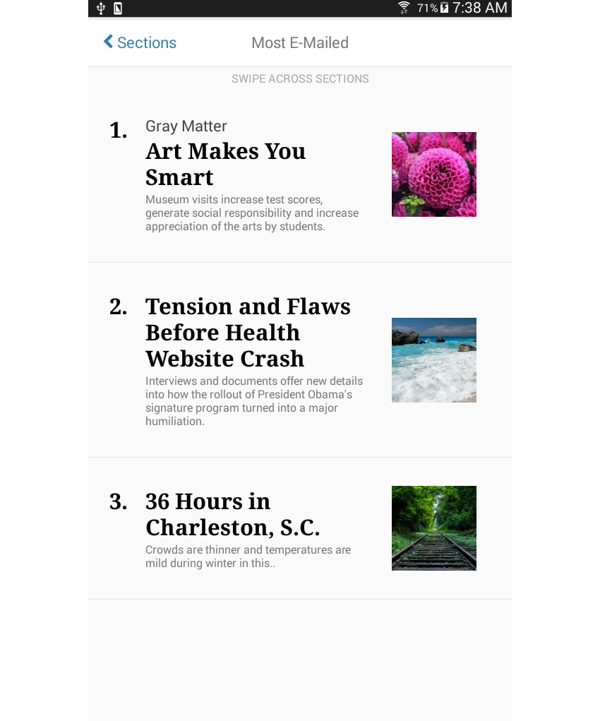
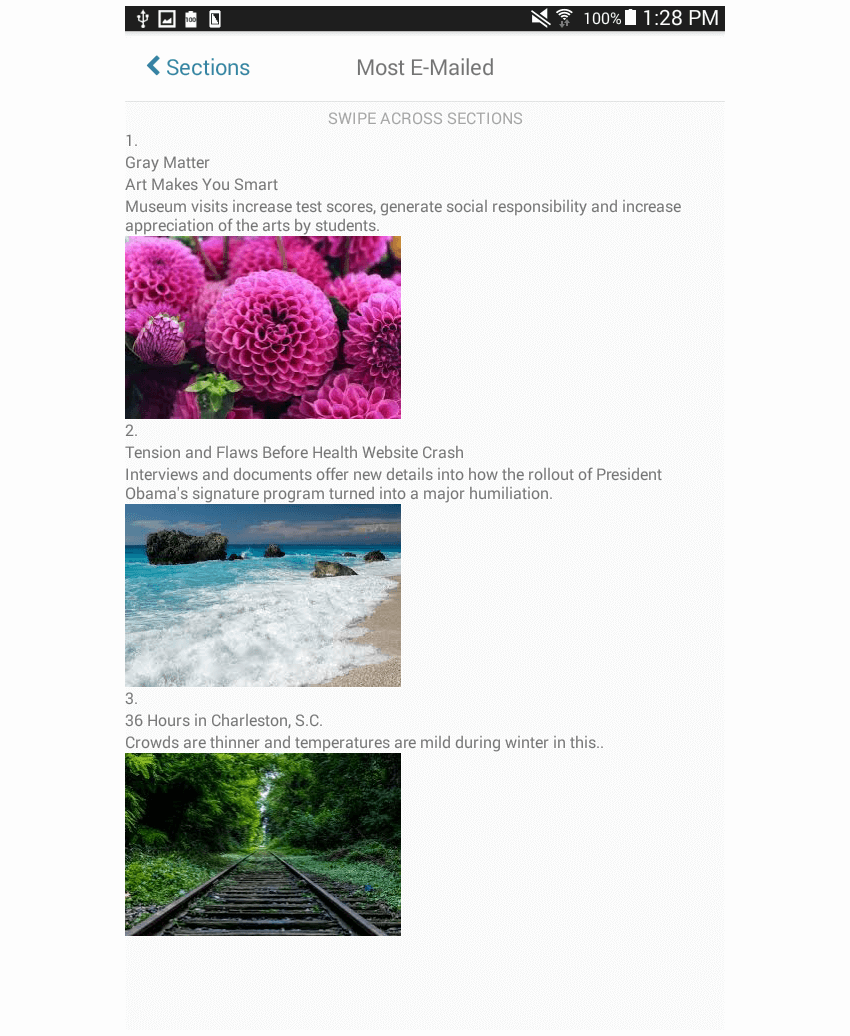
In this final tutorial of the series, you'll create the following news feed page:
News feed layouts are used to present information in such a way that it can be easily scanned. Most of the time it's presented in a list format with the title, excerpt, and optionally a preview image that represents each news item.
Here are a couple of examples of this type of layout being used in the wild:
Project Setup
The first step, of course, is to set up a new React Native project:
react-native init react-native-common-screens
Once the project is set up, open the index.android.js file and replace the default code with the following:
import React, { Component } from 'react';
import {
  AppRegistry
} from 'react-native';

import News from './src/pages/News';

export default class ReactNativeCommonScreens extends Component {

  render() {
    return (
      <News />
    );
  }

}

AppRegistry.registerComponent('ReactNativeCommonScreens', () => ReactNativeCommonScreens);
Create a src/pages folder and create a News.js file inside it.
You'll also need the react-native-vector-icons package. This is specifically used for the back icon in the header.
npm install --save react-native-vector-icons
Open the android/app/build.gradle file and add a reference to the package:
dependencies {
    //rest of the dependencies are here at the top
    compile project(':react-native-vector-icons') //add this
}
Do the same with the android/settings.gradle file by adding the following at the bottom:
include ':react-native-vector-icons'
project(':react-native-vector-icons').projectDir = new File(rootProject.projectDir, '../node_modules/react-native-vector-icons/android')
Open android/app/src/main/java/com/react-native-common-screens/MainApplication.java and import the package:
import java.util.Arrays;
import java.util.List;

import com.oblador.vectoricons.VectorIconsPackage; //add this
Lastly, initialize the package:
@Override
protected List<ReactPackage> getPackages() {
  return Arrays.<ReactPackage>asList(
      new MainReactPackage(),
      new VectorIconsPackage() //add this
  );
}
Creating the News Page
Okay, now that you've tried to code the layout yourself (no cheating, right?) I'll show you how I built my implementation.
You must have noticed the trend by now. I've arranged these according to difficulty—or at least according to what I found difficult! So this final screen is basically the big boss among the other screens that you've created so far. Fret not, though, as I'll still be guiding you step by step.
You will need a few images for the preview image of each news item. I've added some images in the repo that you can use if you want.
Start by adding the boilerplate code:
import React, { Component } from 'react';

import {
  StyleSheet,
  Text,
  View,
  ScrollView,
  Image
} from 'react-native';

import Icon from 'react-native-vector-icons/FontAwesome';

import Button from '../components/Button';
import NewsItem from '../components/NewsItem';
This time there's a new component named NewsItem (src/components/NewsItem). As the name suggests, it is used for rendering each news item. We'll come back to it later, but first take a look at the constructor() function. Just like the gallery screen earlier, this uses the state to store the data source for the news items. The titles and summaries are from the New York Times, but the images are from Google Images (and are labeled for reuse by their respective owners).
constructor(props) {
    super(props);
	this.state = {
		news_items: [
			{
				pretext: 'Gray Matter',
				title: 'Art Makes You Smart',
				summary: 'Museum visits increase test scores, generate social responsibility and increase appreciation of the arts by students.',
				image: require('../images/pink.jpg'),
			},
			{
				pretext: '',
				title: 'Tension and Flaws Before Health Website Crash',
				summary: 'Interviews and documents offer new details into how the rollout of President Obama\'s signature program turned into a major humiliation.',
				image: require('../images/beach.jpg')
			},
			{
				pretext: '',
				title: '36 Hours in Charleston, S.C.',
				summary: 'Crowds are thinner and temperatures are mild during winter in this..',
				image: require('../images/rails.jpg')
			},

		]
	};
}
The content is divided into three parts: the header, the instruction text, and the news items. The header is very similar to the header from the calendar screen earlier; the only difference is that instead of three, there are only two visible elements. (If you want a refresher on how the calendar screen was made, go ahead and read over that tutorial.)
I say "visible" because there are actually three elements—the last one is just hidden! This allows for easy centering of the text in the middle. If you just have two elements in the header, it's tricky to figure out how to divide space between the two elements and still have the middle one appear centered. But if you have three elements, each one can have the same flex value, and you can just use textAlign to position text or alignItems to position View components.
render() {
    return (
		<View style={styles.container}>
			<View style={styles.header}>
				<Button
					noDefaultStyles={true}
                	styles={{button: styles.header_button}}
                	onPress={this.press.bind(this)}
				>
					<View style={styles.back_button}>
						<Icon name="chevron-left" size={20} color="#397CA9" />
                    	<Text style={[styles.back_button_label]}> Sections</Text>
					</View>
				</Button>

                <View style={styles.header_text}>
					<Text style={styles.header_text_label}>Most E-Mailed</Text>
                </View>
                <View style={styles.whitespace}></View>
			</View>

			<View style={styles.instruction}>
				<Text style={styles.instruction_text}>SWIPE ACROSS SECTIONS</Text>
			</View>

			<ScrollView style={styles.news_container}>
			{ this.renderNews() }
			</ScrollView>

		</View>
	);
}
The renderNews() function is the one which loops through all the news items in the state and renders them using the NewsItem component.
renderNews() {
    return this.state.news_items.map((news, index) => {
		return <NewsItem key={index} index={index} news={news} />
	});
}
Next up is the code for the NewsItem component. Start by adding the boilerplate React component code. As you've seen earlier, this component accepts the key, index, and news as its props. You only really need the index and news. key is just React Native's way of uniquely identifying each row in a list. You need to supply it every time you use Array.map for rendering; otherwise, it will complain.
When you use functional components, the props are passed as a single argument. Below, the individual props are extracted using destructuring assignment, so { news, index } basically extracts the news and index properties from the props. From there you can get the number to be rendered.
import React, { Component } from 'react';

import {
  StyleSheet,
  Text,
  View,
  Image
} from 'react-native';

import Button from './Button';

const NewsItem = ({ news, index }) => {
    let number = (index + 1).toString();

	return (
        ...
	);
}
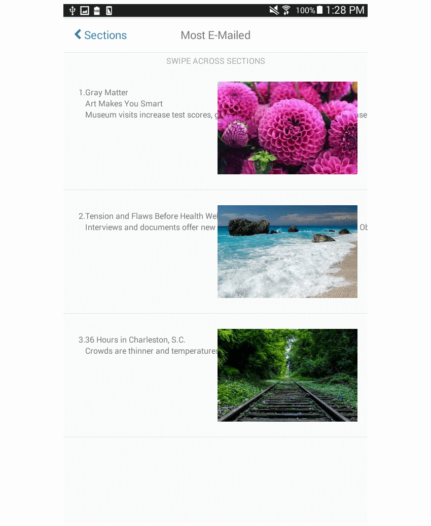
If you look at the screenshot from earlier, you can see that each news item can be divided into two groups: one that displays the news text (number, title, and the excerpt), and one that displays the feature image.
That solves the problem with the feature image since it's just one element. But for the news text, you still have to divide it further. As you may have noticed, the number is in the same position even if the title has a pretext (e.g. "Gray Matter"). The pretext also has a different styling from the title and the number.
Using this knowledge, you can deduce that the number, pretext, and title shouldn't be lumped together in a single container. Furthermore, the pretext, title, and excerpt look as if they're vertically stacked so you can put them inside a single container. Only the number should be brought out. With that, you'll arrive with the following markup:
<Button
	key={index}
	noDefaultStyles={true}
	onPress={onPress.bind(this, news)}
>
	<View style={styles.news_item}>
		<View style={styles.news_text}>
			<View style={styles.number}>
				<Text style={styles.title}>{number}.</Text>
			</View>
			<View style={styles.text_container}>
				{ getPretext(news) }
				<Text style={styles.title}>{news.title}</Text>
				<Text>{news.summary}</Text>
			</View>
		</View>
		<View style={styles.news_photo}>
			<Image source={news.image} style={styles.photo} />
		</View>
	</View>
</Button>
The getPretext() function allows you to conditionally render a Text component only when a news item has a pretext in it.
function getPretext(news) {
    if(news.pretext){
		return (
			<Text style={styles.pretext}>{news.pretext}</Text>
		);
	}
}
Here's the onPress function. All it does is alert the news title, but in a real app this should navigate to the actual article:
function onPress(news) {
	alert(news.title);
}
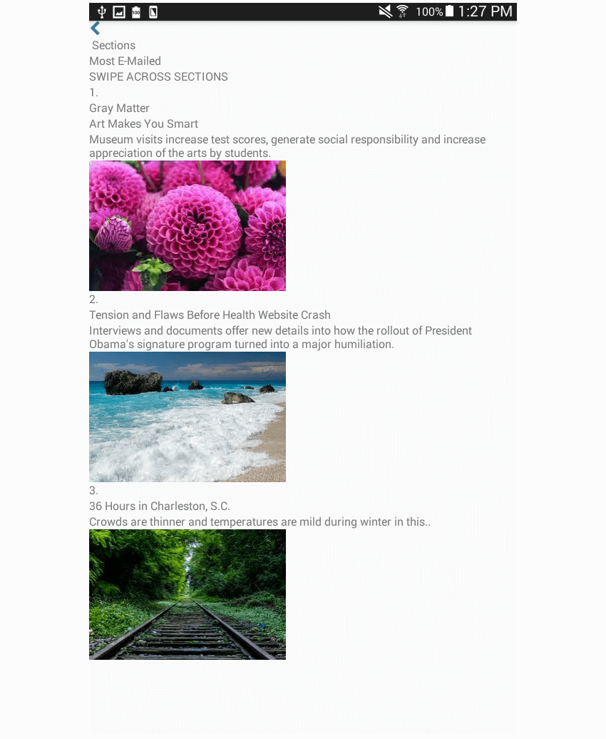
At this point, the page will now look like this:
Now, add the following styles to the News page:
const styles = StyleSheet.create({
    container: {
		flex: 1
	},
	header: {
		flexDirection: 'row',
		backgroundColor: '#FFF',
		padding: 20,
		justifyContent: 'space-between',
		borderBottomColor: '#E1E1E1',
		borderBottomWidth: 1
	},
	header_button: {
		flex: 1,
	},
	whitespace: {
		flex: 1
	},
	back_button: {
		flexDirection: 'row',
		alignItems: 'center'
	},
	back_button_label: {
		color: '#397CA9',
		fontSize: 20,
	},
	instruction: {
		alignSelf: 'center',
		marginTop: 5
	},
	instruction_text: {
		color: '#A3A3A3'
	},
	header_text: {
		flex: 1,
		alignSelf: 'center'
	},
	header_text_label: {
		fontSize: 20,
		textAlign: 'center'
	},
	news_container: {
		flex: 1,
		flexDirection: 'column'
	},
});
I'll no longer be walking you through what each line of code does since it basically applies the same concepts you've learned in the previous tutorials in this series. Here's what the page will look like once the above styles are applied:
Next, add the styles for each news item. Each news_item has a flexDirection of row so that the news text and the featured image are all on a single line. news_text occupies two-thirds of the available space, while news_photo occupies the remaining space.
const styles = StyleSheet.create({
    news_item: {
		flex: 1,
		flexDirection: 'row',
		paddingRight: 20,
		paddingLeft: 20,
		paddingTop: 30,
		paddingBottom: 30,
		borderBottomWidth: 1,
		borderBottomColor: '#E4E4E4'
	},
	news_text: {
		flex: 2,
		flexDirection: 'row',
		padding: 10
	},

});
Next, you need to add the styling to fix the issue with the text overlapping with the preview image. You can do that by assigning a flex value to the children of the news_text. A flex value has already been assigned to news_text, but since a View has been used inside it, you also need to assign a flex value to those so that they won't go over the bounds of their parent View.
We'll assign a flex value of 0.5 to the number, while text_container will have a value of 3. With these values, the text_container will occupy six times as much space as the number.
number: {
    flex: 0.5,
},
text_container: {
	flex: 3
},
Now all you have to do is to add the final touches to style the text:
pretext: {
    color: '#3F3F3F',
	fontSize: 20
},
title: {
	fontSize: 28,
	fontWeight: 'bold',
	color: '#000',
	fontFamily: 'georgia'
},
news_photo: {
	flex: 1,
	justifyContent: 'center',
	alignItems: 'center'
},
photo: {
	width: 120,
	height: 120
}
And don't forget to export the component!
export default NewsItem;
Final Thoughts
That's it! In this final part of this series, you learned how to implement the layout commonly used in news pages. This tutorial brought together all the things that you've learned in the previous parts of the series. You've used both flexDirection: 'row' and flexDirection: 'column' to complete the styles for each news item. You also used your knowledge in aligning images for the preview image.
If you have tried to implement these layouts on your own, failed, and then tried again, you should already have enough skill to implement any kind of layout. You can apply the things you learned in here to implement even the complex layouts that you commonly see in popular apps. If you want more practice, try recreating the layouts you see in popular apps such as Facebook or YouTube.
How did my solution compare to your own? Let us know in the discussion forum below. And in the meantime, check out some of our other tutorials on React Native and Flexbox.


Comments