In this series, you're learning how to use React Native to create page layouts commonly used in mobile apps. The layouts you're creating won't be functional—instead, the main focus of this series is to get your hands dirty in laying out content in your React Native apps.
If you're new to laying out React Native apps or styling in general, check out my previous tutorial:
To follow along with this series, I challenge you to try recreating each screen by yourself first, before you read my step-by-step instructions in the tutorial. You won't really benefit much from this tutorial just by reading it! Try first before looking up the answers here. If you succeed in making it look like the original screen, compare your implementation to mine. Then decide for yourself which one is better!
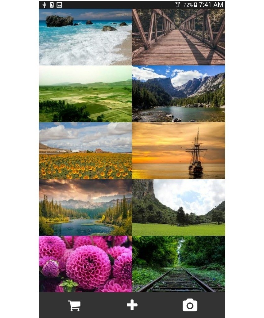
In this third post of the series, you'll create the following photo gallery page:

Galleries are often used to display a collection of related content in such a way that only the necessary information is presented. Most of the time this includes a photo, a title, and other relevant information.
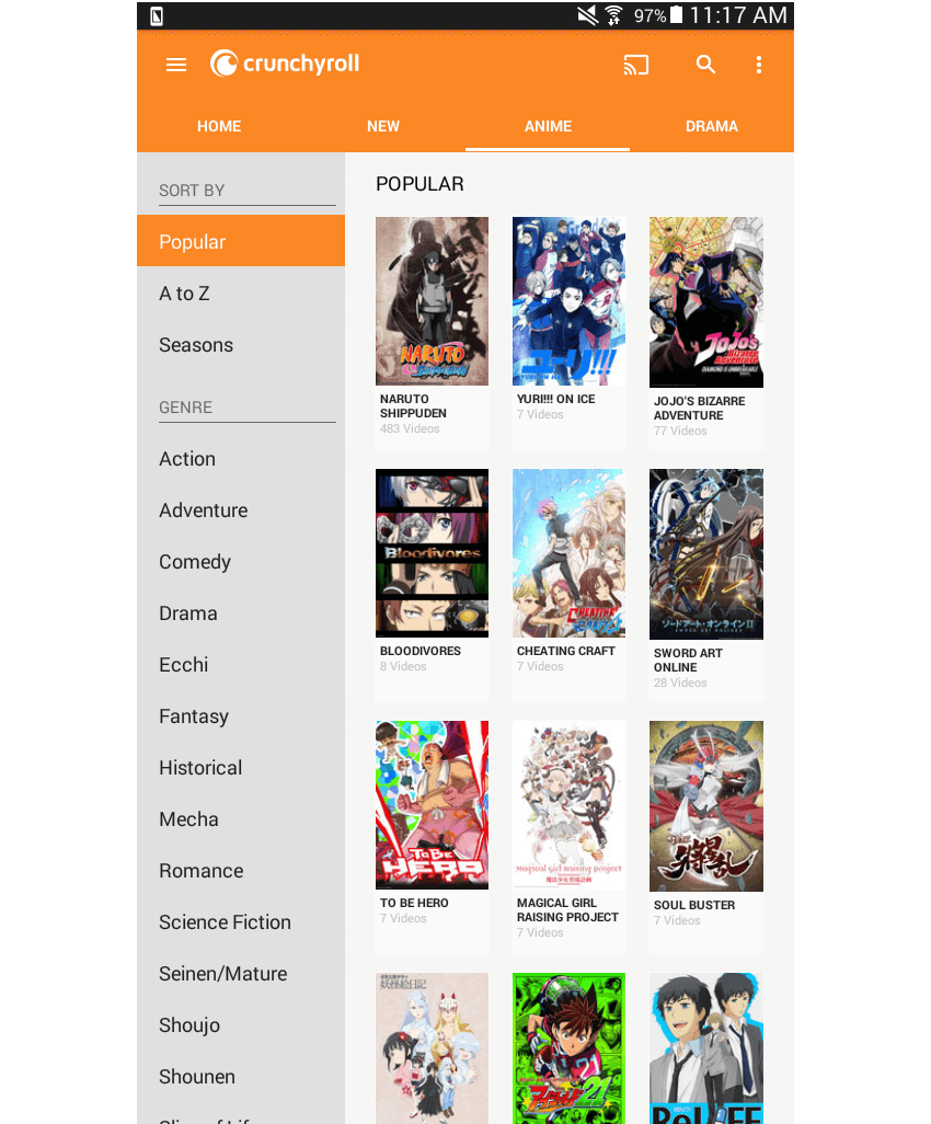
Here are a couple of examples of this type of layout being used in the wild:


Project Setup
The first step, of course, is to set up a new React Native project:
react-native init react-native-common-screens
Once the project is set up, open the index.android.js file and replace the default code with the following:
import React, { Component } from 'react';
import {
  AppRegistry
} from 'react-native';

import Gallery from './src/pages/Gallery';

export default class ReactNativeCommonScreens extends Component {

  render() {
    return (
      <Gallery />
    );
  }

}

AppRegistry.registerComponent('ReactNativeCommonScreens', () => ReactNativeCommonScreens);
Create a src/pages folder and create a Gallery.js file inside it.
You'll also need the react-native-vector-icons package. This is specifically used for the icons in the footer.
npm install --save react-native-vector-icons
Open the android/app/build.gradle file and add a reference to the package:
dependencies {
    //rest of the dependencies are here at the top
    compile project(':react-native-vector-icons') //add this
}
Do the same with the android/settings.gradle file by adding the following at the bottom:
include ':react-native-vector-icons'
project(':react-native-vector-icons').projectDir = new File(rootProject.projectDir, '../node_modules/react-native-vector-icons/android')
Open android/app/src/main/java/com/react-native-common-screens/MainApplication.java and import the package:
import java.util.Arrays;
import java.util.List;

import com.oblador.vectoricons.VectorIconsPackage; //add this
Lastly, initialize the package:
@Override
protected List<ReactPackage> getPackages() {
  return Arrays.<ReactPackage>asList(
      new MainReactPackage(),
      new VectorIconsPackage() //add this
  );
}
Creating the Gallery Page
Okay, now that you've tried to code the layout yourself (no cheating, right?), I'll show you how I built my implementation.
Unlike the previous two pages, the gallery page needs some images that will serve as its main content. You can go to Google and search for images or download the images from the GitHub repo. All the images that I used are labeled for reuse by their respective owners, so you can freely use them if you want. Once you have the images, save them inside the src/images directory. Due to the way the images will be laid out, all of them should have equal dimensions.
Start by creating the file (src/pages/Gallery.js) and add the boilerplate code:
import React, { Component } from 'react';

import {
  StyleSheet,
  View,
  ScrollView,
  Image,
} from 'react-native';

import Icon from 'react-native-vector-icons/FontAwesome';
import Button from '../components/Button';

export default class Gallery extends Component {
    ...
}
This page needs a constructor() function where you define the paths to the images that you want to use. In React Native, the way you refer to images that are inside your working directory is by requiring them just like you would a JavaScript module. It's also important to note that you can't have dynamically generated image paths so you have to supply the actual path by hand.
constructor(props) {
    super(props);
	this.state = {
		photos: [
			{
				label: 'beach',
				src: require('../images/beach.jpg')
			},
			{
				label: 'bridge',
				src: require('../images/bridge.jpg')
			},
			{
				label: 'fields',
				src: require('../images/fields.jpg')
			},
			{
				label: 'mountains',
				src: require('../images/mountains.jpg')
			},
			{
				label: 'sunflower',
				src: require('../images/sunflower.jpg')
			},
			{
				label: 'sunset',
				src: require('../images/sunset.jpg')
			},
			{
				label: 'lake',
				src: require('../images/lake.jpg')
			},
			{
				label: 'nature',
				src: require('../images/nature.jpg')
			},
			{
				label: 'pink',
				src: require('../images/pink.jpg')
			},
			{
				label: 'rails',
				src: require('../images/rails.jpg')
			},
		]
	};
}
You don't really need to define these in the state as the values won't change. You could actually define these in a separate file, import it, assign it to a variable, and then use it directly. But for the sake of simplicity, I decided to just put everything in the state.
Inside the render() method, you're going to break the trend of wrapping everything inside a ScrollView component, because the tab component at the lowermost portion of the screen should have a fixed position. This means that even if the photos goes over the available height, the tabs should still stay in place. To achieve this, use a View component to wrap everything and only wrap the collection of photos in a ScrollView. This allows you to apply the scroll only to the container of the collection of photos:
render() {
    return (
		<View style={styles.container}>
			<ScrollView style={styles.gallery}>
				{ this.renderGallery() }
			</ScrollView>
			<View style={styles.tabs}>
		</View>
	);
}
Now you may start to see a pattern here. Every time you need to use JavaScript code inside the render() function, you should create a separate function to hold that code, instead of putting it directly inside the render() function. This keeps it lean and clean.
Now let's move on to the styling. Although a ScrollView isn't used to wrap everything this time, it's important to note that you still have to supply flex: 1 to the main container so that it consumes the entirety of the available space.
container: {
    flex: 1,
	flexDirection: 'column'
},
gallery: {
	flexDirection: 'column'
},
tabs: {
	flexDirection: 'row',
	backgroundColor: '#333',
	padding: 20
},
tab: {
	flex: 1
},
icon: {
	textAlign: 'center'
},
The renderGallery() function is very similar to the renderWeeks() function that we used in the previous tutorial, which we used to render a calendar page. If you want a refresher on how that works, go ahead and read over the previous tutorial on calendar pages. What you need to know is that resizeMode is applied to the Image. In this case, it's set to cover, which makes the image occupy the entire available space of its container, while still maintaining its aspect ratio. This results in the image getting slightly blown up for devices with larger screens if the original image is smaller.
renderGallery() {
    var count = 0;
	var previous_item = '';
	var pairs = this.getPairsArray(this.state.photos);
	return pairs.map((item, index) => {
		return (
			<View style={styles.item} key={index}>
				<Image
					resizeMode={Image.resizeMode.cover}
					style={styles.photo}
					source={item[0].src} />
				<Image
					resizeMode={Image.resizeMode.cover}
					style={styles.photo}
					source={item[1].src} />
			</View>
		);
	});
}
Here's the getPairsArray() function:
getPairsArray(photos) {
    var pairs_r = [];
	var pairs = [];
	var count = 0;
	photos.forEach((item) => {
	  count += 1;
	  pairs.push(item);
	  if(count == 2){
	    pairs_r.push(pairs)
	    count = 0;
	    pairs = [];
	  }
	});
	return pairs_r;
}

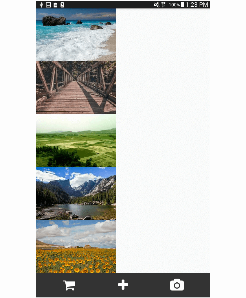
Finally, here is the styling for each row (item) and photo (photo). Note the use of flex: 1 on the actual photo. This is done because the Image component itself is its own container. You want the container itself to occupy half of the available space for each row—that's why a flex property should be assigned. If this isn't done, only the dimensions needed by the photo will be consumed, and the resizeMode that you added earlier won't even have an effect.
item: {
    flex: 1,
	flexDirection: 'row',
},
photo: {
	flex: 1
}
Conclusion
That's it! In this tutorial you learned how to implement the layout for a gallery page. We focused on how to deal with images when it comes to laying out your React Native apps. Often you have to use a combination of flex and resizeMode in order to make images flow the way you want them to. How did my solution compare to your own? Let us know in the discussion forum below.
In an upcoming tutorial, you'll learn how to implement the layout commonly used in news apps. In the meantime, check out some of our other tutorials on React Native and Flexbox!


Comments