In the previous part of this series, we saw how to get started with creating a multi-line chart using the D3.js JavaScript library. In this tutorial, we'll take it to the next level by making the multi-line chart respond to data dynamically, and we'll add some more features as the tutorial progresses.
Getting Started
Let's get started by cloning the first part of the tutorial from GitHub.
git clone https://github.com/jay3dec/MultiLineChart_D3.git
Navigate to MultiLineChart_D3 and browse index.html, and you should have a multi-line graph based on the sample data.
Setting the Domain Dynamically
In the previous tutorial, when we created xScale and yScale using Range and Domain, we hard-coded the minimum and maximum for the domain. To make our graph more flexible, we need to read the minimum and maximum values for the domain dynamically from the data source.
D3.js provides the d3.min and d3.max methods to get the minimum and maximum values from an array respectively. We'll make use of these functions to get the minimum and maximum values for the domain.
We can get the minimum value from an array as shown:
d3.min(data, function(d) {
    return d.value;
})
Similarly, in order to get the maximum value:
d3.max(data, function(d) {
    return d.value;
})
Simply replace the minimum and maximum values in the xScale domain as shown:
xScale = d3.scale.linear().range([MARGINS.left, WIDTH - MARGINS.right]).domain([d3.min(data, function(d) {
    return d.year;
}), d3.max(data, function(d) {
    return d.year;
})]),
Similarly, replace the yScale domain:
yScale = d3.scale.linear().range([HEIGHT - MARGINS.top, MARGINS.bottom]).domain([d3.min(data, function(d) {
    return d.sale;
}), d3.max(data, function(d) {
    return d.sale;
})]),
Save all the changes and browse index.html. Now you should have the graph working well, as it was earlier. The only difference is that it's picking up the domain maximum and minimum values dynamically.
Creating the Line Chart Dynamically
Keeping a single JSON object for the sample would make it easier to parse the data and plot it on the chart. So combine the two pieces of sample data into a single JSON data string as shown below:
var data = [{
    "Client": "ABC",
    "sale": "202",
    "year": "2000"
}, {
    "Client": "ABC",
    "sale": "215",
    "year": "2002"
}, {
    "Client": "ABC",
    "sale": "179",
    "year": "2004"
}, {
    "Client": "ABC",
    "sale": "199",
    "year": "2006"
}, {
    "Client": "ABC",
    "sale": "134",
    "year": "2008"
}, {
    "Client": "ABC",
    "sale": "176",
    "year": "2010"
}, {
    "Client": "XYZ",
    "sale": "100",
    "year": "2000"
}, {
    "Client": "XYZ",
    "sale": "215",
    "year": "2002"
}, {
    "Client": "XYZ",
    "sale": "179",
    "year": "2004"
}, {
    "Client": "XYZ",
    "sale": "199",
    "year": "2006"
}, {
    "Client": "XYZ",
    "sale": "134",
    "year": "2008"
}, {
    "Client": "XYZ",
    "sale": "176",
    "year": "2013"
}];
Now we'll modify our code to make our graph scale dynamically as per the sample data set and its values.
Next we'll split and organize the data based on Client so that we can draw a line graph for each Client in the data. D3 provides a method called d3.nest which helps to arrange data based on a particular key field. We'll use d3.nest to sort out the data based on Client as shown:
var dataGroup = d3.nest()
    .key(function(d) {
        return d.Client;
    })
    .entries(data);
Here is how the dataGroup would look:
[{
    "key": "ABC",
    "values": [{
        "Client": "ABC",
        "sale": "202",
        "year": "2000"
    }, {
        "Client": "ABC",
        "sale": "215",
        "year": "2002"
    }, {
        "Client": "ABC",
        "sale": "179",
        "year": "2004"
    }, {
        "Client": "ABC",
        "sale": "199",
        "year": "2006"
    }, {
        "Client": "ABC",
        "sale": "134",
        "year": "2008"
    }, {
        "Client": "ABC",
        "sale": "176",
        "year": "2010"
    }]
}, {
    "key": "XYZ",
    "values": [{
        "Client": "XYZ",
        "sale": "100",
        "year": "2000"
    }, {
        "Client": "XYZ",
        "sale": "215",
        "year": "2002"
    }, {
        "Client": "XYZ",
        "sale": "179",
        "year": "2004"
    }, {
        "Client": "XYZ",
        "sale": "199",
        "year": "2006"
    }, {
        "Client": "XYZ",
        "sale": "134",
        "year": "2008"
    }, {
        "Client": "XYZ",
        "sale": "176",
        "year": "2013"
    }]
}]
Next, remove the svg line path code for line creation that we hard-coded previously.
vis.append('svg:path')
    .attr('d', lineGen(data))
    .attr('stroke', 'green')
    .attr('stroke-width', 2)
    .attr('fill', 'none');
vis.append('svg:path')
    .attr('d', lineGen(data2))
    .attr('stroke', 'blue')
    .attr('stroke-width', 2)
    .attr('fill', 'none');
Instead we'll iterate over the dataGroup and create a line graph for each Client as shown:
dataGroup.forEach(function(d, i) {
    vis.append('svg:path')
        .attr('d', lineGen(d.values))
        .attr('stroke', 'blue')
        .attr('stroke-width', 2)
        .attr('fill', 'none');
});
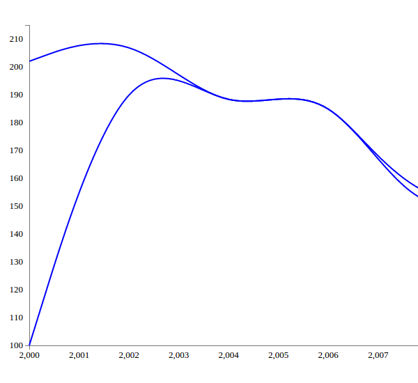
Save the changes and try to browse index.html. You should be able to see the multi-line chart as shown:

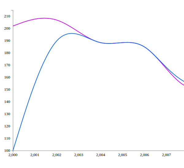
Let's also add some random colors to the graph lines. In order to add random colors, we'll be using the d3.hsl method. Modify the stroke attribute of the line graph as shown below to get random colors for the lines.
dataGroup.forEach(function(d, i) {
    vis.append('svg:path')
        .attr('d', lineGen(d.values))
        .attr('stroke', function(d, j) {
            return "hsl(" + Math.random() * 360 + ",100%,50%)";
        })
        .attr('stroke-width', 2)
        .attr('fill', 'none');
});
Save the changes and browse index.html. You should be seeing random colors for the lines on the graph.

Adding Legends
Next, we'll be adding legends for the Clients in the sample data. Once legends have been added, we'll attach a click event on the legends which would toggle the display of the respective line graphs.
First, in order to add the legend, we need to modify the margin bottom and margin top to 50 to accommodate the legends.
var vis = d3.select("#visualisation"),
    WIDTH = 1000,
    HEIGHT = 500,
    MARGINS = {
        top: 50,
        right: 20,
        bottom: 50,
        left: 50
    },
While iterating the dataGroup, we'll add the legends for the corresponding line graphs. Adding legends is quite simple. First, define the legend space based on the number of Clients or line graphs we'll be drawing:
lSpace = WIDTH/dataGroup.length;
Add a text to svg element with x and y coordinates while iterating the dataGroup after the line creation as shown:
vis.append("text")
    .attr("x", (lSpace / 2) + i * lSpace)
    .attr("y", HEIGHT)
    .style("fill", "black")
    .text(d.key);
We have adjusted the legend spacing (lSpace) based on the number of legends we have to show, so that all the legends are equally spaced from each other. We have divided the legend by 2 so that it's center aligned in its space and will be so as it progresses forward, as we add (i * lSpace) to upcoming legends.
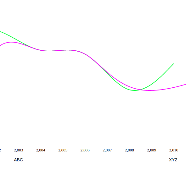
Save all the changes and try to browse index.html and you should see the legends below the X axis.

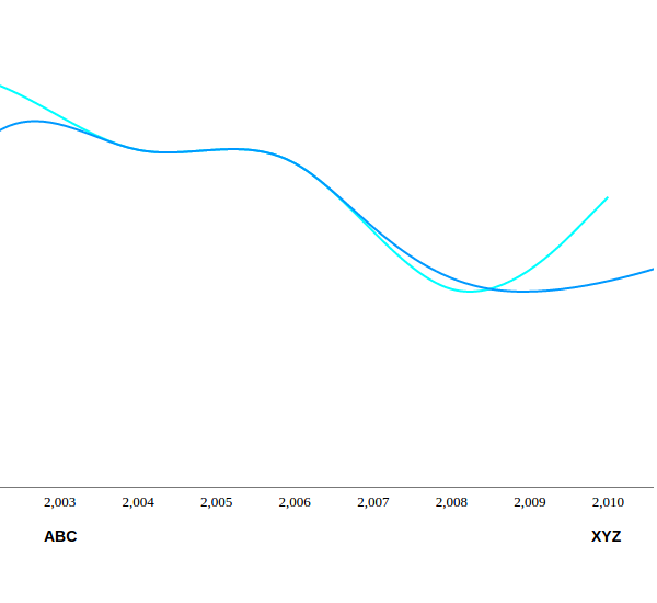
Let's add a bit of styling on the legends to make them look bold. Add the following CSS to index.html:
.legend {
    font-size: 14px;
    font-weight: bold;
}
Add the class legend to the legend created.
vis.append("text")
    .attr("x", (lSpace / 2) + i * lSpace)
    .attr("y", HEIGHT)
    .style("fill", "black")
    .attr("class", "legend")
    .text(d.key);

D3.js Events
Now, let's add click events on each of the legends displayed to toggle the display of the corresponding line on the multi-line graph.
First, we'll need add an id for each line graph created in order to toggle its display.
.attr('id', 'line_'+d.key)
Here is how the line creation code looks:
vis.append('svg:path')
    .attr('d', lineGen(d.values, xScale, yScale))
    .attr('stroke', function(d, j) {
        return "hsl(" + Math.random() * 360 + ",100%,50%)";
    })
    .attr('stroke-width', 2)
    .attr('id', 'line_' + d.key)
    .attr('fill', 'none');
Next, in the legend creation portion, add the click attribute:
.on('click', function() {
    alert(d.key);
})
Save the change and browse index.html. Click on the legends and you should see the legends' names as alerts.
Next, let's add the code to toggle the line display. We simply need to check the current display state of the line graph and toggle the opacity to show and hide the line accordingly.
.on('click', function() {
    var active = d.active ? false : true;
    var opacity = active ? 0 : 1;

    d3.select("#line_" + d.key).style("opacity", opacity);

    d.active = active;
})
Save the changes and try to browse index.html. Try clicking on the legends and the display of the corresponding line graph should toggle.
Conclusion
In this tutorial, we saw how to make our multi-line chart dynamic. We also saw how to create D3.js events. For detailed information on various other D3.js methods and APIs, have a look at the official documentation.
Source code from this tutorial is available on GitHub.
Do let us know your thoughts in the comments below!


Comments