Introduction
In this tutorial, I'm going to show you a brand new addition to the iOS SDK that was introduced in iOS 7, UIKit Dynamics and I'll show you how it can be used to create attractive, eye-catching animation effects.
The purpose of the interface is to allow developers to add realism to their applications in an easy and straightforward fashion. In this tutorial, we’ll see a number of examples that illustrate this.
In the first part of this tutorial, I will demonstrate how to create an animated menu and in the second part we will focus on creating a customized animated alert view. We will create the menu and the alert view as standalone components to maximize reusability.
1. UIKit Dynamics Essentials
Before we start writing code, it's necessary to take a look at the essentials of the UIKit Dynamics. UIKit Dynamics is part of the UIKit framework, which means that you don't need to add any additional frameworks to your projects to use it.
It provides developers with an interface to add realistic effects to the view layer of your applications. It’s important to mention that UIKit Dynamics makes use of a physics engine to do its work. This allows developers to focus on the functionality they'd like to add to their application instead of the implementation. A basic understanding of math and physics is all you need to get started with UIKit Dynamics.
The main component of the UIKit Dynamics interface is the UIDynamicAnimator class, which is also known as the dynamic animator. This class is responsible for performing the animations using a physics engine under the hood. Even though the dynamic animator is the heart of the UIKit Dynamics interface, it can’t be used on its own.
In order to work, specific behaviors need to be added to the dynamic animator. These behaviors are a collection of physics forces that define the animation that results from adding one or more behaviors. Programmatically speaking, these dynamic behaviors are classes of the UIKit Dynamics interface and each behavior has specific attributes that can be modified to influence the animation.
The base class of these behaviors is the UIDynamicBehavior class. Although you're free to create your own custom behaviors, UIKit Dynamics comes with a number of easy-to-use subclasses that mimic common behaviors, such as gravity and collisions.
-
UIGravityBehavior: ThisUIDynamicBehaviorsubclass adds gravity to an item. As a result, the item moves to a certain direction defined by the gravity behavior. -
UICollisionBehavior: This class defines how two items collide with one another or how an item collides with a predefined boundary, visible or invisible. -
UIPushBehavior: As its name indicates, this behavior gives an item a push, it accelerates the item. The push can be continuous or instantaneous. A continuous push behavior gradually applies the force of the push while an instantaneous push behavior applies the force the moment the behavior is added. -
UISnapBehavior: A snap behavior defines how an item snaps to another item or a point in space. The snap behavior is customizable in several ways. For example, the item can either snap to a point without any bounciness or jiggle for a few moments before coming to a halt. -
UIAttachmentBehavior: An attachment behavior defines how two dynamic items are connected to one another or how a dynamic item is connected to an anchor point.
These are the most important dynamic behaviors currently provided by the UIKit Dynamics interface. In order for these behaviors to do their work, they need to be initialized, configured, and added to a dynamic animator object, which we covered earlier.
Combining behaviors is possible as long as they don’t cause any conflicts. Also note that some behaviors can only be added once to the dynamic animator object. For example, adding two instances of the UIGravityBehavior class to the dynamic animator will result in an exception.
The behaviors are always applied to dynamic items. A dynamic item is any object that conforms to the UIDynamicItem protocol. The great thing is that UIView and UICollectionViewLayoutAttributes classes already conform to this protocol. This means that every view in your application can leverage UIKit Dynamics.
There's one more UIDynamicBehavior subclass that's worth mentioning, UIDynamicItemBehavior. Instead of defining a specific behavior, it offers a base dynamic animation configuration that can be applied to dynamic items. It has a number of properties to define the behavior:
-
elasticity: This property defines the elasticity of a collision between dynamic items or a dynamic item and a boundary. The value ranges from0.0to1.0with the latter being a very elastic collision. -
density: This property defines the mass of a dynamic item with a high value resulting in a heavy object. This can be useful if you don’t want a dynamic item to be moved when another item collides with it. -
resistance: The property’s name speaks for itself. The property defines the velocity damping of a dynamic item. -
angularResistance: This one is similar to theresistanceproperty, but theangularResistanceproperty defines angular velocity damping. -
friction: This property defines the friction or resistance of two dynamic items that slide against each other. -
allowsRotation: This one simply specifies if a dynamic item is allowed to rotate or not.
Combining dynamic behaviors can give spectacular results. In this tutorial, we'll use most of the behaviors listed above.
I encourage you to visit Apple’s official documentation and read more about the key classes of UIKit Dynamics. Also, after finishing this tutorial, it’s useful to play around with the result to get a better understanding of the concepts and the various behaviors defined by UIKit Dynamics.
2. Application Overview
I've already mentioned in the introduction that we're going to create two reusable components that will leverage UIKit Dynamics. In this tutorial, we'll create a custom animated menu. Take a look at the final result below.
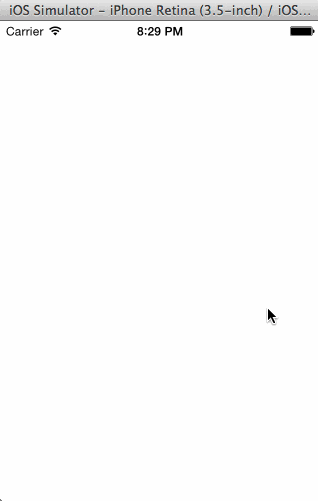
This component is a UIView object that slides in and out of the screen. To make the menu appear and disappear, a simple swipe gesture is used. The items of the menu are listed in a plain table view. The animation you see in the above screenshot is achieved by combining a number of dynamic behaviors.
3. Creating the Project
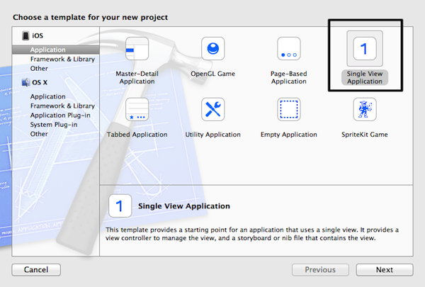
Start by launching Xcode and create a new project. Select the Single View Application template in the Application category of the iOS section. Click Next to continue.
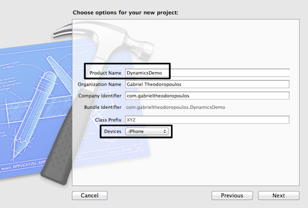
Name the project DynamicsDemo and make sure that Devices is set to iPhone. For this tutorial, I've left the Class Prefix field empty, but feel free to enter your own class prefix. Click Next , tell Xcode where you'd like to store the project, and hit Create.
Download the source files of this tutorial and add the images from the Xcode project to your project in the Images.xcassets folder in the Project Navigator.
(Image Copyright: icons8)
4. Understanding the Menu
Before we begin implementing the menu component, it’s important to take a closer look at how it should operate. As I've already mentioned, the menu should show itself by sliding into view from the right to the left and hide itself by sliding out of view from left to right.
Showing and hiding the menu is triggered by a swipe gesture. UIKit Dynamics will be responsible for the behavior or animation of the menu. The behaviors we'll use are:
- Gravity behavior: The gravity behavior will make the menu move in the right direction, left or right. Without the gravity behavior, the menu won't do much.
- Collision behavior: The collision behavior is equally important. Without it, the menu wouldn't stop moving once gravity was applied to it. An invisible boundary will trigger a collision and make the menu stop where we want it to stop.
- Push behavior: Even though the gravity and collision behaviors can animate the menu in and out, we will give it an extra push or acceleration using a push behavior. This will make the animation snappier.
- Dynamic item behavior: We will also add a dynamic item behavior for defining the elasticity of the menu. This will result in a bouncy collision.
Instead of instantiating the above behaviors every time they need to take effect, we will initialize them once. We apply and configure the behaviors when we need them, which will depend on the position of the menu and the direction it needs to move in.
5. Properties, Structures, and Initialization
Step 1: Creating the Class
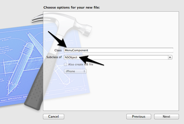
Let’s begin by adding a new class to the project. Press Command-N, select Objective-C class from the list of templates in the iOS > Cocoa Touch section. Click Next to continue.
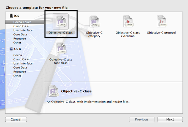
Name the new class MenuComponent and make sure the class inherits from NSObject. Click Next, tell Xcode where you want to save the class files, and hit Create.
Step 2: Declaring Properties
Open MenuComponent.h and define an enumeration that will represent the menu direction. The direction can be left-to-right or right-to-left. Add the following code snippet below the import statement.
typedef enum MenuDirectionOptionTypes{
    menuDirectionLeftToRight,
    menuDirectionRightToLeft
} MenuDirectionOptions;
Open MenuComponent.m, add a class extension, and declare the following properties:
@interface MenuComponent()

@property (nonatomic, strong) UIView *menuView;
@property (nonatomic, strong) UIView *backgroundView;
@property (nonatomic, strong) UIView *targetView;
@property (nonatomic, strong) UITableView *optionsTableView;
@property (nonatomic, strong) NSArray *menuOptions;
@property (nonatomic, strong) NSArray *menuOptionImages;
@property (nonatomic, strong) UIDynamicAnimator *animator;
@property (nonatomic) MenuDirectionOptions menuDirection;
@property (nonatomic) CGRect menuFrame;
@property (nonatomic) CGRect menuInitialFrame;
@property (nonatomic) BOOL isMenuShown;

@end
-
menuView: This is the view object of the menu that will be animated in and out of view. The table view will be a subview of this view. -
backgroundView: The background view is a semi-transparent view that will prevent the user from tapping anything but the menu view. -
targetView: This is the superview to which the menu and background views will be added. -
optionsTableView: This is the table view that will list the menu options. -
menuOptions: This array will contain the menu options that the table view will display. -
menuOptionImages: This array will contain the file names of the images that on the left of each table view cell. -
animator: This is theUIDynamicAnimatorinstance that will animate the menu. -
menuDirection: This property is of typeMenuDirectionOptionsand determines the direction in which the menu will move. -
menuFrame: This is the frame of the menu. -
menuInitialFrame: And this is the initial frame of the menu. -
isMenuShown: A flag that indicates whether the menu is shown or not.
In addition to these private properties, we also need to declare some public properties. Revisit MenuComponent.h and add the following code snippet:
@interface MenuComponent : NSObject

@property (nonatomic, strong) UIColor *menuBackgroundColor;
@property (nonatomic, strong) NSMutableDictionary *tableSettings;
@property (nonatomic) CGFloat optionCellHeight;
@property (nonatomic) CGFloat acceleration;

@end
-
menuBackgroundColor: This property is used to set the menu’s background color. -
tableSettings: This is the dictionary I mentioned in the previous section. It will let us configure the table view by setting a number of options. -
optionCellHeight: This is the only table view attribute that cannot be set using thetableSettingsdictionary. It specifies the row height of the table view's cells. -
acceleration: This property specifies the magnitude of the push behavior, in other words, the amount of force applied to the menu view when it's swiped into and out of view.
Step 3: Implementing the Initialization Method
In this step, we declare a custom initializer in which we set:
- the final frame of the menu view, that is, the frame when the animation is completed and the menu is visible
- the target view to which the menu view will be added as a subview
- the array of options and images displayed by the table view
- the direction of the animation when the menu is shown
The interface of the custom initializer is shown below. Add it to the public interface of the MenuComponent class.
- (id)initMenuWithFrame:(CGRect)frame targetView:(UIView *)targetView direction:(MenuDirectionOptions)direction options:(NSArray *)options optionImages:(NSArray *)optionImages;
Let's take a look at the implementation of the custom initializer. Add the following code snippet to the implementation file of the MenuComponent class. The implementation is pretty straightforward as you can see below.
- (id)initMenuWithFrame:(CGRect)frame targetView:(UIView *)targetView direction:(MenuDirectionOptions)direction options:(NSArray *)options optionImages:(NSArray *)optionImages {
    if (self = [super init]) {
        self.menuFrame = frame;
        self.targetView = targetView;
        self.menuDirection = direction;
        self.menuOptions = options;
        self.menuOptionImages = optionImages;
    }

    return self;
}
6. Setting Everything Up
There are a number of properties that need to be initialized and I think it's therefore a good idea to group them together in a few private methods. Navigate to the class extension of the MenuComponent class and declare the following method:
@interface MenuComponent()

...

- (void)setupMenuView;
- (void)setupBackgroundView;
- (void)setupOptionsTableView;
- (void)setInitialTableViewSettings;
- (void)setupSwipeGestureRecognizer;

@end
setupMenuView
In setupMenuView, we set up the menu view. Because the menu initially needs to be out of the screen’s visible area, we start by calculating the menu's initial frame. We then initialize the menu view with its initial frame, set its background color, and add it as a subview to the target or parent view.
- (void)setupMenuView {
    if (self.menuDirection == menuDirectionLeftToRight) {
        self.menuInitialFrame = CGRectMake(-self.menuFrame.size.width,
                                           self.menuFrame.origin.y,
                                           self.menuFrame.size.width,
                                           self.menuFrame.size.height);
    }
    else{
        self.menuInitialFrame = CGRectMake(self.targetView.frame.size.width,
                                           self.menuFrame.origin.y,
                                           self.menuFrame.size.width,
                                           self.menuFrame.size.height);
    }

    self.menuView = [[UIView alloc] initWithFrame:self.menuInitialFrame];
    [self.menuView setBackgroundColor:[UIColor colorWithRed:0.0 green:0.47 blue:0.39 alpha:1.0]];
    [self.targetView addSubview:self.menuView];
}
setupBackgroundView
In setupBackgroundView, we set up the background view. Note that the alpha value of the background view is initially set to 0.0. We update this value the moment the menu appears.
- (void)setupBackgroundView {
    self.backgroundView = [[UIView alloc] initWithFrame:self.targetView.frame];
    [self.backgroundView setBackgroundColor:[UIColor grayColor]];
    [self.backgroundView setAlpha:0.0];
    [self.targetView addSubview:self.backgroundView];
}
setupOptionsTableView
In setupOptionsTableView, we start by initializing the table by invoking initWithFrame: in which the menu view’s size is used for the table view's size. The MenuComponent instance is set as the table view's data source and delegate.
- (void)setupOptionsTableView {
    self.optionsTableView = [[UITableView alloc] initWithFrame:CGRectMake(0.0, 0.0, self.menuFrame.size.width, self.menuFrame.size.height) style:UITableViewStylePlain];
    [self.optionsTableView setBackgroundColor:[UIColor clearColor]];
    [self.optionsTableView setScrollEnabled:NO];
    [self.optionsTableView setSeparatorStyle:UITableViewCellSeparatorStyleNone];
    [self.menuView addSubview:self.optionsTableView];

    [self.optionsTableView setDelegate:self];
    [self.optionsTableView setDataSource:self];
}
By setting the the MenuComponent instance as the table view's data source and delegate, the compiler tells us that the MenuComponent class doesn't conform to the UITableViewDataSource and UITableViewDelegate protocols. Let's fix this by updating the header file of the MenuComponent class as shown below.
@interface MenuComponent : NSObject <UITableViewDataSource, UITableViewDelegate>
setupInitialTableViewSettings
In setupInitialTableViewSettings, we initialize and populate the tableSettings dictionary that we declared earlier in the class's public interface.
- (void)setInitialTableViewSettings {
    self.tableSettings = [[NSMutableDictionary alloc] initWithObjectsAndKeys:
                          [UIFont fontWithName:@"American Typewriter" size:15.0], @"font",
                          [NSNumber numberWithInt:NSTextAlignmentLeft], @"textAlignment",
                          [UIColor whiteColor], @"textColor",
                          [NSNumber numberWithInt:UITableViewCellSelectionStyleGray], @"selectionStyle",
                          nil];
}
setupSwipGestureRecognizer
In setupSwipeGestureRecognizer, we initialize and configure the swipe gesture recognizer that's used to hide the menu view.
- (void)setupSwipeGestureRecognizer {
    UISwipeGestureRecognizer *hideMenuGesture = [[UISwipeGestureRecognizer alloc] initWithTarget:self action:@selector(hideMenuWithGesture:)];
    if (self.menuDirection == menuDirectionLeftToRight) {
        hideMenuGesture.direction = UISwipeGestureRecognizerDirectionLeft;
    }
    else{
        hideMenuGesture.direction = UISwipeGestureRecognizerDirectionRight;
    }
    [self.menuView addGestureRecognizer:hideMenuGesture];
}
Two things are worth pointing out. First, the direction of the swipe gesture depends on the value of the menuDirection property. Second, the hideMenuWithGesture: method is a private method that is invoked every time the gesture recognizer detects a swipe gesture. We'll implement this method later, but, to get rid of the compiler warning, declare the method in the private class extension of the MenuComponent class as shown below.
@interface MenuComponent()

...

- (void)hideMenuWithGesture:(UISwipeGestureRecognizer *)gesture;

@end
Let's take advantage of the work we just did by invoking the helper methods in the initialization method as shown below.
- (id)initMenuWithFrame:(CGRect)frame targetView:(UIView *)targetView direction:(MenuDirectionOptions)direction options:(NSArray *)options optionImages:(NSArray *)optionImages {
    if (self = [super init]) {
        ...

        // Setup the background view.
        [self setupBackgroundView];

        // Setup the menu view.
        [self setupMenuView];

        // Setup the options table view.
        [self setupOptionsTableView];

        // Set the initial table view settings.
        [self setInitialTableViewSettings];

        // Setup the swipe gesture recognizer.
        [self setupSwipeGestureRecognizer];
    }

    return self;
}
Note that the background view is set up before menu view is to make sure the background view is positioned below the menu view.
Finally, initialize the remaining properties after invoking the helper methods as shown below.
- (id)initMenuWithFrame:(CGRect)frame targetView:(UIView *)targetView direction:(MenuDirectionOptions)direction options:(NSArray *)options optionImages:(NSArray *)optionImages {
    if (self = [super init]) {
        ...

        // Initialize the animator.
        self.animator = [[UIDynamicAnimator alloc] initWithReferenceView:self.targetView];

        // Set the initial height for each cell row.
        self.optionCellHeight = 50.0;

        // Set the initial acceleration value (push magnitude).
        self.acceleration = 15.0;

        // Indicate that initially the menu is not shown.
        self.isMenuShown = NO;
    }

    return self;
}
7. Dynamic Behaviors
Every time the menu view appears or disappears, we use the same dynamic behaviors. We will therefore reuse those dynamic behaviors. The only thing that differs is the direction of the menu during the animation.
We're going to create one method in which we'll initialize and apply the necessary dynamic behaviors and we’ll call this method every time the menu state needs to change. Start by updating the class's private class extension with the toggleMenu method.
@interface MenuComponent()

...

- (void)toggleMenu;

@end
I already mentioned that the dynamic behaviors that will be used to animate the menu are gravity, collision, and push. Each of these behaviors has one or more properties that, when modified, determine the direction of the animation.
- The gravity behavior has a
directionproperty, aCGVectorstructure that specifies the direction of the gravity. For example, by setting thedirectionproperty to{ 1.0, 0.0 }the gravity behavior pulls to the right whereas a value of{ 0.0, 1.0 }results in a force that pulls towards the bottom. - The collision behavior works either between two dynamic items or between a dynamic item and a boundary. In our example, we need an invisible boundary defined by two points that stops the menu view.
- The push behavior has a
magnitudeproperty defining the acceleration applied to a dynamic item. The value also determines the direction of the push.
In the toggleMenu method, we first calculate the values of the aforementioned properties. We then create and configure the dynamic behaviors, and add them to the dynamic animator object.
It’s important to emphasize that the values of isMenuShown, indicating whether the menu is currently shown or not, and menuDirection, specifying the direction of the animation, determine the values of the aforementioned properties.
The animator object has an array that contains every dynamic behavior that has been added to it. Every time the toggleMenu method is called, the existing dynamic behaviors need to be removed by clearing the array, because some dynamic behaviors cannot be added twice to the dynamic behavior, such as the gravity behavior.
Let's start implementing the toggleMenu method.
- (void)toggleMenu{
    // Remove any previous behaviors added to the animator.
    [self.animator removeAllBehaviors];

    // The following variables will define the direction of the menu view animation.

    // This variable indicates the gravity direction.
    CGFloat gravityDirectionX;

    // These two points specify an invisible boundary where the menu view should collide.
    // The boundary must be always to the side of the gravity direction so as the menu view
    // can stop moving.
    CGPoint collisionPointFrom, collisionPointTo;

    // The higher the push magnitude value, the greater the acceleration of the menu view.
    // If that value is set to 0.0, then only the gravity force will be applied to the
    // menu view.
    CGFloat pushMagnitude = self.acceleration;
}
The gravityDirectionX, collisionPointFrom, collisionPointTo, and pushMagnitude variables will hold the values that we'll assign to the dynamic behaviors later. Let’s set their values, depending on the menu's state and the animation direction.
- (void)toggleMenu{
    ...

    // Check if the menu is shown or not.
    if (!self.isMenuShown) {
        // If the menu view is hidden and it's about to be shown, then specify each variable
        // value depending on the animation direction.
        if (self.menuDirection == menuDirectionLeftToRight) {
            // The value 1.0 means that gravity "moves" the view towards the right side.
            gravityDirectionX = 1.0;

            // The From and To points define an invisible boundary, where the X-origin point
            // equals to the desired X-origin point that the menu view should collide, and the
            // Y-origin points specify the highest and lowest point of the boundary.

            // If the menu view is being shown from left to right, then the collision boundary
            // should be defined so as to be at the right of the initial menu view position.
            collisionPointFrom = CGPointMake(self.menuFrame.size.width, self.menuFrame.origin.y);
            collisionPointTo = CGPointMake(self.menuFrame.size.width, self.menuFrame.size.height);
        }
        else{
            // The value -1.0 means that gravity "pulls" the view towards the left side.
            gravityDirectionX = -1.0;

            // If the menu view is being shown from right to left, then the collision boundary
            // should be defined so as to be at the left of the initial menu view position.
            collisionPointFrom = CGPointMake(self.targetView.frame.size.width - self.menuFrame.size.width, self.menuFrame.origin.y);
            collisionPointTo = CGPointMake(self.targetView.frame.size.width - self.menuFrame.size.width, self.menuFrame.size.height);

            // Set to the pushMagnitude variable the opposite value.
            pushMagnitude = (-1) * pushMagnitude;
        }

        // Make the background view semi-transparent.
        [self.backgroundView setAlpha:0.25];
    }
    else{
        // In case the menu is about to be hidden, then the exact opposite values should be
        // set to all variables for succeeding the opposite animation.

        if (self.menuDirection == menuDirectionLeftToRight) {
            gravityDirectionX = -1.0;
            collisionPointFrom = CGPointMake(-self.menuFrame.size.width, self.menuFrame.origin.y);
            collisionPointTo = CGPointMake(-self.menuFrame.size.width, self.menuFrame.size.height);

            // Set to the pushMagnitude variable the opposite value.
            pushMagnitude = (-1) * pushMagnitude;
        }
        else{
            gravityDirectionX = 1.0;
            collisionPointFrom = CGPointMake(self.targetView.frame.size.width + self.menuFrame.size.width, self.menuFrame.origin.y);
            collisionPointTo = CGPointMake(self.targetView.frame.size.width + self.menuFrame.size.width, self.menuFrame.size.height);
        }

        // Make the background view fully transparent.
        [self.backgroundView setAlpha:0.0];
    }
}
The above code snippet is pretty simple to understand, despite its size. The comments in the code will help you understand what's going on. Note that the background view’s alpha value is determined by whether the menu is about to be shown or hidden.
It's time to add the dynamic behaviors. Let’s start with the gravity behavior.
UIGravityBehavior *gravityBehavior = [[UIGravityBehavior alloc] initWithItems:@[self.menuView]];
[gravityBehavior setGravityDirection:CGVectorMake(gravityDirectionX, 0.0)];
[self.animator addBehavior:gravityBehavior];
We use the gravityDirectionX variable to set the gravity's gravityDirection property.
UICollisionBehavior *collisionBehavior = [[UICollisionBehavior alloc] initWithItems:@[self.menuView]];
[collisionBehavior addBoundaryWithIdentifier:@"collisionBoundary"
                                       fromPoint:collisionPointFrom
                                         toPoint:collisionPointTo];
[self.animator addBehavior:collisionBehavior];
You may have noticed that the initialization methods of the gravity and collision behaviors accept an array that contains the dynamic items to which the behavior will be applied. In our example, there is only the menu view.
Before we add the push behavior to the dynamic animator, let’s first create a dynamic item behavior, which is, simply put, a general purpose behavior that we'll use for setting the elasticity of the collision. The greater the elasticity value, the greater the bounciness of the collision between the view and the invisible boundary. The accepted values range from 0.0 to 1.0.
UIDynamicItemBehavior *itemBehavior = [[UIDynamicItemBehavior alloc] initWithItems:@[self.menuView]];
[itemBehavior setElasticity:0.35];
[self.animator addBehavior:itemBehavior];
We could have set more behavior attributes using the itemBehavior object, such as the resistance or the friction. You can play around with these properties later if you want.
Let's now add the push behavior that will accelerate the menu.
UIPushBehavior *pushBehavior = [[UIPushBehavior alloc] initWithItems:@[self.menuView] mode:UIPushBehaviorModeInstantaneous];
[pushBehavior setMagnitude:pushMagnitude];
[self.animator addBehavior:pushBehavior];
By setting mode to UIPushBehaviorModeInstantaneous the force of the push behavior is applied all at once instead of gradually. The dynamic behaviors have now been added to the dynamic animator, which means it's time to make the menu view appear and disappear.
8. Showing and Hiding the Menu
Step 1: showMenu
To show and hide the menu, we need to invoke the private toggleMenu method. The menu should appear when a swipe gesture is detected by the target view in the direction of the swipe. Let's start by declaring a public method that we can invoke to show the menu. Open ViewController.h and declare the showMenu method as shown below.
@interface MenuComponent : NSObject <UITableViewDataSource, UITableViewDelegate>

...

- (void)showMenu;

@end
The implementation is very simple, because all we do is invoke the toggleMenu method. Note that we update isMenuShown to reflect the new state of the menu.
- (void)showMenu {
    if (!self.isMenuShown) {
        [self toggleMenu];

        self.isMenuShown = YES;
    }
}
Step 2: Showing the Menu
Let's start using the MenuComponent class in our view controller. Open ViewController.m and add an import statement at the top.
#import "MenuComponent.h"
In the ViewController's private class extension, declare a menuComponent property of type MenuComponent for the menu.
@interface ViewController ()

@property (nonatomic, strong) MenuComponent *menuComponent;

@end
Before we initialize the menu, let's create the gesture recognizer that will detect the swipe gestures to show and hide the menu. We do this in the view controller's viewDidLoad method.
- (void)viewDidLoad {
    [super viewDidLoad];

    UISwipeGestureRecognizer *showMenuGesture = [[UISwipeGestureRecognizer alloc] initWithTarget:self action:@selector(showMenu:)];

    showMenuGesture.direction = UISwipeGestureRecognizerDirectionLeft;

    [self.view addGestureRecognizer:showMenuGesture];
}
The showMenu: method triggered by the gesture recognizer is a private helper method that we'll implement shortly. Note that the gesture direction is set to UISwipeGestureRecognizerDirectionLeft, which means that we want the menu to animate in from the right to the left.
With the gesture recognizer initialized, it's time to create the menu using the initializer we implemented earlier in the MenuComponent class. Add the following code snippet to the view controller's viewDidLoad method.
    CGRect desiredMenuFrame = CGRectMake(0.0, 20.0, 150.0, self.view.frame.size.height);
    self.menuComponent = [[MenuComponent alloc] initMenuWithFrame:desiredMenuFrame
                                                       targetView:self.view
                                                        direction:menuDirectionRightToLeft
                                                          options:@[@"Download", @"Upload", @"E-mail", @"Settings", @"About"]
                                                     optionImages:@[@"download", @"upload", @"email", @"settings", @"info"]];
Make sure that the direction you pass in the initialization method matches that of the gesture recognizer.
Next, declare the showMenu: method in the view controller's class extension.
@interface ViewController ()

@property (nonatomic, strong) MenuComponent *menuComponent;

- (void)showMenu:(UIGestureRecognizer *)gestureRecognizer;

@end
The implementation of the showMenu: method couldn't be easier.
- (void)showMenu:(UIGestureRecognizer *)gestureRecognizer{
    [self.menuComponent showMenu];
}
Before running the app for the first time, revisit MenuComponent.m and comment out the invocation of the setupOptionsTableView method in the initialization method. This is necessary if we want to prevent our application from crashing, because we haven't implemented the table view protocols yet.
// Setup the options table view.
// [self setupOptionsTableView];
Run the application and swipe from the right to the left. At this point, the menu should appear, but we can't make it disappear and the menu doesn't display any options yet.
Step 3: Hiding the Menu
Even though the swipe gesture for showing the menu is performed on the view to which the menu is added, the gesture for hiding the menu needs to be detected by the menu itself. Do you remember that we created a gesture recognizer in the MenuComponent class and declared hideMenuWithGesture:? The latter method will be invoked when the menu needs to be hidden.
Let’s implement hideMenuWithGesture: in MenuComponent.m. Its implementation is pretty simple as you can see below.
- (void)hideMenuWithGesture:(UISwipeGestureRecognizer *)gesture {
    // Make a call to toggleMenu method for hiding the menu.
    [self toggleMenu];

    // Indicate that the menu is not shown.
    self.isMenuShown = NO;
}
If you run the application now, you should be able to show and hide the menu with a swipe gesture.
9. Menu Options
The menu view is now capable of appearing and disappearing. It's time to focus our attention on setting up the options table view and displaying the menu options. We've already declared a few options during the menu's initialization in the view controller's viewDidLoad method. Let's see what we need to do to display them.
The first thing we need to do is implement the required method of the UITableViewDataSource and UITableViewDelegate protocols. Note that the cell height is specified by the optionCellHeight property.
- (NSInteger)numberOfSectionsInTableView:(UITableView *)tableView {
    return 1;
}


- (NSInteger)tableView:(UITableView *)tableView numberOfRowsInSection:(NSInteger)section {
    return [self.menuOptions count];
}


- (CGFloat)tableView:(UITableView *)tableView heightForRowAtIndexPath:(NSIndexPath *)indexPath {
    return self.optionCellHeight;
}
In tableView:cellForRowAtIndexPath:, we configure the cells to display the menu options and images. Note that we use the tableSettings object to configure the table view cells.
- (UITableViewCell *)tableView:(UITableView *)tableView cellForRowAtIndexPath:(NSIndexPath *)indexPath {
    UITableViewCell *cell = [tableView dequeueReusableCellWithIdentifier:@"optionCell"];

    if (cell == nil) {
        cell = [[UITableViewCell alloc] initWithStyle:UITableViewCellStyleDefault reuseIdentifier:@"optionCell"];
    }

    // Set the selection style.
    [cell setSelectionStyle:[[self.tableSettings objectForKey:@"selectionStyle"] intValue]];

    // Set the cell's text and specify various properties of it.
    cell.textLabel.text = [self.menuOptions objectAtIndex:indexPath.row];
    [cell.textLabel setFont:[self.tableSettings objectForKey:@"font"]];
    [cell.textLabel setTextAlignment:[[self.tableSettings objectForKey:@"textAlignment"] intValue]];
    [cell.textLabel setTextColor:[self.tableSettings objectForKey:@"textColor"]];

    // If the menu option images array is not nil, then set the cell image.
    if (self.menuOptionImages != nil) {
        [cell.imageView setImage:[UIImage imageNamed:[self.menuOptionImages objectAtIndex:indexPath.row]]];
        [cell.imageView setTintColor:[UIColor whiteColor]];
    }


    [cell setBackgroundColor:[UIColor clearColor]];

    return cell;
}
Before running the application, make sure to uncomment the call to setupOptionsTableView.
// Setup the options table view.
[self setupOptionsTableView];
That’s it. Run the application and swipe from right to left to show the menu and its options.
10. Handling User Selection
As I mentioned earlier, we won't be implementing a delegate protocol for the options menu. Instead, we'll make use of blocks. We won't be adding any new methods though. Instead, we're going to slightly modify the showMenu method. Start by updating its declaration in MenuComponent.h as shown below.
- (void)showMenuWithSelectionHandler:(void(^)(NSInteger selectedOptionIndex))handler;
The showMenu: method now accepts one argument, a block. The block also accepts one argument, the user's selection.
This also means that we need to store the block, because we need to invoke it when the user selects an option from the menu. In MenuComponent.m, declare a private property for storing the block.
@interface MenuComponent()
...

@property (nonatomic, strong) void(^selectionHandler)(NSInteger);

@end
We then need to update the showMenu: method as shown below.
- (void)showMenuWithSelectionHandler:(void (^)(NSInteger))handler {
    if (!self.isMenuShown) {
        self.selectionHandler = handler;

        [self toggleMenu];

        self.isMenuShown = YES;
    }
}
We start by storinghandler in the selectionHandler property. Whenever the user selects an item from the table view, we invoke the selection handler. Take a look at the implementation of tableView:didSelectRowAtIndexPath: for clarification.
- (void)tableView:(UITableView *)tableView didSelectRowAtIndexPath:(NSIndexPath *)indexPath {
    [[tableView cellForRowAtIndexPath:indexPath] setSelected:NO];

    if (self.selectionHandler) {
        self.selectionHandler(indexPath.row);
    }
}
Finally, we need to update the view controller to use the new showMenu: method. Update the view controller's showMenu: method, which is invoked when a swipe gesture is detected, with the one shown below. To make sure that everything is working, we show an alert view displaying the user's selection.
- (void)showMenu:(UIGestureRecognizer *)gestureRecognizer {
    [self.menuComponent showMenuWithSelectionHandler:^(NSInteger selectedOptionIndex) {
        UIAlertView *alert = [[UIAlertView alloc] initWithTitle:@"UIKit Dynamics Menu"
                                                        message:[NSString stringWithFormat:@"You selected option #%d", selectedOptionIndex + 1]
                                                       delegate:nil
                                              cancelButtonTitle:nil
                                              otherButtonTitles:@"Okay", nil];
        [alert show];
    }];
}
Run the application once again to make sure everything works as expected. The menu component class is ready.

Conclusion
In this tutorial, we've created a reusable component for displaying a menu using UIKit Dynamics. If UIKit Dynamics was new for you, then I hope this tutorial has given you a taste of what you can do with it. Feel free to play around with demo application to become more familiar with UIKit Dynamics.
Stay tuned for the next tutorial in which we'll create another reusable component, a custom alert view.


Comments