Understanding layouts is important for good Android application design. In this tutorial, you learn all about linear layouts, which organize user interface controls, or widgets, vertically or horizontally on the screen. When used correctly, linear layouts can be the fundamental layout upon which many interesting Android application user interfaces can be designed.
What Is A Linear Layout?
Linear layouts are one of the simplest and most common types of layouts used by Android developers to organize controls within their user interfaces. The linear layout works much as its name implies: it organizes controls linearly in either a vertical or horizontal fashion. When the layout’s orientation is set to vertical, all child controls within it are organized in a single column; when the layout’s orientation is set to horizontal, all child controls within it are organized in a single row.
Linear layouts can be defined within XML layout resources or programmatically in the application's Java code.
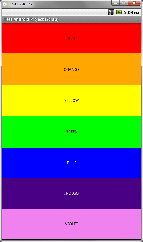
The following figure shows a linear layout with seven TextView controls. This linear layout’s orientation is set to vertical, causing each of the TextView controls to display in a single column. Each TextView control has its text attribute set to a color, with that same color set as the background for the control; each control is stretched the width of the screen by setting the controls’ layout_width attribute to fill_parent.

Defining an XML Layout Resource with a Linear Layout
The most convenient and maintainable way to design application user interfaces is by creating XML layout resources. This method greatly simplifies the UI design process, moving much of the static creation and layout of user interface controls and definition of control attributes, to the XML, instead of littering the code.
XML layout resources must be stored in the /res/layout project directory hierarchy. Let’s take a look at the rainbow linear layout introduced in the previous section. Again, this screen is basically a vertical linear layout set to fill the entire screen, which is achieved by setting its layout_width and layout_height attributes to fill_parent. This layout resource file, aptly named /res/layout/rainbow.xml, is defined in XML as follows:
<?xml version="1.0" encoding="utf-8"?>
<LinearLayout xmlns:android="http://schemas.android.com/apk/res/android"
    android:layout_width="fill_parent" android:layout_height="fill_parent"
    android:orientation="vertical">
    <TextView android:text="RED" android:id="@+id/TextView01"
        android:layout_height="wrap_content" android:background="#f00"
        android:layout_width="fill_parent" android:layout_weight=".14"
        android:gravity="center" android:textColor="#000"></TextView>
    <TextView android:text="ORANGE" android:id="@+id/TextView02"
        android:layout_height="wrap_content" android:layout_width="fill_parent"
        android:layout_weight=".15" android:background="#ffa500"
        android:gravity="center" android:textColor="#000"></TextView>
    <TextView android:text="YELLOW" android:id="@+id/TextView03"
        android:layout_height="wrap_content" android:layout_width="fill_parent"
        android:layout_weight=".14" android:background="#ffff00"
        android:gravity="center" android:textColor="#000"></TextView>
    <TextView android:text="GREEN" android:id="@+id/TextView04"
        android:layout_height="wrap_content" android:layout_width="fill_parent"
        android:layout_weight=".15" android:background="#0f0" android:gravity="center"
        android:textColor="#000"></TextView>
    <TextView android:text="BLUE" android:id="@+id/TextView05"
        android:layout_height="wrap_content" android:layout_width="fill_parent"
        android:layout_weight=".14" android:background="#00f" android:gravity="center"
        android:textColor="#fff"></TextView>
    <TextView android:text="INDIGO" android:id="@+id/TextView06"
        android:layout_height="wrap_content" android:layout_width="fill_parent"
        android:layout_weight=".14" android:background="#4b0082"
        android:gravity="center" android:textColor="#fff"></TextView>
    <TextView android:text="VIOLET" android:id="@+id/TextView07"
        android:layout_height="wrap_content" android:layout_width="fill_parent"
        android:layout_weight=".14" android:background="#ee82ee"
        android:gravity="center" android:textColor="#000"></TextView>
</LinearLayout>
Perhaps you’ve noticed that each of the child controls of the linear layout have a number of interesting attributes, including one called layout_weight. We’ll talk more about this in a few moments.
The following two figures show what this layout might look like on a device in both portrait and landscape modes:


Recall that, from within the Activity, only a single line of code within the onCreate() method is necessary to load and display a layout resource on the screen. If the layout resource was stored in the /res/layout/rainbow.xml file, that line of code would be:
setContentView(R.layout.rainbow);
Defining a Linear Layout Programmatically
You can also programmatically create and configure linear layouts. This is done using the LinearLayout class (android.widget.LinearLayout). You’ll find the child-specific parameters in the LinearLayout.LayoutParams class. Also, the typical layout parameters (android.view.ViewGroup.LayoutParams), such as layout_height and layout_width, as well as margin parameters (ViewGroup.MarginLayoutParams), still apply to LinearLayout objects.
Instead of loading a layout resource directly using the setContentView() method as shown earlier, you must instead build up the screen contents in Java and then supply a parent layout object which contains all the control contents to display as child views to the setContentView() method. In this case, your parent layout would be the linear layout.
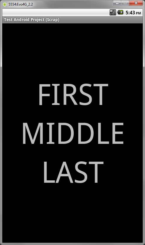
For example, the following code illustrates how to programmatically have an Activity instantiate a LinearLayout and place three TextView objects within it in its onCreate() method:
public void onCreate(Bundle savedInstanceState) {
    super.onCreate(savedInstanceState);
    // setContentView(R.layout.rainbow);
    TextView tv1 = new TextView(this);
    tv1.setText("FIRST");
    tv1.setTextSize(100);
    tv1.setGravity(Gravity.CENTER);

    TextView tv2 = new TextView(this);
    tv2.setTextSize(100);
    tv2.setGravity(Gravity.CENTER);
    tv2.setText("MIDDLE");

    TextView tv3 = new TextView(this);
    tv3.setTextSize(100);
    tv3.setGravity(Gravity.CENTER);
    tv3.setText("LAST");

    LinearLayout ll = new LinearLayout(this);
    ll.setOrientation(LinearLayout.VERTICAL);
    ll.setLayoutParams(new LayoutParams(LayoutParams.FILL_PARENT, LayoutParams.FILL_PARENT));
    ll.setGravity(Gravity.CENTER);
    ll.addView(tv1);
    ll.addView(tv2);
    ll.addView(tv3);
    setContentView(ll);
}
The following two figures show what this layout might look like on a device in both portrait and landscape modes:


Let’s take a closer look at the Java code listing above. First, three TextView controls are created and configured. Each has a text size (font size), a text alignment (gravity), and the text itself. Next, a linear layout is created with a vertical orientation. It’s layout parameters allow it to fill the entire parent (in this case, the entire screen) and its gravity causes all child controls to be centered within the screen, instead of from the top left-hand corner. Each of the three TextView controls is added as a child view using the addView() method. Finally, the linear layout is passed into the setContentView() method as the parent control to display on the screen.
As you can see, the code can rapidly grow in size as more controls are added to the screen. For organization and maintainability, defining and using layouts programmatically is best left for the odd case rather than the norm.
Exploring the Important Linear Layout Properties and Attributes
Now let’s talk a bit about the attributes that help configure a linear layout and its child controls.
Some specific attributes apply to linear layouts. Some of the most important attributes you’ll use with linear layouts include:
- The orientation attribute (required), which can be set to vertical or horizontal (class: LinearLayout)
- The gravity attribute (optional), which controls how all child controls are aligned and displayed within the linear layout (class: LinearLayout)
- The layout_weight attribute (optional, applied to each child control) specifies each child control’s relative importance within the parent linear layout (class: LinearLayout.LayoutParams)
Also, general ViewGroup-style attributes apply to linear layouts. These include:
- Generic Layout Parameters such as layout_height (required) and layout_width (required) (class: ViewGroup.LayoutParams)
- Margin Layout Parameters such as margin_top, margin_left, margin_right and margin_bottom (class: ViewGroup. MarginLayoutParams)
- Layout Parameters such as layout_height and layout_width (class: ViewGroup.LayoutParams)
Weighing Child Controls
Most of the linear layout attributes are pretty self explanatory. However, the layout_weight attribute deserves a bit of extra discussion. Unlike other linear layout attributes, which are applied to the linear layout view itself, this attribute applies to its child controls. The weight values themselves should be numbers (eg .50, .25, .10, .10, .05, ), where the total if you sum the weight values of all children equals 1 (100%).
The weight of a child controls how much “importance” or “space” its given within its parent linear layout. This is best illustrated using an example. Let’s turn back to the rainbow linear layout we used earlier. In order to allow all the child controls to “expand” to fill the linear layout equally, regardless of the size of the screen, we used layout_weight to assign relative weights to each TextView. As there are seven colors that we want to give equal merit, we divided 1 by 7 and come up with about 0.143. However, since we wanted the weights to sum to 1 evenly, five of the controls’ weights received a value of either .14 and two receive a value of .15—a subtle difference that makes our sum exactly 1, but is quite noticeable for the first and last controls.
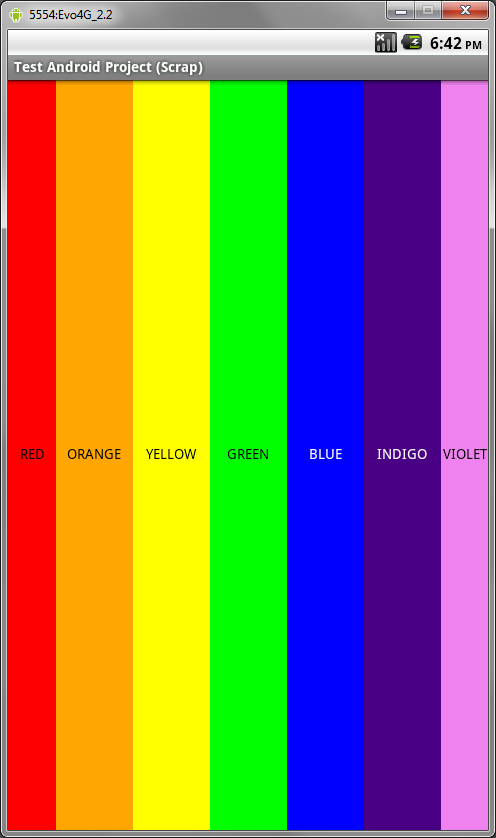
This weight trick works well when there is adequate space on the screen for all controls to display properly. That said, when space gets tight, the weight attribute may be overridden by other factors, such as view clipping or, in the case of a TextView, trying not to wrap the text. This becomes apparent when we change the rainbow.xml layout file to contain a similar horizontal layout (layout_height is also set to fill_parent).
The following two figures show what this same layout (only changed to a horizontal orientation) as it might appear on a device in both portrait and landscape modes:


What we expect is that the red and violet areas (weight 0.15) will be slightly larger than the other colors (weight 0.14), but this is not how it displays. If you look closely at the RED TextView, it should take up more space than its neighbor ORANGE TextView. However, because “Red” is a short word, and “Orange” is not, some jostling is done automatically in order to try to keep all words from wrapping. The result is more pleasing, but it can be a bit annoying to work around if this is not the effect desired.
Conclusion
Android application user interfaces are defined using layouts, and linear layouts are one of the fundamental layout types used. The linear layout allows child controls to be organized in a single row (horizontally) or single column (vertically). The child control placement can be further adjusted using gravity and weight attributes.
About the Authors
Mobile developers Lauren Darcey and Shane Conder have coauthored several books on Android development: an in-depth programming book entitled Android Wireless Application Development and Sams TeachYourself Android Application Development in 24 Hours. When not writing, they spend their time developing mobile software at their company and providing consulting services. They can be reached at via email to [email protected], via their blog at androidbook.blogspot.com, and on Twitter @androidwireless.


Comments