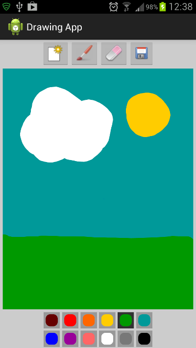
In this series, we will create a finger-painting app for Android using touch interaction. The user will be able to select from a color palette, choose a brush size, erase, create a new drawing, or save their existing drawing to the device gallery.
In this first part of the series we will get the app user interface setup, then in the second part we will implement the drawing functionality. In the final part we will add the ability for the user to erase, to start a new drawing, to save existing drawings and to choose brush and eraser sizes.
Series Format
This series on Creating a Drawing App will be in three parts:
Final Preview

Above is a screenshot from the app this series will teach you how to build. Hopefully your drawings will be better than mine!
1. Create an Android Project
Step 1
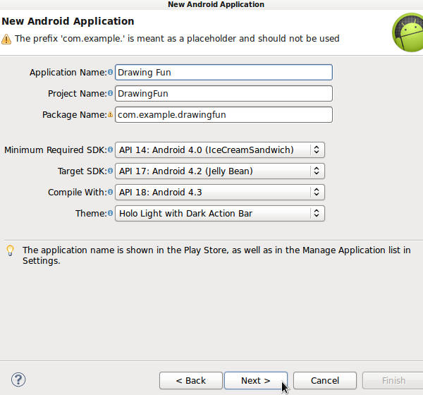
Start a new Android project in Eclipse, choosing application and package names. We are using a minimum API level of 14 and a target of 17 for the code in this tutorial.

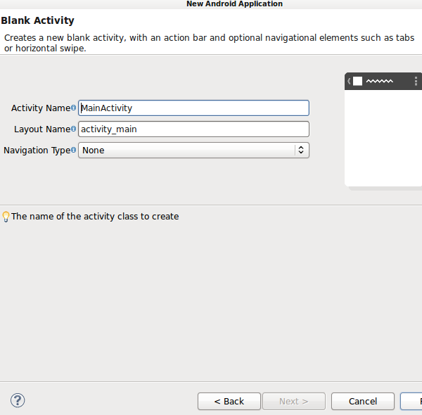
Let Eclipse create a blank main Activity and layout - you can use the default names.

Step 2
Open your project Manifest file and switch to the XML editing tab. Your Activity and SDK levels should already be set. Add the following to your Activity element opening tag, forcing the app only to use portrait:
android:screenOrientation="portrait"
Step 3
Before we start building the interface, let's define some numbers we will use throughout the series. In your app's "res/values" folder, if Eclipse has not already created it, add the "dimens.xml" file - if it is already there you can simply add new values to it. The outline should be as follows:
<resources>
</resources>
If Eclipse created the file, there may be some values in it already. We are going to use three possible brush/eraser sizes: small, medium, and large. We need to define the size for each as both a dimension and an integer value so that we can use these measurements in both the XML layout and drawable resources and the Java code:
<!-- Brush sizes -->
<dimen name="small_brush">10dp</dimen>
<integer name="small_size">10</integer>
<dimen name="medium_brush">20dp</dimen>
<integer name="medium_size">20</integer>
<dimen name="large_brush">30dp</dimen>
<integer name="large_size">30</integer>
The values for dimension and integer at each size are the same, so that the UI indicates the brush size as it will function when the user draws with it.
2. Create a Custom View Class
Step 1
We are going to define a custom View class in which the drawing will take place. In your app's source package, create a new class. Name it "DrawingView" and select "android.view.View" as the Superclass. The new class should have the following outline:
public class DrawingView extends View
{

}
Step 2
In your new View class you will need the following import statements in addition to the View import which Eclipse should have added for you:
import android.content.Context;
import android.util.AttributeSet;
Add a constructor method to the class:
public DrawingView(Context context, AttributeSet attrs){
	super(context, attrs);
	setupDrawing();
}
We will add an instance of the custom View to the XML layout file. Add the specified helper method to the class:
private void setupDrawing(){
//get drawing area setup for interaction
}
We will implement this method in the next part of the series, as well as adding other methods to the class.
3. Design the Activity Layout
Step 1
Open your app's "res/values" strings XML file and add some text strings we will use in the layout:
<string name="start_new">New</string>
<string name="brush">Brush</string>
<string name="erase">Erase</string>
<string name="save">Save</string>
<string name="paint">Paint</string>
Open the app's main layout file and switch to the XML tab to edit the code. The Activity screen content will be easiest to implement using Linear Layouts. Replace the content of the layout file with the following outline:
<LinearLayout xmlns:android="http://schemas.android.com/apk/res/android"
	xmlns:tools="http://schemas.android.com/tools"
	android:layout_width="match_parent"
	android:layout_height="match_parent"
	android:background="#FFCCCCCC"
	android:orientation="vertical"
	tools:context=".MainActivity" >

</LinearLayout>
We set vertical orientation and a gray background color.
Step 2
Inside the main Linear Layout, add another to hold the UI buttons along the top of the screen:
<LinearLayout
    android:layout_width="wrap_content"
    android:layout_height="50dp"
    android:layout_gravity="center"
    android:orientation="horizontal" >
</LinearLayout>
This time the layout is horizontal with a set height and centering applied. Inside this layout we will add the buttons for starting a new drawing, selecting a brush, selecting an eraser, and saving a drawing. We are using the following images for these buttons, although you can create your own if you prefer:


Copy the images to your app's drawable folder(s) - if you are creating your own you can target particular densities. To complete the tutorial series without targeting particular screen densities you can simply create a folder named "drawable" and add all of your drawable resources to it.
Let's now add an ImageButton for each option in the Activity. Start with the button to create a new drawing inside the second Linear Layout:
<ImageButton
    android:id="@+id/new_btn"
    android:layout_width="wrap_content"
    android:layout_height="fill_parent"
    android:contentDescription="@string/start_new"
    android:src="@drawable/new_pic" />
We will use the ID to respond to button clicks in the Activity class. We specify the new button icon image as source for the ImageButton and add a content description string.
Next add the brush button:
<ImageButton
	android:id="@+id/draw_btn"
	android:layout_width="wrap_content"
	android:layout_height="fill_parent"
	android:contentDescription="@string/brush"
	android:src="@drawable/brush" />
Now add the eraser button:
<ImageButton
	android:id="@+id/erase_btn"
	android:layout_width="wrap_content"
	android:layout_height="fill_parent"
	android:contentDescription="@string/erase"
	android:src="@drawable/eraser" />
On clicking either the brush or eraser button, the user will be prompted to select a size - we will implement this later. Next add the save button:
<ImageButton
	android:id="@+id/save_btn"
	android:layout_width="wrap_content"
	android:layout_height="fill_parent"
	android:contentDescription="@string/save"
	android:src="@drawable/save" />
That's it for the top Linear Layout control buttons.
Step 3
After the top button Linear Layout, but still inside the outer Linear Layout in the file, let's now add an instance of the custom view class we created:
<com.example.drawingfun.DrawingView
	android:id="@+id/drawing"
	android:layout_width="fill_parent"
	android:layout_height="0dp"
	android:layout_marginBottom="3dp"
	android:layout_marginLeft="5dp"
	android:layout_marginRight="5dp"
	android:layout_marginTop="3dp"
	android:layout_weight="1"
	android:background="#FFFFFFFF" />
As you can see, you can add a custom View to your layouts in much the same way as the standard Android UI elements. We set general layout properties, a white background for drawing, and provide an ID for referencing the View in Java. By retrieving a reference to this instance of the custom View class, our Activity will be able to access the methods we define in the View class declaration we created.
Step 4
Now let's add the color palette. After the custom View element, add another Linear Layout for the palette buttons:
<LinearLayout
	android:layout_width="wrap_content"
	android:layout_height="wrap_content"
	android:layout_gravity="center"
	android:orientation="vertical" >
</LinearLayout>
This element will contain two rows of buttons so enter two more Linear Layouts for these. Place the following inside the one you just added:
<!-- Top Row -->
<LinearLayout
	android:id="@+id/paint_colors"
	android:layout_width="wrap_content"
	android:layout_height="wrap_content"
	android:orientation="horizontal" >
</LinearLayout>
<!-- Bottom Row -->
<LinearLayout
	android:layout_width="wrap_content"
	android:layout_height="wrap_content"
	android:orientation="horizontal" >
</LinearLayout>
The first row has an ID because we are going to use it in Java when the app starts to set the first default color as selected so that the user can start drawing straight away. For each color, we are going to use the following ImageButton structure:
<ImageButton
	android:layout_width="@dimen/large_brush"
	android:layout_height="@dimen/large_brush"
	android:layout_margin="2dp"
	android:background="#FF660000"
	android:contentDescription="@string/paint"
	android:onClick="paintClicked"
	android:src="@drawable/paint"
	android:tag="#FF660000" />
Don't add this to your layout file yet - we will do that shortly, for now look over the code. We use one of the dimension values we defined for the color button. Notice that the background and tag attributes are the same - the background is for the appearance of the button in the UI, while the tag is so that we can set the paint color according to what the user has clicked in the Activity Java code. The element includes a method to execute on clicks of the button - we will implement this in the Activity class next time. We also specify a drawable named "paint". Add this to the project now, creating a new file in the project drawable folder(s) and naming it "paint.xml". Enter the following code in the new drawable file:
<layer-list xmlns:android="http://schemas.android.com/apk/res/android" >
<item>
	<shape android:shape="rectangle" >
		<stroke
			android:width="4dp"
			android:color="#FF999999" />
		<solid android:color="#00000000" />
		<padding
			android:bottom="0dp"
			android:left="0dp"
			android:right="0dp"
			android:top="0dp" />
	</shape>
</item>
<item>
	<shape xmlns:android="http://schemas.android.com/apk/res/android" >
		<stroke
			android:width="4dp"
			android:color="#FF999999" />
		<solid android:color="#00000000" />
		<corners android:radius="10dp" />
	</shape>
</item>
</layer-list>
This is less complex than it looks at first glance. To create a rounded button appearance, we use two layered Shape Drawables, one a rectangle outline and the other a rounded stroke. The strokes have a gray color, with transparency in the middle through which the background color for each button will be seen (the background color being the color represented by the button).
Back in the layout file, inside the top row layout in the color palette section, add the following ImageButton elements to represent the first six colors, using the structure we outlined above:
<ImageButton
	android:layout_width="@dimen/large_brush"
	android:layout_height="@dimen/large_brush"
	android:layout_margin="2dp"
	android:background="#FF660000"
	android:contentDescription="@string/paint"
	android:onClick="paintClicked"
	android:src="@drawable/paint"
	android:tag="#FF660000" />

<ImageButton
	android:layout_width="@dimen/large_brush"
	android:layout_height="@dimen/large_brush"
	android:layout_margin="2dp"
	android:background="#FFFF0000"
	android:contentDescription="@string/paint"
	android:onClick="paintClicked"
	android:src="@drawable/paint"
	android:tag="#FFFF0000" />

<ImageButton
	android:layout_width="@dimen/large_brush"
	android:layout_height="@dimen/large_brush"
	android:layout_margin="2dp"
	android:background="#FFFF6600"
	android:contentDescription="@string/paint"
	android:onClick="paintClicked"
	android:src="@drawable/paint"
	android:tag="#FFFF6600" />

<ImageButton
	android:layout_width="@dimen/large_brush"
	android:layout_height="@dimen/large_brush"
	android:layout_margin="2dp"
	android:background="#FFFFCC00"
	android:contentDescription="@string/paint"
	android:onClick="paintClicked"
	android:src="@drawable/paint"
	android:tag="#FFFFCC00" />

<ImageButton
	android:layout_width="@dimen/large_brush"
	android:layout_height="@dimen/large_brush"
	android:layout_margin="2dp"
	android:background="#FF009900"
	android:contentDescription="@string/paint"
	android:onClick="paintClicked"
	android:src="@drawable/paint"
	android:tag="#FF009900" />

<ImageButton
	android:layout_width="@dimen/large_brush"
	android:layout_height="@dimen/large_brush"
	android:layout_margin="2dp"
	android:background="#FF009999"
	android:contentDescription="@string/paint"
	android:onClick="paintClicked"
	android:src="@drawable/paint"
	android:tag="#FF009999" />
Each button is identical apart from the colors defined in the background and tag attributes. Add the next six in the bottom row layout:
<ImageButton
	android:layout_width="@dimen/large_brush"
	android:layout_height="@dimen/large_brush"
	android:layout_margin="2dp"
	android:background="#FF0000FF"
	android:contentDescription="@string/paint"
	android:onClick="paintClicked"
	android:src="@drawable/paint"
	android:tag="#FF0000FF" />

<ImageButton
	android:layout_width="@dimen/large_brush"
	android:layout_height="@dimen/large_brush"
	android:layout_margin="2dp"
	android:background="#FF990099"
	android:contentDescription="@string/paint"
	android:onClick="paintClicked"
	android:src="@drawable/paint"
	android:tag="#FF990099" />

<ImageButton
	android:layout_width="@dimen/large_brush"
	android:layout_height="@dimen/large_brush"
	android:layout_margin="2dp"
	android:background="#FFFF6666"
	android:contentDescription="@string/paint"
	android:onClick="paintClicked"
	android:src="@drawable/paint"
	android:tag="#FFFF6666" />

<ImageButton
	android:layout_width="@dimen/large_brush"
	android:layout_height="@dimen/large_brush"
	android:layout_margin="2dp"
	android:background="#FFFFFFFF"
	android:contentDescription="@string/paint"
	android:onClick="paintClicked"
	android:src="@drawable/paint"
	android:tag="#FFFFFFFF" />

<ImageButton
	android:layout_width="@dimen/large_brush"
	android:layout_height="@dimen/large_brush"
	android:layout_margin="2dp"
	android:background="#FF787878"
	android:contentDescription="@string/paint"
	android:onClick="paintClicked"
	android:src="@drawable/paint"
	android:tag="#FF787878" />

<ImageButton
	android:layout_width="@dimen/large_brush"
	android:layout_height="@dimen/large_brush"
	android:layout_margin="2dp"
	android:background="#FF000000"
	android:contentDescription="@string/paint"
	android:onClick="paintClicked"
	android:src="@drawable/paint"
	android:tag="#FF000000" />
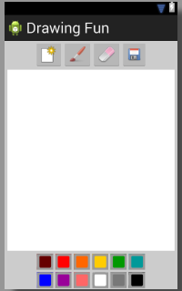
Change the colors if you like, but make sure you use the same color value in the background and tag attributes for each button. You should now be able to see the layout in the Graphical Layout tab in Eclipse:

Conclusion
We've now completed the first part of the series! Your app won't do much at the moment, but in the next part we will implement the drawing functions, detect and respond to touch interaction, and allow the user to choose colors. In the final part, we will enhance this functionality to allow the user to erase, choose brush and eraser sizes, start a new drawing, or save the current drawing.
In future follow-up tutorials to this series, we will look at using pattern fills in drawing functions, using opacity, and supporting non-touch interaction (e.g. trackball, stylus and mouse). You will be able to use these later tutorials to build on the skills you learn in this series. Stay tuned!


Comments