The Android compatibility library allowed you to add fragments to the tutorial list (TutList) application for use on devices running Android 1.6 and higher. However, it does not provide perfect compatibility. One sticking point is providing a mechanism to indicate to the user which list item is selected and to show in another fragment, the context for its details (view the article contents, in this case).
In this quick tutorial, we'll extend the existing TutList application to provide this feature for Honeycomb devices (Android 3.0 and 3.1) while not breaking compatibility with older devices.
Step 0: Getting Started
This tutorial assumes you start where Android Fundamentals: Status Bar Notifications left off. You can download that older code and work from it, or you can simply download or view the code provided with this tutorial and follow along. The choice is yours. This tutorial is for Version Code 10. The “tags” view of the source viewer has each version, for convenience.
Step 1: A Simple Attempt
If you do a little digging around in the Google sample applications illustrating fragments, you'll find that the sample code for uses built-in list item type for the adapter, called android.R.layout.simple_list_item_activated_1. Since we're using our own custom layout for the list item, we can't use this in our sample. Additionally, this layout is not defined prior to API Level 11. However, what we do notice is that the code for the layout has a simple addition for supporting the indicator: a background setting.
Simply adding this attribute, as shown below, results in a project that no longer compiles:
<?xml version="1.0" encoding="utf-8"?>
<TextView
    xmlns:android="http://schemas.android.com/apk/res/android"
    android:id="@+id/title"
    android:layout_width="fill_parent"
    android:layout_height="wrap_content"
    android:textSize="24dp"
    android:padding="6dp"
    android:background="?android:attr/activatedBackgroundIndicator" />
Why won't it compile? Simple. The background attribute is also only available in API Level 11 and higher. And you can't just use the underlying value, either. The resource the attribute referenced is a StateListDrawable that uses a state value of "state_activated" that was introduced in API Level 11.
Step 2: Fixing Compilation
If the background attribute is only available on API Level 11 and higher, can we just compile for Level 11? Let's try it. To quickly switch the API level that is being compiled with, right-click on the project, choose Properties, find the Android section, and change the Project Build Target to Android 3.0 (API Level 11).
It compiles. So are you done? Not yet. First, try running it on an Android 3.0 device. (Maybe you were an attendee at Google IO and you have a shiny new Galaxy tab 10.1. Try it on that one!) Second, try running it on a device with API Level 10 or lower.
Did the screen work on either device target? Nope! So what's going on?
There are two problems: On Honeycomb devices, the indicator doesn't draw properly. On devices running earlier versions of Android, the application crashes. Both problems are fixable, so let's fix both of these issues now.
Step 3: Showing the Indicator
There are two reasons the indicator doesn't show. The first reason is that we're not yet configuring the ListView correctly, nor telling it which list item to highlight. The second reason is that the attribute we're using for the background relies on new values found within the new holographic theme for Honeycomb.
To solve the first problem, edit TutListFragment.java and add an override method for onActivityCreate() to set the choice mode of the ListView control:
@Override
public void onActivityCreated(Bundle savedInstanceState) {
    super.onActivityCreated(savedInstanceState);

    getListView().setChoiceMode(ListView.CHOICE_MODE_SINGLE);
}
This tells the ListView control that there will be one "choice" or selection at a time. Now, we need to tell the ListView which item is the chosen item. This is done via the setItemChecked() method of ListView. Place the following code at the end of the onListItemClicked() method:
l.setItemChecked(position, true);
Now the ListView will be updated appropriately, but the theme values are still not available. This is because the project’s targetSdkVersion setting is set to an earlier version of Android so a compatible theme is used rather than the new Honeycomb theme. To fix this, change the targetSdkVersion setting in the AndroidManifest.xml file from 10 to 11.
Now run the application again on your Honeycomb device (or emulator). The currently viewed tutorial is now highlighted in the ListView!
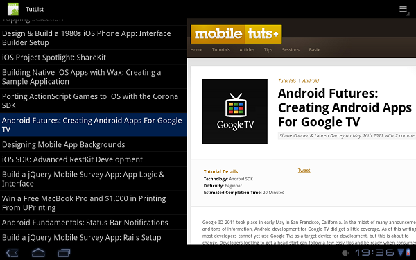
Bonus: Action Bar Activated Automagically
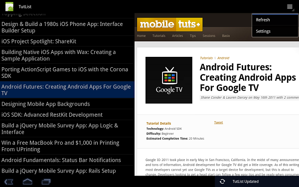
Did you notice anything new in that last screen shot? That's right, the Action Bar is now active. Just by changing the targetSdkVersion value in your manifest file, we now have an Action Bar. You'll also notice that the options menu button is no longer visible. In its place, the Action Bar menu is now available and has our options menu items (without icons). The menu items work just as they did before.
Step 4: Avoiding Crashes on Previous API Levels
Before you get too excited, let's not forget that the app still crashes on devices running earlier versions of the Android SDK—not cool. You may have noticed several steps along the way that hint at an unfortunate conclusion: the indicators won't work on devices prior to Honeycomb. All of the attributes we've used require Honeycomb, but can't we just make our own settings? Unfortunately not. The key item that is missing is an "activated" state -- a new view control state introduced in Honeycomb for these sorts of user interface items. (The background attribute ultimately uses the selector feature to pick a drawable based on a particular state. In this case, it uses state_activated, which is new to API Level 11. Alternate states aren't changed in previous API versions, either, for this use of the ListView.)
Although there are programmatic solutions to this problem, we still need to make sure that the application doesn't crash simply loading the layout. To fix this, create a new layout folder named "layout-v11" and place the existing Honeycomb-specific list_item.xml in it. Then make a copy of list_item.xml and put it in the original layout folder, but remove the background property.
Now we have created an alternative layout for Honeycomb, and a default layout without the background property to use in other cases. The special attribute will only be accessed on devices running API Level 11 (and higher, actually -- this works just fine on API Level 12 devices).
Warning: We are now using features that require compiling with API Level 11. Although this particular case is simple, we now won't have compiler errors if we try to use a call that isn't available on earlier versions. More care is now required in the choice of method calls and in testing. This is a drawback of using new features while remaining compatible with older API levels. Generally speaking, though, it's often worth the extra effort.
Conclusion
In this quick tutorial you learned how to indicate to users which list item is selected by using a new indicator feature only found on API Level 11 and higher while still maintaining backward compatibility with older versions of the Android SDK. In the process, you also learned how to enable the Action Bar, available in API Level 11 and higher, while learning how valuable Android alternative resource selection can be to target a specific version of the API.
We'll leave the programmatic solution for older API levels as an exercise to the reader. How would you indicate which ListView item is selected in older SDKs?
About the Authors
Mobile developers Lauren Darcey and Shane Conder have coauthored several books on Android development: an in-depth programming book entitled Android Wireless Application Development and Sams Teach Yourself Android Application Development in 24 Hours. When not writing, they spend their time developing mobile software at their company and providing consulting services. They can be reached at via email to [email protected], via their blog at androidbook.blogspot.com, and on Twitter @androidwireless.
Need More Help Writing Android Apps? Check out our Latest Books and Resources!


Comments