In our last article, we covered how to setup your Thesis Skin's structure. Next we're going to cover how to style that structure using Thesis Packages.
Now that we've got our boxes fully configured and ready for styling, we need to click on the CSS button at the top of our Skin Editor. This will direct us to the area where we can create packages and build the stylesheet this skin will use.
Thesis Packages
The package section of the Thesis Skin Editor is where all of your CSS modifications will take place. The package section is made up of three areas:
- The Skin CSS/Custom CSS window
- The package creation area (which includes created packages)
- The custom variable area (which includes created variables)
A package, in its simplest form, is a box that contains CSS for a given selector - or box from our HTML structure. To add styles to each element, we need to create a package for it.
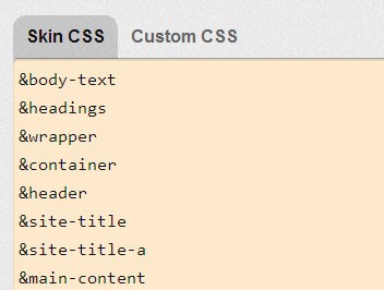
Once the package has been created, you need to then apply it to your Skin CSS by using the Thesis reference for the package in your Skin CSS window.
1. Creating a Package
To create a package, you need to select what type of package to create, Thesis has eight pre-built options to choose from, but for what we are trying to accomplish we'll be focusing mostly on the Single Element Styles, Links, Widgets and Columns.
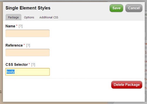
Each package is made up of three sections, the Package details, Options and Additional CSS. The "package" tab contained inside each package provides input fields that help identify what the package is styling.
The options are exactly that, options. You can set the width, height, border, margin, etc. through editing the options - or you can choose to use the "Additional CSS" tab and include any other formatting that might not be available by default in the options.

Starting with our #wrapper, let's start building out the packages.
To create the package (specifically the #wrapper package):
- Select "Single Element Styles" from the dropdown menu
- Click "Add Package"
- In the popup prompt, we need to choose a name and reference for the package (ideally you would pick something that would help you identify which element this particular package was for)
- Fill in the appropriate CSS selector for the page, in this case we're going to make the
#wrapperpackage, so type in "#wrapper" and click the "Options" tab at the top of the pop up prompt - In the options tab, set a width of 100%
- Click the green "save" button at the top of the pop up
." and "#" when you are filling in the CSS selector to distinguish between ID and class in the package.2. Applying the Package
Now that we've created the package, we need to apply it to our Skin CSS. To do this, type the reference tag into the Skin CSS window. Each reference tag will start with an "&" and be followed by the reference you provided.
So, to include our #wrapper we need to type &wrapper into our Skin CSS. When we've finished creating and applying our packages we need to click "Save CSS" to save our styles.

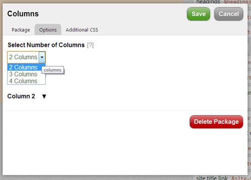
Remember that each package has its own set of options, most are pretty simple to pick up on, however the columns package might catch you off guard, so let's walk through creating a columns package and adding it to our skin.
3. Creating Column Packages

If you remember, our layout is composed of two columns. The largest column will contain our recent posts, and the smaller will be our widget sidebar. To create a column package we need to follow these steps:
- Select "Columns" from the dropdown list
- Choose a name, reference and the CSS Selector for the container housing the columns (in our tutorial we'll be applying this package to the
.main_contentbox - Click the "Options" tab to reveal column options
- Select the number of columns for the package (in our case we’ll need 2 columns)
- Expand the Column 1 options
- Define the CSS selector for the first column (
.column-1) and set the width to 700 and the alignment (left in our case) - Set the padding to 10 for top, right, bottom and left
- Expand the Column 2 options
- Define the CSS selector for the second column (
.column-2) and set the width to 220 and the alignment (right in this instance) - Set the padding to 10 for top, right, bottom and left
- Add the reference tag to the Skin CSS and click "Save"
Now that our column styling is in place, we can continue giving the rest of our HTML structure packages. You can view the rest of the CSS styles used in creating each package by viewing the stylesheet in the source files.
Conclusion
Over the course of this series we've discussed how to interact with the Thesis 2.0 Framework, how to configure your site settings and build your skin's layout and style. For some, Thesis may seem very "back-and-forth," having to go from one place to the next to make changes, but for those who are just starting out with WordPress theme development, Thesis can be a very easy tool to use.
Once you become more familiar with the Thesis framework you can start developing your own custom boxes, functions, etc. One topic not covered in this series, but definitely worth exploring, are Thesis hooks, which can be implemented into boxes to provide even more dynamic functionality, such as breadcrumbing, pagination, etc.
Although the skin created for this tutorial is not robust or embellished design-wise, it may give some a great starting point.


Comments