WordPress 4.0 is here! While it's a major release, some will argue that there aren't any groundbreaking changes like when WordPress 3.0 was released.
In this article, we're going to see what's new in version 4.0 and the reactions among the WordPress community.
What's New in WordPress 4.0
There are a number of notable enhancements in WordPress 4.0. Rather than list them out, let's take a look at some of the major additions and improvements in details so we're ready to use them as soon as we install the application.
Media Library Improvements
Media Library gets probably the biggest facelift in WordPress version 4.0. Instead of a hard-to-browse, clunky listing of media attachments, you get a slick grid of all your uploads:
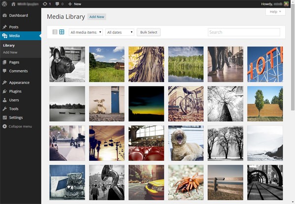
You can choose multiple images by checking the checkboxes on the upper right corner of each attachment. (It's kind of a hard thing to do, this may need some improvement.)
Single attachment pages are also renewed: Attachment details are now opened with a modal window instead of a separate page:
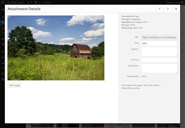
I really like this new interface. What do you think?
Enhancements in Plugin Installs
Back in 2008 when WordPress 2.7 was released, the introduction of "plugin installs via the admin panel" was a huge thing for WordPress. But since then, the "Add New Plugin" screens stayed the same
In WordPress 4.0, the "Add New Plugin" pages gets a nice facelift and we get to see "plugin cards" when we browse or search new plugins:

And that's not all: The design of modal windows have changed, too. It looks much better than before, thanks to plugin header images:
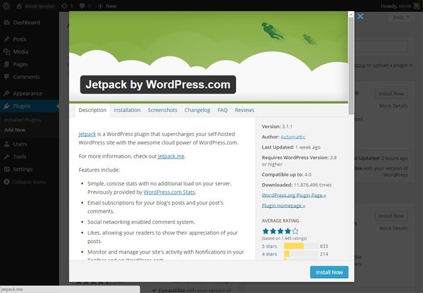
That being said, it's not a major enhancement. But still, it feels nice to see better designs.
Improvements in the Visual Editor
This might be your new favorite new feature in WordPress: The Visual Editor is now way easier to use for people who likes to write long posts! Our beloved TinyMCE editor gets two new features – First, the editor expands automatically as you write:
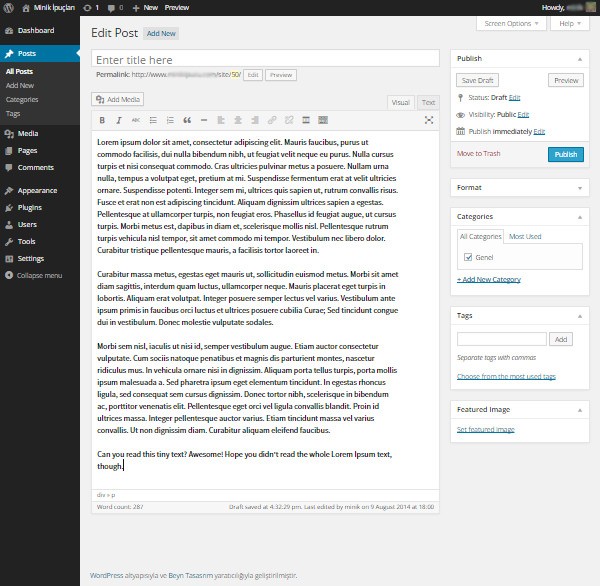
Secondly, the toolbar is now fixed and follows you as you go down:
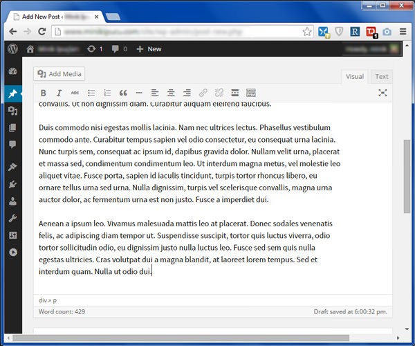
It's the little things that make a big difference.
New Language Selection Options
If you want to install a new copy of WordPress 4.0, you'll be greeted with a new "language selection" page:
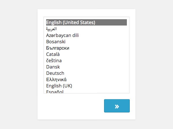
This means that if you're going to install WordPress in a different language, you don't have to visit the localized subdomains of WordPress.org, but instead you can just select your language and continue.
Another improvement about language selections is that you can change your language from the Options » General page. At the bottom of the page, you can see the new "Site Language" option:
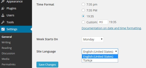
As a non-native English speaker, I can say that this is a huge improvement for those like me.
Enhancements in the Customizer
Another new improvements in WordPress are about the Theme Customizer – sorry, it's just Customizer now. The first one is related to widgets – Now, widgets are loaded in a sub-panel in the Customizer:

The second enhancement is about the Customizer API. If you want details about what's new in the API, check out the "Customizer Improvements in 4.0" article at Make WordPress Core blog.
WordPress 4.0 and the Community
While many of us are excited when a new version of WordPress is released, this version let some people down in the WordPress community because it isn't a huge release as anticipated by some people.
When WordPress 3.0 was out, there were some really exciting changes like the merge of WordPress and WordPress MU, custom menus, a new admin panel design and a new default theme. Now, over four years later, WordPress 4.0 is released and while the changes are really nice and exciting, we can't compare it to the changes in WordPress 3.0. Raelene Wilson starts her article in WPMU DEV with the following sentences:
Is it just me, or does WordPress 4.0 seem more like version 3.10?
Did someone get the numbering wrong? Did we accidentally skip to 4.0?
That must be it, because I can’t think of any other reason why such a minor upgrade to WordPress is deserving of a full version number.
She's not alone: Kevin Muldoon from Elegant Themes says that you may be disappointed:
If you are expecting ground breaking new features in WordPress 4.0, you are going to be disappointed. While WordPress 3.0 was a revolutionary step for WordPress as a platform, 4.0 is more of an evolutionary move forward that improves existing features.
And Brenda Barron from ManageWP wrote an article titled "WordPress 4.0: What Developers Wish It Had" which begins with the following:
There isn’t actually a huge feature boost this time around, which some are arguing is a good thing. Others are disappointed in what it offers (or doesn’t offer).
In my personal opinion, this new version is more like a release of UX improvements in WordPress. As a UX enthusiasts, I'm delighted to see the changes but I must say, it really looks like a smaller change set than WordPress 3.0's.
Conclusion
Sarah Gooding summarized the changes and improvements at WP Tavern a while ago:
- Previews of oEmbed URLs in the visual editor and via the “Insert from URL” tab in the media modal.
- Media library “grid view” added in addition to the “list view”
- Refreshed plugin install and search experience
- Select a language when installing WordPress
- Improvements to editor resizing its top and bottom bars pin when needed
- Improvements to keyboard and cursor interaction with TinyMCE views
- Widgets in the Customizer are now loaded in a separate panel
- Improvements to formatting functions
As we discussed, all are solid improvements, and despite the fact that some aren't as excited as others, there are a lot of things to look forward to using in our day-to-day.
Once WordPress 4.0 you get a chance to install and explore it, tell us what you think by commenting below. And if you liked this article, don't forget to share it with your friends!


Comments