Google's "Accelerated Mobile Pages" (AMP) project has, of late, helped influence websites to become faster. With good technique and a powerful content distrobution network, Google has directly made AMP-enhanced sites faster. AMP has also worked indirectly, however, by encouraging us to look at the optimizations and best-practices AMP contains. Even if you're not about to make your website AMP compliant, it's useful to understand AMP as a todo list for optimizing a non-AMP website.
One of the optimizations on this list is a technique called "lazy loading", which we saw in action in our recent article on using AMP's <amp-img> custom element. With this technique, when a visitor first arrives at a page only the images in or near the viewport are loaded. The rest are triggered to load as the visitor scrolls down.
Lazy loading allows a visitor to start engaging with content sooner, and the enhanced load speed can boost your search engine rankings. The more images you have on a page, the greater speed improvements you stand to gain.

In this tutorial we're going to look at how you can deploy lazy loading on non-AMP websites using a script named Layzr.js. We're going to replicate the functionality of AMP's <amp-img> element as closely as possible, but we'll also work with some of the features specific to Layzr.
Let's begin!
1. Basic Setup
As part of the article "AMP Project: Will it Make Your Sites Faster?" I created a basic layout containing five images. To enable you to draw comparisons between using AMP and deploying lazy loading yourself, we'll be recreating that same five image layout. I'll show you how to run various load speed tests later in this tutoral.
In the source files attached to this tutorial you'll find the AMP version of the layout, and the completed version of what you'll be making here. Both are included to help you decide which approach suits you best.
As we step through everything I recommend testing your work using Chrome Developer Tools (F12) with the Network tab open, Disable Cache checked, and throttling set to Regular 3G. This simulates an average mobile connection, showing you a chart of each image loading in real time, and will help you get a clear view of how your lazy loading is operating.
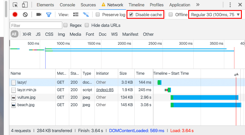
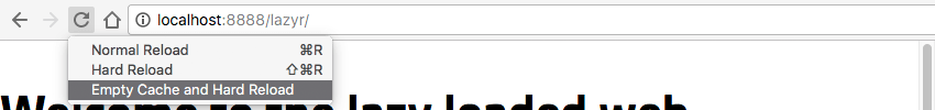
When you refresh the page for testing hold down the reload button, which will make a dropdown appear with different options. Choose Empty Cache and Hard Reload to fully simulate a visitor arriving at your site the first time.
Create HTML Shell
Let's start by getting the basics down. First, make a folder to house your project and inside it create a file named index.html.
Open it up for editing and add the following code:
<!doctype html>
<html lang="en">
  <head>
    <meta charset="utf-8">
    <title>Layzr.js Lazy Loading</title>
    <meta name="viewport" content="width=device-width,minimum-scale=1,initial-scale=1">
    <style>
    body {
      margin: 0;
    }
    img {
      display: block;
      margin: 0 auto;
    }
    </style>
  </head>
  <body>
    <h1>Welcome to the lazy loaded web</h1>


  </body>
</html>
With the code above we're just getting an HTML shell in place, and including a little CSS to ensure the page's body and images don't have any unexpected gaps around them.
We're also including margin: 0 auto; so the images we add later will be centered.
Load Layzr
The layzr.js script has two convenient CDN sources you can load from—we'll be using one coming from Cloudfare.
Add this code to your html, before the closing </body> tag.
<script src="https://cdnjs.cloudflare.com/ajax/libs/layzr.js/2.0.2/layzr.min.js"></script>
If you would prefer not to load the script from a CDN you can download it instead and follow the brief instructions at: https://github.com/callmecavs/layzr.js#download
Instantiate Layzr
Now that we have Layzr loaded in, we need to make it execute when the page loads. To do so, add this code after the script tags you just inserted in the previous section:
<script>
const instance = Layzr()

document.addEventListener('DOMContentLoaded', function(event){
  instance.update().check().handlers(true)
})
</script>
This code first creates an instance that is used to contain Layzr, then once the page's DOM content has loaded it uses that instance to activate Layzr's functionality.
Your overall code so far should now look like this:
<!doctype html>
<html lang="en">
  <head>
    <meta charset="utf-8">
    <title>Layzr.js Lazy Loading</title>
    <meta name="viewport" content="width=device-width,minimum-scale=1,initial-scale=1">
    <style>
    body {
      margin: 0;
    }
    img {
      display: block;
      margin: 0 auto;
    }
    </style>
  </head>
  <body>
    <h1>Welcome to the lazy loaded web</h1>


    <script src="https://cdnjs.cloudflare.com/ajax/libs/layzr.js/2.0.2/layzr.min.js"></script>
    <script>
    const instance = Layzr()

    document.addEventListener('DOMContentLoaded', function(event){
      instance.update().check().handlers(true)
    })
    </script>

  </body>
</html>
2. Add Images (Normal Resolution)
With Layzr loaded and ready to go we can start adding some images for it to work its magic on. You can use any images you would like, however if you want to use the exact code samples you see in the following steps you can download the source files attached to this tutorial. In there you will find an images folder which you can copy and paste into your own project.
To add images when using Layzr you'll use a regular img element, but instead of using the src attribute you'll use data-normal like so:
<img data-normal="images/vulture.jpg" alt="Vulture">
Ensuring Images Have Height
In order for any lazy loading script to work it needs to know the height of all images on a site so it can decide which ones need to be loaded, (because they are in the viewport or close to it), and which ones should wait.
The tricky part however is that an image doesn't actually have any height until its fully loaded into a page. This means if we want lazy loading to work we need a way to give the page information about image height before the images are loaded.
We'll be covering two methods to achieve this, one for fixed size images and one for responsive. Giving images height by making them fixed in size is the simplest method, as you need only add height and width attributes.
<img data-normal="images/vulture.jpg" alt="Vulture" height="640" width="960">
Go ahead now and add img elements above your script tags, using the data-normal attribute, and including height and width, for each image you want to load.
    <img data-normal="images/vulture.jpg" alt="Vulture" height="640" width="960">

    <img data-normal="images/beach.jpg" alt="Beach" height="640" width="960">

    <img data-normal="images/bear.jpg" alt="Bear" height="640" width="960">

    <img data-normal="images/sky.jpg" alt="Sky" height="540" width="960">

    <img data-normal="images/bike.jpg" alt="Bike" height="540" width="960">
This fixed size method will allow lazy loading to work, however it prevents the images being responsive, and this is not ideal. We'll cover how to give images both height and responsiveness a little later.
3. Set a Loading Threshold
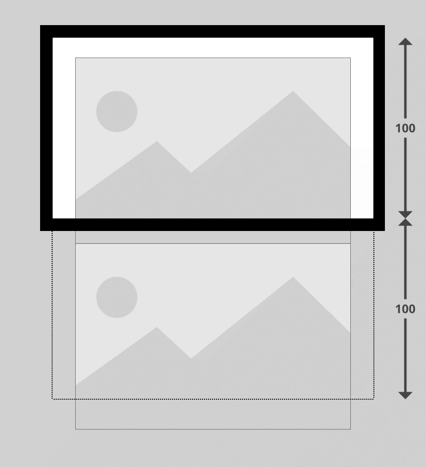
By default, Layzr will only bring in images that are in view at the time of load. However, visitors have a smoother experience if images next in line (just outside the viewport) are preloaded as well.
Do this by setting an option named threshold when instantiating the script. The way it works is you'll provide a value that represents a percentage of the viewport height. If you set a value of 100 this would represent 100% of the viewport height, e.g. 1200px. In this case anything off screen within 1200px of the viewport would also be loaded.
For example, if you had two large images, one of them was pushed just outside of the viewport, and your threshold was set to 100, both images would load:
To set a threshold value replace this line in your code:
const instance = Layzr()
...with this:
const instance = Layzr({
  threshold: 100
})
You can change this value to whatever best suits the sites you create. As a point of interest, it would seem AMP's lazy loading threshold is roughly equivalent to 200.
4. Add Retina/HiDPI Images
One of the great things about Layzr is it makes it very straight forward to add images for high resolution devices. All you need to do is include the the attribute data-retina. For example:
<img data-normal="images/vulture.jpg" data-retina="images/[email protected]" alt="Vulture" height="640" width="960">
Update all the img elements in your HTML to include retina images, like so:
    <img data-normal="images/vulture.jpg" data-retina="images/[email protected]" alt="Vulture" height="640" width="960">

    <img data-normal="images/beach.jpg" data-retina="images/[email protected]" alt="Beach" height="640" width="960">

    <img data-normal="images/bear.jpg" data-retina="images/[email protected]" alt="Bear" height="640" width="960">

    <img data-normal="images/sky.jpg" data-retina="images/[email protected]" alt="Sky" height="540" width="960">

    <img data-normal="images/bike.jpg" data-retina="images/[email protected]" alt="Bike" height="540" width="960">
5. Responsive Image Placeholders and Reflow Prevention
Making lazy loaded images responsive can be a tricky proposition. As we mentioned earlier, in order to determine when to load images Layzr first needs to know their heights. Because responsive images change their dimensions all the time, their height is unpredictable.
On top of this we also want to have something in our page layout to prevent reflow. Reflow is what happens when an image finishes loading and goes from having no size to suddenly taking up space in the layout, causing everything around it to move. This can be very frustrating for visitors trying to focus on your content only to have it jump around the page on them.
We can solve both of these problems by having responsive placeholders in the page at the correct size for each image. The placeholders will ensure the page layout doesn't need to reflow, and will also give Layzr heights to work with. We'll be basing our approach on an ingenious technique from this "A List Apart" article by Thierry Koblentz on "Creating Intrinsic Ratios for Video".
The only proviso is you'll need to know the aspect ratio of each image you post in advance, because the CSS will resize the images according to a specified aspect ratio.
Add an Aspect Ratio Wrapper
The first thing we're going to do is add a div wrapper around our first image—this div will become our placeholder. We'll be resizing the div itself with CSS, then setting the image within to fill it horizontally and vertically.
We're going to give the div a class name that represents the aspect ratio of the image it will contain. In our example, the first image is 960 pixels wide by 640 pixels high, so let's figure out what aspect ratio that makes it.
640 (our height) is two thirds of 960 (our width), meaning that for every 2 units of height the image has 3 units of width. Aspect ratios are typically expressed as width:height, as in the case of the well known 16:9. The ratio of our first example image is 3:2.
To represent this aspect ratio we'll give our wrapper div the class name ratio_3_2.
    <div class="ratio_3_2">
      <img data-normal="images/vulture.jpg" data-retina="images/[email protected]" alt="Vulture" height="640" width="960">
    </div>
Add Standard Aspect Ratio Styling
Now we'll add the CSS to make this all work.
In between the existing <style></style> tags in the head of your index.html file, add this code:
    div[class^="ratio_"]{
      position: relative;
      width: 100%;
    }
This selector will pick up our ratio_3_2 class, but it will also pick up any other class that begins with ratio_. This means we can create more classes later to accommodate different aspect ratios.
Inside this style we're making sure our wrapper always stretches to 100% of its parent width. We're also setting it to position: relative; as this will absolutely position the image inside it—you'll see why a little later.
Give the Aspect Ratio Wrapper Height
Now we'll add this code specific to our ratio_3_2 class only:
    .ratio_3_2 {
      /*padding-top: calc( 100% * (2 / 3) );*/
      padding-top: 66.666667%;
    }
The padding-top value there is what allows us to keep our wrapper div at the aspect ratio we want. Whatever the width of the div, this padding will keep the height at 66.666667% of that amount, (two thirds), hence maintaining our 3:2 aspect ratio.
To determine what percentage to put here, figure out what the height of your aspect ratio is when expressed as a percentage of the width. You can do this with the calculation:
100% * (height / width)
For our 3:2 ratio that makes it: 100% * (2 / 3) = 66.666667%
You can calculate the correct percentage for your desired aspect ratio in advance, or if you prefer you can use the CSS calc() function as seen commented out in the example above:
padding-top: calc( 100% * (2 / 3) );
Fill the Aspect Ratio Wrapper with Image
Our aspect ratio wrapper is now going to maintain the desired dimensions regardless of viewport width. So now all we have to do is make the image contained inside it fill up the wrapper, thereby inheriting its dimensions.
We'll do this by absolutely positioning any image nested inside a ratio_ classed wrapper div, placing it at the top left corner of the wrapper, then stretching it to 100% height and width, like so:
    div[class^="ratio_"] > img {
      position: absolute;
      top: 0;
      left: 0;
      width: 100%;
      height: 100%;
    }
Check your first image and you should now see it stretches to the width of the viewport, but will shrink to fit when you resize, keeping its aspect ratio all the while.
Add Extra Aspect Ratios
You're likely to have images with all kinds of different aspect ratios and you'll want to be able to accommodate them. In the example images we're working with in this tutorial the first three have an aspect ratio of 3:2, but the fourth and fifth are 16:9.
To account for this add a new class named according to the aspect ratio, i.e. ratio_16_9, with a corresponding padding-top value:
    .ratio_16_9 {
      /*padding-top: calc( 100% * (9 / 16) );*/
      padding-top: 56.25%;
    }
Go ahead and add aspect ratio div wrappers around all the rest of the images, using the appropriate classes for each depending on their size. You can also remove the height and width attributes from your images as they are now all going to being overridden by our CSS.
    <div class="ratio_3_2">
      <img data-normal="images/vulture.jpg" data-retina="images/[email protected]" alt="Vulture">
    </div>

    <div class="ratio_3_2">
      <img data-normal="images/beach.jpg" data-retina="images/[email protected]" alt="Beach">
    </div>

    <div class="ratio_3_2">
      <img data-normal="images/bear.jpg" data-retina="images/[email protected]" alt="Bear">
    </div>

    <div class="ratio_16_9">
      <img data-normal="images/sky.jpg" data-retina="images/[email protected]" alt="Sky">
    </div>

    <div class="ratio_16_9">
      <img data-normal="images/bike.jpg" data-retina="images/[email protected]" alt="Bike">
    </div>
Reload your browser preview and resize the viewport: you should now find all your images are responsive whilst preserving their lazy-loading functionality, with no reflow.
6. Add srcset
Layzr also supports the srcset attribute. In browsers that support srcset it will be used in preference over data-normal and data-retina.
Rather than using the straight srcset attribute, however, it should be prepended with data- just like the other attributes we've used so far.
Update the code of your first image to:
<img
  data-normal="images/vulture.jpg"
  data-retina="images/[email protected]"
  alt="Vulture"
  data-srcset="images/vulture_sml.jpg 320w, images/vulture_med.jpg 640w, images/vulture.jpg 960w">
To see this working go to your browser preview, shrink the viewport down to below 320px wide, reload and watch the network panel. You should see the smallest version of your image load first. Then increase the size of the viewport and you should see the medium and large versions load as you go.
The images folder provided in the source files includes small, medium and large versions of each image. Update your code to use all of them in your data-srcset attributes like so:
    <div class="ratio_3_2">
      <img data-normal="images/vulture.jpg" data-retina="images/[email protected]" alt="Vulture" data-srcset="images/vulture_sml.jpg 320w, images/vulture_med.jpg 640w, images/vulture.jpg 960w">
    </div>

    <div class="ratio_3_2">
      <img data-normal="images/beach.jpg" data-retina="images/[email protected]" alt="Beach" data-srcset="images/beach_sml.jpg 320w, images/beach_med.jpg 640w, images/beach.jpg 960w">
    </div>

    <div class="ratio_3_2">
      <img data-normal="images/bear.jpg" data-retina="images/[email protected]" alt="Bear" data-srcset="images/bear_sml.jpg 320w, images/bear_med.jpg 640w, images/bear.jpg 960w">
    </div>

    <div class="ratio_16_9">
      <img data-normal="images/sky.jpg" data-retina="images/[email protected]" alt="Sky" data-srcset="images/sky_sml.jpg 320w, images/sky_med.jpg 640w, images/sky.jpg 960w">
    </div>

    <div class="ratio_16_9">
      <img data-normal="images/bike.jpg" data-retina="images/[email protected]" alt="Bike" data-srcset="images/bike_sml.jpg 320w, images/bike_med.jpg 640w, images/bike.jpg 960w">
    </div>
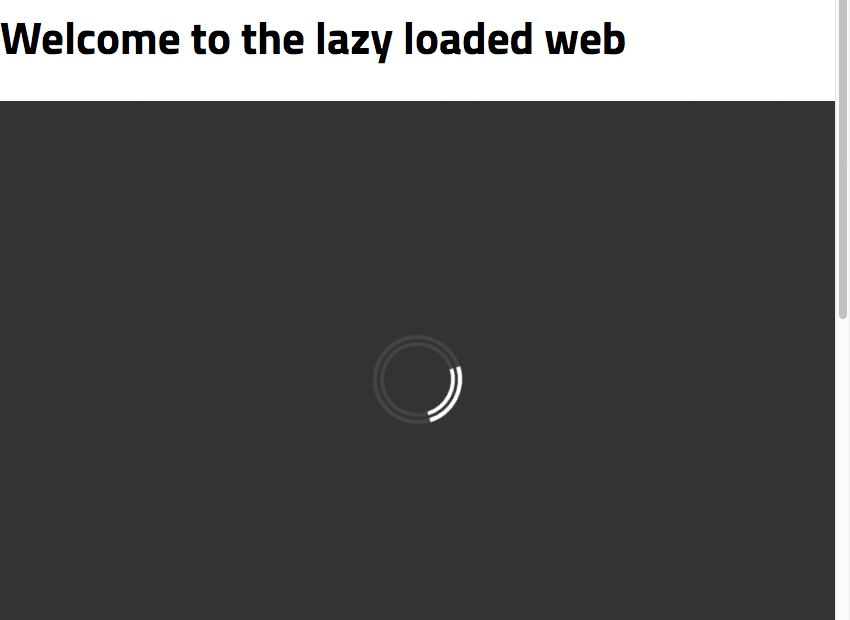
Add a Loading Animation
We're almost done, but to create a final layer of polish we're going to add a loading animation. This will help communicate to visitors which portions of the layout are acting as image placeholders, and that those images are in the process of being loaded.
We'll be using a pure CSS loader, a slightly modified version of this great pen by Alan Shortis: https://codepen.io/alanshortis/pen/eJLVXr
To avoid needing any extra markup we're going to have our loading animation contained in an :after psuedo-element attached to every aspect ratio wrapper. Add the following to your CSS:
    div[class^="ratio_"]:after {
      content: '';
      display: block;
      width: 3rem;
      height: 3rem;
      border-radius: 50%;
      border: .5rem double #444;
      border-left: .5rem double white;
      position: absolute;
      top: calc(50% - 2rem);
      left: calc(50% - 2rem);
      animation: spin 0.75s infinite linear;
    }
    @keyframes spin {
      0% {
        transform: rotate(0deg);
      }
      100% {
        transform: rotate(360deg);
      }
    }
The above code creates a little circle shaped loader icon, centers it, and makes it spin 360 degrees in a circle every 0.75 seconds.
We're also going to add a dark grey background color to our aspect ratio wrappers so they're easily distinguished from the rest of the layout. Add this background-color: #333; line as follows:
    div[class^="ratio_"]{
      position: relative;
      width: 100%;
      background-color: #333;
    }
Finally we just need to make sure our loader doesn't position itself over the top of our images. To do this we'll add the line z-index: 1; to our images, shifting them to a layer on top of the loaders:
    div[class^="ratio_"] > img {
      position: absolute;
      top: 0;
      left: 0;
      width: 100%;
      height: 100%;
      z-index: 1;
    }
Refresh your page now and you should see your loading animation in action.
Your Final Code
With all the above complete, your code should now look like this:
<!doctype html>
<html lang="en">
  <head>
    <meta charset="utf-8">
    <title>Layzr.js Lazy Loading</title>
    <meta name="viewport" content="width=device-width,minimum-scale=1,initial-scale=1">
    <style>
    body {
      margin: 0;
    }
    img {
      display: block;
      margin: 0 auto;
    }

    div[class^="ratio_"]{
      position: relative;
      width: 100%;
      background-color: #333;
    }
    .ratio_3_2 {
      /*padding-top: calc( 100% * (2 / 3) );*/
      padding-top: 66.666667%;
    }
    .ratio_16_9 {
      /*padding-top: calc( 100% * (9 / 16) );*/
      padding-top: 56.25%;
    }

    div[class^="ratio_"] > img {
      position: absolute;
      top: 0;
      left: 0;
      width: 100%;
      height: 100%;
      z-index: 1;
    }

    div[class^="ratio_"]:after {
      content: '';
      display: block;
      width: 3rem;
      height: 3rem;
      border-radius: 50%;
      border: .5rem double #444;
      border-left: .5rem double white;
      position: absolute;
      top: calc(50% - 2rem);
      left: calc(50% - 2rem);
      animation: spin 0.75s infinite linear;
    }
    @keyframes spin {
      0% {
        transform: rotate(0deg);
      }
      100% {
        transform: rotate(360deg);
      }
    }
    </style>
  </head>
  <body>
    <h1>Welcome to the lazy loaded web</h1>

    <div class="ratio_3_2">
      <img data-normal="images/vulture.jpg" data-retina="images/[email protected]" alt="Vulture" data-srcset="images/vulture_sml.jpg 320w, images/vulture_med.jpg 640w, images/vulture.jpg 960w">
    </div>

    <div class="ratio_3_2">
      <img data-normal="images/beach.jpg" data-retina="images/[email protected]" alt="Beach" data-srcset="images/beach_sml.jpg 320w, images/beach_med.jpg 640w, images/beach.jpg 960w">
    </div>

    <div class="ratio_3_2">
      <img data-normal="images/bear.jpg" data-retina="images/[email protected]" alt="Bear" data-srcset="images/bear_sml.jpg 320w, images/bear_med.jpg 640w, images/bear.jpg 960w">
    </div>

    <div class="ratio_16_9">
      <img data-normal="images/sky.jpg" data-retina="images/[email protected]" alt="Sky" data-srcset="images/sky_sml.jpg 320w, images/sky_med.jpg 640w, images/sky.jpg 960w">
    </div>

    <div class="ratio_16_9">
      <img data-normal="images/bike.jpg" data-retina="images/[email protected]" alt="Bike" data-srcset="images/bike_sml.jpg 320w, images/bike_med.jpg 640w, images/bike.jpg 960w">
    </div>

    <script src="https://cdnjs.cloudflare.com/ajax/libs/layzr.js/2.0.2/layzr.min.js"></script>
    <script>
    const instance = Layzr()

    document.addEventListener('DOMContentLoaded', function(event){
      instance.update().check().handlers(true)
    })
    </script>

  </body>
</html>
Wrapping Up
You've now completely implemented lazy loading by hand, with as close as possible to feature parity with AMP.
There are a couple of things AMP does automatically, like handling aspect ratio preservation on responsive images, but on the flip side doing things yourself allows added control, such as specifying your own loading threshold.
Hopefully working through this process has helped you decide which approach you prefer.

Thanks to Michael Cavalea for an excellent script! To learn more about Layzr.js visit: https://github.com/callmecavs/layzr.js


Comments