As web designers and developers, we've been living in the mobile era for a few years now. In this tutorial, we're going to review seven plugins that help to make your website look good and perform well for mobile visitors.
Mobile visitors usually refers to those who are visiting the site via tablet or smartphones. Naturally, we have to build websites that respond and adapt to mobile devices, or we won't be reaching many of those who are visiting our sites and/or our applications.
But how do we catch up? By making our websites mobile ready, of course. In this tutorial, we're going to review seven plugins to help you make your website look good and perform well for mobile users.
Plugins to Help You With Responsive & Adaptive Web Design
It's unlikely that you've never heard of the terms "responsive web design" or "adaptive web design" within the last two years. The purpose of this approach in web design is to make web pages fit will within the constraints of the screens of mobile devices.
The four WordPress plugins below can help you present mobile-ready pages in your website.
Hammy

Hammy is a handy plugin that resizes the images in your website for mobile devices. It replaces the <img> tags with <figure> tags and uses WordPress 3.5 image code to resize the images.
In order to use the plugin, you need to set some breakpoints and choose a container HTML element. With the breakpoints you specify, the plugin can resize the images when the screen width reaches a breakpoint. You can also set some class names to prevent certain images to be ignored.
Responsive Widgets
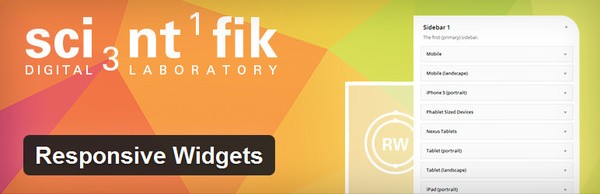
Responsive Widgets is a plugin that introduces new WordPress text/HTML widgets that appear only in particular devices like iPads, Nooks, PlayStation Vitas, and other generic devices like tablets or smartphones.
In order to use the plugin, you just need a basic understanding of WordPress widgets. Open up the Widgets page and you'll see many new widgets for the following devices and screen types:
- Mobile
- Mobile (landscape)
- iPhones and iPods
- Phablets
- Tablet (portrait)
- Tablet (landscape)
- iPad Portrait
- iPad Landscape
- Nexus Tablets
- Kindle Tablets
- Surface Tablet
- Nook Tablets
- PS Vitas
- Desktops
- Large Monitors (1240px+ screens)
- Print only
Many of the widgets have checkboxes that allow you to make exceptions. For example, if you want to show a widget on tablets but not iPads, you can check a checkbox and you're good to go.
WP Lightbox 2

WP Lightbox 2 is a very popular "lightbox" plugin that allows you to use in-page popup images and galleries with overlay effects. It's not a plugin to help you with responsive web design per se, but it's responsive out-of-the-box so you can use it with your websites.
In order to use the plugin, you don't need to do anything other than activate the plugin. It has some options like enabling Lightbox in the comments section or changing animation duration, but it basically works upon activation with no additional configuration.
Responsible
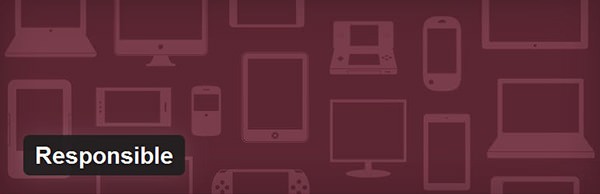
Responsible is an extremely helpful WordPress plugin to test your responsive designs on the fly in your browser. It uses the Viewport Resizer Bookmarklet to place a fixed bar at the top of your page where you can resize the page to spesific dimensions like smartphones, tablets or desktop screens, and custom dimensions that you can set.
In order to use the plugin, just activate it and visit one of your pages. The bar will appear on each page so you can test your designs, completely hassle-free.
Mobile Theme Plugins
These plugins work in a more specialized way: They help you show a different WordPress theme if the user connects to your website with a mobile device. This is particularly useful if you have a theme that is not mobile-ready. If you don't have the time or the energy to make your theme mobile-ready, you can enjoy these fantastic plugins to do the job.
WPTouch Mobile Plugin
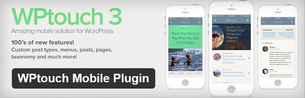
With over five millon downloads and a rating of 3.9 out of 5 stars, WPTouch is probably the most popular mobile theme plugin today. It offers one of the easiest ways to create a mobile version of your website, completely out of the box.
In order to use the plugin, you just need to install and activate the plugin. While its default settings will be enough for many users, you can adjust a ton of settings in its configuration pages.
A word of warning, though: With great power comes great responsibility, and with over five million downloads come even more. In July 2014, it has been announced that WPTouch 3.x versions had a deadly vulnerability which was fixed immediately but may have caused huge problems for users of the plugin. It's always a good idea to look out for updates and this applies to the core and all your plugins and themes.
WordPress Mobile Pack
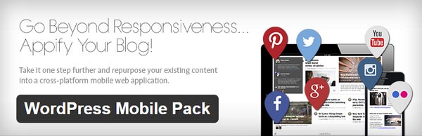
WordPress Mobile Pack is another big player which offers mobile themes for WordPress websites. For now, it has over 600,000 downloads and a rating of 3.8 out of 5 stars. WordPress Mobile Pack offers a very unique mobile theme for you and your visitors – a mobile app-like interface instead of a classic mobile design.
Like WPTouch, WordPress Mobile Pack is ready to use as you install and activate the plugin. If you want, you can make some adjustments on the configuration page.
Jetpack by WordPress.com

Jetpack is not only one of the most popular WordPress plugins ever, but it's also supported and maintained by WordPress.com and Automattic. And this big plugin also has a "Mobile Theme" feature from which we can benefit.
In order to use the "Mobile Theme" feature, you need to go to the Jetpack » Settings configuration page after you install and activate Jetpack. In the list of Jetpack modules, find "Mobile Theme" and activate it. It's not much, really, but it offers a fast & clean design for mobile devices. A note from personal experience: It doesn't play nicely with the official Disqus plugin.
Conclusion
In the web, it's always important to keep up with the trends and offer users what they want, especially if you expect something from them in return (whether it be money or praise). In our day, "mobile ready" is becoming standard and it would be foolish to put off your users with a website that doesn't translate well to mobile devices.
Do you know any other good plugins that makes websites more mobile accessible? Please share your thoughts and knowledge with us by commenting below. And if you liked this article, don't forget to share it with your friends!

Comments