Can you create for the web using your mobile device?
This question has erupted from the mouths of web designers and programmers since the earliest models of smart phones. How capable are modern mobile devices where creating is concerned?
In this article, I will discuss some of the major hurdles which mobile phones face, with regard to creating for the web. We’ll mention a few tools along the way, but we’ll be focusing more on the discussion of how the mobile device is fundamentally different from a desktop or a laptop, and what opportunities and restrictions this brings to light.
We’re Making the Wrong Arguments
When two things are combined to make a fundamentally novel thing, we refer to this process as synthesis. It’s often difficult for our brains to determine the final effects of synthesis.
For example, before the first iPhone was revealed, people predicted what the iPod-inspired cell phone device would look like. Naturally, they predicted some qualities of the cell phone, and some qualities of the iPod, combined.
The synthesized product of two things does not always retain the appearance of the two things it is made from.
When it comes to creating digital products with mobile devices, this synthesis is still in progress. Many of the tools we’ve created have tried to shove the paradigms of development and creation that we are used to from laptops and desktops into the mobile device. Most of these tools replicate interface elements and workflows on the iPhone, simply adapting the interfaces enough to allow for touch inputs.
While this might work in a pinch (for example, if you’re stuck on a bus and your server goes down, or if you need to touch up a photo to send to a content editor), using many of these tools is impossible at worst and painful at best.
We have not yet found what true synthesis for mobile devices and the process of creation should look like.
What Can Mobile do Well?
In order to fully understand the future state of tooling for mobile devices as content creation platforms, we must look at the platform’s functions on their own. What do mobile devices excel at?
Mobility
Mobile devices are first of all, by nature, mobile. This allows for creation with very little setup or teardown. In contrast, even a laptop requires a flat surface and some space to operate; mobile devices typically only require one hand to operate at a nominal level. This provides for much more immediate access.

Senses
Mobile devices typically have much more sensing ability than the average laptop. Few mobile devices are manufactured without GPS, gyroscopes, and other motion detection abilities. These sensing tools provide access to raw information about the device and the developer’s current situation than is typically unavailable on laptop devices. This kind of information could be used, for example, to capture organic motion, hyper-accurate location information, or even auto-adaptation for the developer using the phone based on their physical orientation or location.
Media Capture
Mobile devices are able to generate relatively high quality media, specifically video and still images due to ever-increasing camera quality. Desktops and laptops typically are much more limited in this arena, providing tools for editing but not the hardware for capturing.

Touch
Mobile phones are optimized for touch. Laptops and desktops, typically, are not touch-enabled. This provides for unique opportunities in terms of interacting with visual interfaces that previously was impossible. For example, multi-touch display input provides potential for rich interactions that are entirely impossible to emulate on a desktop machine with a mouse.
Testing Connectivity
Mobile devices are much more accurate at testing mobile connectivity issues, as they can be hard-limited on which types of network access is used for data transfer. This is also not emulated, but is a real-life limitation that can be imposed on the phone.
Best Mobile-first Testing
Perhaps the most compelling feature of a mobile device is that it is the most effective testing platform for itself. Thus, if we can target the iPhone while creating on an iPhone, we are more able to see a direct relation between our creating space and what the final product will look like.
What do Mobile Devices do Poorly?
Typing
Specifically (and importantly), typing code on a mobile device is very difficult. Punctuation is far more prevalent in most programming languages than any spoken language. Typing punctuation is currently quite difficult. Furthermore, the limits of typing with two thumbs or pecking forefingers are quickly felt by programmers who have tried to write code on a mobile phone or tablet.

Filesystems
Until a significant shift in computing occurs, filesystems are core to the way programmers and web developers work. Unfortunately, mobile devices (and particularly Apple devices) don’t provide an easy-to-manipulate filesystem. Let’s propose an example exercise. How would you do the following on a mobile device?
- Clone a git repository
- Rename a few files in that repository
- Change permissions on a file in the repo
- Run an
npm installor abundle installfrom the root of that directory - Push that directory to a remote repository
- Share the contents of that file with a coworker
- Run some commands to pre-process some of the files
As you can see, answering any of these questions requires a series of steps that are relatively non-intuitive for most developers. The most common solution for these questions, on a mobile device, is to find some kind of terminal emulator that allows the developer to get back to a Unix system, where they can run command line commands and have further control over their system.
Multi-tasking
Phones are pretty terrible at multi-tasking. Tablets are better, but still not great. Part of the reason for this is the screen real estate; it’s impossible for my phone to represent the amount of data that my 4k screen can represent. It’s also a product of how we use our phones most commonly: one app at a time. On a computer, we typically have multiple applications open, and visible, at all times.
The Need for Simulation
Creating from mobile devices also introduces a need for better simulation. When creating on a desktop, testing the use cases of other desktops is relatively simple, given that you have a screen that covers the largest likely screen sizes. It is also trivial to resize your browser window to match that of a given mobile device, providing for an easily accessed preview of the consequences and layout effects. This kind of simulation is quite literally impossible on mobile phones, as the screen size prohibits testing and simulating screens larger than itself without translating to a zoomed-out perspective of the same digital artefact.
This is also true of testing forthcoming technologies, such as VR, wearables, and super-size screens like 4k TVs. Until mobile devices support better emulation techniques, or some process for testing external peripherals, it will be difficult to make a switch for most developers who are creating for these endpoints.
Should Everything Be An “App”?
Another issue with the mobile development world is that, for the most part, mobile phones are built with the idea that applications are standalone feature packages. This collides with one of the arguably most powerful concepts used by developers: the unix philosophy of doing one very small thing, very well, and composing many of those small things to make complex, powerful workflows.
Development is a craft which traditionally requires raw, powerful tools. The current toolset looks more like a multi-tool Leatherman which doesn’t have everything you need to complete the task at hand. The workflow of a developer who creates primarily on a mobile device would necessarily be significantly different than the workflow of a developer who works on a laptop or desktop. This, on its own, is a challenge; the collective direction of the industry relies on the support and efforts being in relatively the same direction. In other words, we benefit from larger numbers of people adopting similar tools, practices, and workflows, because we experience similar problems and share solutions with each other. However, if we are using very different tools from one another, the collective knowledge suffers from that shift, as fewer people experience the same problems.
If it Walks and Quacks Like a Duck...
We should be creating tools that are intended to be used on a phone, rather than retrofitting tools that are intended to be used on a different medium to be simply accessible on a phone. We should take into account the strengths of the media, and avoid building tools that exploit the weaknesses.

The Future of the Web: Evolving Our Processes
The future of the web looks increasingly different from the present. We know that change is a part of this industry, but what kind of changes should we anticipate or bring on, and how will it affect the way we utilize mobile devices for creation?
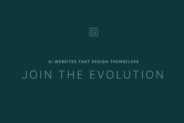
One possible answer to this question is to offload the work mobile devices are bad at (namely, the coding) to be done based on predetermined models, algorithmic intelligence, and optimized techniques. This is how TheGrid.io claims to work, touting “websites that design themselves.” Of course, the reinvention of the WYSIWYG is certainly a constant work in progress.
As we uncover new and profound ways to interact with different devices, we should keep in mind a few simple truths:
- We should never be so tied to a process that we forget the importance of the outcome.
- We should prefer tools that evolve versus tools that adapt. (Evolution is a fundamental change in interaction, while adaptation is a shallow affordance that translates one interaction into an unnatural input designed for a different interaction.)
- A great craftsman doesn’t change his toolset often, but is willing to invest in high quality tools up front that last a lifetime
Conclusion
Mobile devices have embedded themselves into the world, and they are here to stay. It is our job as creators to assess and push these devices to their potential, and to seek new avenues that spark creativity through new possibilities. We should look at these devices not simply as smaller computers, but in terms of their strengths. Once we learn to harness the strength of mobile, true synthesis will take place, and the now-painful process of creating for the web on mobile will become an indispensable skill.

Comments