The UIAlertView class is easy to implement, but unless you get under the hood and tinker around it will look the same each time. This Quick Tip shows you how to create custom graphics programmatically and apply them to an alert. Changing the graphics in your app may be just the ticket for a fresh and engaging design!
Step 1: Set Up the Xcode File
Launch Xcode and create a new project by clicking File > New > New Project. We want to create an
iOS Empty Application. Name your product "Custom Alert" and enter a Company Identifier of your choosing. Select "iPhone" from the "Device Family" menu and remove any checks in front of "Use Core Data," "Use Automatic Reference Counting," and "Include Unit Tests." Click "Next" and choose a location to save your project. Make sure the box next to "Source Control" is not checked and click "Create" to make your project.
Step 2: Create a UIAlertView
We first want to subclass UIAlertView. Click File > New > New File to create a new subclass. Choose an iOS Cocoa Touch Objective-C class and click "Next." Name your class "CustomAlertView." and choose UIView from the "Subclass of" menu. Before clicking "Next.", choose the "CustomAlert" folder from the "Groups" menu and make sure the "CustomAlert" is checked in the "Targets" box. Click "Create" to add the new subclass.
The newly-created class is a UIView class, but we need it to inherit from UIAlertView. Click on the "CustomAlertView.h" file and change the inheritance to UIAlertView.
#import <UIKit/UIKit.h>

@interface CustomAlertView : UIAlertView

@end
In the AppDelegate header file, import the "CustomAlertView.h" file and conform to the UIAlertViewDelegate protocol.
#import <UIKit/UIKit.h>
#import "CustomAlertView.h"
@interface AppDelegate : UIResponder <UIApplicationDelegate, UIAlertViewDelegate>

@property (strong, nonatomic) UIWindow *window;

@end
Navigate to the AppDelegate implementation file and include the instance method alertView:clickedButtonAtIndex:.
The buttonIndex is used to determine which button was pressed.
- (void)alertView:(UIAlertView *)alertView clickedButtonAtIndex:(NSInteger)buttonIndex
{
    if (buttonIndex == 0) {
        NSLog(@"THE 'NO' BUTTON WAS PRESSED");
    }
    if (buttonIndex == 1) {
        NSLog(@"THE 'YES' BUTTON WAS PRESSED");
    }
}
Now, insert the following code to instantiate the alert object in the application:didFinishLaunchingWithOptions: method.
Note that the delegate is set to self in the init method in order to receive the callback when a button is pressed.
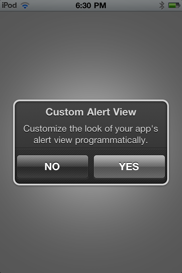
    CustomAlertView *customAlertView = [[CustomAlertView alloc] initWithTitle:@"Custom Alert View"
                                                                message:@"Customize the look of your app's alert view programmatically."
                                                                delegate:self
                                                   cancelButtonTitle:@"NO"
                                                   otherButtonTitles:@"YES",nil];
    [customAlertView show];
    [customAlertView release];
If you build and run the app right now, you will get the typical graphics of a standard UIAlertView.
Step 3: Customize the Graphics
Let's remove the standard graphics and customize the UIAlertView.
Overriding layoutSubviews:
First, we need to override UIView's layoutSubviews: method in the "CustomAlertView.m" file where we will hide the blue background and find the labels to change the appearance of the text.
- (void)layoutSubviews
{
    for (UIView *subview in self.subviews){ //Fast Enumeration
        if ([subview isMemberOfClass:[UIImageView class]]) {
            subview.hidden = YES; //Hide UIImageView Containing Blue Background
        }

        if ([subview isMemberOfClass:[UILabel class]]) { //Point to UILabels To Change Text
            UILabel *label = (UILabel*)subview;	//Cast From UIView to UILabel
            label.textColor = [UIColor colorWithRed:210.0f/255.0f green:210.0f/255.0f blue:210.0f/255.0f alpha:1.0f];
            label.shadowColor = [UIColor blackColor];
            label.shadowOffset = CGSizeMake(0.0f, 1.0f);
        }
    }
}
Because layoutSubviews: is called after the object is initialized, but before the object is drawn, you have the opportunity to add code that will provide additional customization before it appears on the screen. In the above code, we use fast enumeration to iterate through the array of existing subviews of the alert looking for the UIImageView, which holds the background and two UILabels which hold the text. By using the convenience method isMemberOfClass:, a Boolean value of true or false is returned depending on whether the subview is an instance of the specified class. When the classes are located, the UIImageView is hidden and the UILabels' text colors, shadow colors, and shadow offsets are set.
Overriding drawRect
Importing pre-made vector graphics can be problematic. Between changing screen resolutions and organizing files, importing images tends to be more work than it is worth in some cases. If you are looking for flexible, pixel-perfect graphics, overriding the view's drawRect: method is usually the best solution.
The graphics for the UIAlertView created by the following code provide a subtle difference in color, shadow, and texture, but keep the same general shape of a standard alert. Insert the sections of code explained in this tutorial into the drawRect: method in a subclass of UIAlertView.
Get a Reference to the Current Graphics Context
CGContextRef context = UIGraphicsGetCurrentContext();
The UIGraphicsGetCurrentContext() function returns a reference to the current view's graphics context, allowing you to make changes to its state.
Create a Base Shape
CGRect activeBounds = self.bounds;
CGFloat cornerRadius = 10.0f;
CGFloat inset = 6.5f;
CGFloat originX = activeBounds.origin.x + inset;
CGFloat originY = activeBounds.origin.y + inset;
CGFloat width = activeBounds.size.width - (inset*2.0f);
CGFloat height = activeBounds.size.height - (inset*2.0f);

CGRect bPathFrame = CGRectMake(originX, originY, width, height);
CGPathRef path = [UIBezierPath bezierPathWithRoundedRect:bPathFrame cornerRadius:cornerRadius].CGPath;
We start by creating a basic shape with rounded corners. Notice that the parameters for the shape are based on the current bounds of the UIAlertView. This allows the shape to be drawn in a consistent manner with the alert's bounds, compensating for any changes that occur. Two important components when creating this shape are cornerRadius and inset. The cornerRadius determines the roundness of the corners, while the inset defines how far inside the bounds the shape is drawn. Finally, we create the shape with a UIBezierPath constructed from the convenience method bezierPathWithRoundedRect: cornerRadius:.
Accessing the CGPath property of the newly created UIBezierPath object allows it to be used in the context.
Add a Fill and Outer Drop Shadow
CGContextAddPath(context, path);
CGContextSetFillColorWithColor(context, [UIColor colorWithRed:210.0f/255.0f green:210.0f/255.0f blue:210.0f/255.0f alpha:1.0f].CGColor);
CGContextSetShadowWithColor(context, CGSizeMake(0.0f, 1.0f), 6.0f, [UIColor colorWithRed:0.0f/255.0f green:0.0f/255.0f blue:0.0f/255.0f alpha:1.0f].CGColor);
CGContextDrawPath(context, kCGPathFill);
When drawing in Core Graphics, think in terms of layering pieces on top of each other. In this project, the first layer consists of drop shadows because they are the outermost and bottom layer. We set the parameters of the first graphics state, specifically its shape, fill color, and shadow color. Then we draw the context using CGContextDrawPath() and the CGPathDrawingMode kCGPathFill which will essentially create the exterior drop shadow.
Clip the Context
CGContextSaveGState(context); //Save Context State Before Clipping To "path"
CGContextAddPath(context, path);
CGContextClip(context);
Now we want to draw inside the base shape. In order to accomplish this, we need to clip the context to the shape prior to drawing the next state. Anything drawn afterward but before we call CGContextRestoreGState() stays inside the clipping area and doesn't cover the exterior drop shadow.
Draw a Gradient
CGColorSpaceRef colorSpace = CGColorSpaceCreateDeviceRGB();
size_t count = 3;
CGFloat locations[3] = {0.0f, 0.57f, 1.0f};
CGFloat components[12] =
    {
        70.0f/255.0f, 70.0f/255.0f, 70.0f/255.0f, 1.0f,     //1
        55.0f/255.0f, 55.0f/255.0f, 55.0f/255.0f, 1.0f,     //2
        40.0f/255.0f, 40.0f/255.0f, 40.0f/255.0f, 1.0f      //3
    };
CGGradientRef gradient = CGGradientCreateWithColorComponents(colorSpace, components, locations, count);
CGPoint startPoint = CGPointMake(activeBounds.size.width * 0.5f, 0.0f);
CGPoint endPoint = CGPointMake(activeBounds.size.width * 0.5f, activeBounds.size.height);
CGContextDrawLinearGradient(context, gradient, startPoint, endPoint, 0);
CGColorSpaceRelease(colorSpace);
CGGradientRelease(gradient);
Next, we add a subtle gradient to the background. In order to draw a gradient, we will need a gradient reference which specifies the colors and their locations within the gradient. The startPoint and endPoint of the gradient are based on the bounds of the alert view, covering the entire alert without going outside of the clipping area. Note that we've released the CGColorSpaceRef and CGGradientRef now that we are done with them. In general, when you see a Core Graphics function call with the word "create" in it, you'll need to release the reference when you are finished.
Create a Hatched Background
CGFloat buttonOffset = 92.5f; //Offset buttonOffset by half point for crisp lines
CGContextSaveGState(context); //Save Context State Before Clipping "hatchPath"
CGRect hatchFrame = CGRectMake(0.0f, buttonOffset, activeBounds.size.width, (activeBounds.size.height - buttonOffset+1.0f));
CGContextClipToRect(context, hatchFrame);

CGFloat spacer = 4.0f;
int rows = (activeBounds.size.width + activeBounds.size.height/spacer);
CGFloat padding = 0.0f;
CGMutablePathRef hatchPath = CGPathCreateMutable();
for(int i=1; i<=rows; i++) {
    CGPathMoveToPoint(hatchPath, NULL, spacer * i, padding);
    CGPathAddLineToPoint(hatchPath, NULL, padding, spacer * i);
}
CGContextAddPath(context, hatchPath);
CGPathRelease(hatchPath);
CGContextSetLineWidth(context, 1.0f);
CGContextSetLineCap(context, kCGLineCapRound);
CGContextSetStrokeColorWithColor(context, [UIColor colorWithRed:0.0f/255.0f green:0.0f/255.0f blue:0.0f/255.0f alpha:0.15f].CGColor);
CGContextDrawPath(context, kCGPathStroke);
CGContextRestoreGState(context); //Restore Last Context State Before Clipping "hatchPath"
The next bit of code deals with the hatched diagonal lines behind the buttons. In order to get the lines to draw only underneath the buttons we need to create a new rectangle shape, clip the context to the rectangle, and add the hatched lines to the context. The buttonOffset is the height of the space for the hatched lines to be drawn. The moving pattern created by the for loop is based on the alert view's bounds. To change the appearance of the hatched lines simply alter the spacer CGContextSetLineWidth(), or the hatchFrame values.
Draw a Separating Line
CGMutablePathRef linePath = CGPathCreateMutable();
CGFloat linePathY = (buttonOffset - 1.0f);
CGPathMoveToPoint(linePath, NULL, 0.0f, linePathY);
CGPathAddLineToPoint(linePath, NULL, activeBounds.size.width, linePathY);
CGContextAddPath(context, linePath);
CGPathRelease(linePath);
CGContextSetLineWidth(context, 1.0f);
CGContextSaveGState(context); //Save Context State Before Drawing "linePath" Shadow
CGContextSetStrokeColorWithColor(context, [UIColor colorWithRed:0.0f/255.0f green:0.0f/255.0f blue:0.0f/255.0f alpha:0.6f].CGColor);
CGContextSetShadowWithColor(context, CGSizeMake(0.0f, 1.0f), 0.0f, [UIColor colorWithRed:255.0f/255.0f green:255.0f/255.0f blue:255.0f/255.0f alpha:0.2f].CGColor);
CGContextDrawPath(context, kCGPathStroke);
CGContextRestoreGState(context); //Restore Context State After Drawing "linePath" Shadow
Now, we want to draw a separating line between the buttons and the labels. Creating the line using CGPathCreateMutable draws it using the specified point locations. The line's location within the alert view is based on the buttonOffset and spans its width. Once again, we use a function call containing the word "create," CGPathCreateMutable(). Therefore, we release the CGMutablePathRef one after we're done.
Create an Inner Shadow
CGContextAddPath(context, path);
CGContextSetLineWidth(context, 3.0f);
CGContextSetStrokeColorWithColor(context, [UIColor colorWithRed:210.0f/255.0f green:210.0f/255.0f blue:210.0f/255.0f alpha:1.0f].CGColor);
CGContextSetShadowWithColor(context, CGSizeMake(0.0f, 0.0f), 6.0f, [UIColor colorWithRed:0.0f/255.0f green:0.0f/255.0f blue:0.0f/255.0f alpha:1.0f].CGColor);
CGContextDrawPath(context, kCGPathStroke);
To create the appearance of a raised border around the alert view, we draw the original UIBezierPath with a shadow. The path will continue to be clipped by the first call to clip the context which results in the shadow appearing only on the inside of the stroked line. To change the size of the inner shadow, set the blur parameter inside CGContextSetShadowWidthColor to a different number.
Redraw the Path to Avoid Pixilation
CGContextRestoreGState(context); //Restore First Context State Before Clipping "path"
CGContextAddPath(context, path);
CGContextSetLineWidth(context, 3.0f);
CGContextSetStrokeColorWithColor(context, [UIColor colorWithRed:210.0f/255.0f green:210.0f/255.0f blue:210.0f/255.0f alpha:1.0f].CGColor);
CGContextSetShadowWithColor(context, CGSizeMake(0.0f, 0.0f), 0.0f, [UIColor colorWithRed:0.0f/255.0f green:0.0f/255.0f blue:0.0f/255.0f alpha:0.1f].CGColor);
CGContextDrawPath(context, kCGPathStroke);
Rounded corners have a tendency to appear pixilized once they have been clipped, so our last bit of code redraws the outer line to ensure it is crisp and clean. Before we redraw the outer line, we call CGContextRestoreGState() which releases our first clipping area, so we can draw on top of the original line.
Step 4: Test the UIAlertView
Run the app on the simulator or on your device to view the UIAlertView and its custom graphics.
Conclusion
Creating graphics using Core Graphics is about subtlety and layering of effects. There are plenty of graphical elements that can be adjusted when customizing UIAlertView , and this tutorial only covers a small portion of them. But the point is that these elements can all be adjusted and created programmatically to enhance the user's experience.

Comments