Welcome to the third and last part of this session, where we've created some useful custom views. We've implemented a custom text input view, a custom accordion menu, and now we're going to build a simple custom alert view. Read on!
Final Effect Preview
Custom Alert View Overview
The custom Alert View is going to be an alternative, simple, and nice alert view that will serve our need to display simple messages to the user. It will mainly consist of the following parts.
- A label upon which the message will appear.
- A toolbar below the label.
- An okay button on the right side of the toolbar.
- A cancel button on the left side of the toolbar.
The above will reside together into a UIView, and the view will be contained into the main view of the view controller that we'll build for the purpose of this custom alert view.
The main view of the view controller is going to be semi-transparent, which will prevent users from tapping on anything else in the background while the alert view is up.
Furthermore, the alert view will slide in from the top side of the screen when it's about to appear, and it'll slide out with the reverse move when it's about to go offscreen. It'll contain two buttons, an okay button and a cancel button. They can be visible or not depending on the needs of the message about to appear.
Here is a sample of the final result.
[Final product demo movie here]
1. The Custom Alert View Controller
Step 1
Let's begin our work by creating a new group in the Xcode for the custom alert view. This way we can keep our custom views tidy and clear.
On the Project Navigator pane on the left side of the Xcode, Control + Click (right click) on the CustomViewsDemo group and select the New Group option from the popup menu.
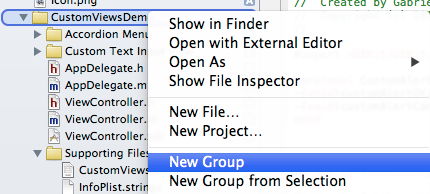
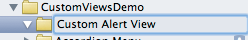
Set the Custom Alert View as the name of the new Group.
Step 2
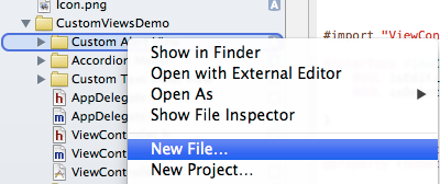
Let's keep going by creating a new view controller. Control+Click (right click) on the Custom Alert View group and select the New File... option from the popup menu.
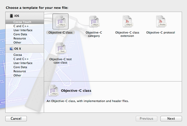
Inside the new window, select the Objective-C class as the template for the new file and click next.
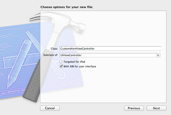
In the next step, complete the following tasks.
- Set the name CustomAlertViewController as the content of the Class field.
- In the Subclass of field select the UIViewController value.
- Make sure that the “With XIB for user interface” is checked.
After completing all of these steps, click on the next button.
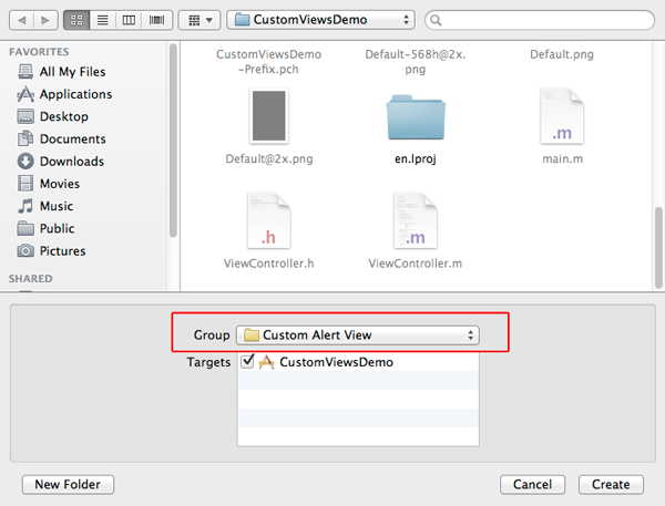
This is the last step before our new view controller is created. The only thing we need to do here is make sure that Custom Alert View is the selected group. Then, click on the create button.
2. Interface Setup
Step 1
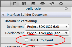
Now that the new view controller is ready, let's begin working with the interface. Click on the CustomAlertViewController.xib file to let the Interface Builder show onscreen. Turn the Autolayout feature off in case somebody wants to create the alert view for iOS versions prior to 6. Here is how you'll accomplish that.
- Click on the Utilities button at the Xcode toolbar to show the Utilites pane if not visible.
- Click on File Inspector.
- Scroll towards the bottom a little bit and click on the "Use Autolayout" option to turn it off.
We also need to make sure the alert view works on 3.5" screen devices, so go to the Attributes Inspector and under the Simulated Metrics section set the Size value to None.
Step 2
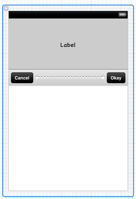
It's time to add some views to the interface. Grab the following from the Object library and set some properties, just as described here:
-
UIView
- Frame: X:0.0, Y:0.0, Width: 320.0, Height: 180.0
- Background color: R:204, G:204, B:204
-
Autosizing: Flexible Width, Flexible Margin Top

-
UILabel
- Font: Custom
- Family: Chalkboard SE
- Style: Regular
- Size: 17
- Alignment: Center
- Lines: 4
- Line breaks: Word Wrap
- Shadow: White Color
- Shadow offset: Horizontal: 1, Vertical: 1
- Frame: X: 20.0, Y: 7.0, Width: 280.0, Height: 123.0
-
Autosizing: Flexible Width, Flexible Margin Top

-
UIToolbar
- Tint: R: 204, G: 204, B: 204
- Frame:: X: 0.0, Y: 136.0, Width: 320.0, Height: 44.0
-
UIBarButtonItem
- Position: Left side of the toolbar
- Tint: Black Color
- Identifier: Custom
- Title: Cancel
-
UIBarButtonItem
- Identifier: Flexible Space
-
UIBarButtonItem
- Position: Right side of the toolbar
- Tint: Black Color
- Identifier: Custom
- Title: Okay
Here is what your interface should look like.
3. IBOutlet Properties and IBAction Methods
Step 1
Now that the interface is ready, we need to create some IBOutlet properties to connect our views, as well as create a couple of IBAction methods so that our UIBarButtonItem buttons work. In order to do that, we need to have the Assistant Editor visible.
While you're in the Interface Builder, click on the middle button of the Editor section in the Xcode toolbar to reveal the Assistant Editor and make the appropriate connections.
Step 2
To create IBOutlet properties and connect them to the views, make sure that you have the Document Outline visible and:
- Control + Click (right click) on a view.
- On the popup menu, click on the New Referencing Outlet.
- Drag and drop into the Assistant Editor window.
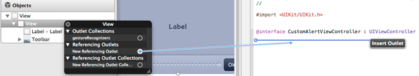
Then just specify a name for the new property.
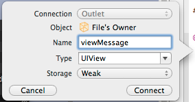
In the screenshots above, I demonstrated how to create an IBOutlet property for the UIView that contains all the other subviews. All the IBOutlet properties you need to create following the above procedure are inside the next code snippet.
@property (weak, nonatomic) IBOutlet UIView *viewMessage;
@property (weak, nonatomic) IBOutlet UILabel *lblMessage;
@property (weak, nonatomic) IBOutlet UIToolbar *toolbar;
@property (strong, nonatomic) IBOutlet UIBarButtonItem *btnOK;
@property (strong, nonatomic) IBOutlet UIBarButtonItem *btnCancel;
@property (weak, nonatomic) IBOutlet UIBarButtonItem *flexSpace;
Step 3
Let's create the necessary IBAction methods now. In order to create a new IBAction method for a UIBarButtonItem button, we'll do the following:
- Control + Click (right click) on the bar button item.
- Click on the Selector option in the Sent Actions section of the popup menu.
- Drag and drop into the Assistant Editor window.
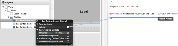
Set a name for the new method.
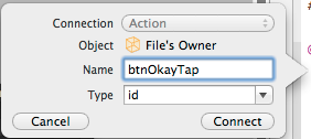
There are two UIBarButtonItems in our interface, so you have to do this procedure twice. You'll do it once for the Okay button and once for the Cancel button. Here are both of the IBAction methods.
- (IBAction)btnOkayTap:(id)sender;
- (IBAction)btnCancelTap:(id)sender;
They will both be implemented later.
4. Code Level Setup
Step 1
It would be a great idea to distinguish the two UIBarButtonItems (buttons) we previously added using their tag values. We didn't set any tag value in the Interface Builder, because I personally prefer doing so programmatically. As you will find out by yourself later, the tag values are the key to making the buttons of the alert view work properly.
For the time being, let's define two constants that will represent the tag values for each UIBarButtonItem (the Okay button and the Cancel button) of the alert view.
Open the CustomAlertViewController.m file and at the top of it, right after the #import... line, add the following:
#define OK_BUTTON_TAG       888
#define CANCEL_BUTTON_TAG   999
The alert view will use animations to appear and disappear from the screen, so it's a good idea to define a constant for the duration of the animation. Right after the two constants we just added, write this one:
#define OK_BUTTON_TAG       888
#define CANCEL_BUTTON_TAG   999
#define ANIMATION_DURATION  0.25
Step 2
There are a couple of initializations that need to be done, but prior to doing so let's create a custom init method, preferably right after the @implementation CustomAlertViewController line.
-(id)init{
    self = [super init];
    if (self) {

    }

return self;
}
There are four things we need to do here:
- Set the background color and the alpha value of the default view (self.view).
- Programatically calculate the message label's height, just in case the message view's height change in Interface Builder.
- Set the tag value of the Okay button.
- Set the tag value of the Cancel button.
Let's set the background of the default view to a semi-transparent, grey color.
[self.view setBackgroundColor:[UIColor colorWithRed:0.33 green:0.33 blue:0.33 alpha:0.75]];
If you want to change the height of the viewMessage property, don't worry about the exact height of the contained UILabel (the lblMessage property). We'll calculate it programatically.
[_lblMessage setFrame:CGRectMake(_lblMessage.frame.origin.x,
                                         _lblMessage.frame.origin.y,
                                         _lblMessage.frame.size.width,
                                        _viewMessage.frame.size.height - _toolbar.frame.size.height)];
Finally, let's set the tag values for the two buttons we have.
[_btnOK setTag:OK_BUTTON_TAG];
[_btnCancel setTag:CANCEL_BUTTON_TAG];
The init method is ready. Our next step is to declare and implement the public methods of the view controller.
5. Implementing the Public Methods
Step 1
There are a great number of public methods that can be implemented, and many of them depend on the imagination of the programmer or the level of the functionalities expected from a custom alert view of this kind. However, in our example, we are going to implement only methods regarding the following issues:
- Appearance of the alert view on a parent view.
- Disappearance from the parent view.
- Disappearance from the parent view instantly.
- The state toggle of the Okay button (remove/insert).
- The state toggle of the Cancel button (remove/insert).
- Checking whether the Okay button is removed.
- Checking whether the Cancel button is removed.
Click on the CustomAlertViewController.h to bring it on. Add the next declaration into it.
-(void)showCustomAlertInView:(UIView *)targetView withMessage:(NSString *)message;
-(void)removeCustomAlertFromView;
-(void)removeCustomAlertFromViewInstantly;
-(void)removeOkayButton:(BOOL)shouldRemove;
-(void)removeCancelButton:(BOOL)shouldRemove;
-(BOOL)isOkayButtonRemoved;
-(BOOL)isCancelButtonRemoved;
Let's begin implementing the above methods one by one, but first let's switch to the CustomAlertViewController.m file.
Step 2
The showCustomAlertInView:withMessage is perhaps the most important method, as it is responsible for showing the custom alert view in the target view specified by the first parameter. There are some major points to be noted, however.
First, the status bar; the alert view is going to slide in and out from the top of the screen, so the space the status bar occupies if it is visible is accountable. We can easily find out if it’s visible and get its size. But there is a small trap in case the status bar is visible and we have to deal with both portrait and landscape orientation. Why? Because in portrait mode, the status bar size is in the form Width x Height (e.g. 320.0 x 20.0) and in landscape mode the size is in the form Height x Width (e.g. 20.0 x 480.0). The easiest way for us to determine the status bar height is to check for the minimum value between the width and the height.
Secondly, to present the alert view correctly we have to check the orientation every time this method is called and set the view’s frame accordingly. It is important to note that when we are in landscape mode the width of the screen is the height for the view and the height of the screen is the width for the view. Also, when the status bar is visible (and in our example it is), a padding is created (at the left side of the view in landscape mode, at the top in portrait mode), which needs to be eliminated. For that reason, we'll simply use the CGRectOffset method to move the alert view's frame for an offset value equal to the status bar height, either towards the top or the left of the parent view.
As I have already said, the message view is going to be offscreen initially, which means that the Y origin point of the viewMessage property is going to be set to -_viewMessage.frame.size.height. When we use animation to show it onscreen, we'll simply set the Y origin point to the 0.0 value, so a smooth slide-in effect will be achieved. Finally, the message string passed as the second parameter to the method will be set to the label, and we're done.
After having said all of that, here is the whole method:
-(void)showCustomAlertInView:(UIView *)targetView withMessage:(NSString *)message{
    CGFloat statusBarOffset;

    if (![[UIApplication sharedApplication] isStatusBarHidden]) {
        // If the status bar is not hidden then we get its height and keep it to the statusBarOffset variable.
        // However, there is a small trick here that needs to be done.
        // In portrait orientation the status bar size is 320.0 x 20.0 pixels.
        // In landscape orientation the status bar size is 20.0 x 480.0 pixels (or 20.0 x 568.0 pixels on iPhone 5).
        // We need to check which is the smallest value (width or height). This is the value that will be kept.
        // At first we get the status bar size.
        CGSize statusBarSize = [[UIApplication sharedApplication] statusBarFrame].size;
        if (statusBarSize.width < statusBarSize.height) {
            // If the width is smaller than the height then this is the value we need.
            statusBarOffset = statusBarSize.width;
        }
        else{
            // Otherwise the height is the desired value that we want to keep.
            statusBarOffset = statusBarSize.height;
        }
    }
    else{
        // Otherwise set it to 0.0.
        statusBarOffset = 0.0;
    }


    // Declare the following variables that will take their values
    // depending on the orientation.
    CGFloat width, height, offsetX, offsetY;

    if ([[UIApplication sharedApplication] statusBarOrientation] == UIInterfaceOrientationLandscapeLeft ||
        [[UIApplication sharedApplication] statusBarOrientation] == UIInterfaceOrientationLandscapeRight) {
        // If the orientation is landscape then the width
        // gets the targetView's height value and the height gets
        // the targetView's width value.
        width = targetView.frame.size.height;
        height = targetView.frame.size.width;

        offsetX = -statusBarOffset;
        offsetY = 0.0;
    }
    else{
        // Otherwise the width is width and the height is height.
        width = targetView.frame.size.width;
        height = targetView.frame.size.height;

        offsetX = 0.0;
        offsetY = -statusBarOffset;
    }

    // Set the view's frame and add it to the target view.
    [self.view setFrame:CGRectMake(targetView.frame.origin.x, targetView.frame.origin.y, width, height)];
    [self.view setFrame:CGRectOffset(self.view.frame, offsetX, offsetY)];
    [targetView addSubview:self.view];


    // Set the initial frame of the message view.
    // It should be out of the visible area of the screen.
    [_viewMessage setFrame:CGRectMake(0.0, -_viewMessage.frame.size.height, _viewMessage.frame.size.width, _viewMessage.frame.size.height)];

    // Animate the display of the message view.
    // We change the y point of its origin by setting it to 0 from the -height value point we previously set it.
    [UIView beginAnimations:@"" context:nil];
    [UIView setAnimationDuration:ANIMATION_DURATION];
    [UIView setAnimationCurve:UIViewAnimationCurveEaseOut];
    [_viewMessage setFrame:CGRectMake(0.0, 0.0, _viewMessage.frame.size.width, _viewMessage.frame.size.height)];
    [UIView commitAnimations];

    // Set the message that will be displayed.
    [_lblMessage setText:message];
}
Step 3
The next method we have to implement is the -(void)removeCustomAlertFromView, which simply makes the alert view disappear from the screen. There is nothing particular to mention about here, as it uses a simple animation to alter the Y origin point of the message view and make it that way go away using a slide-out effect. Pay attention to the last command only, which removes the default view from the superview with some delay and after the animation has finished.
-(void)removeCustomAlertFromView{
    // Animate the message view dissapearing.
    [UIView beginAnimations:@"" context:nil];
    [UIView setAnimationDuration:ANIMATION_DURATION];
    [UIView setAnimationCurve:UIViewAnimationCurveEaseOut];
    [_viewMessage setFrame:CGRectMake(0.0, -_viewMessage.frame.size.height, _viewMessage.frame.size.width, _viewMessage.frame.size.height)];
    [UIView commitAnimations];

    // Remove the main view from the super view as well after the animation is finished.
    [self.view performSelector:@selector(removeFromSuperview) withObject:nil afterDelay:ANIMATION_DURATION];
}
The -(void)removeCustomAlertFromViewInstantly method is the easiest, as it simply removes the default view from the superview.
-(void)removeCustomAlertFromViewInstantly{
    [self.view removeFromSuperview];
}
Step 4
Next, we need to write the -(BOOL)isOkayButtonRemoved and the -(BOOL)isCancelButtonRemoved methods. Both of them play an important role in the functionality of the alert view and you can easily understand from their names why. These methods could be private, as I don't call any of them directly from the demo app. However, in a real application, they might be useful, so let them be in public scope.
The functionality is similar in both of these methods. We simply check in each one if the respective UIBarButtonItem (button) is found in the toolbar's items, and we return the appropriate value. So, here are both of them:
-(BOOL)isOkayButtonRemoved{
    if ([[_toolbar items] indexOfObject:_btnOK] == NSNotFound) {
        return YES;
    }
    else{
        return NO;
    }
}


-(BOOL)isCancelButtonRemoved {
    if ([[_toolbar items] indexOfObject:_btnCancel] == NSNotFound) {
        return YES;
    }
    else{
        return NO;
    }
}
Step 5
Next, let's implement both the -(void)removeOkayButton:(BOOL)shouldRemove and -(void)removeCancelButton:(BOOL)shouldRemove methods. These ones are identical, just like the previous methods. The first one makes the Okay button of the alert view appear or get removed from the view, while the other one deals with the Cancel button.
There is one thing that I should point out. Both of these methods do the same job for different buttons, so it would be pointless (and really bad practice) to write the procedure of showing/removing each button to/from the view twice. Therefore, we'll implement in the next step a private method which does the real job. Its name is -(void)addOrRemoveButtonWithTag:andActionToPerform:, and this is the one that we call in both of our current methods.
Here they are:
-(void)removeOkayButton:(BOOL)shouldRemove{
    if ([self isOkayButtonRemoved] != shouldRemove) {
        [self addOrRemoveButtonWithTag:OK_BUTTON_TAG andActionToPerform:shouldRemove];
    }
}


-(void)removeCancelButton:(BOOL)shouldRemove {
    if ([self isCancelButtonRemoved] != shouldRemove) {
        [self addOrRemoveButtonWithTag:CANCEL_BUTTON_TAG andActionToPerform:shouldRemove];
    }
}
Note that in the methods above we provide the private method (not implemented yet) with the shouldRemove parameter flag, and nothing more gets done in any of them.
6. The Private Method
Step 1
Now that the public methods are implemented, we are halfway to our destination. Beyond that, we just saw that we need to create another method, which doesn't need to be public, responsible for showing or hiding each button of our alert view.
At first, we need to declare this method. Go to the private part of the interface, add the highlighted line and you are done:
@interface CustomAlertViewController ()
-(void)addOrRemoveButtonWithTag:(int)tag andActionToPerform:(BOOL)shouldRemove;
@end
Step 2
Before we go further into the implementation of the method we just declared, let me explain how it will work. First, we'll get the items of the toolbar into a mutable array, so we are able to add or remove objects. Next, depending on the tag of the button provided in the parameter, we'll specify the index of the button into the array with the toolbar items. For that purpose, we are going to use the index of the flexible space we added into the Interface Builder. If we are about to show or hide the Cancel button, then we want to access the index 0, otherwise we want to access the index right after the index of the flexible space.
After we have the index of the button into the items array specified, the rest is easy. Depending on the flag, we either remove the button from the items, or we add it to the appropriate position. Finally, after all the work has been done, we set the modified items array as the items of the toolbar.
Here it is. Pay attention to the fact that we are using the tag values we previously defined as constants.
-(void)addOrRemoveButtonWithTag:(int)tag andActionToPerform:(BOOL)shouldRemove{
    NSMutableArray *items = [[_toolbar items] mutableCopy];

    int flexSpaceIndex = [items indexOfObject:_flexSpace];
    int btnIndex = (tag == OK_BUTTON_TAG) ? flexSpaceIndex + 1 : 0;

    if (shouldRemove) {
        [items removeObjectAtIndex:btnIndex];
    }
    else{
        if (tag == OK_BUTTON_TAG) {
            [items insertObject:_btnOK atIndex:btnIndex];
        }
        else{
            [items insertObject:_btnCancel atIndex:btnIndex];
        }
    }

    [_toolbar setItems:(NSArray *)items];
}
It's time to explain why we used the strong property for the btnOk and the btnCancel IBOutlet properties. We did it because of this method. When using the strong property, the reference to the IBOutlet property doesn't get lost even when the button is removed from the toolbar. It's just like we have the retain in case we don't use the ARC. On the contrary, if we keep the weak property, when we remove a button from the toolbar the reference to it gets removed as well. As a result, when we go to add it to the toolbar again, the only thing that is found is a nil object and not the UIBarButtonItem we want. This is a really simple explanation, and you should do some more reading about these attributes if you want or need to get a more general knowledge regarding these things. For testing purposes, you can change the properties in the CustomAlertViewController.h file to weak and watch the message in the debugger, but only after we have the alert view completed.
7. Protocol Definition
Now that both the public and the private method(s) are ready, we need to define the protocol which allows the delegate class that adopts it (in our case the ViewController) to implement the necessary methods required to handle the Okay and Cancel button taps.
So, go to the CustomAlertViewController file and define a protocol, along with the next delegate methods:
@protocol CustomAlertViewControllerDelegate
-(void)customAlertOK;
-(void)customAlertCancel;
@end
Then, right after the @interface header, add the highlighted line:
@interface CustomAlertViewController : UIViewController
@property (nonatomic, retain) id<CustomAlertViewControllerDelegate> delegate;
...
8. Implementing the IBAction Methods
At this point, we are just a step away from having the custom alert view ready. We simply need to implement the two IBAction methods we defined earlier. Every time that the Okay button gets tapped, the -(void)customAlertOK delegate method will be called. Similarly, every time that the Cancel button gets tapped, the -(void)customAlertCancel delegate method will be called.
- (IBAction)btnOkayTap:(id)sender {
    [self.delegate customAlertOK];
}

- (IBAction)btnCancelTap:(id)sender {
    [self.delegate customAlertCancel];
}
9. Prepare the Alert View for Action
Our brand new custom view is finally ready. What we need to do now is watch it in action, and here is how we are going to try it out:
- When we delete an item, a confirmation alert will show up.
- When we use the dummy Option 1, the Cancel button will get removed and the Okay will remain on the toolbar.
- When we use the dummy Option 2, the Okay button will get removed and the Cancel will remain on the toolbar.
- When we use the dummy Option 3, both the Okay and Cancel buttons will get removed from the toolbar and the alert view will go away a few seconds later.
- When we use the dummy Options 4 and 5, the Okay button will remain only on the toolbar.
Step 1
Open the ViewController.h file and import the alert view:
#import "CustomAlertViewController.h"
Also, make the ViewController class the delegate of the CustomAlertViewController in the interface header:
@interface ViewController : UIViewController <UITableViewDelegate, UITableViewDataSource, CustomTextInputViewControllerDelegate, AccordionMenuViewControllerDelegate,
 CustomAlertViewControllerDelegate>
Step 2
Switch to the ViewController.m file and declare a CustomAlertViewController object at the private part of the interface (along with the rest custom views' objects). Also, add a BOOL flag named isDeletingItem, which will indicate whether we delete an item from the list or not:
@interface ViewController (){
    BOOL isEditingItem;
    BOOL isDeletingItem;
}

@property (nonatomic, strong) NSMutableArray *sampleDataArray;
@property (nonatomic, strong) NSArray *menuOptionsArray;

@property (nonatomic, strong) CustomTextInputViewController *textInput;
@property (nonatomic, strong) AccordionMenuViewController *accordionMenu;
@property (nonatomic, strong) CustomAlertViewController *customAlert;

@end
Step 3
The object and the flag have been declared, but they have not been initialized yet. So, head to the viewDidLoad method and add the following lines before its closing:
// Initialize the custom alert view controller object
// and set self as its delegate.
_customAlert = [[CustomAlertViewController alloc] init];
[_customAlert setDelegate:self];

// Set the inital value of the isDeleting flag.
isDeletingItem = NO;
Step 4
Most of the work will take place inside the -(void)userSelectedOptionWithIndex:(NSUInteger)index delegate method of the custom Accordion Menu. For instance, when the user chooses to delete an item, instead of directly deleting the item in the respective case inside the method, we'll call the custom alert view to show a confirmation message. Similarly, when the user selects any of the other options, we'll show the appropriate messages with the appropriate buttons visible, just as I previously described.
Note the use of the removeOkayButton and the removeCancelButton methods and how we play with them. When we set the NO value as their parameter, the respective button is removed from the toolbar. On the contrary, when we set the YES value, the respective button is visible on the toolbar again. You can also see that when we show the confirmation message to the user the isDeletingItem flag turns to YES.
Here is the whole method. What we care about here is from case 1 and so forth:
-(void)userSelectedOptionWithIndex:(NSUInteger)index{
    if (index != [_menuOptionsArray count]) {
        NSIndexPath *indexPath = [_table indexPathForSelectedRow];

        switch (index) {
            case 0:
                [_textInput showCustomTextInputViewInView:self.view
                                                    withText:[_sampleDataArray objectAtIndex:[indexPath row]]
                                                    andWithTitle:@"Edit item"];

                // Set the isEditingItem flag value to YES, indicating that
                // we are editing an item.
                isEditingItem = YES;
                break;

            case 1:
                // Make sure that both the Okay and the Cancel button will be shown on the alert view.
                [_customAlert removeOkayButton:NO];
                [_customAlert removeCancelButton:NO];

                // Show the custom alert view.
                [_customAlert showCustomAlertInView:self.view
                                        withMessage:@"Hey, wait!\nAre you sure you want to delete this item?"];

                isDeletingItem = YES;
                break;

            case 2:
                // Show only the Okay button and remove the Cancel button.
                [_customAlert removeOkayButton:NO];
                [_customAlert removeCancelButton:YES];
                // Show the custom alert view.
                [_customAlert showCustomAlertInView:self.view
                                        withMessage:@"Where is the Cancel button?"];
                break;
            case 3:
                // Show only the Cancel button and remove the Okay button.
                [_customAlert removeOkayButton:YES];
                [_customAlert removeCancelButton:NO];
                // Show the custom alert view.
                [_customAlert showCustomAlertInView:self.view
                                        withMessage:@"Where is the Okay button?"];
                break;

            case 4:
                // Remove both of the buttons.
                [_customAlert removeOkayButton:YES];
                [_customAlert removeCancelButton:YES];
                // Show the custom alert view.
                [_customAlert showCustomAlertInView:self.view
                                        withMessage:@"This is an alert without buttons.\nThis message will go away in about 3 seconds."];

                [_customAlert performSelector:@selector(removeCustomAlertFromView) withObject:nil afterDelay:3.0];
                break;

            case 5:
            case 6:
                // Remove the Cancel button.
                [_customAlert removeOkayButton:NO];
                [_customAlert removeCancelButton:YES];
                // Show the custom alert view.
                [_customAlert showCustomAlertInView:self.view
                                        withMessage:@"This is another option of your great menu!"];
                break;

            default:
                break;
        }
    }

    [_accordionMenu closeAccordionMenuAnimated:YES];
}
Step 5
As a final step, we need to implement the delegate methods of the CustomAlertViewController class and add the desired behaviour of the demo app in them. Let's begin with the -(void)customAlertOK. In this method, note that we first check if we are deleting an item or not. If we are, then after doing all the necessary actions to delete the item from the list, we instantly remove the alert view from the parent view; at the same time the isDeletingItem flag becomes false again. Otherwise, we simply remove the alert view from the view.
-(void)customAlertOK{
    if (isDeletingItem) {
        NSIndexPath *indexPath = [_table indexPathForSelectedRow];
        [_sampleDataArray removeObjectAtIndex:[indexPath row]];
        [_table reloadSections:[NSIndexSet indexSetWithIndex:0] withRowAnimation:UITableViewRowAnimationAutomatic];
        isDeletingItem = NO;

        [_customAlert removeCustomAlertFromViewInstantly];
    }
    else{
        [_customAlert removeCustomAlertFromView];
    }
}
The next delegate method is simple enough. We have to check the isDeletingItem flag value here too and make it false, just in case the user tapped the Cancel button to avoid deleting the item.
-(void)customAlertCancel{
    [_customAlert removeCustomAlertFromView];

    if (isDeletingItem) {
        isDeletingItem = NO;
    }
}
We are ready! Go and give it a try in the Simulator. Use the custom alert view in both portrait and landscape orientation and watch how the buttons work in each case.
Conclusion
As we've proved once again, it is not hard to create custom views using simple techniques. In this case, we created a custom alert view, a reusable component that is pretty useful in case someone doesn't want to use the default alert view that the iOS provides. For the purpose of this tutorial, only two buttons have been added to the alert view. Naturally, it could be enriched with more buttons and even more functionalities! Everything is up to your imagination and your needs! This tutorial was the final part in a trilogy where three important, useful and reusable custom views have been built. I hope they all serve their cause and become useful tools in the hands of every iOS programmer!

Comments