Today we're going to look at New Relic custom dashboards. Specifically, I will show you three ways that I tend to use custom dashboards:
- creating an overview dashboard from existing charts
- creating your own charts from existing data captured by New Relic
- creating dashboards for your custom metrics
This content was commissioned by New Relic and was written and/or edited by the Tuts+ team. Our aim with sponsored content is to publish relevant and objective tutorials, case studies, and inspirational interviews that offer genuine educational value to our readers and enable us to fund the creation of more useful content.
But, before we get into any of that, we must first ask ourselves a question, why should we use custom dashboards at all? New Relic does a pretty good job of presenting your application performance data. Just using the regular UI, you can glean way more information about the performance of your app than you ever could have before you started using New Relic. So, before I show you how to use custom dashboards, I'll explain why I think anyone using New Relic should look at them sooner rather than later.
Why Use Custom Dashboards at All?
It's true, most people happily use New Relic without ever looking at the custom dashboard functionality that it provides. It's not until you're a fairly advanced user that you may decide to look at custom dashboards and see what they have to offer you. I think this is a shame, playing around with custom dashboards can not only allow you to slice and dice your app performance data in different ways, but can also:
- teach you quite a bit about how New Relic captures metrics
- allow you to learn exactly what kind of data gets stored for the metrics that get captured
- teach you about the limitations of New Relic charts
You can learn all those things by reading the documentation, but playing around with custom dashboards, allows us to begin to understand some of these things by example (on a more intuitive level), rather than just knowing it as a bunch of dot points. As is often the case with technology, tinkering with an unrelated area of a tool, will sometimes give you more insight and understanding into how the more commonly used areas of the same tool work. Using custom dashboards will make you a more savvy New Relic user, and if you've read the other New Relic posts that I've written, you'll know how I feel about knowing your tools.
Creating an Overview Dashboard from Existing Charts
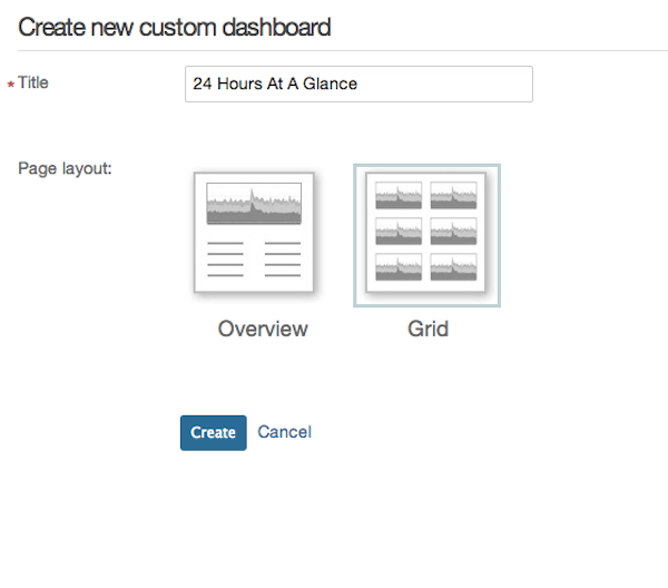
The one custom dashboard I always like to build is what I call '24 hours at a glance'. I take a bunch of existing charts that I consider important for a single application, lock the time period to the last 24 hours and put them all together on one dashboard. Whenever I am looking at a specific application in New Relic, this will be the first screen I look at to see if there is anything particularly bad that jumps out at me from the last 24 hours. Let's see how we can build this kind of dashboard.
Firstly, we need to create a new custom dashboard. In the New Relic UI click on Dashboards->Create custom dashboard. On the next screen, we give our dashboard a name (you could use "24 hours at a glance", or your own name) and pick the grid layout. Essentially, grid layout is a collection of charts all the same size and overview layout is one big chart surrounded by a bunch of smaller charts (we will use overview layout in the next section).
Now we need to select the app for which we want to create our dashboard and then find some relevant charts to add. I like to add the following:
- server average response time
- historical server average response time
- browser average response time
- error rate
- throughput
- historical throughput
- application CPU usage by host
- application memory usage by host
- top five web transactions by wall clock time
- downtime
- top countries by throughput
- top five database operations by wall clock time
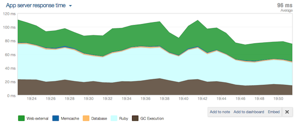
Depending on your application you may want to add some others, but I find this gives me a fairly good snapshot of what's happening with the application and what to investigate if anything is wrong. Let's find one of these charts and add them to our new dashboard. The server average response time is an easy one, as it's the big chart in the Overview section of the Monitoring tab for an application. Each chart in the New Relic UI has a little New Relic logo in the bottom right corner, when you hover your mouse over this logo it turns into a plus sign, clicking on the plus will allow you to add this chart to a dashboard:
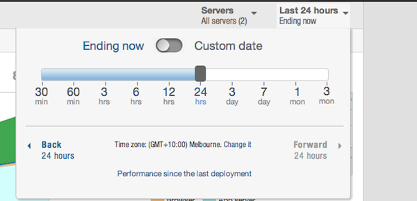
But before we add our chart, we need to change the time window for the New Relic UI to be 24 hours. We need to do this in order to give ourselves the ability to 'lock' the chart to the last 24 hours when we actually add it to the dashboard (this is awkward UX in my opinion, but at least we have a way to do what we need):
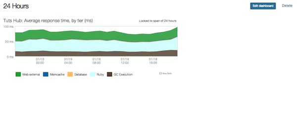
We can now go ahead and add the chart:
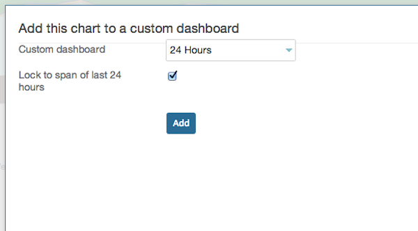
Don't forget to tick the Lock to span checkbox. When we now visit our new dashboard, the chart we've just added should be there:
We can rinse and repeat the above process until we've added all the charts that we want. In the end, it should look something like this:
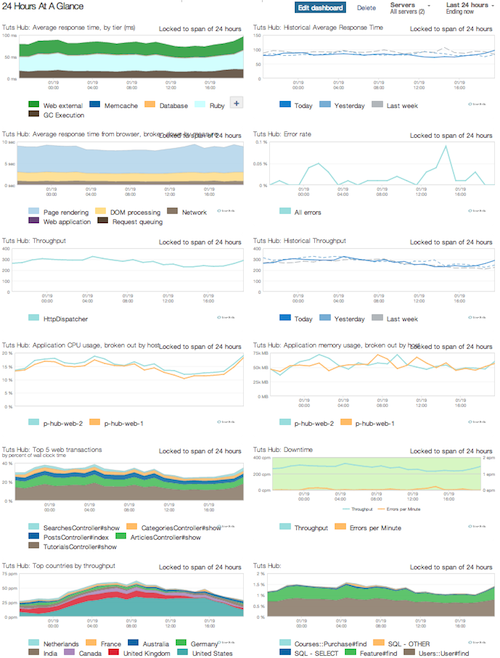
You can click the Edit dashboard button in the top right corner which will let you drag the charts around and arrange them in the order you want. The only thing to note is that you can't modify the individual charts in any way (for example, you may have wanted to have a more descriptive chart title, but you can't change it) since they are standard New Relic charts.
The other custom dashboard I always like to build from existing charts is the 'All applications at a glance'. This is only applicable if you have multiple applications you're looking after. Here we pick one or two of the most important charts for every relevant application and put them together. It's usually a safe bet to use the 'Response Time' chart from each application. The actual process of putting the dashboards together is the same as described above, you'll just need to switch applications to get the relevant charts from each. In the end, you should end up with something like this:
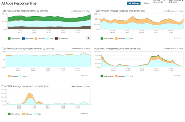
This is the screen I'll tend to look at first, when I log in to New Relic. It may be useful to lock the time of each chart to 24 hours just like we did for our '24 hours at a glance' dashboard, but that's up to you. Of course, this is only relevant if you're supporting multiple applications. Having said that, if you have multiple pre-production environments for your application (for staging or load test), you may want to put them all together into a dashboard similar to this one, it may help you catch changes that degrade performance before the code ends up in production.
Creating Your Own Charts from Existing Data
The New Relic UI suffers from some necessary limitations. It needs to be all things to all people, so they can only group together charts and tables that would make sense for all web applications. Most of the time the UI screens will limit you to looking at one transaction at a time and one or two sets of metrics at a time, if you need to access others you have to click around. The good news is, with custom dashboards, this limitation no longer applies. We know which transactions are related within our domain, we also know which metrics are important to us on a per transaction basis. We can build a dashboard that groups together several related transactions with all the important metrics for each and look at it on the one screen.
Let's say we have a particularly important transaction in our application, it might make sense to have a dashboard where we can see most of the important information about this transaction at a glance. Here on Tuts+ we have a concept of articles (obviously) and articles are pretty important to us, let's build a dashboard to keep an eye on them.
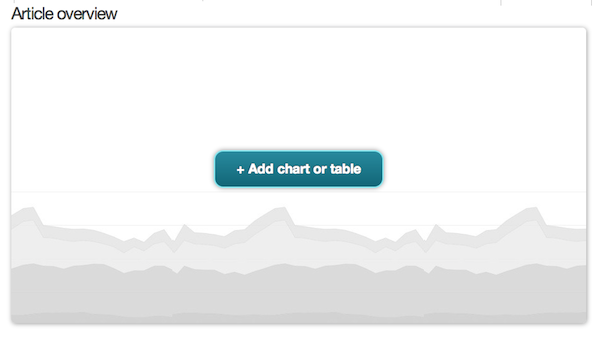
Once again we need to create a new dashboard just like before, we'll call it 'Article overview', but this time we'll use an overview layout. We don't have to go hunting for charts as we'll be creating our own custom charts, so click the big button to create the main chart for our dashboard:
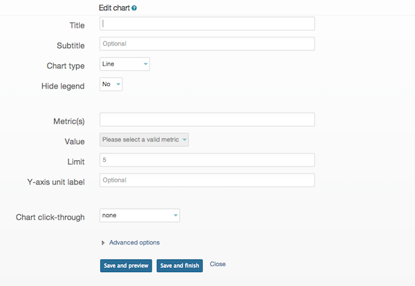
It will ask you if you want to add a chart or a table, we will add a table later, for now choose chart. You will see a screen that looks like this:
The main thing to look at here is the metric that you want to display. When you click inside the metrics text-box it will drop down a list of top level metrics that you can select. The metrics in New Relic are named as prefix/category/label. In the case of a Rails app, the prefix might be Controller or ActiveRecord (if you're not using Rails, the prefix for transactions will be WebTransactions). For Controller, the category would be the name of the controller and the label will be the action name. If you explore some of the metrics while you're playing around with your first chart, you will start to have a feel for the kind of metrics you have access to and where to find them. If you don't see the metrics you expect, make sure that you have the right application selected within New Relic, this always trips me up.
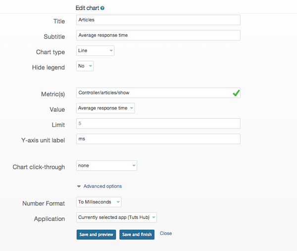
Back to our main chart. The metric we're after will be tied to our ArticlesController, so its name is Controller/articles/show. Once we've picked the metric, the contents of the Value drop-down will change to contain all the values that make sense for this metric. It's worth once again exploring all the various values and seeing what the resulting chart actually contains. In our case, "Average response time" seems like a good thing to have as our main chart.
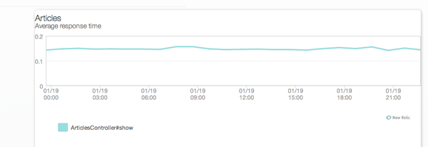
At this point, if we give our chart a title and click the preview button we can see what it looks like:
This looks OK, but I want the Y axis to be in milliseconds and I want the units on the axis as well. So, let's drop down the advanced options for the chart and change the number format to be 'To Milliseconds', we will also set the Y-axis unit label as 'ms':
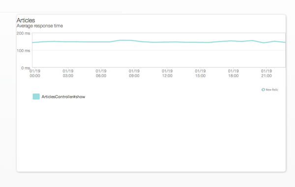
Our chart now looks good on the preview. The only thing of note that we haven't talked about is the Chart click-through drop-down. This essentially allows your chart to be a link to another custom dashboard, when you click on the chart, that dashboard will be displayed. We don't need this functionality, so we leave the drop-down alone. We'll now go ahead and save our chart.
We can now add the various sub-charts. In our case, I happen to know that Tuts+ has a concept of tutorials (also, obviously) which is closely related to articles, so if I am going to keep an eye on article average response time, it's probably a good idea to have a tutorial average response time close by as a comparison, so I will create a chart for that. We'll follow the same steps as above, in the end our dashboard will look like this:
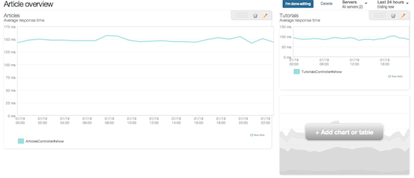
Hmm, it looks like the average response time for articles is much higher than tutorials, but I happen to know that both of them share a significant amount of code, strange. But it's also an indication that our custom dashboard is already paying dividends and we haven't even finished constructing it yet. I could have found this information by looking it up in the regular New Relic UI, but having the charts side by side like this helps to really bring home the fact that there might be an issue.
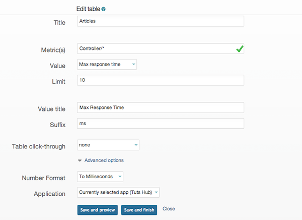
It might also be good to see where our ArticlesController sits compared to other controllers, as far as their maximum response time goes, this is a job for a table. We add another chart just like before, but this time pick table instead of chart. To create tables with multiple rows, we need to use wildcards in our metric name. In our case, I will set the metric to be Controller/, this will select all the metrics under the *Controller prefix, I will now set the limit text-box to be 10 which will do exactly as you expect and set the number of rows in our table to ten. In the end, we should have something that looks like this, right before we save:
Our custom dashboard will now be:
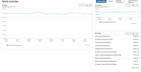
It seems that ArticlesController#show has the longest maximum response time out of all the controller actions, including TutorialsController#show, this is very curious and I should probably make a note to look into this.
We can continue adding a bunch of other charts such as end user average response time or calls per minute. However, some things you just can't construct using a custom chart, such as historical throughput or response time. Luckily we can always fall back on finding the charts that we want somewhere else in New Relic and simply adding those ones to our custom dashboard.
The only limitation with using a dashboard which has custom charts is that you have to have the correct app selected within New Relic, otherwise all the custom charts on your dashboard will be blank.
Creating Dashboards for Your Custom Metrics
If you read my last article on custom metrics, you might remember me mentioning that the only way for you to view the custom metric data that you've collected is to create a custom dashboard in New Relic, this is the third reason to use custom dashboards. If you collect a lot of custom metrics, this might be the best reason of all.
On Tuts+ we have a concept of categories (yet again, obviously), I just happen to know that we have a few custom metrics floating around for categories. Let's see if we can put these on a dashboard and actually get an idea of what's happening. We'll create another dashboard and call it 'Categories Custom Metrics'. All custom metrics in New Relic should live under the Custom prefix and this is where we find the metrics we're looking for:
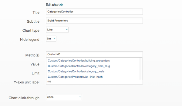
We'll create a couple of charts, one to see how long building presenters in CategoriesController takes and the other to see how long it takes to get a link hash from the presenters. The key thing to know with custom metrics, is what kind of data you're actually sending to New Relic. In this case I happen to know that we're measuring time, so I can pick 'Average value' as my metric value and set the Number format to milliseconds to get a reasonable looking chart. After creating both charts, our custom dashboard looks like this:
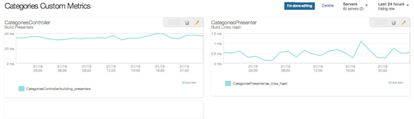
It looks like getting the link hash from the presenters is very quick and doesn't fluctuate too much, there is no need to optimize anything here and I can probably stop collecting this metric completely (no need to capture unnecessary data). However, building the presenters takes significantly more time, we can look into this further to see if it can be optimized. We can also keep an eye on the chart (by looking at the custom dashboard occasionally) to make sure the performance doesn't degrade as we continue to work on the application.
Conclusion
Custom dashboards are not a panacea. Aside from creating charts for custom metrics, you can do everything that custom dashboards can do with the regular New Relic UI. However playing with custom dashboards will definitely help you become more of a power user of New Relic, with a deeper understanding of how it works under the hood. In addition, the ability to look at your performance metrics in different ways can be an invaluable tool to help you surface potential performance problems before they have a significant impact on your application.
If you have any questions about New Relic custom dashboards, don't be afraid to leave a comment and I'll do my best to answer. Also, if you've used custom dashboards to good effect in the past, please share any tips you might have, it's always interesting to see how other people use their tools.

Comments