HTML emails are a great way to keep clients posted on the latest updates related to your business or product, but they're a bit tricky. CSS support in email clients is inconsistent. As a result, we must resort to ancient techniques, such as using tables, and inline CSS. Today, I'm going to walk you through the process of creating simple HTML emails.
Intro: HTML Email
As a freelance web developer, coding HTML emails are one of the more challenging tasks that I have to deal with. Fortunately, when one of my first clients asked me to design and code his email newsletter, he was patient enough to let me go through the long and frustrating process of figuring it all out. You might not be so lucky, so prepare yourself with this tutorial.
The Problem: Email Clients
You think IE is a pain in the butt? Wait until you meet Outlook 2007. Because of the vast differences in HTML/CSS rendering between email clients, using modern coding techniques will result in a rather catastrophic mess in many popular email clients. Email clients simply don't render HTML in the same way as browsers do -- not even close in many cases. Things like floats, background images, and even margins are no longer part of your vocabulary. So what's a standard-loving coder to do?
The Solution: Code like it's 1997
That's right. Tables. Cellpadding, cellspacing, colspan, all those gross things you thought you'd left behind. Tables are the only way to get consistent email layouts, so it's time to (temporarily) forget your CSS-loving ways and embrace un-semantic, messy tables.
Step 1: The Design
Keep it Simple
When designing an HTML email, keep simplicity in mind. The design we're using today has multiple column layouts, mostly for demonstration purposes, but consider sticking to two columns throughout when coding your own newsletter to save yourselves a lot of headaches.
Minimize Image Use
Remember to not get too fancy with your designs since Outlook doesn't support background images. In fact, depending on your client's needs, you may want to skip the Photoshop process entirely to force yourself to keep the design practical. That said, we'll be using Photoshop here so you can get a better idea of our plan.
You can use background images for decorative reasons, as long as the email is legible and makes sense without them. For example, we're going to add a little gradient to our header, but it's no big deal if it doesn't show up.
Thinner is Better
Because email client preview windows are often just a small fraction of screen width, you generally want to keep your design under about 600px. Nobody likes horizontal scroll bars.
Be Consistent
Remember that we're going to be using inflexible properties like cellpadding and cellspacing for spacing out our elements. It's prudent to try and keep the spacing between elements consistent.
Our Design
This design is similar to one I used for a client newsletter last summer, but simplified. It's not beautiful, but that's not the point here. It's simple and consistent, and has a number of layout options so you can see how they differ.
Step 2: Planning Our Code
In my experiences, HTML email code gets very complicated, very quickly. It's important to have a plan of attack. So here's the plan (we'll come back to this, don't worry if you don't follow).
First, we start off with one big 100% width table with a grey background, this is our "wrapper" table.
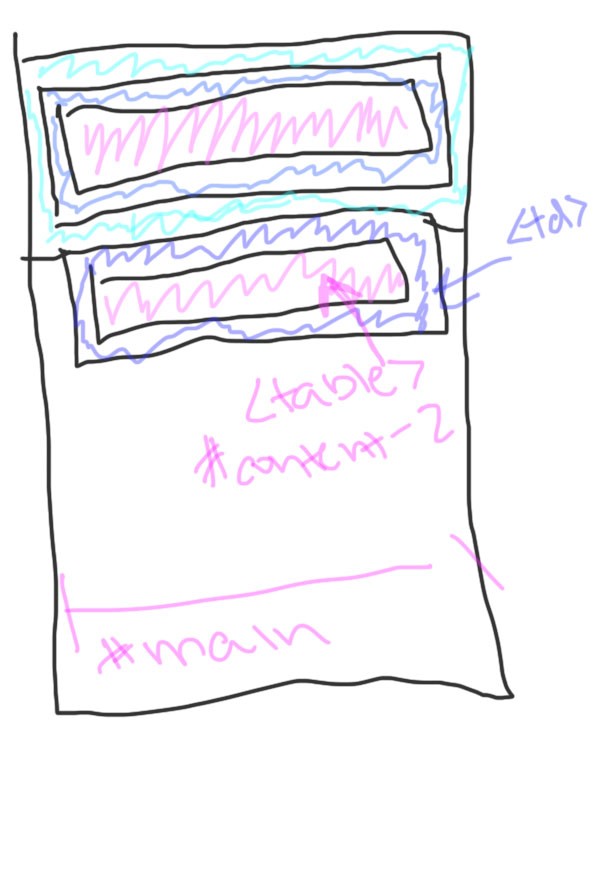
Next up, note that there are three more tables inside the wrapper table: one at the top for the "view in browser" link, one in the middle for the main content, and one at the bottom for the "unsubscribe" link.
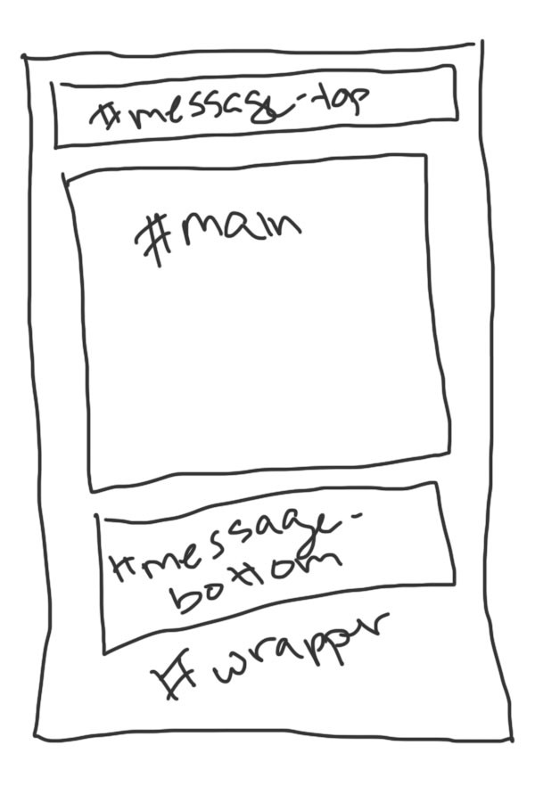
Finally, within the main table, each horizontal section of content will be within a table row and a table cell. These table cells, in turn, will contain another table to host each content section:
Cellpadding and Cellspacing
Instead of using the margin and padding CSS properties, we're going to be using the cellpadding and cellspacing HTML attributes. Think of cellpadding as being pretty much the same as CSS padding - space inside an element, around the content. Cellspacing is the space between data cells on a table.
Our #main table is going to have 15px of cellspacing, so that we'll have 15px of whitespace around the whole main content section, and 15px between each horizontal group. Cellpadding and cellspacing only apply to the parent table, not the children. If we don't want any cellpadding or cellspacing, we need to specify that for every table.
Step 3: Coding it Up
Now we can start the process of coding our newsletter, section by section. In opposition to best practices, we're going to be doing some styling along with structure. We're going to start with the layout, including all the spacing and padding, and background colours, after that, we'll do typography and other CSS stuff.
Setup
Setup for an email is really simple: only the html, head and body tags are involved. Let's add in the wrapper table and the three main tables we discussed previously.
As far as doctypes are concerned, there are a few different approaches, as detailed in this article. In our case, I've decided against using one, because we don't need any of the stuff we would get by declaring a doctype. It will get stripped out in most cases anyways.
<html>

<p><head>
	<meta http-equiv="Content-Type" content="text/html; charset=utf-8">
	<title>Nettuts Email Newsletter</title>
</head></p>

<p><body></p>

<p><table width="100%" cellpadding="0" cellspacing="0" bgcolor="e4e4e4"><tr><td></p>

<p><table id="top-message" cellpadding="20" cellspacing="0" width="600" align="center">
	</table><!-- top message -->

	<table id="main" cellpadding="0" cellspacing="15" bgcolor="ffffff" width="600" align="center">
	</table><!-- main -->

	<table id="bottom-message" cellpadding="20" cellspacing="0" width="600" align="center">
	</table><!-- bottom message --></p>

<p></tr></td></table><!-- wrapper --></p>

<p></body></p>

<p></html>
</p>
Generally speaking, it's better to assign widths to individual table cells than to the table itself.
Notice that the two message tables have cellpadding values of 20px. This will space out those paragraphs from the main content. The main table has 15px of cellspacing. This is to establish a consistent vertical rhythm. Since each section is within its own table cell, there will be 15px between them all.
Also notice that the tables are all set to align="center", and we have explicitly defined their widths. In HTML emails, it is generally best not to define widths for wrapping tables. You're better off defining widths for each cell, but in this case we'll break this rule because we have cellspacing/cellpadding to worry about.
Message Tables
These are super simple: just paragraphs within center-aligned cells.
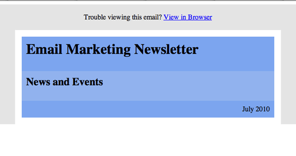
<table id="top-message" cellpadding="20" cellspacing="0" width="600" align="center">
	<tr>
		<td align="center">
			<p>Trouble viewing this email? <a href="#">View in Browser</a></p>
		</td>
	</tr>
</table><!-- top message --><p>Ê</p>
The bottom message is exactly the same.
Header
The header is pretty simple, it's only one column, with three rows. Since we have that nice blue background, we're going to need some padding around each cell to get the text away from the edges.
<tr>
	<td>
		<table id="header" cellpadding="10" cellspacing="0" align="center">
			<tr>
				<td width="570" bgcolor="7aa7e9"><h1>Communitech Venture Services</h1></td>
			</tr>
			<tr>
				<td width="570" bgcolor="8fb3e9"><h2>News and Events</h2></td>
			</tr>
			<tr>
				<td width="570" align="right" bgcolor="7aa7e9"><p>July 2010</p></td>
			</tr>
		</table><!-- header -->
	</td>
</tr><!-- header -->
Remember to set the width of each cell, which in this case is 570px (600px-15px of cellspacing on each side). We've also set the align property for the date to right. Right now, we're not adding in the background image, we'll do that later. In the mean time, just use a lighter blue.
Notice that we're using bgcolor instead of style="background:". This is because html values are better supported in email clients than CSS properties.
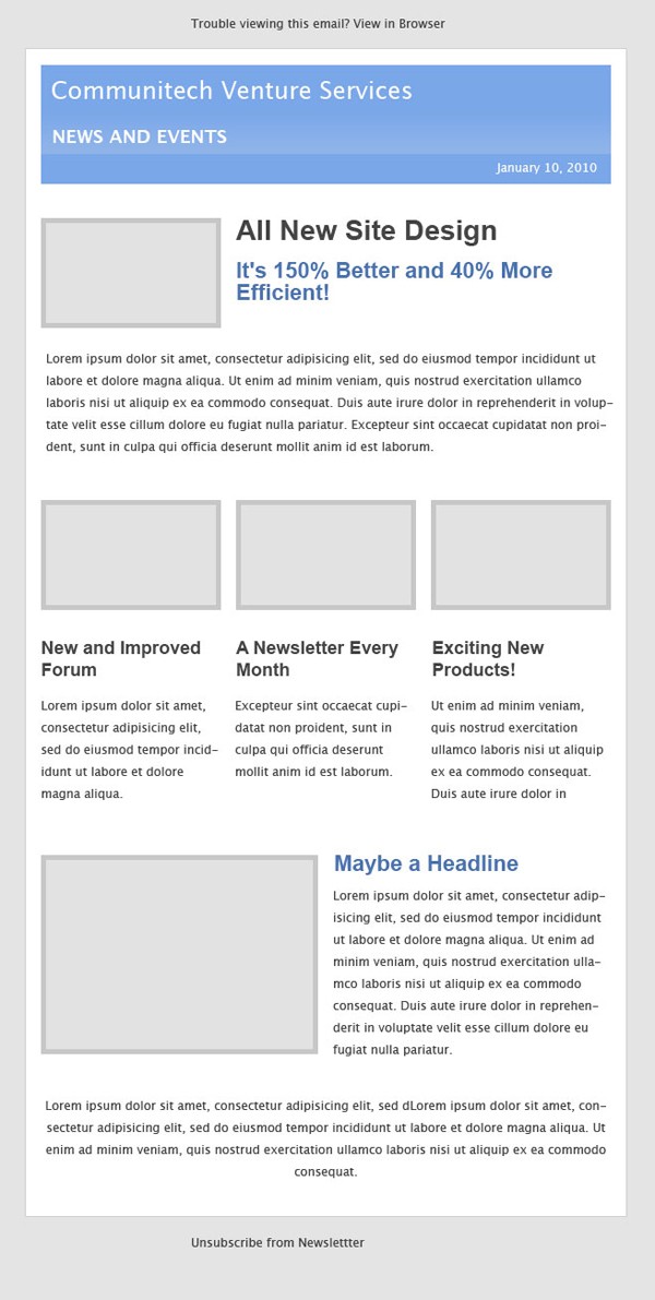
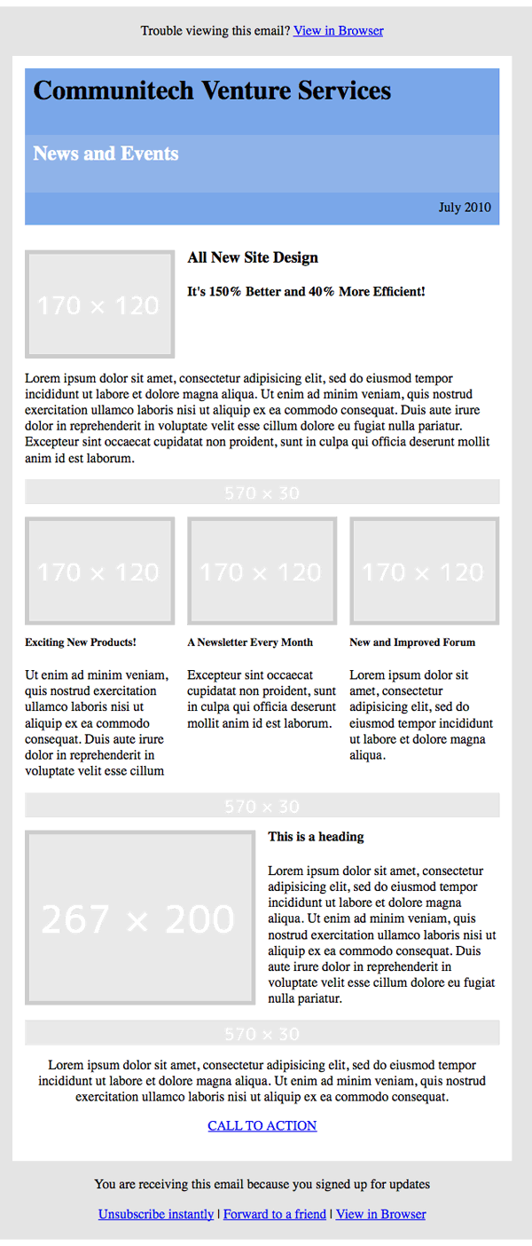
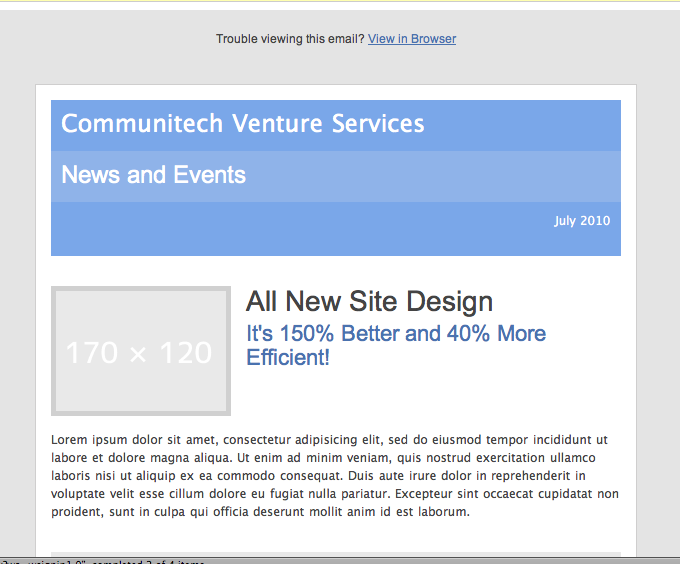
That's what we've got so far, it looks pretty bad, but the layout is just what we wanted.
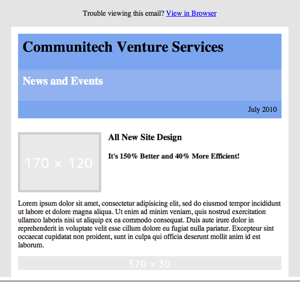
Content Section - 2-Column
Our first content section is a left-aligned image with two headlines beside it. Instead of using CSS floats like we normally would, we're going to make a table with three cells:
- one for the image,
- one for the space between the image and the headlines,
- and finally one for the headlines.
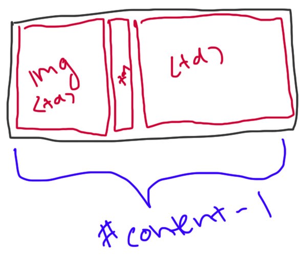
For the image with the border, we're going to nest another table within the cell and set the cellpadding to 5px and give it a grey background colour. Cellpadding adds to the width of the element, so we need to reduce the defined width of the cell by 10px.
<tr>
	<td></td>
</tr>
<tr>
	<td>
		<table id="content-1" cellpadding="0" cellspacing="0" align="center">
			<tr>
				<td width="170" valign="top">
					<table cellpadding="5" cellspacing="0">
						<tr>
							<td bgcolor="d0d0d0"><img src="http://dummyimage.com/170x120/e9e9e9/fff" /></td>
						</tr>
					</table>
				</td>
				<td width="15"></td>
				<td width="375" valign="top" colspan="3">
					<h3>All New Site Design</h3>
					<h4>It's 150% Better and 40% More Efficient!</h4>
				</td>
			</tr>
		</table><!-- content 1 -->
	</td>
</tr><!-- content 1 -->
Notice:
- We've added an empty table row and cell above the content. Because we have
15pxof cellspacing, we can use an empty cell to add15pxof spacing between elements. In my testing, this works fine empty, but you could always add a non-breaking space to be sure. - We're setting the
v-alignproperty totop. This is important, because it aligns each cell with the top of the row. The default is middle, which leads to some weird results. - We're using dummy images from dummyimage.com because all images in HTML emails must be hosted (more on that later) and it's much easier to use generated images. Check out the site, it explains how to specify the image you want with the URL.
Content Section - 1-Column
This is a really simple section: just a one-column table with a paragraph inside. Don't forget to set the width of the cell and to set the table to centre align.
<p><tr>
	<td>
		<table id="content-2" cellpadding="0" cellspacing="0" align="center">
			<tr>
				<td width="570"><p>Lorem ipsum dolor sit amet, consectetur adipisicing elit, sed do eiusmod tempor incididunt ut labore et dolore magna aliqua. Ut enim ad minim veniam, quis nostrud exercitation ullamco laboris nisi ut aliquip ex ea commodo consequat. Duis aute irure dolor in reprehenderit in voluptate velit esse cillum dolore eu fugiat nulla pariatur. Excepteur sint occaecat cupidatat non proident, sunt in culpa qui officia deserunt mollit anim id est laborum.</p></td>
			</tr>
		</table><!-- content-2 -->
	</td>
</tr><!-- content-2 -->
</p>
Dividers
To add vertical space (more than the 15px of cellspacing we have) we have to use a spacer image. Just like the 90's! We could use a spacer gif and upload it, but at the moment it's faster to just use another dummy image. I'll leave it grey so you can see it, but later we can set it to white on white.
<tr>
	<td height="30"><img src="http://dummyimage.com/570x30/e9e9e9/fff" /></td>
</tr>
Which gives us something like this:
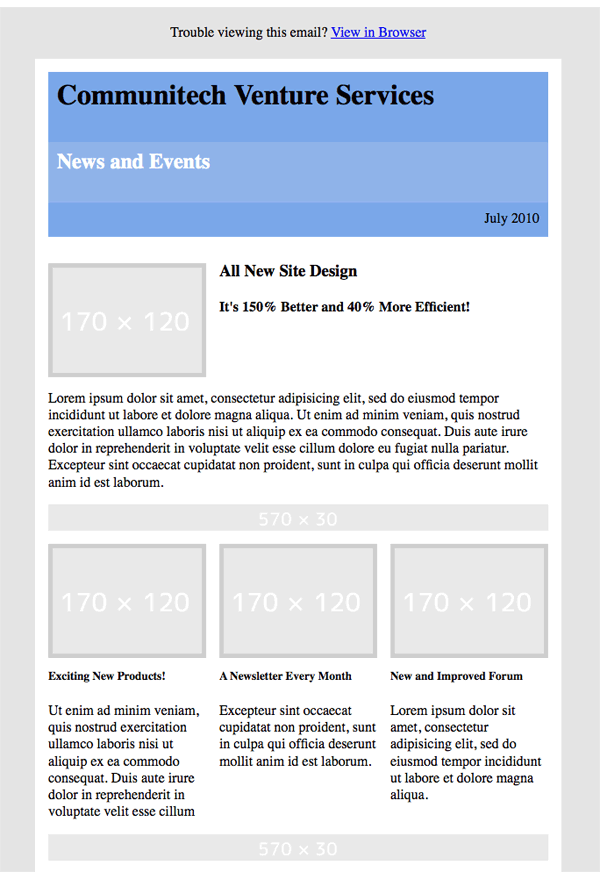
Content Section - 3-Column
For a 3-column section, we use five table cells, one for each column, and one between the columns to separate them.
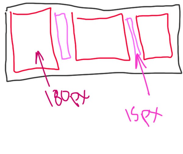
<tr>
	<td>
		<table id="content-3" cellpadding="0" cellspacing="0" align="center">
			<tr>
				<td width="180" valign="top">
					<table cellpadding="5" cellspacing="0">
						<tr>
							<td bgcolor="d0d0d0"><img src="http://dummyimage.com/170x120/e9e9e9/fff" /></td>
						</tr>
					</table>
				</td>
				<td width="15"></td>
				<td width="180" valign="top">
					<table cellpadding="5" cellspacing="0">
						<tr>
							<td bgcolor="d0d0d0"><img src="http://dummyimage.com/170x120/e9e9e9/fff" /></td>
						</tr>
					</table>
				</td>
				<td width="15"></td>
				<td width="180" valign="top">
					<table cellpadding="5" cellspacing="0">
						<tr>
							<td bgcolor="d0d0d0"><img src="http://dummyimage.com/170x120/e9e9e9/fff" /></td>
						</tr>
					</table>
				</td>
			</tr>
		</table><!-- content-3 -->
	</td>
</tr><!-- content-3 -->
Pretty straightforward, use the same method for the border as we did in the 2-column section. Don't forget the v-align!
The three text columns are exactly the same process.
<tr>
	<td>
		<table id="content-4" cellpadding="0" cellspacing="0" align="center">
			<tr>
				<td width="180" valign="top">
					<h5>Exciting New Products!</h5>
					<p> Ut enim ad minim veniam, quis nostrud exercitation ullamco laboris nisi ut aliquip ex ea commodo consequat.									Duis aute irure dolor in reprehenderit in voluptate velit esse cillum</p>
				</td>
				<td width="15"></td>
				<td width="180" valign="top">
					<h5>A Newsletter Every Month</h5>
					<p>Excepteur sint occaecat cupidatat non proident, sunt in culpa qui officia
						deserunt mollit anim id est laborum.</p>
				</td>
				<td width="15"></td>
				<td width="180" valign="top">
					<h5>New and Improved Forum</h5>
					<p>Lorem ipsum dolor sit amet, consectetur adipisicing elit,
						sed do eiusmod tempor incididunt ut labore et dolore magna aliqua.</p>
				</td>
			</tr>
		</table><!-- content-4 -->
	</td>
</tr><!-- content-4 -->
Add in another divider at the bottom, and we're almost there:
The Rest...
Everything else is just repeating what we've already done: a 2-column section and a 1-column section with dividers between them.
<tr>
	<td>
		<table id="content-5" cellpadding="0" cellspacing="0" align="center">
			<tr>
				<td width="267" valign="top">
					<table cellpadding="5" cellspacing="0" bgcolor="d0d0d0"><tr><td>
						<img src="http://dummyimage.com/267x200/e9e9e9/fff" />
					</td></tr></table>
				</td>
				<td width="15"></td>
				<td width="278" valign="top">
					<h4>This is a heading</h4>
					<p>Lorem ipsum dolor sit amet, consectetur adipisicing elit, sed do eiusmod tempor incididunt ut labore et dolore magna aliqua. Ut enim ad minim veniam, quis nostrud exercitation ullamco laboris nisi ut aliquip ex ea commodo consequat. Duis aute irure dolor in reprehenderit in voluptate velit esse cillum dolore eu fugiat nulla pariatur.</p>
				</td>
			</tr>
		</table><!-- content-5 -->
	</td>
</tr><!-- content-5 -->
<tr>
	<td height="30"><img src="http://dummyimage.com/570x30/e9e9e9/fff" /></td>
</tr>
<tr>
	<td>
		<table id="content-6" cellpadding="0" cellspacing="0" align="center">
			<p align="center">Lorem ipsum dolor sit amet, consectetur adipisicing elit, sed do eiusmod tempor incididunt ut labore et dolore magna aliqua. Ut enim ad minim veniam, quis nostrud exercitation ullamco laboris nisi ut aliquip ex ea commodo consequat. </p>
			<p align="center"><a href="#">CALL TO ACTION</a></p>
		</table>
	</td>
</tr>
And the main layout is now complete:
A Word on Images
Unlike regular web pages, you can't just put all your images in a folder and then use relative pathways to link to them. All links must be absolute! When I'm developing an email, I usually host images on a subdomain or on Amazon S3. When I'm ready to send out the email for a client, I move all the images to a subdomain of their website.
All image links must be absolute!
Step 4: Styling the Email
We can't use an external stylesheet, and we can't embed the CSS in the head of the email, because some clients will strip out the entire head tag, or ignore style tags. We're going to have to use inline styles, which is a huge pain. Fortunately, there are useful services available that will take embedded CSS and make it inline. I use a website called Premailer, where you can pasted in the code directly and it outputs the same thing with inline CSS.
We're going to do embedded CSS for this tutorial, then we're going to make it inline with premailer.
Premailer takes embedded CSS and makes it inline!
Basic Reset
We're not going to do a hard reset with the * selector like you might do for a web page. Using the defaults will actually yield more consistent results. The only elements whose padding/margins we'll need to reset are ones that will have space around them (from cellpadding/cellspacing) like our header headings, or our paragraphs.
You'll also notice a margin around the wrapper table, which is just default styling on the body element.
<style type="text/css">
	body, #header h1, #header h2, p {margin: 0; padding: 0;}
</style>
Typography
Nothing very special about the typography for an email since it's pretty much the same is it would be for a web page. Don't use shorthand declarations (like font: ) because you won't get consistent results.
#top-message p, #bottom-message p {color: #3f4042; font-size: 12px; font-family: Arial, Helvetica, sans-serif; }
#header h1 {color: #ffffff; font-family: "Lucida Grande", "Lucida Sans", "Lucida Sans Unicode", sans-serif; font-size: 24px; }
#header h2 {color: #ffffff; font-family: Arial, Helvetica, sans-serif; font-size: 24px; }
#header p {color: #ffffff; font-family: "Lucida Grande", "Lucida Sans", "Lucida Sans Unicode", sans-serif; font-size: 12px;  }
h3 {font-size: 28px; color: #444444; font-family: Arial, Helvetica, sans-serif; }
h4 {font-size: 22px; color: #4A72AF; font-family: Arial, Helvetica, sans-serif; }
h5 {font-size: 18px; color: #444444; font-family: Arial, Helvetica, sans-serif; }
p {font-size: 12px; color: #444444; font-family: "Lucida Grande", "Lucida Sans", "Lucida Sans Unicode", sans-serif; line-height: 1.5;}
h1, h2, h3, h4, h5, h6 {margin: 0 0 0.8em 0;}
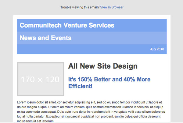
And look: it's significantly better now!
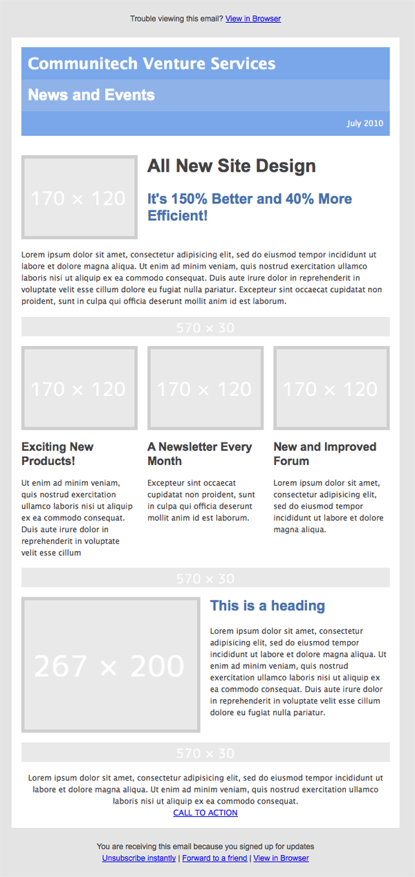
Background Images
Background images work pretty much the same as in a web page, except that sometimes they don't work! Make sure you have a fallback background colour, which is assigned to the cell as a bgcolor, for clients that don't support CSS backgrounds.
<td style="background: url(http://tessat.s3.amazonaws.com/email-bg.jpg); " width="570" bgcolor="8fb3e9:><h2>News and Events</h2></td>
Miscellaneous other styles
We need to style each link or they will inherit the default colour the email client has, and lets also add that border around the main table. We're also going to add display:block to all our images, this solves a bug in Outlook and Hotmail.
Make sure to add "display: block" to all images to prevent a weird margin bug in Hotmail.
#main {border: 1px solid #cfcece;}
img {display: block;}
a {color: #4A72AF;}
And we're done with the easy part. Now on to the testing!
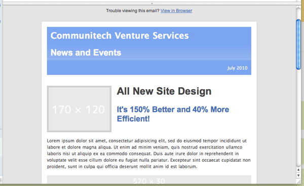
Step 5: Testing
The testing process is the most important and most obnoxious part of creating HTML emails. When I work on an email, I test frequently, at every stage, so I can pinpoint exactly what goes wrong. There are a lot of clients to test, and a lot of ways to test them, let's go over it all.
Email Clients
These are the clients you should be testing for, at the very least:
- Outlook 2003/2007
- Hotmail
- Yahoo! Mail
- Gmail
- Apple Mail
- Thunderbird
How to Test
We'll need to find a way to send HTML emails first. Your client will probably be set up with a service like Mailchimp or Campaign Monitor, which will allow you to test and send email campaigns.
You may think I'm complicating this unnecessarily, because some email clients let you paste in HTML code. However, this can lead to different results than when using an email campaign app. Test with an app to be on the safe side.
Testing with Mailchimp
My preferred method involves using Mailchimp for testing and sending test campaigns. Mailchimp is free for up to 500 recipients, so you don't have to pay for testing. It has a simple and easy to use interface. Here is a quick step-by-step walkthrough:
- Sign up for a free Mailchimp account, and add a recipient list of your test email accounts: Hotmail, Yahoo!, and Gmail, and sign into your new account.
- Choose create a campaign and select regular ol" campaign from the main account page. Fill out basic info about the campaign, you really just need a name for testing purposes.
- At the design page, select Import -> Paste in code and make sure you select Automatic CSS Inliner
- If you're not using Mailchimp, make sure you use Premailer to get your CSS inline
- Proceed till you get to the confirm page, and select send test. You can send a few tests from here but after that, you need to actually send out the emails to your list.
Testing with Litmus
Litmus is a web app that tests HTML emails in all sorts of versions of all sorts of clients. The full service costs money, but if you can't convince your client to pay, the free version still lets you test in old Gmail and Outlook 2003, which is still useful.
Results - The Good
Some of our tests turned out pretty well:
Apple Mail
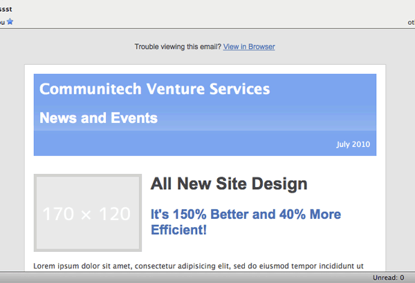
Thunderbird
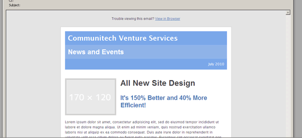
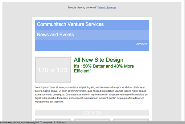
Results - The Bad-ish
Some were a little off, but more or less the same:
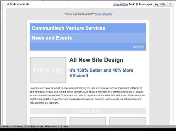
Gmail (safari)
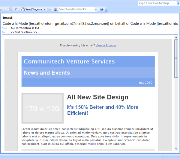
Outloook 2007
Outlook 2003
Yahoo! Mail
Results - The Ugly
We also had a couple failures.
Hotmail (GREEN???)
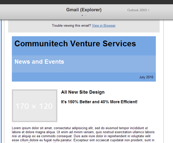
Old Gmail (explorer)
Cleaning up the Mess
All things considered, this is a pretty successful test, because I tested a lot of the elements in Outlook and Gmail as I was going. The problems we have with old Gmail and Hotmail are related to default style sheets that the clients use. Microsoft's special and unique brand of crazy has given us a default stylesheet that overrides all headings with a green text style with the !important designation. Sometimes I'm pretty sure they want to make me crazy.
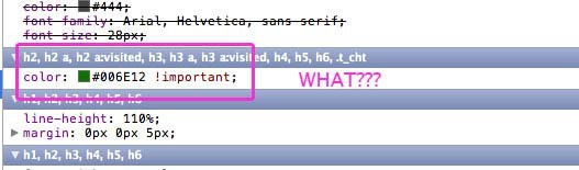
To solve this, we need to add the !important declaration to all our heading colour styles like this:
h3 {font-size: 28px; color: #444444 !important; font-family: Arial, Helvetica, sans-serif; }
	h4 {font-size: 22px; color: #4A72AF !important; font-family: Arial, Helvetica, sans-serif; }
	h5 {font-size: 18px; color: #444444 !important; font-family: Arial, Helvetica, sans-serif; }
For old Gmail, we have a similar problem in the header: Gmail is adding extra margin to the bottom of the heading tags. We just need to override margin-bottom specifically.
#header h1 {color: #ffffff !important; font-family: "Lucida Grande", "Lucida Sans", "Lucida Sans Unicode", sans-serif; font-size: 24px; margin-bottom: 0!important; }
	#header h2 {color: #ffffff !important; font-family: Arial, Helvetica, sans-serif; font-size: 24px; margin-bottom: 0 !important}
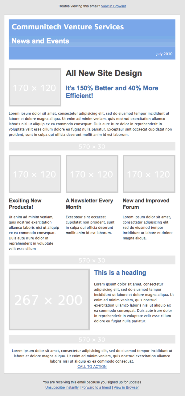
And we fixed Hotmail:
So there we have it, a functional, consistent (if a little plain) HTML email. It's a pain, yes, but once you get a system going it goes a lot faster. Try to keep your code well commented and organized so that you can re-use parts of it later.
If you can talk your client into signing up for something like Litmus, your life will be much easier. You can also test lots of clients through the paid versions of Mailchimp and Campaign monitor.
Troubleshooting
You will certainly come across problems I haven't covered here, but I have some general advice for cleaning up:
- Check your math: I can't remember how many times I've screwed up a layout by not adding up table cell widths accurately. Remember to account for cellpadding: it adds to the width of your cells.
-
Check for default stylesheets: use something like Firebug or Webkit Inspector to check if a browser client is overriding your styles. If this happens, adding an
!importantdeclaration should solve the problem. - Look it Up: there's always a very good chance someone has experienced your problem before. If Google doesn't help, try browsing tips and tricks on the blogs of popular email campaign services, some people do emails for a living, and they know their stuff!
- Break it Down: If you can't find where you went wrong, go back to the beginning and check your email bit by bit until you find what breaks it.
The Result
Here's the final code for your reference:
<html>
<head>
   <meta http-equiv="Content-Type" content="text/html; charset=utf-8">
   <title>Nettuts Email Newsletter</title>
   <style type="text/css">
   	a {color: #4A72AF;}
	body, #header h1, #header h2, p {margin: 0; padding: 0;}
	#main {border: 1px solid #cfcece;}
	img {display: block;}
	#top-message p, #bottom-message p {color: #3f4042; font-size: 12px; font-family: Arial, Helvetica, sans-serif; }
	#header h1 {color: #ffffff !important; font-family: "Lucida Grande", "Lucida Sans", "Lucida Sans Unicode", sans-serif; font-size: 24px; margin-bottom: 0!important; padding-bottom: 0; }
	#header h2 {color: #ffffff !important; font-family: Arial, Helvetica, sans-serif; font-size: 24px; margin-bottom: 0 !important; padding-bottom: 0; }
	#header p {color: #ffffff !important; font-family: "Lucida Grande", "Lucida Sans", "Lucida Sans Unicode", sans-serif; font-size: 12px;  }
	h1, h2, h3, h4, h5, h6 {margin: 0 0 0.8em 0;}
	h3 {font-size: 28px; color: #444444 !important; font-family: Arial, Helvetica, sans-serif; }
	h4 {font-size: 22px; color: #4A72AF !important; font-family: Arial, Helvetica, sans-serif; }
	h5 {font-size: 18px; color: #444444 !important; font-family: Arial, Helvetica, sans-serif; }
	p {font-size: 12px; color: #444444 !important; font-family: "Lucida Grande", "Lucida Sans", "Lucida Sans Unicode", sans-serif; line-height: 1.5;}
   </style>
</head>

<body>

<table width="100%" cellpadding="0" cellspacing="0" bgcolor="e4e4e4"><tr><td>

<table id="top-message" cellpadding="20" cellspacing="0" width="600" align="center">
		<tr>
			<td align="center">
				<p>Trouble viewing this email? <a href="#">View in Browser</a></p>
			</td>
		</tr>
	</table><!-- top message -->

<table id="main" width="600" align="center" cellpadding="0" cellspacing="15" bgcolor="ffffff">
		<tr>
			<td>
				<table id="header" cellpadding="10" cellspacing="0" align="center" bgcolor="8fb3e9">
					<tr>
						<td width="570" bgcolor="7aa7e9"><h1>Communitech Venture Services</h1></td>
					</tr>
					<tr>
						<td width="570" bgcolor="8fb3e9" style="background: url(http://tessat.s3.amazonaws.com/email-bg.jpg);"><h2 style="color:#ffffff!important">News and Events</h2></td>
					</tr>
					<tr>
						<td width="570" align="right" bgcolor="7aa7e9"><p>July 2010</p></td>
					</tr>
				</table><!-- header -->
			</td>
		</tr><!-- header -->

		<tr>
			<td></td>
		</tr>
		<tr>
			<td>
				<table id="content-1" cellpadding="0" cellspacing="0" align="center">
					<tr>
						<td width="170" valign="top">
							<table cellpadding="5" cellspacing="0">
								<tr><td bgcolor="d0d0d0"><img src="http://tessat.s3.amazonaws.com/coins_small.jpg" width="170" /></td></tr></table>
						</td>
						<td width="15"></td>
						<td width="375" valign="top" colspan="3">
							<h3>All New Site Design</h3>
							<h4>It's 150% Better and 40% More Efficient!</h4>
						</td>
					</tr>
				</table><!-- content 1 -->
			</td>
		</tr><!-- content 1 -->
		<tr>
			<td>
				<table id="content-2" cellpadding="0" cellspacing="0" align="center">
					<tr>
						<td width="570"><p>Lorem ipsum dolor sit amet, consectetur adipisicing elit, sed do eiusmod tempor incididunt ut labore et dolore magna aliqua. Ut enim ad minim veniam, quis nostrud exercitation ullamco laboris nisi ut aliquip ex ea commodo consequat. Duis aute irure dolor in reprehenderit in voluptate velit esse cillum dolore eu fugiat nulla pariatur. Excepteur sint occaecat cupidatat non proident, sunt in culpa qui officia deserunt mollit anim id est laborum.</p></td>
					</tr>
				</table><!-- content-2 -->
			</td>
		</tr><!-- content-2 -->
		<tr>
			<td height="30"><img src="http://dummyimage.com/570x30/fff/fff" /></td>
		</tr>
		<tr>
			<td>
				<table id="content-3" cellpadding="0" cellspacing="0" align="center">
					<tr>
						<td width="170" valign="top" bgcolor="d0d0d0" style="padding:5px;">
							<img src="http://tessat.s3.amazonaws.com/crayons.jpg" width="170" />
						</td>
						<td width="15"></td>
						<td width="170" valign="top" bgcolor="d0d0d0" style="padding:5px;">
							<img src="http://tessat.s3.amazonaws.com/handshake.jpg" />
						</td>
						<td width="15"></td>
						<td width="170" valign="top" bgcolor="d0d0d0" style="padding:5px;">
							<img src="http://tessat.s3.amazonaws.com/moo02.jpg" />
						</td>
					</tr>
				</table><!-- content-3 -->
			</td>
		</tr><!-- content-3 -->
		<tr>
			<td>
				<table id="content-4" cellpadding="0" cellspacing="0" align="center">
					<tr>
						<td width="180" valign="top">
							<h5>Exciting New Products!</h5>
							<p> Ut enim ad minim veniam, quis nostrud exercitation ullamco laboris nisi ut aliquip ex ea commodo consequat.									Duis aute irure dolor in reprehenderit in voluptate velit esse cillum</p>
						</td>
						<td width="15"></td>
						<td width="180" valign="top">
							<h5>A Newsletter Every Month</h5>
							<p>Excepteur sint occaecat cupidatat non proident, sunt in culpa qui officia
								deserunt mollit anim id est laborum.</p>
						</td>
						<td width="15"></td>
						<td width="180" valign="top">
							<h5>New and Improved Forum</h5>
							<p>Lorem ipsum dolor sit amet, consectetur adipisicing elit,
								sed do eiusmod tempor incididunt ut labore et dolore magna aliqua.</p>
						</td>
					</tr>
				</table><!-- content-4 -->
			</td>
		</tr><!-- content-4 -->
		<tr>
			<td height="30"><img src="http://dummyimage.com/570x30/fff/fff" /></td>
		</tr>
		<tr>
			<td>
				<table id="content-5" cellpadding="0" cellspacing="0" align="center">
					<tr>
						<td width="267" valign="top">
							<table cellpadding="5" cellspacing="0" bgcolor="d0d0d0"><tr><td>
								<img src="http://tessat.s3.amazonaws.com/card18.jpg" />
							</td></tr></table>
						</td>
						<td width="15"></td>
						<td width="278" valign="top">
							<h4>This is a heading</h4>
							<p>Lorem ipsum dolor sit amet, consectetur adipisicing elit, sed do eiusmod tempor incididunt ut labore et dolore magna aliqua. Ut enim ad minim veniam, quis nostrud exercitation ullamco laboris nisi ut aliquip ex ea commodo consequat. Duis aute irure dolor in reprehenderit in voluptate velit esse cillum dolore eu fugiat nulla pariatur.</p>
						</td>
					</tr>
				</table><!-- content-5 -->
			</td>
		</tr><!-- content-5 -->
		<tr>
			<td height="30"><img src="http://dummyimage.com/570x30/fff/fff" /></td>
		</tr>
		<tr>
			<td>
				<table id="content-6" cellpadding="0" cellspacing="0" align="center">
					<p align="center">Lorem ipsum dolor sit amet, consectetur adipisicing elit, sed do eiusmod tempor incididunt ut labore et dolore magna aliqua. Ut enim ad minim veniam, quis nostrud exercitation ullamco laboris nisi ut aliquip ex ea commodo consequat. </p>
					<p align="center"><a href="#">CALL TO ACTION</a></p>
				</table>
			</td>
		</tr>

	</table><!-- main -->
	<table id="bottom-message" cellpadding="20" cellspacing="0" width="600" align="center">
		<tr>
			<td align="center">
				<p>You are receiving this email because you signed up for updates</p>
				<p><a href="#">Unsubscribe instantly</a> | <a href="#">Forward to a friend</a> | <a href="#">View in Browser</a></p>
			</td>
		</tr>
	</table><!-- top message -->
</td></tr></table><!-- wrapper -->

</body>
</html>
Here's what our final result looks like if we use real pictures:
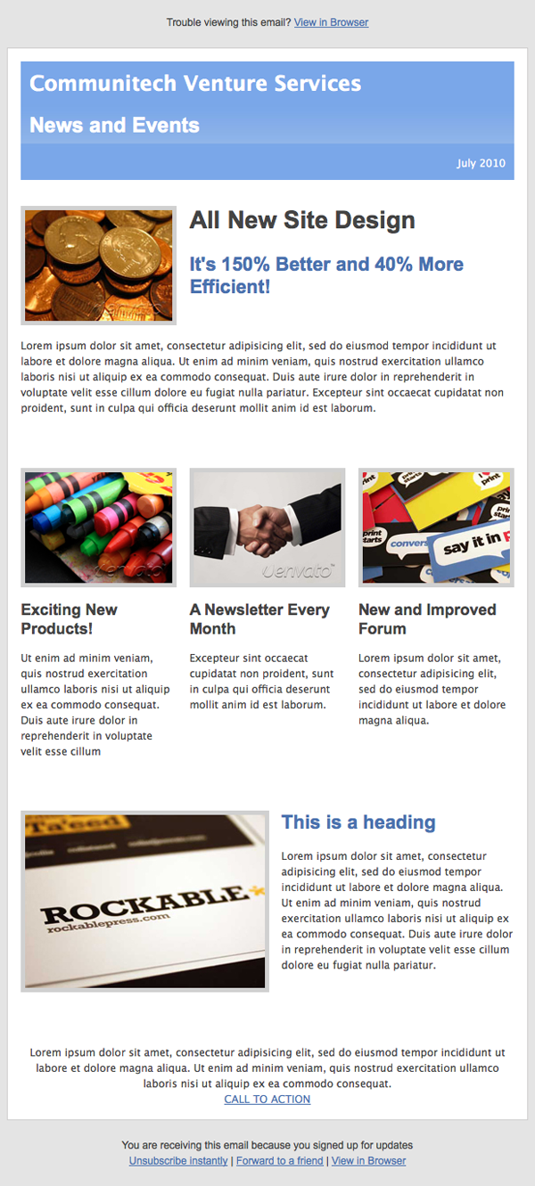
Nothing really special, but it should get you started on designing your own HTML emails. There are, of course, other ways to do everything I've done but with HTML email all that really matters is that it works. There isn't much of a concept of web standards or best practices here.
Resources
- Purchase Email Templates on ThemeForest
- Campaign Monitor Resources (Their Blog also has some really useful tips)
- Mailchimp Resources
- 6 Easy Ways to Improve Your HTML Emails
- 20 Email Design Best Practices and Resources for Beginners
- 30 HTML Best Practices for Beginners
I hope you've learned a bit today! I know I found my first HTML email project to be one of the most educational I've ever worked on. It only seems fair to share what I learned!

Comments