In this tutorial we will use the jQuery Charts Plotting plugin, JQplot, to create a new WordPress plugin which can display some of your blog's traffic, popular categories, and more with some beautiful visual charts. Looking for a way to pimp out a client's dashboard (or your own!) with some useful infographics? Look no further... we'll show you how it's done right here.
Step 1 Creating Theme:
As a jQuery chart library we choose JQplot which is easy to use and open-source under GPL, MIT licenses. We will give 4 different charts in this post, but then by using our fantasy you can make more charts related to your WordPress site data. We will call our plugin Infograph. You can download and install ready plugin from download link given in this post. Now let's look structure of plugin step by step: The plugin contains 6 functions (1 for JS script enque, one for CSS, and 4 ones for charts), 4 shortcodes for charts and 2 action hooks. I hope you all know what is shortcode and action, so let's go on.
First we add 2 functions for adding JS and CSS support:
function myscripts ()
{
wp_deregister_script('jquery');
wp_register_script( 'jquery',get_bloginfo('wpurl') . "/wp-content/plugins/infograph/jquery-1.3.2.min.js");
wp_enqueue_script('jquery');

wp_register_script( 'jqplot',get_bloginfo('wpurl') . "/wp-content/plugins/infograph/src/jquery.jqplot.js");
wp_enqueue_script( 'jqplot' );

wp_register_script( 'bar', get_bloginfo('wpurl') . "/wp-content/plugins/infograph/src/plugins/jqplot.barRenderer.js");
wp_enqueue_script( 'bar' );

wp_register_script( 'cax', get_bloginfo('wpurl') . "/wp-content/plugins/infograph/src/plugins/jqplot.categoryAxisRenderer.js");
wp_enqueue_script( 'cax' );

wp_register_script( 'pol', get_bloginfo('wpurl') . "/wp-content/plugins/infograph/src/plugins/jqplot.pointLabels.js");
wp_enqueue_script( 'pol' );

wp_register_script( 'fun', get_bloginfo('wpurl') . "/wp-content/plugins/infograph/src/plugins/jqplot.funnelRenderer.js");
wp_enqueue_script( 'fun' );

wp_register_script( 'pie', get_bloginfo('wpurl') . "/wp-content/plugins/infograph/src/plugins/jqplot.pieRenderer.js");
wp_enqueue_script( 'pie' );

wp_register_script( 'meg', get_bloginfo('wpurl') . "/wp-content/plugins/infograph/src/plugins/jqplot.meterGaugeRenderer.js");
wp_enqueue_script( 'meg' );

}

function add_css () {
	 echo '
	 <link type="text/css" rel="stylesheet" href="' . get_bloginfo('wpurl') . '/wp-content/plugins/infograph/src/jquery.jqplot.css" />' ;
	 echo '<link type="text/css" rel="stylesheet" href="' . get_bloginfo('wpurl') . '/wp-content/plugins/infograph/examples.css" />' ;
}

add_action('wp_enqueue_scripts', 'myscripts');
add_action('wp_head', 'add_css');
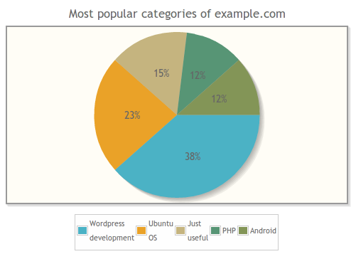
Step 2 "Popular Categories" Chart:
This chart is a pie which shows the most popular categories of your blog. You can place it to any page or post. Just put [ mycategories ] shortcode to any post:
function categories($atts,$content = '') {
$ch_cats = get_categories(array('orderby'=>'count','order'=>'desc') );
$sayy= count($ch_cats);
$chl='';
for ($i=1;$i<=5;$i++)
  {
    $chl=$chl.'[\''.$ch_cats[$i-1]->name.'\','.$ch_cats[$i-1]->count.'],';  //[[[\'a\',25],[\'b\',14],[\'c\',7]]]
     }

$chl='[['.substr($chl,0,-1).']]';

return '<script>
$(document).ready(function(){
plot1 = $.jqplot(\'chart1\', '.$chl.', {
title: \'Most popular categories of example.com\',
seriesDefaults:{renderer:$.jqplot.PieRenderer,rendererOptions: { padding: 8, showDataLabels: true}},legend:{show:true,placement: \'outside\',rendererOptions: {numberRows: 1}},
legend:{show:true,
        placement: \'outside\',
        rendererOptions: {
        numberRows: 1
                     },
        location:\'s\',
        marginTop: \'15px\'
                  }
  });
});
  </script>
  <div id="chart1" style="margin-top:30px;margin-bottom:30px; margin-left:20px; width:500px; height:300px;"></div>  ';
 }
add_shortcode('mycategories', 'categories');
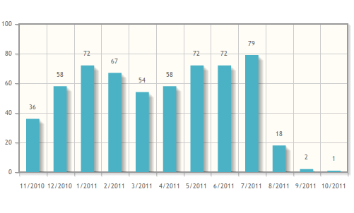
Step 3 "Activity By Month" Chart:
This chart can display last 12 months activity in your blog. It shows how many posts you have posted last 12 monthes by month.
function postsbymonth($atts,$content = '') {
	// Post count by month
global $wpdb,$wp_query;
$postcountbymonth=$wpdb->get_results("select * from (select  MONTH(post_date) as mo,YEAR(post_date) as ye,count(ID) as co from $wpdb->posts
where post_status='publish'
group by MONTH(post_date),YEAR(post_date) order by post_date desc limit 12) a order by ye asc,mo asc");
$labels='';$postcounts='';
foreach ($postcountbymonth as $pc)
 {
	 $labels=$labels.'\' '.$pc->mo.'/'.$pc->ye.' \',';
	 $postcounts=$postcounts.$pc->co.',';
 }
$postcounts='['.substr($postcounts,0,-1).']';
$labels='['.substr($labels,0,-1).']';

return '
<script language="javascript" type="text/javascript">
$(document).ready(function(){
        $.jqplot.config.enablePlugins = true;
        var s1 = '.$postcounts.';
        var ticks = '.$labels.';
        plot1 = $.jqplot(\'chart2\', [s1], {
            seriesDefaults:{
                renderer:$.jqplot.BarRenderer,
                pointLabels: { show: true }
            },
            axes: {
                xaxis: {
                    renderer: $.jqplot.CategoryAxisRenderer,
                    ticks: ticks
                }
            },
            highlighter: { show: false }
        });
    });
</script>
  <div id="chart2" style="margin-top:20px;margin-bottom:20px; margin-left:20px; width:500px; height:250px;"></div>
  ';
 }
add_shortcode('bymonth', 'postsbymonth');
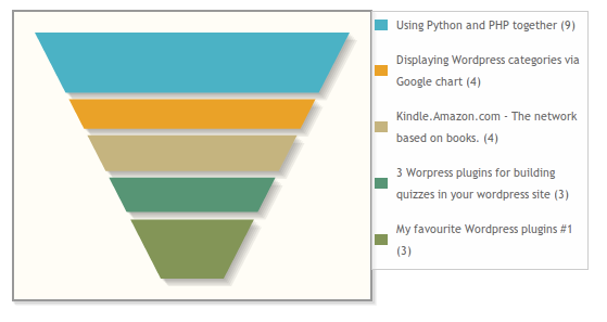
Step 4 "The Most Commented Posts" Chart:
Third chart is also about interesting data, it shows your the most commented posts.
function mostcommented($atts,$content = '') {
global $wpdb,$wp_query;
$postcountbymonth=$wpdb->get_results("select post_title as pt,comment_count as co from $wpdb->posts where post_status='publish' order by co desc limit 5");
$labels='';$titles='';
foreach ($postcountbymonth as $pc)
 {
	 $titles=$titles.'[\' '.$pc->pt.' ('.$pc->pt.') \','.$pc->co.'],';

 }

$titles='['.substr($titles,0,-1).']';
  return '
  <style>.jqplot-table-legend{width:200px}
  #chart4 table tr td:nth-child(odd){width:20px;}
  </style>
<script  type="text/javascript">
$(document).ready(function(){
    s1 = '.$titles.';
    plot4 = $.jqplot(\'chart4\', [s1], {
        seriesDefaults:{
            renderer:$.jqplot.FunnelRenderer,
            rendererOptions: {
                showDataLabels: false

            }
        },
        legend: {
            show: true,
            placement: \'outside\'
        }
    });
});
</script>
  <div id="chart4" style="margin-top:20px;margin-bottom:20px; margin-left:20px; width:350px; height:300px;"></div>
  ';
 }
add_shortcode('mypopularposts', 'mostcommented');
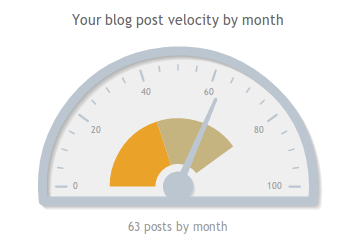
Step 5 "Blog Velocity" Chart:
Our last chart for this tutorial shows velocity of your blog. It shows average number of your post count by month.
function velocity($atts,$content = '') {

global $wpdb,$wp_query;

$postcountbymonth=$wpdb->get_results("select post_title as pt,comment_count as co from $wpdb->posts where post_status='publish'");
$postcountresult= round($wpdb->num_rows/12);

$maxvel=pow(10,strlen((string)$postcountresult));
$ticks='';
$intervals='';

for ($i=1;$i<=6;$i++){
	$ticks=$ticks.($maxvel*($i-1)/5).',';
	if($i % 2 != 0)
	  {
		  $intervals=$intervals.($maxvel*($i-1)/5).',';
		  }
	}

$ticks='['.substr($ticks,0,-1).']';
$intervals='['.substr($intervals,0,-1).']';

  return '
  <script>
  $(document).ready(function(){
   s1 = ['.$postcountresult.'];
   plot5 = $.jqplot(\'chart5\',[s1],{
       title: \'Your blog post velocity by month\',
       series: [{
           renderer: $.jqplot.MeterGaugeRenderer,
           rendererOptions: {
               label: \'Blog velocity\',
               labelPosition: \'bottom\',
               ticks: '.$ticks.',
               intervals:'.$intervals.',
           }
       }],
   });
});
</script>
<div id="chart5" style="margin-top:20px;margin-bottom:20px; margin-left:20px; width:350px; height:300px;"></div>';
 }
add_shortcode('velocity', 'velocity');
Using WordPress API's and jQuery charts you can prolongate this chart list, these 4 charts was just examples for interested developers.

Comments