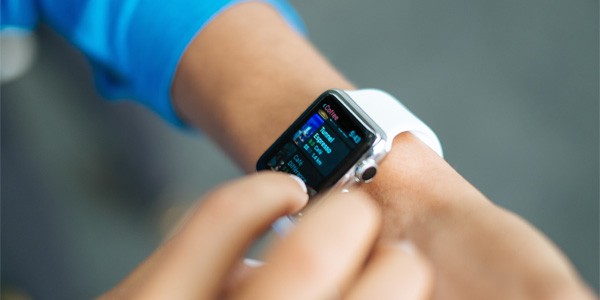
When Apple launched the Apple Watch, there was a lot of excitement. Wearables are a new category to design experiences for. The caveat? Translating your app to a smartwatch experience is different from building a responsive product for example.
It's not a matter of fitting content onto a smaller screen. In fact, it starts much broader. How does the ideal wearable experience look like? What are the constraints to keep in mind?
In this tutorial, we explore how to define the right product strategy when you design for the Apple Watch.
Designing for Context
First, you need to learn the constraints of the medium you're designing for. The Apple Watch is used in a very particular set of contexts:
- It's a device that is easier to physically access than a smartphone, which is often in the user's pocket.
- The size of the screen is smaller than the size of your smartphone's screen.
- The Apple Watch is often checked while multitasking (for example, on the go, in the middle of a conversation, while driving).
- There are a number of technical limitations to keep in mind. For example, to use an Apple Watch app, you need to have the iOS counterpart installed on your iPhone.
- Data transmitted between the Apple Watch and your iPhone is sent over Bluetooth, which tends to be slow.
- In general, Apple Watch apps are slower and less responsive compared to other software we use.
Anyone who wants to create an app for the Apple Watch should try the device for at least a week. By using it, you learn to understand the use cases of the product. Perhaps the most important lesson you learn are its flaws and how to design for those.
While researching how other people use the Apple Watch, I've concluded the following lessons:
- First and foremost, it's mainly a notification device. It's easy to check notifications you receive, but it doesn't require you to take your smartphone out of your pocket.
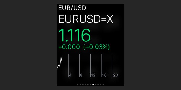
- Second, it's often used to quickly check tiny bits of information. Think local weather, stock prices, and your to-dos, for example.
What Does This Mean for My Application?
You need to understand how people interact with your application. What functionality do they typically use? What information do they check?
Take Tinder, for example, it's difficult to take the app's native experience of swiping between interesting people and bring it to a wearable. That is why they decided to focus on the second most important interaction, sending and receiving messages. Tinder's Apple Watch app offers you the ability to see your matches, read your message history, and send messages using voice recognition (Siri).
Below, you can find a brief checklist. This helps you brainstorm how your app could work on the Apple Watch.
- In my app, what interaction requires the least amount of effort and returns the most value to my users?
- What content draws users back to my app?
- Is my app mainly information-driven or interaction-driven?
- If I'd have to reduce my application to a single feature, what feature would that be?
- If a user would have to check some information in my app, what information would that be?
If you know that an Apple Watch app is mainly used to look at information (with minimal interaction), you'll notice how simplification is the key to succeed.
Glances, Complications & the App
There are different ways to interact with an Apple Watch app. These interactions are glances, complications, and the actual app.
Glances
An Apple Watch glance can be best described as a small widget that can be accessed without having to open the app. A user swipes up on the watch face to display glances. A user can swipe left or right to switch between glances from different apps.
A glance is somewhat between a notification and a complete app. An ideal designed glance displays a small chunk of information and sometimes includes some interaction. Does this sound confusing? It will become more clear as I describe the other interaction types.
Complications
To add app functionality directly to the watch face of the Apple Watch, Apple created complications. You are able to customize your watch face and Apple provides a number of default options. Apps that support complications can be used to tweak your watch face. They can be used instead or in combination with the default complications.
For example, you could use Citymapper's ETA function to display your estimated time of arrival directly on your watch face instead of having to look at a glance or opening the Citymapper Apple Watch app.
App
Finally, there's the fully interactive app. A user has to open the app to access all the content and functionality that isn't used in glances or complications.
If you've designed an excellent glance and/or complication, you'll notice the actual app being used less because both glances and complications are easier to access.
Designing an Apple Watch App
As the Apple Watch offers different ways to interact with an app, figuring out how to design for each type of interaction is difficult. I tend to stick to the following process.
Complication
Start with your app's complication: What is the smallest piece of information you could display that is relevant to the user (for example, upcoming meetings, the current temperature, today's date)? Chances are that you won't need a complication because it isn't relevant to your app. Most apps don't have a complication.
Glance
Next, define your glance. What is the typical interaction with your app? This feature becomes the glance. For example, Swarm displays nearby friends and includes the interaction to check in at the nearest location. Another example would be my banking app, which displays the amount in my checking and savings account in one glance.
App
What functionality is interesting, but too complicated to put into a glance? Taking Swarm as example, I can add a sticker to my check-in and add a message.
The difference between the app, a glance, and a complication might be a little bit daunting at first. Below are the steps a user takes to access each interaction, sorted from the least to the most effort:
- A complication is seen directly on the watch face. No interaction is necessary beyond looking at your wrist.
- A glance is seen when a user looks at their wrist and swipes up from the bottom of the screen. Then, a user can swipe horizontally between different glances.
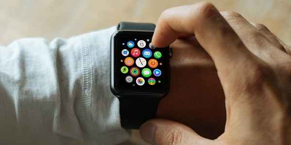
- An app can be accessed when a user presses the Apple Watch crown. Then, the user scrolls in the app overview screen and taps the app they want to open. Once the app has finished loading, the user can interact with the app.
Keep the following in mind. A user can manage their installed apps, glances and complications directly from the Apple Watch app on their iPhone. A glance or complication is not added by default.
The above information might seem redundant if you use an Apple Watch on a daily basis. Though, I want to challenge you to think about these interactions as the user often has different objectives. A glance is typically used in a different way than the actual app, for example (quick peek versus long(er) interaction).
It pays off to think about each interaction individually.
Case Studies
Flitsmeister
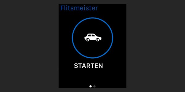
Flitsmeister is a Dutch speeding radar detector for iPhone. By using crowdsourced data, they notify users if they're about to drive by a location where a user's speed is being monitored.
While their iPhone app is more complex (listing traffic, displaying different radar locations, etc.), they've simplified their Apple Watch experience.
Most of the app is notification-driven. The user receives a notification as they're about to pass a radar. The only purpose of the Apple Watch app is a simple shortcut to activate the app with your smartphone still in your pocket.
They deliberately decided not to implement a complication, but rather keep the Apple Watch app to a bare minimum, which works very well for this product.
Slack
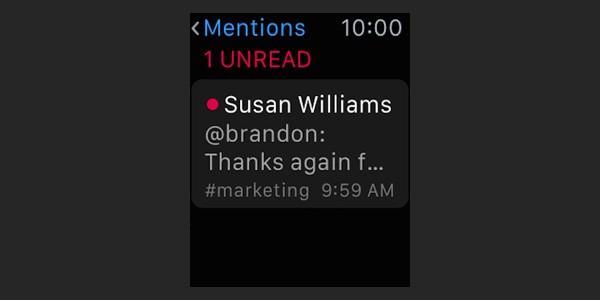
Slack is a team communication tool. Slack thought carefully about the most valuable information a user receives. They decided to simplify the functionality of their Apple Watch app and support the following:
- read direct messages
- view mentions
If you think about this, it makes a lot of sense. Reading a full chat history on your wrist is an unpleasant experience, while reading messages directed at the user is valuable. Especially in the context of being on the go, this is a helpful feature.
Slack decided to not implement a glance or a complication. The information is accessed by opening the Slack Apple Watch app.
Strava
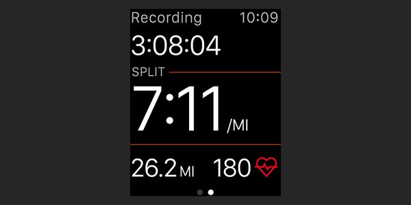
Strava is a fitness app and it is an excellent example of a well executed Apple Watch app. While the iPhone app has a lot of functionality to see your friends' activity and analyze your runs, the Apple Watch app focuses on the essentials. The screen displays your average minutes per mile, your heart rate, and the total amount of time and distance you've ran.
Simplification and displaying information contextually is key and Strava does this really well.
Conclusion
When you're designing an Apple Watch app for the first time, the process is complex. If your app offers a lot of functionality, the different types of Apple Watch interactions are something to think about.
The best advice I can give is to relentlessly simplify the information you display and reduce the functionality you want to offer on the watch. All of this, while making a careful distinction between an app, a glance, and a complication, and how users could use them differently.
In my next tutorial, we'll look into the Apple Watch design guidelines now that we have a better understanding of the medium.
Thank you for reading. Should you have any questions, drop a comment below or reach out on Twitter.

Comments