If this is the first time you are designing for a wearable device, you will notice that there are some key differences compared to designing a product for a smartphone or a desktop computer.
In this quick tip, I cover some of these differences while also teaching you how to design for Apple Watch.
Before We Start
We will be designing a glance for Apple Watch. As a reminder, a glance is a single screen without interactive elements. It simply displays information and can be tapped to open the corresponding Apple Watch app.
A user can access a glance by swiping up on the watch face screen. A user can also choose which glances they would like to see on their Apple Watch. It is opt in, which means that a user has to explicitly select the glances they want to see on their device. It's an elegant and simple way to show information about their favorite apps.
What differentiates a glance from the app itself is that a glance is a single screen and, as a result, loads more quickly. Glances are also easier and quicker to access than the corresponding Apple Watch app.
Design Guidelines
Designing for Apple Watch means you need to keep certain guidelines in mind. This is similar to designing for iOS or Android. You can learn more about the design guidelines in the previous tutorial of this series.
Designing a Glance
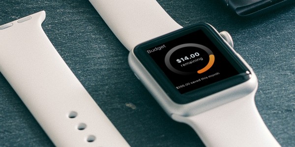
Imagine an Apple Watch app in which the user can easily track their budget. In our glance, we want to display a daily budget while also displaying the amount of money the user has saved up so far that month. Depending on how someone spends money during the day, the daily budget decreases.
Step 1: Set Up the Artboard
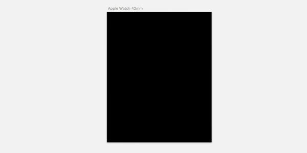
Open Sketch and insert a new artboard. The list on the right shows the different preset artboards you can choose from. Under iOS devices, select Apple Watch 42mm.
Click on the artboard in your layer list and use the right panel to select a background color. Choose black (#000000) as the background color. Black is the default background color for Apple Watch apps.
Step 2: Glance Title
Because of the black bezel of the Apple Watch, we can use the artboard edge to edge in our design. In contrast to a typical app or web design, adding a margin on either left or right of your design isn't necessary.
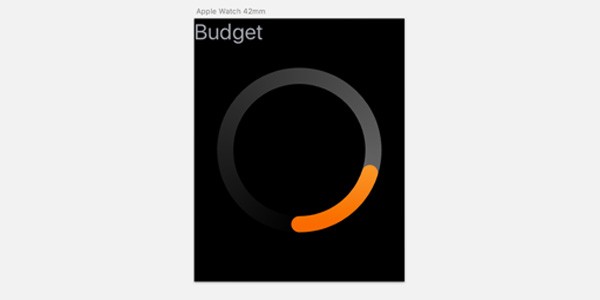
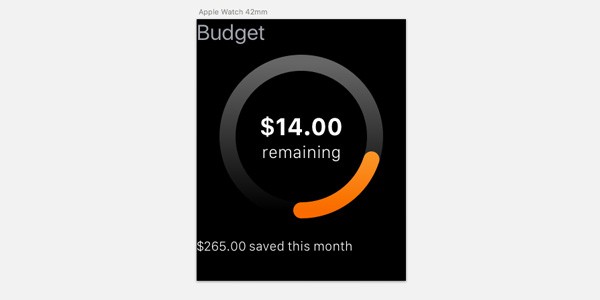
Add a title, "Budget", so the user is aware of what glance they are looking at. SF Compact is the default font used on Apple Watch. You can learn more about typography for Apple Watch on Apple's developer website. For the 42mm watch face, it is best to stick to 32 pt (for 72 dpi designs). The text should be aligned in the upper left corner.
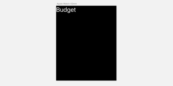
Finally, change the title color to a light grey (#a2a5ae) to reduce the contrast of black and white in the design. White should be reserved for information we want to stand out, such as the remaining budget.
Step 3: Daily Budget
The most important feature of the glance is displaying the user's daily budget. We could present this textually, but let's make the design more interesting. I'd like to design a circular graph, which decreases as the user spends money.
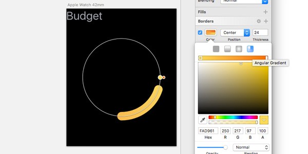
First, use the oval tool to make a circle with a size of 220 by 220. Center the shape in the artboard and set the border width to 24. Click the settings icon next to the border title to open the border settings menu. Set Gap to 1000 and Dash to 138. Finally, select the round ends. Well done, you have created a border ring.
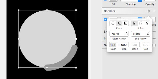
Disable the fill color of the circle and change the border color to an angular gradient of your choice. You could use the rotate function to move the shape around in the screen, but this is not necessary for our glance design.
Right-click the oval in your layer list and duplicate the element. Open the border settings of the duplicated shape and set Dash to 690. Move the duplicated layer below the original oval layer and play with the gradient colors and opacity to complete the graphic. In the example below, I used an angular grey-black gradient with a reduced opacity.
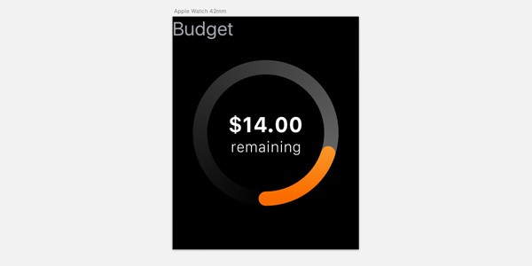
Next, add a text layer with copy "$14.00 remaining". Set the font size of "$14.00" to 38 pt and the font size of "remaining" to 26 pt. Center the text in the artboard. Our glance is slowly coming together.
Step 4: Money Saved
Finally, we need to display the amount of money the user has saved so far that month. We are going to use the bottom section of the glance to add that piece of information. Because we already have a graphic element at the center of the glance, we will use text to display the amount the user has saved. This will create a well balanced and informative glance.
Create a new text layer and use SF Compact as the font with a light font weight. We are going to create a footer text. Select a font size of 20 pt and set the text to something along the lines of "$265.00 saved this month". Align the text at the bottom left of the artboard.
What's important when designing a glance is that at the bottom of your design pagination will appear. A user can swipe between different glances of different apps. Let's move the footer text up by 40 points to add some margin at the bottom.
Because we moved the footer text up, the daily budget section is uncentered. Move the group containing the text and the different ovals up by 20 points. And we're done.
Conclusion
With a few simple shapes and tricks, we created an elegant Apple Watch glance. If you would like to learn more about building products for Apple Watch, I recommend reading a tutorial about choosing the right product strategy or learning more about the Apple Watch design guidelines.
If you have any questions about designing for the Apple Watch, reach out in the comments or on Twitter. Thank you for your time.

Comments