Apple Watch offers a new medium to communicate with users. Using an app on a wearable device is vastly different than using it on your smartphone. To guide app creators in their journey to build a good Apple Watch app, Apple released design guidelines to assist them in designing a good app experience. In this article, we take a look at those guidelines.
Design Philosophy
In order to design good applications for the Apple Watch, it's important to understand the design philosophy Apple had in mind when it designed the Apple Watch. Apple recommends to keep the following foundations in mind.
Lightweight
Because of the limited screen size and operating power, the Apple Watch should be mainly used as a device to support fast interactions.
Personal
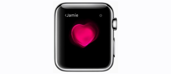
A device has never been so close to us. Apple emphasizes to be mindful and keep the close connection in mind as you design an Apple Watch app.
Interactions
There are four distinct ways a user can use gestures to navigate an application:
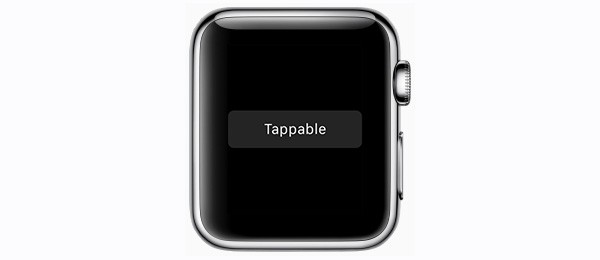
- A tap triggers an action-based event.
- Vertical swipes scroll the current screen (a user can also use the digital crown to scroll).
- Horizontal swipes display the previous or next page in a page-based interface.
- Left edge swipes navigate back to a parent screen in a hierarchical interface.
Force Touch
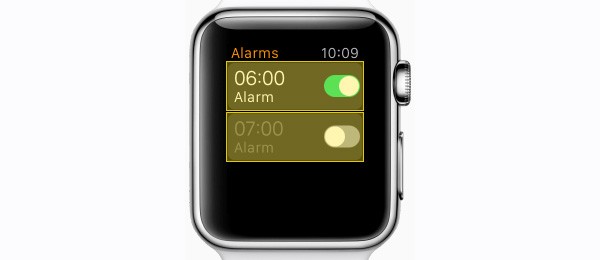
When a user applies pressure on the Apple Watch screen, it detects force and displays a menu overlay for the current screen. For example, in the alarm app, Force Touch is used to add a new alarm.
Haptic Feedback
A unique way to give a user feedback for the Apple Watch is to provide haptic feedback. There are different types of haptics, each conveying a specific meaning such as success, failure, or a click.
App Components
Apple provides a range of options to interact with an application, including notifications, glances, and complications.
Notifications
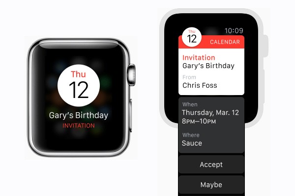
There's a distinction between a short look and a long look. When a user receives a notification and they raise their wrist, they see a short look first. A short look consists of a title, the app name, and the app icon.
A long look appears when a user continues to look at the notification instead of lowering their wrist after seeing the short look. The content area for a long look is dynamic, but the overall structure of the notification is not. You can add buttons to a long look in order to make a notification actionable.
Glances
A glance is a single screen a user can access without having to open an app. This is done by swiping up on the home screen. Not every app needs a glance as they're a single, informative screen. A user chooses what glances they want to add to their Apple Watch. In general, there are a few rules to keep in mind while designing a glance.
- A glance should be quick and easy to read.
- A glance should be contextually relevant and not just an app launcher. For a stock app, you would display the most recent market prices, for example.
- Left-align glance content. This is a standard for all glances and keeps the visual hierarchy consistent.
Complications
A complication adds app-specific information to a user's watch face. Watch faces are customizable and thus how complications are displayed on a watch face is diverse. For example, you have large and small modular complications as well as circular templates among more. Complications are drawn using templates, which means that there's limited customization in terms of design.
You can learn more about the complication families and templates in Human Interface Guidelines. Complications are optional.
Information Architecture
In general, there are two types of navigation models to suit your needs:
- page-based navigation
- hierarchical navigation
Page-Based Navigation
A page-based navigation is best suited for a flat collection of information. The app consists of a number of single pages. A user can swipe horizontally between the pages (and vertically to display more content on a single page). It is advised to limit the number of pages in order to keep navigation smooth for users.
Hierarchical Navigation
A hierarchical navigation provides a hierarchy. The most common design is to have a list page and a detail page. It is recommend to only have two or three levels of hierarchy.
Alerts & Action Sheets
Just as there are alerts and action sheets in a typical mobile app, you can also use this type of navigation in an Apple Watch app. The general guidelines here are to use alerts sparingly, use succinct messages and always offer the ability to dismiss an alert.
Interface Design
In order to make the user interface design guidelines more digestible, I've summarized the most important rules below.
- An Apple Watch comes in two sizes, 38mm and 42mm. The same content should be displayed, no matter what display size, by using relative sizing.
- In general, left-align elements. Left-aligned text is much easier to read and Apple Watch apps apply this rule consistently.
- Apps always have a black background to create an illusion that there's an edgeless screen.
- Avoid using color as the only way to show interactivity, the rounded rectangle is a consistent design pattern for buttons.
- You can define a global tint color to act as primary brand color. Make sure the colors you choose for an application are light to guarantee legibility and contrast with the black background.
- Don't include a launch screen as it slows interaction speeds.
- Apple Watch does support animated image sequences and appearance animations, but they typically don't add value to your app.
Typography
Apple uses SF Compact as the system font on Apple Watch. There are two variations (point sizes based on images of 144px/inch):
- SF Compact Text for labels whose text is 19pt or smaller
- SF Compact Display for labels whose text is 20pt or larger
You can add custom typography, but this isn't recommended. Dynamic Type is very helpful on Apple Watch hence using the system font is often the best design solution.
Apple provides standard built-in type styles ranging from headlines to footnotes to reduce the need for custom typography.
Building Blocks
To make it easier to create Apple Watch apps, Apple provides a number of interface elements, which you can use as building blocks to create your app. Below you find a brief list of the different ones you can use. Each interface element has its own set of guidelines. You can learn more about these guidelines in the resources section below.
- static text (labels)
- images
- groups (combines images and labels, for example)
- pickers (manipulated with the digital crown)
- tables
- buttons
- switches
- sliders
- maps
- movies
- date & timer labels
- menus
Resources

Apple provides design assets you can use. You can access them from Apple's Human Interface Guildeines website.
Furthermore, for an indication of the exact pixel sizes needed for iconography and complication images, Apple provides an overview in the Human Interface Guidelines.
Finally, to learn more about the specific guidelines for the different building blocks to create your Apple Watch app, you can learn more it in the Interface Elements section of Apple's Human Interface Guidelines.
Conclusion
By sticking to Apple's design guidelines for the Apple Watch, you make sure that your app is understandable for Apple Watch users. Simultaneously, with the existing typography and building blocks, it is possible to create great Apple Watch apps without customization.
If you would like to learn more about the design guidelines, visit Apple's Human Interface Guidelines for Apple Watch. Should you have any questions, drop them in the comments below or reach out to me on Twitter. Thank you for your time.

Comments