Welcome to the first in a series that will cover all the steps necessary to both design and code a "Phone" application! Our application will function much like the default iPhone version with one very important aesthetic twist: our design is inspired by the 1980s. This is a hands-on series, so read on and let's get started!
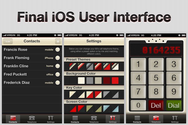
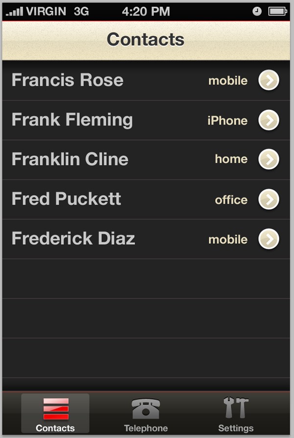
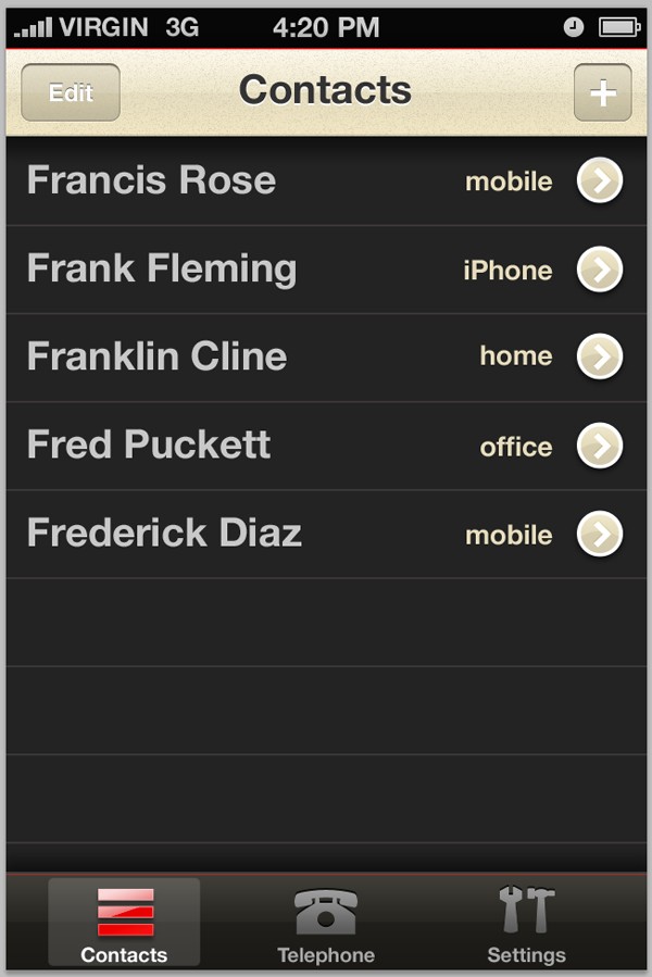
Final App Preview
Over the course of this series, this is what you will be creating:
Summary of This Lesson
In today's lesson, we're going to be covering the main structure of the user interface, so the title and navigation bars, buttons and background. We'll also be doing the favorites screen and making a start on the settings screen. We'll be covering the phone/keypad design and finishing out the "settings" section in the second part of this series, which will be published soon!
Step 1
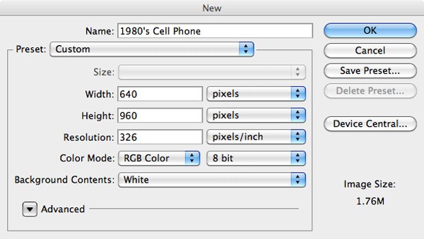
Open up Photoshop and go to File > New. Setup an RGB document with a 326ppi resolution (suitable for the retina displays) with a dimension of 640x960px.
Step 2
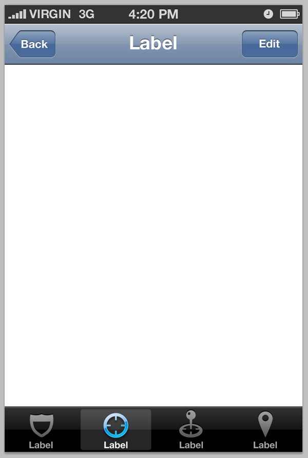
Head over to Teehan+Lax and download their awesome (and free) iPhone GUI PSD Version 4 file. We'll be using some of the default Apple UIKit elements from this pack. Open up the file and copy and paste the objects in the following screenshot into your own document (the top, title and tab bars). They should automatically snap into place.
Step 3
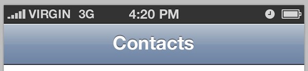
Select the Text Tool and click on the 'Label' typography that is already in your document. Change it to 'Contacts'.
Step 4
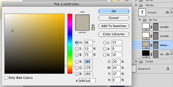
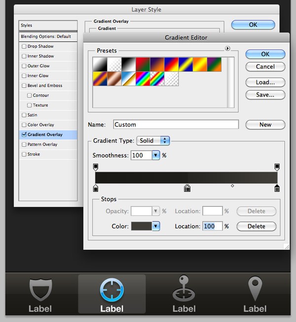
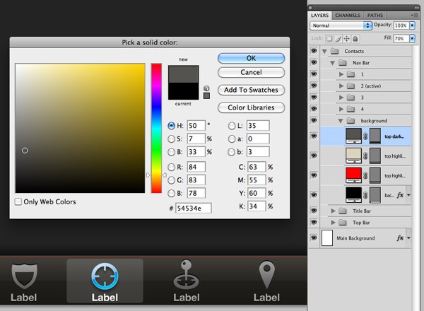
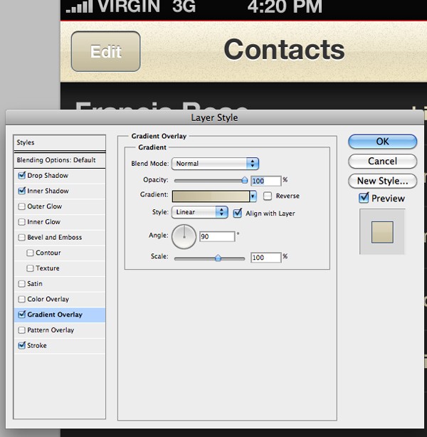
Right-Click on the title bars main shape layer and select Blending Options to open up the Layer Style window. Click on the Gradient Overlay tab. Keeping the Gradient settings the same, and then change the colors. I used some beige-like colors, going from light to dark, to lighter to lighter - in a subtle way, as can be seen.
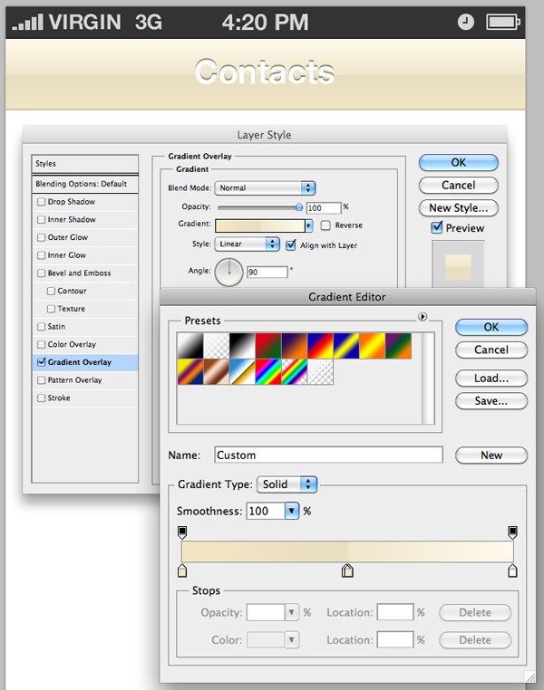
Double-Click on the color swatch next to the layer above your main title bar layer (this is one of the highlight layers) and change the color to a medium beige/brown color.
Step 5
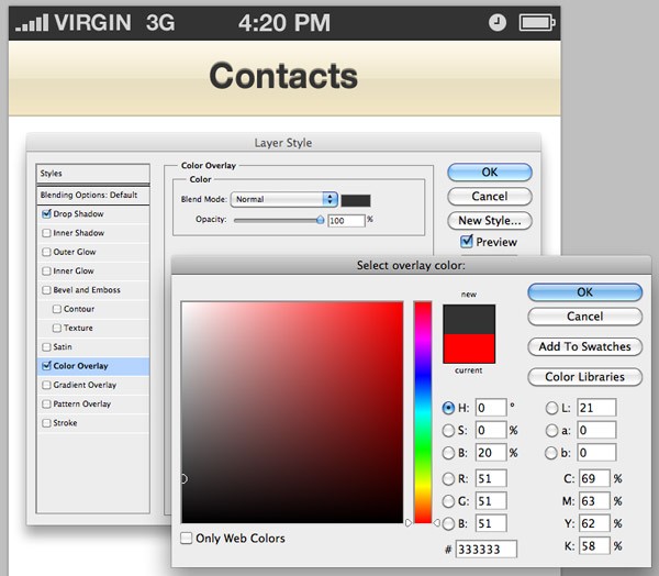
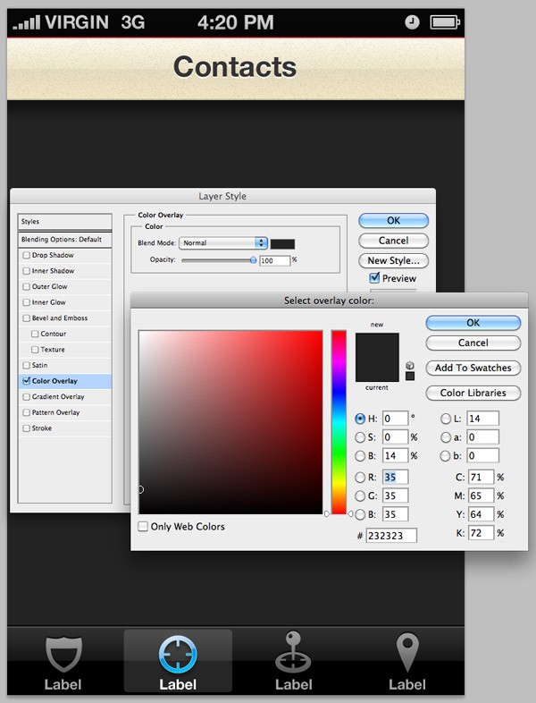
Right-Click on your 'Contacts' typography layer and select Blending Options to open up the Layer Style window. Select the Color Overlay tab and change the color to a dark grey (I used #333333).
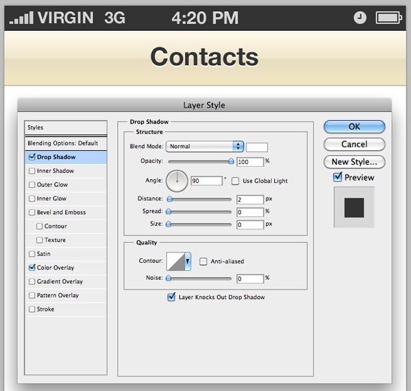
Select the Drop Shadow tab and change the color to white with a Normal Blend Mode (as the default Blend Mode with drop shadows makes white appear transparent). Change the angle to 90 degrees, the distance to 2px and everything else to 0px. This will create what is essentially a 2px white stroke, but only to the bottom side of your type.
Step 6
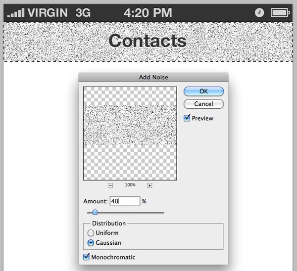
Whilst holding the Cmd-Key, click on thumbnail of the main title bars background layer in your Layers Panel. This will make a selection of everything on that layer. Go to Layer > New Layer to create a new layer above your title bar's background layer and fill it with white. Go to Filter > Noise > Add Noise and add 40% noise to your layer. Click OK.
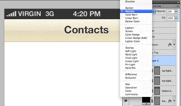
Change your noise layers Blending Mode to Multiply, and lower its opacity level to 10%.
Step 7
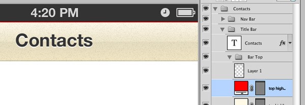
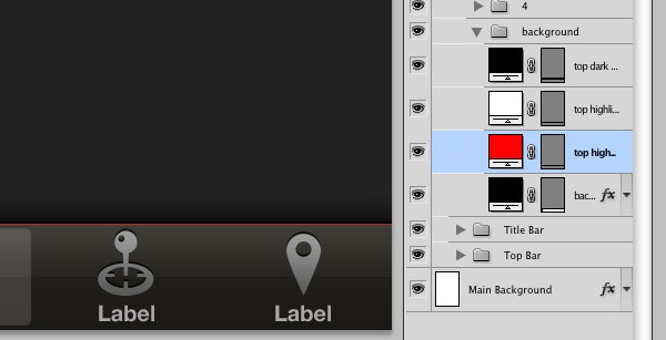
Double-Click on the color swatch next to your top highlight layer, and change it to red.
Step 8
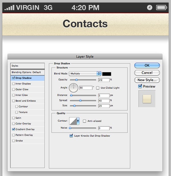
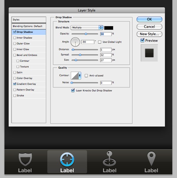
Open up the Layer Style window for your title bars background layer once again, and select the Drop Shadow tab. Change the opacity to 25%, the distance to 5px, spread to 40%, and size to 29px. Make sure the angle is set to 90 degrees and then click OK. This will add a drop shadow beneath your bar, which will look great once we add a background to our design.
Step 9
Right-Click on your main background layer in your Layers Panel (the one that was there when we first created the document). Click on the Color Overlay tab and change the background to a dark grey. I used #232323. Click OK, and then OK again.
Step 10
Open up the Layer Style window for your tab bars main background. Slightly adjust the colors of the Gradient Overlay, increasing the amount of a color of your choosing to give the gradient a little more color, giving it that bit of edge to help it stand out.
Whilst you're here, click on the Drop Shadow tab to create a shadow opposite to the one we just created for our title bar, but give it a -90 degree angle instead of a 90 degree one.
Step 11
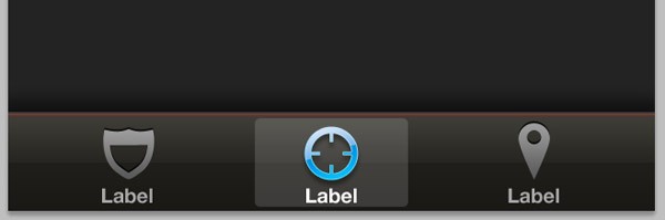
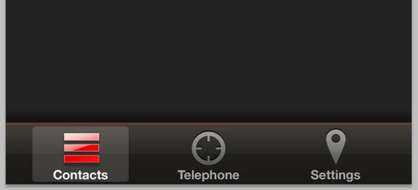
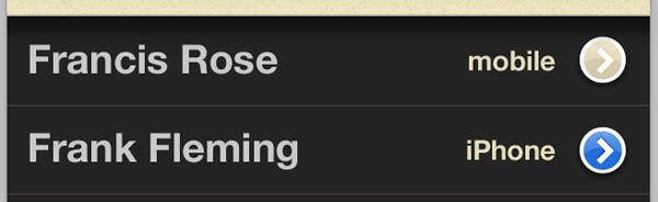
Change the color of your tab bars top highlight to red. This will give it a lovely unique and retro look.
Change the color of your other top highlight to a color from your top title bar, and then the color of your top dark highlight to the same grey color used in the top half of your tab bar. This will make it look as if the top red highlight is a pixel or two beneath the top of your gradient.
You can see the link work (our highlights) more clearly in the screenshot below:
Step 12
Remove one of the preset icons, and realign the other three icons so they sit an equal distance apart from each other. Using the Rectangular Marquee Tool, make three rectangle selections whilst holding the Shift-Key to keep the previous selection selected whilst selecting the second and third shape. On a new layer, fill the selection(s) with black.
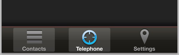
Right-Click on the shield icon layer and select Copy Layer Style. Delete the layer, and then Right-Click on your new layer, and select Paste Layer Style. Reposition the icon into the tab bar, as seen below. You can also rename the "Label" types here to "Contacts", "Telephone", and "Settings".
Locate the layer which holds the active state shape beneath the "Telephone" type. Duplicate this layer twice and reposition it beneath the "Contacts" and "Settings" type and icons. Hide all of these layers apart from the one beneath contacts. Now Right-Click on the "Contacts" icon (which is currently a circle) and click Copy Layer Style. Paste the layer style onto your contacts icon.
Step 13
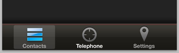
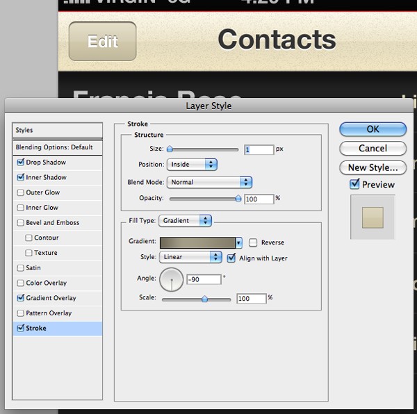
Right-Click on your "Contacts" icons layer and select Blending Options to open up the Layer Style window. Select the Gradient Overlay tab and change the gradient colors to red as seen below, keeping all of the other gradient settings the same. Once you're done, click the OK button.
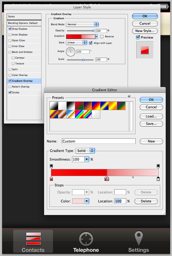
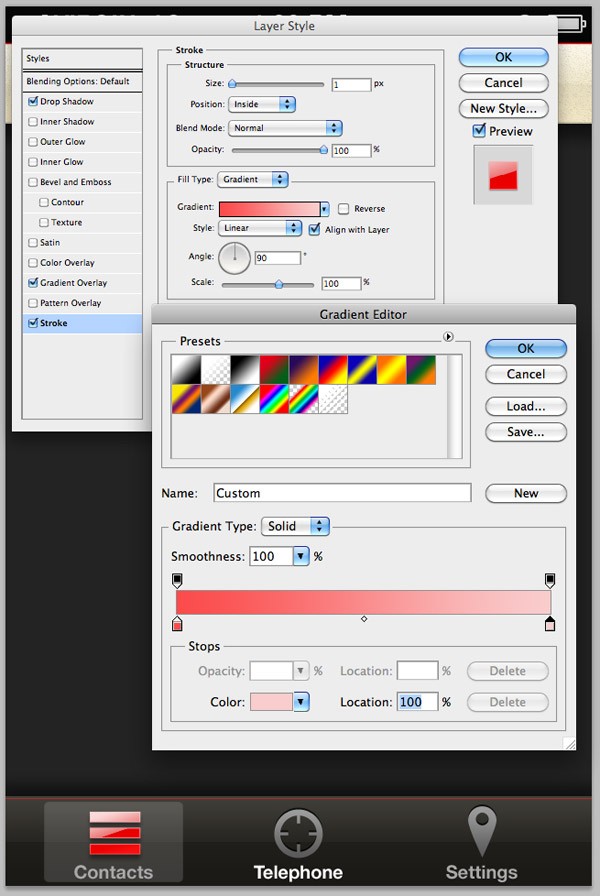
Leaving the Layer Style window open, now select the Stroke tab. Change the strokes fill type to gradient, and then choose a medium red to light red/pink color. Click OK twice when you're done.
Change the colors of your tab bar typography - your active tab should have white text, and the others should be grey.
Step 14
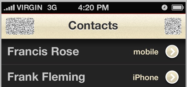
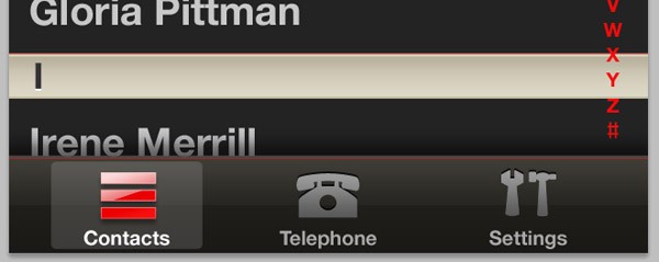
Open the iPhone GUI PSD file back up. Locate the contacts scroll list and then drag the layers folder over to your own document. Reposition the folders/layers content so it fits on your screen nicely. This contact list is the iPhone's default - we will simply be using it's main elements (the lines and typography) and changing the colors to produce a favorites screen. Start by removing the white background.
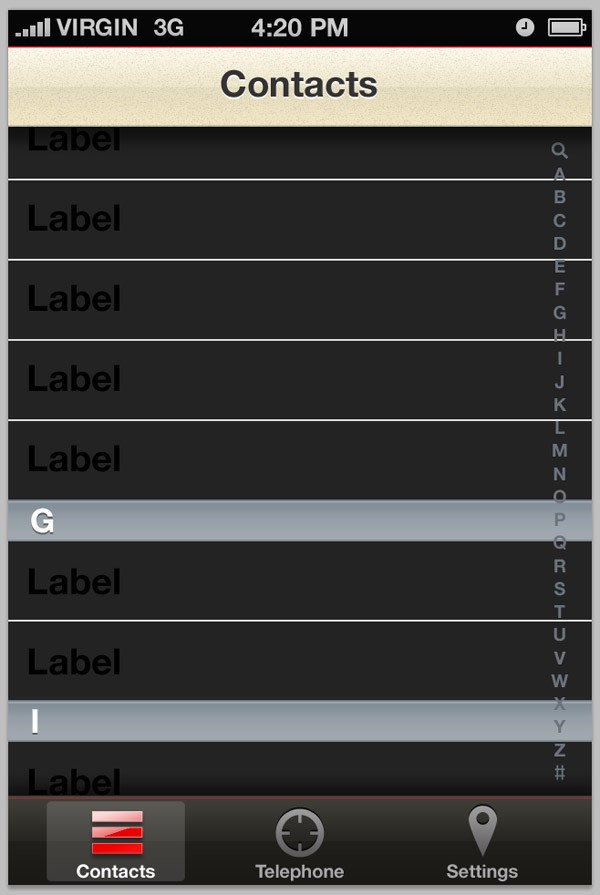
Step 15
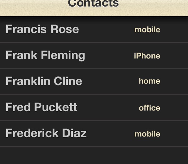
Insert some random names into your contact list. Reposition it so that the text is an equal distance away from the title bar at the top. Change the typography color.
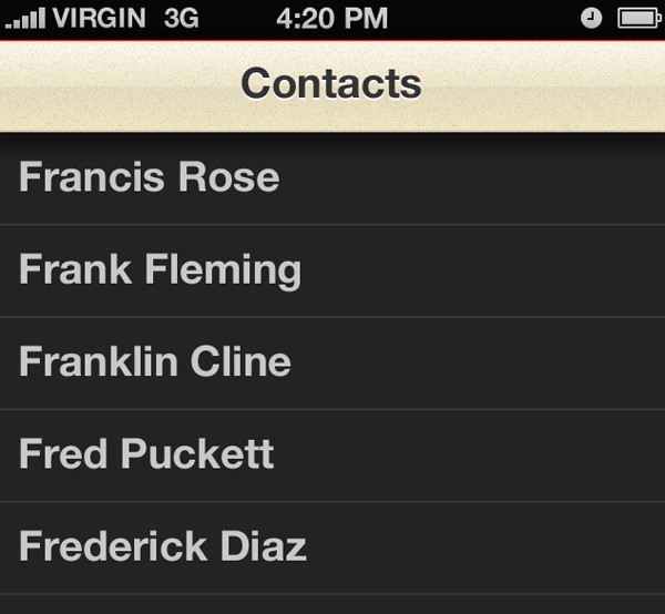
Using the same font but with a smaller size, write a label stating which contacts phone number you have listed as a favorite. Change the color to a color from your title bar. You can use the Eyedropper Tool to select a color.
Step 16
Open up your iPhone GUI Kit PSD again and locate the arrow icons. Drag the icons folder over to your own document. Duplicate it, and reposition your icons as seen below.
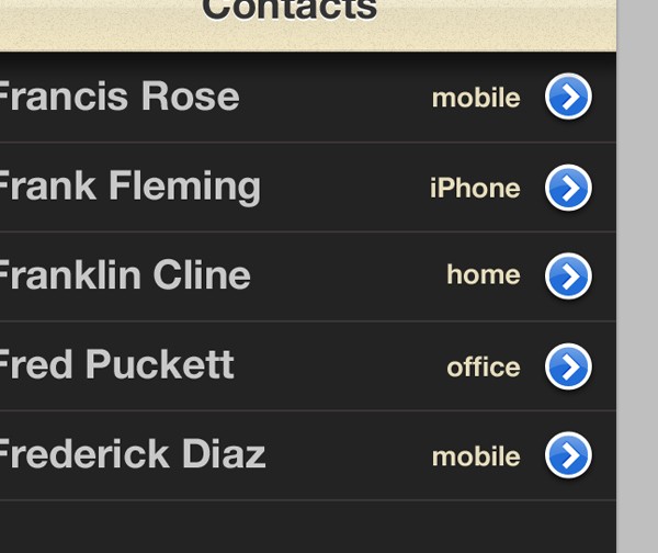
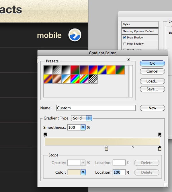
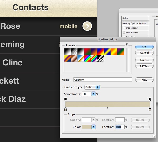
Open up the Layer Style window for your first icon and click on the Gradient Overlay tab. Open up the Gradient Editor and apply colors similar to the ones seen below.
Do the same for the bottom half of your icons shape.
You should end up with something looking similar to below...
Copy the layer styles by Right-Clicking on your icon layers and selecting the "Copy Layer Style" option. Right-Click on your other icon shapes and select the "Paste Layer Style" option to make all of your icons look the same.
Step 17
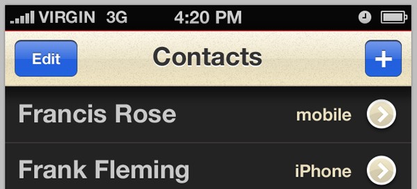
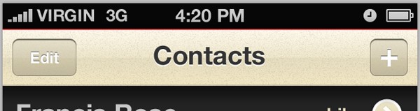
From your GUI PSD, drag over two default iOS buttons, and position them in the title bar. Change the default "Layer" text to "Edit". These buttons are for editing your favorites list, and adding new favorites.
Open up the Layer Styles window for one of your shapes and change the colors of your gradient so that it matches the rest of the color scheme used throughout the app design so far.
Also change the gradient fill on your 1px stroke. Copy the new layer style and paste it onto your other button.
Create a new layer. Make a selection of your shapes by holding the Cmd+Shift-Key. Fill the selections with white on the new layer. Go to Filter > Noise > Add Noise and add around 10% noise.
Lower the opacity of the noise layer to around 5%. The outcome is very minimal but it does make a slight difference and helps the buttons merge in with our title bar a little more.
With that done, our contacts screen is complete!
Step 18
Select the Custom Shape Tool and locate the telephone shape. Whilst holding the Shift-Key, drag out the shape onto your canvas (using the Shape Tool automatically creates a new layer so there is no need to do that yourself in this case). Reposition the shape/icon above your "Telephone" tab bar text, and copy and paste the grey layer style onto it.
Repeat the step with the settings tool - this shape (the spanner and hammer) is also a default Photoshop shape found in the preset shapes when using the Custom Shape Tool.
Step 19
Put all of your documents layers into a folder titled "Contacts". Duplicate this folder and hide the original, and then rename the new layer to "Settings". Each folder will hold a screen, so in total (by the end of the second part of this tutorial) we'll have three folders, one for each tab item: "Contacts", "Telephone" and "Settings".
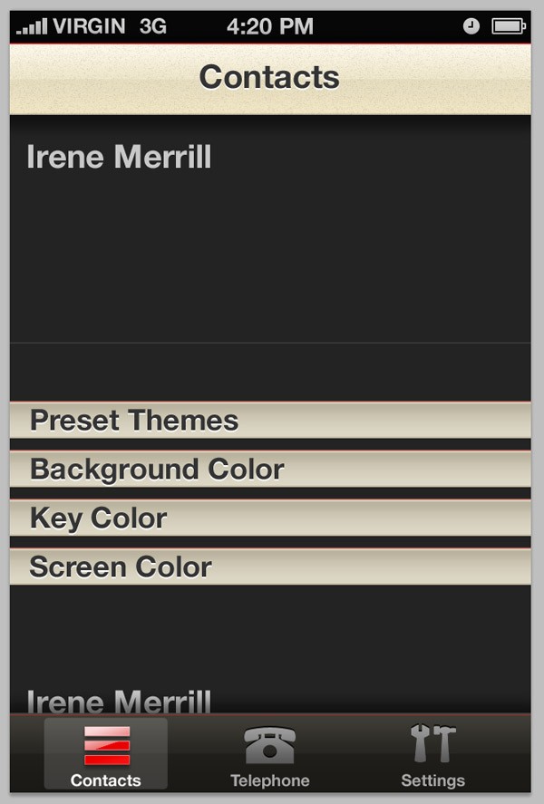
Remove the majority of your names in your new settings folder, as well as your keylines. From the GUI PSD, select one of the category bars from the contacts folder. Change the gradients and strokes, like seen below.
Step 20
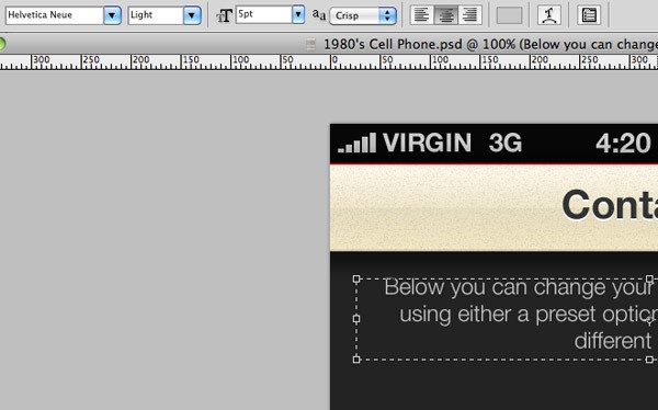
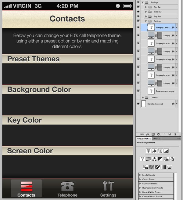
Select the Type Tool and click on the remaining name (type) on your canvas. Enlarge the text box, and select the text align to center from the toolbar. Reduce the size of the text, and change the font (currently Helvetica Neue Regular) to Helvetica Neue Light at 5pt. Type in some text, I used the following which you're welcome to copy and paste:
"Below you can change your 80's cell telephone theme, using either a preset option or by mix and matching different colors."
Step 21
Reposition your category bars as seen below, making sure they're the same distance apart. You can do this by simply measuring how many pixels each one is away from the other. Change the category bars type; I used "Preset Themes", "Background Color", "Key Color" and "Screen Color".
Conclusion
In the first part of this tutorial we have covered the basics of our applications user interface design. In the second part, we will be finishing off the Settings page, as well as designing the telephones keypad, including a digital LCD screen and numbered buttons.

Comments