Welcome to the fourth installment in our series on how to both design and build a 1980s version of the iOS "Phone" app. In this tutorial, we will be learning how to use Photoshop to slice the app design comp in order to continue building and skinning the app with Xcode.
Step 1
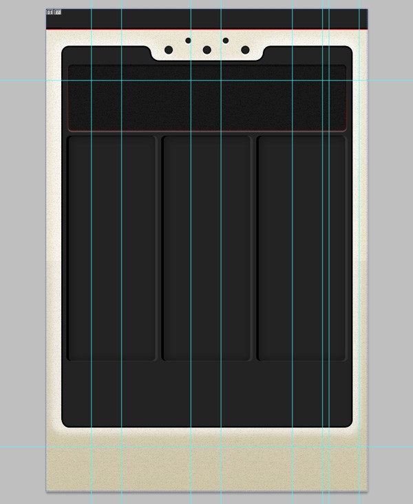
In step five of the previous tutorial, Mark deconstructed the final preview of the app design and put together some notes and a graphic request form for us, which can be seen below:
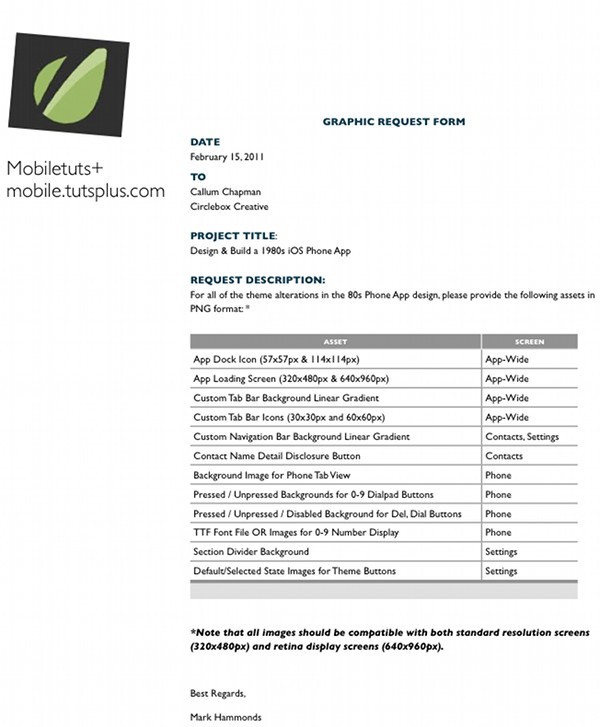
If you haven't already, go and give step five of the previous tutorial a read to get a feel for what has been requested of us in this tutorial.
Step 2
We're going to start by creating the loading screen for our application. This is the screen the user will see as soon as they click on the application's dock icon to launch the application.
We're just going to use our telephone tab bar icon that we created in the initial design tutorials in this series as the main focus point of our loading screen. Duplicate this and place it into a new folder in your main PSD file. Call the folder "Loading Screen". Add a new layer and add a Gradient Overlay to it (we covered how to do all of this in the initial design tutorials). I also added a pattern to mine.
Once you're done with the loading screen, we need to export it as a PNG file ready to be used in the application development. Take note of how we do this, as it is how we will be saving all of our images for development:
Go to File > Save for Web & Devices. You should be presented with this window:
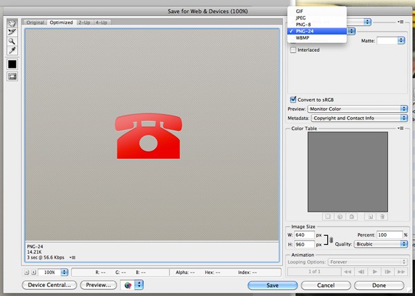
Select PNG-24 from the drop-down menu (see above). In this case, transparency isn't important as there aren't any transparent sections, but in other images this is important. Select it now to save you from having to select it later on. Click the Save button and save it with the name "[email protected]" in a folder called "design slices".
Why the "@2x"? We will be creating lower resolution images of all the sliced images in this application later on. This is important due to the iPhone 4 having a higher resolution than all previous iPhones. The naming convention we will use to do this is to append "@2x" to the higher resolution versions of the images because doing so will allow Xcode to automatically load the higher resolution version of the file when needed.
Step 3
We now need to create a dock icon. I'm simply going to use the Crop Tool to crop the telephone icon out of our loading screen background. Below you'll find the icon ready for both a retina and a non-retina display:
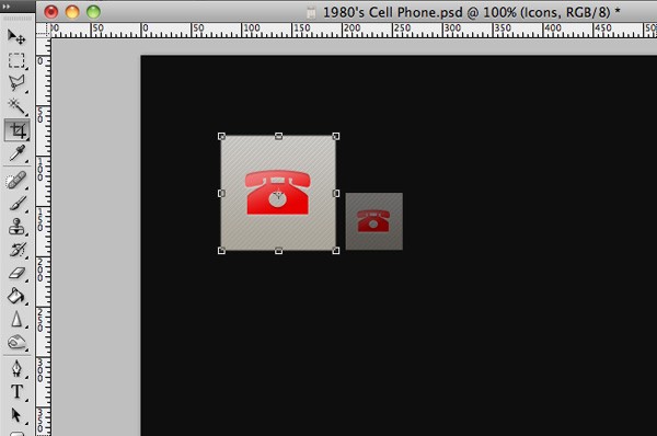
Crop out the larger version of the two, and save using the technique we used above for our loading screen.
Step 4
There are actually several ways in which you can slice up an application (or indeed any digital user interface) design. You could use Photoshop's built in Slice Tool, create the elements in their own documents, or crop the graphics out of the comp individually.
In this case, as a matter of preference, we're going to be using the Crop Tool to crop out our different elements. This is especially important as we're going to be using icons with transparent backgrounds, and the PSD file holds three screens in total, not one.
Go to View > Rulers to turn your rulers on, and drag out some guides around your first icon. These guides are going to be used to tell us where we need to crop our images. Make sure the guides are exactly 60 pixels apart from each other.
Select the Crop Tool and make a selection over your first icon. Hold the Shift-Key to keep it square:
Press the Enter-Key and click Crop Image. Hide the background image from your canvas and save your icon as a PNG image. Repeat the process for all your tab bar icons, both inactive (gray) and active (red) versions of your icons.
Step 5
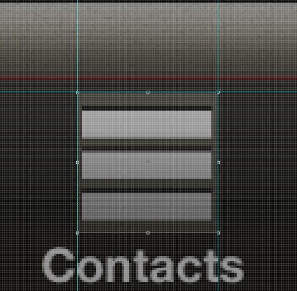
We're now going to export a PNG version of the telephone's background image, including the button grooves, border, and speaker holes.
Doing this is simply a case of hiding layers we don't want to see. Make sure your "Telephone" folder is visible, and all your others are hidden. Hide all of your buttons, button numbers, and screen text. You should end up with just a background of this screen. Everything you see should not be interactive.
Go to File > Save for Web & Devices to save this screen background as a PNG image.
Step 6
Hide all of your folders other than your "Settings" folder. We're now going to export each and every one of our theme setting color squares. This involves using the same technique we used to export our tab bar icons: a combination of Rulers, Guides, and the Crop Tool.
Once you've cropped your first color square, be sure to hide the background. We need to save these with a transparent background:
We also need to save another version of this same element but with an active state. We haven't yet created an active state for this buttons, so we're simply going to use a green dot to determine whether the color/theme option has been selected or not.

You need to repeat this step for each and every one of your theme/color options and squares. Be sure to make each and every one of your images the same size.
Step 7
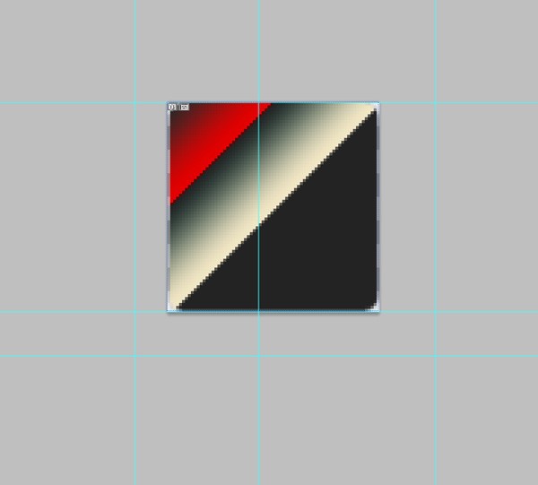
It's now time to create the linear gradient image for our custom tab and navigation bars. Select the Crop Tool and make a selection over your tab bar, making sure it starts at the top and ends at the bottom.
The width of your selection should be anywhere from 1 to 10 pixels (or even more). I've gone for somewhere in the middle to make sure the noise/texture still appears in the final developed app design.
Below is a zoomed-in version of my final tab bar gradient. This will be repeated along the x-axis to recreate the tab bar without the use of a large, long, and unnecessary image:
Step 8
Using the techniques that we've just covered in this tutorial, keep on working your way through the graphic request form that Mark Hammonds created for us:
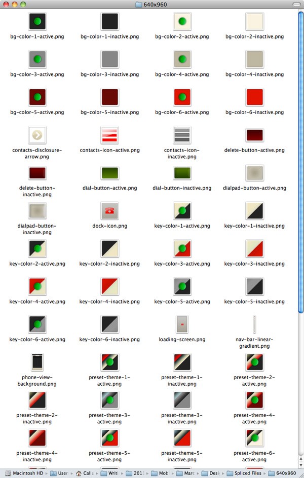
You should end up with 69 files (Retina resolution) once you've completed with the design.
Step 9
The final step is to create lower resolution versions of our images. This may sound like you have to do the work all over again, but, thanks to Photoshop's "automate" feature, we can fortunately avoid doubling our efforts.
The retina iPhone resolution is exactly double the non-retina iPhone resolution, so all we need to do is halve the physical size of our files. Duplicate all your existing images, and put them in a new folder called "320x480".
Open the first of your duplicate files in Photoshop and create a new action. When the action is recording, go to Image > Image Size. Change the settings to 50%, and then click OK. Now, save your image over your existing file (making sure it's still a PNG image) and close the document. Click the stop button on your action.
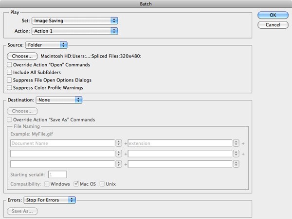
Go to File > Automate > Batch. Select your new action from the drop down menu and choose "folder" from the source drop-down menu. Select none from the destination drop-down menu (the destination has already been selected in the save command within our action). Select your "320x480" folder, and then click OK. This will halve the image size of all of your sliced images, making them ready for older versions of the iPhone. Of course, there's just one more step you need to take: remove the "@2x" from all the filenames in your "320x480" folder, and then copy the smaller resolution files back into the main "design slices" folder.
Conclusion
After completing the above steps, we now have all the graphic resources ready for use by the development team. Take a look at the attached download to match your own work against mine!
Next Time. . .
With the required graphic resources in place, the next tutorial in this series will continue to walk-through the process of building and skinning the app.

Comments