In the previous part of this tutorial, we saw how to get started with D3.js, and created dynamic scales and axes for our visualization graph using a sample dataset. In this part of the tutorial, we'll plot the graph using the sample dataset.
To get started, clone the previous tutorial source code from GitHub.
git clone https://github.com/jay3dec/PythonD3jsMashup_Part2.git
Navigate to the Google App Engine (GAE) SDK directory and start the server.
./dev_appserver.py PythonD3jsMashup_Part2/
Point your browser to http://localhost:8080/displayChart and you should be able to see the X and Y axes that we created in the previous tutorial.
Before getting started, create a new template called displayChart_3.html which will be the same as displayChart.html. Also add a route for displayChart_3.html. This is done just to keep the demo of the previous tutorial intact, since I'll be hosting it on the same URL.
class DisplayChart3(webapp2.RequestHandler):
  def get(self):
    template_data = {}
    template_path = 'Templates/displayChart_3.html'
    self.response.out.write(template.render(template_path,template_data))


application = webapp2.WSGIApplication([
    ('/chart',ShowChartPage),
    ('/displayChart',DisplayChart),
    ('/displayChart3',DisplayChart3),
    ('/', ShowHome),
], debug=True)
Creating the Visualization Graph (With Sample Data)
From our sample dataset, we have a number of count to be plotted across a set of corresponding year.
var data = [{
    "count": "202",
    "year": "1590"
}, {
    "count": "215",
    "year": "1592"
}, {
    "count": "179",
    "year": "1593"
}, {
    "count": "199",
    "year": "1594"
}, {
    "count": "134",
    "year": "1595"
}, {
    "count": "176",
    "year": "1596"
}, {
    "count": "172",
    "year": "1597"
}, {
    "count": "161",
    "year": "1598"
}, {
    "count": "199",
    "year": "1599"
}, {
    "count": "181",
    "year": "1600"
}, {
    "count": "157",
    "year": "1602"
}, {
    "count": "179",
    "year": "1603"
}, {
    "count": "150",
    "year": "1606"
}, {
    "count": "187",
    "year": "1607"
}, {
    "count": "133",
    "year": "1608"
}, {
    "count": "190",
    "year": "1609"
}, {
    "count": "175",
    "year": "1610"
}, {
    "count": "91",
    "year": "1611"
}, {
    "count": "150",
    "year": "1612"
}];
We'll represent each of the data points as circles in our visualization graph. D3.js provides API methods to create various shapes and sizes.
First, we'll use d3.selectAll to select circles inside the visualization element. If no elements are found, it will return an empty placeholder where we can append circles later.
var circles = vis.selectAll("circle");
Next, we'll bind our dataset to the circles selection.
var circles = vis.selectAll("circle").data(data);
Since our existing circle selection is empty, we'll use enter to create new circles.
circles.enter().append("svg:circle")
Next, we'll define certain properties like the distance of the circles' centers from the X (cx) and Y (cy) axes, their color, their radius, etc. For fetching cx and cy, we'll use xScale and yScale to transform the year and count data into the plotting space and draw the circle in the SVG area. Here is how the code will look:
var circles = vis.selectAll("circle").data(data);
circles.enter()
.append("svg:circle")
.attr("stroke", "black") // sets the circle border
.attr("r", 10) // sets the radius
.attr("cx", function(d) { // transforms the year data so that it
return xScale(d.year); // can be plotted in the svg space
})
.attr("cy", function(d) { // transforms the count data so that it
return yScale(d.count); // can be plotted in the svg space
})
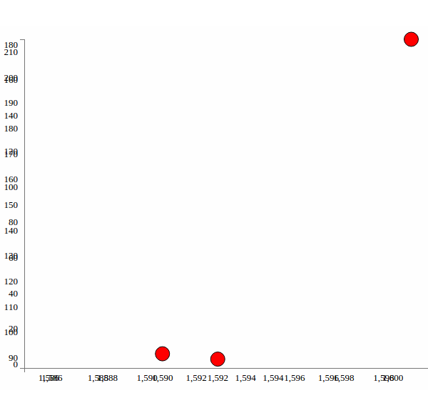
.style("fill", "red") // sets the circle color
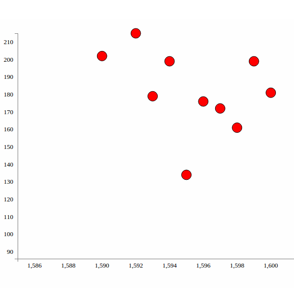
Save changes and refresh your page. You should see the image below:
Modifying Google BigQuery to extract relevant data
In the first part of this series, when we fetched data from BigQuery, we selected some 1,000 words.
SELECT word FROM [publicdata:samples.shakespeare] LIMIT 1000
We have a dataset which contains a list of all the words which appear across all of Shakespeare's work. So, to make the visualization app reveal some useful information, we'll modify our query to select the number of times a particular word, for example Caesar, appears in Shakespeare's work across different years.
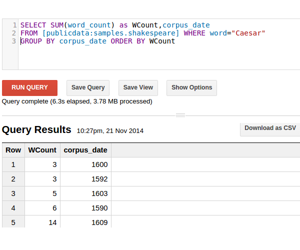
So, log into Google BigQuery and we'll have a screen like the one shown below:

After we have logged into Google BigQuery, we'll have an interface where we can compose and check our SQL queries. We want to select the number of times a particular word appears across all of Shakespeare's work.
So our basic query would look like this:
SELECT SUM(word_count) as WCount,corpus_date FROM [publicdata:samples.shakespeare] WHERE word="Caesar" GROUP BY corpus_date ORDER BY WCount
The above query gives us a result set as shown below:
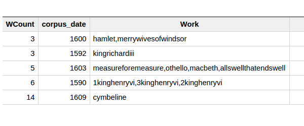
Let's also include the group of works corresponding to the Word Count. Modify the query as shown to include the corpus:
SELECT SUM(word_count) as WCount,corpus_date,group_concat(corpus) as Work FROM [publicdata:samples.shakespeare] WHERE word="Caesar" and corpus_date>0 GROUP BY corpus_date ORDER BY WCount
The resulting result set is shown below:
Plotting the Data From Google BigQuery
Next, open app.py and create a new class called GetChartData. Inside it, include the query statement we created above.
queryData = {'query':'SELECT SUM(word_count) as WCount,corpus_date,group_concat(corpus) as Work FROM '
'[publicdata:samples.shakespeare] WHERE word="God" and corpus_date>0 GROUP BY corpus_date ORDER BY WCount'}
Next, create a BigQuery service against which we'll execute our queryData.
tableData = bigquery_service.jobs()
Now, execute the queryData against the BigQuery service and print the result to the page.
dataList = tableData.query(projectId=PROJECT_NUMBER,body=queryData).execute()
self.response.out.write(dataList)
Also include a new route for GetChartData as shown.
application = webapp2.WSGIApplication([
    ('/chart',ShowChartPage),
    ('/displayChart',DisplayChart),
    ('/displayChart3',DisplayChart3),
    ('/getChartData',GetChartData),
    ('/', ShowHome),
], debug=True)
Finally update the code to the GAE platform.
./appcfg.py update PythonD3jsMashup_Part2/
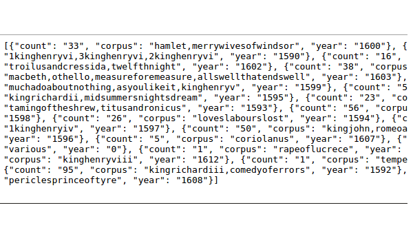
Point your browser to http://YourAppspotUrl.com/getChartData which should display the resulting data from BigQuery.
Next, we'll try to parse the data received from Google BigQuery and convert it into a JSON data object and pass it to the client side to process using D3.js.
First, we'll check if there are any rows in dataList returned. If no rows, we'll set the response as null or zero.
if 'rows' in dataList:
  # parse dataList
else:
  resp.append({'count':'0','year':'0','corpus':'0'})
Next, we'll parse the dataList by looping each row and picking up count, year and corpus and creating our required JSON object.
resp = []
if 'rows' in dataList:
  for row in dataList['rows']:
    for key,dict_list in row.iteritems():
        count = dict_list[0]
        year = dict_list[1]
        corpus = dict_list[2]
        resp.append({'count': count['v'],'year':year['v'],'corpus':corpus['v']})
else:
  resp.append({'count':'0','year':'0','corpus':'0'})
Since we'll be returning the parsed data as JSON, import the JSON library
import json
And return the created response as a JSON response.
self.response.headers['Content-Type'] = 'application/json'
self.response.out.write(json.dumps(resp))
Let's also make the search keyword dynamic, so that it can be passed as a parameter.
inputData = self.request.get("inputData")
queryData = {'query':'SELECT SUM(word_count) as WCount,corpus_date,group_concat(corpus) as Work FROM '
'[publicdata:samples.shakespeare] WHERE word="'+inputData+'" and corpus_date>0 GROUP BY corpus_date ORDER BY WCount'}
Here is how the class GetChartData finally looks:
class GetChartData(webapp2.RequestHandler):
  def get(self):
    inputData = self.request.get("inputData")
    queryData = {'query':'SELECT SUM(word_count) as WCount,corpus_date,group_concat(corpus) as Work FROM '
'[publicdata:samples.shakespeare] WHERE word="'+inputData+'" GROUP BY corpus_date ORDER BY WCount'}
    tableData = bigquery_service.jobs()
    dataList = tableData.query(projectId=PROJECT_NUMBER,body=queryData).execute()

    resp = []
    if 'rows' in dataList:
      for row in dataList['rows']:
        for key,dict_list in row.iteritems():
          count = dict_list[0]
          year = dict_list[1]
          corpus = dict_list[2]
          resp.append({'count': count['v'],'year':year['v'],'corpus':corpus['v']})
    else:
      resp.append({'count':'0','year':'0','corpus':'0'})


    self.response.headers['Content-Type'] = 'application/json'
    self.response.out.write(json.dumps(resp))
Update the app into GAE and point your browser to http://YourAppspotUrl.com/getChartData and you can see the returned JSON response.
Next, we'll create an interface to query the Google BigQuery dataset from our app dynamically. Open up Templates/displayChart_3.html and include an input box where we'll input keywords to query the dataset.
<div align="center">
    <input id="txtKeyword" type="text" class="span3" placeholder="Type something…">
</div>
Include a jQuery script in the page and on the DOM ready event, we'll query the Python method GetChartData on Enter Key press.
$(document).ready(function() {
    $("#txtKeyword").keyup(function(event) {
        if (event.keyCode == 13) {  // If enter key press
            DisplayChart();
        }
    });
    InitChart();                    // Init Chart with Axis
});
Create another function DisplayChart on the client side, inside which we'll make an Ajax call to the Python GetChartData method.
function DisplayChart() {
    var keyword = $('#txtKeyword').val();
    $.ajax({
        type: "GET",
        url: "/getChartData",
        data: {
            inputData: keyword
        },
        dataType: "json",
        success: function(response) {
            console.log(response);
        },
        error: function(xhr, errorType, exception) {
            console.log('Error occured');
        }
    });
}
Update the code to GAE and point your browser to http://YourAppspotUrl.com/displayChart3. Enter a keyword, say Caesar, and press Enter. Check your browser console and you should see the returned JSON response.
Next, let's plot the circles using the returned response. So create another JavaScript function called CreateChart. This function is similar to the InitChart function but the data would be passed as parameter. Here is how it looks:
function CreateChart(data) {
    var vis = d3.select("#visualisation"),
        WIDTH = 1000,
        HEIGHT = 500,
        MARGINS = {
            top: 20,
            right: 20,
            bottom: 20,
            left: 50
        },
        xScale = d3.scale.linear().range([MARGINS.left, WIDTH - MARGINS.right]).domain([d3.min(data, function(d) {
                return (parseInt(d.year, 10) - 5);
            }),
            d3.max(data, function(d) {
                return parseInt(d.year, 10);
            })
        ]),
        yScale = d3.scale.linear().range([HEIGHT - MARGINS.top, MARGINS.bottom]).domain([d3.min(data, function(d) {
                return (parseInt(d.count, 10) - 5);
            }),
            d3.max(data, function(d) {
                return parseInt(d.count, 10);
            })
        ]),
        xAxis = d3.svg.axis()
        .scale(xScale),

        yAxis = d3.svg.axis()
        .scale(yScale)
        .orient("left");


    vis.append("svg:g")
        .attr("class", "x axis")
        .attr("transform", "translate(0," + (HEIGHT - MARGINS.bottom) + ")")
        .call(xAxis);

    vis.append("svg:g")
        .attr("class", "y axis")
        .attr("transform", "translate(" + (MARGINS.left) + ",0)")
        .call(yAxis);


    var circles = vis.selectAll("circle").data(data);
    circles.enter()
        .append("svg:circle")
        .attr("stroke", "black")
        .attr("r", 10)
        .attr("cx", function(d) {
            return xScale(d.year);
        })
        .attr("cy", function(d) {
            return yScale(d.count);
        })
        .style("fill", "red")

}
From the InitChart function, remove the circle creation portion since it won't be required now. Here is how InitChart looks:
function InitChart() {
    var data = [{
        "count": "202",
        "year": "1590"
    }, {
        "count": "215",
        "year": "1592"
    }, {
        "count": "179",
        "year": "1593"
    }, {
        "count": "199",
        "year": "1594"
    }, {
        "count": "134",
        "year": "1595"
    }, {
        "count": "176",
        "year": "1596"
    }, {
        "count": "172",
        "year": "1597"
    }, {
        "count": "161",
        "year": "1598"
    }, {
        "count": "199",
        "year": "1599"
    }, {
        "count": "181",
        "year": "1600"
    }, {
        "count": "157",
        "year": "1602"
    }, {
        "count": "179",
        "year": "1603"
    }, {
        "count": "150",
        "year": "1606"
    }, {
        "count": "187",
        "year": "1607"
    }, {
        "count": "133",
        "year": "1608"
    }, {
        "count": "190",
        "year": "1609"
    }, {
        "count": "175",
        "year": "1610"
    }, {
        "count": "91",
        "year": "1611"
    }, {
        "count": "150",
        "year": "1612"
    }];


    var color = d3.scale.category20();
    var vis = d3.select("#visualisation"),
        WIDTH = 1000,
        HEIGHT = 500,
        MARGINS = {
            top: 20,
            right: 20,
            bottom: 20,
            left: 50
        },
        xScale = d3.scale.linear().range([MARGINS.left, WIDTH - MARGINS.right]).domain([d3.min(data, function(d) {
                return (parseInt(d.year, 10) - 5);
            }),
            d3.max(data, function(d) {
                return parseInt(d.year, 10);
            })
        ]),
        yScale = d3.scale.linear().range([HEIGHT - MARGINS.top, MARGINS.bottom]).domain([d3.min(data, function(d) {
                return (parseInt(d.count, 10) - 5);
            }),
            d3.max(data, function(d) {
                return parseInt(d.count, 10);
            })
        ]),
        xAxis = d3.svg.axis()
        .scale(xScale),

        yAxis = d3.svg.axis()
        .scale(yScale)
        .orient("left");


    vis.append("svg:g")
        .attr("class", "x axis")
        .attr("transform", "translate(0," + (HEIGHT - MARGINS.bottom) + ")")
        .call(xAxis);

    vis.append("svg:g")
        .attr("class", "y axis")
        .attr("transform", "translate(" + (MARGINS.left) + ",0)")
        .call(yAxis);
}
From now on, when we load the /displayChart3 page, circles won't be displayed. Circles will only appear once the keyword has been searched. So, on the success callback of the DisplayChart Ajax call, pass the response to the CreateChart function.
success: function(response) {
    console.log(response);
    CreateChart(response);
}
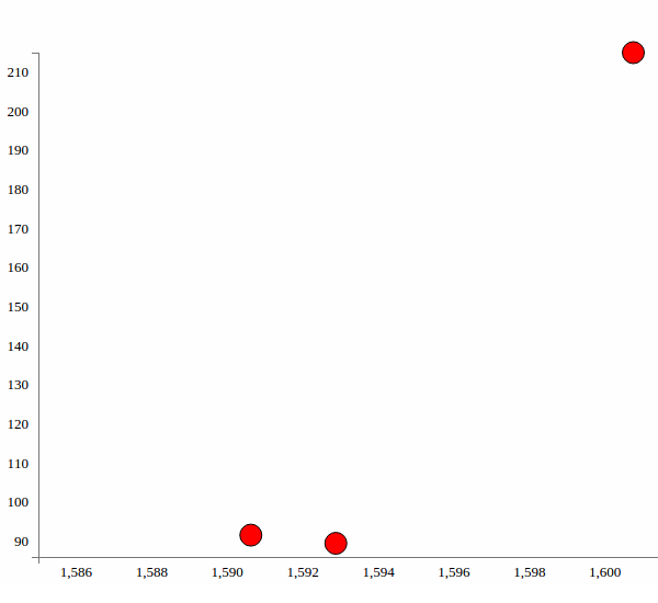
Update the code to GAE and try searching for the keyword Caesar. OK, so now we get to see the result as circles on the graph. But there is one problem: both the axes get overwritten.
So in order to avoid that we'll check inside the CreateChart function if the axes are already there or not.
var hasAxis = vis.select('.axis')[0][0];

if (!hasAxis) {

    vis.append("svg:g")
        .attr("class", "x axis")
        .attr("transform", "translate(0," + (HEIGHT - MARGINS.bottom) + ")")
        .call(xAxis);

    vis.append("svg:g")
        .attr("class", "y axis")
        .attr("transform", "translate(" + (MARGINS.left) + ",0)")
        .call(yAxis);
}
As you can see, we just checked if the SVG element has axes, and if not we create them again. Update the code to GAE and try searching again for the keyword, and you should see something like this:
Wrapping It Up
Although all looks good now, still there are a few issues which we'll address in the next part of this tutorial. We'll also introduce D3.js transitions and a few more features to our D3.js graph, and try to make it more interactive.
The source code from this tutorial is available on GitHub.

Comments