In the first part of this series, we created a Python application and deployed it to Google App Engine (GAE). From the application we connected it to a Google BigQuery dataset and fetched the data into our application. In this tutorial, we'll see how to visualize the data using the JavaScript library D3.js.
1. Getting Started With D3.js
D3.js is a JavaScript library to create data-driven documents. It uses the capabilities of HTML5, SVG and CSS3 to create interactive visualizations based on arbitrary data. It also makes use of different transformations to make the display visually more appealing.
From the D3.js official site:
D3.js is a JavaScript library for manipulating documents based on data. D3 helps you bring data to life using HTML, SVG and CSS. D3’s emphasis on web standards gives you the full capabilities of modern browsers without tying yourself to a proprietary framework, combining powerful visualization components and a data-driven approach to DOM manipulation.
To get started with D3.js, download and include D3.js, or you can directly link to the latest release.
<script src="http://d3js.org/d3.v3.min.js" charset="utf-8"></script>
Now we are all set for creating our graph using D3.js.
2. Creating the X and Y Axes
First, clone the previous tutorial source code from GitHub.
git clone https://github.com/jay3dec/PythonD3jsMashup_Part1.git
We'll create a new page to display our chart. Let's name it displayChart.html. So navigate to PythonD3jsMashup_Part1/Templates/ and create a new page called displayChart.html. Add the following HTML code to it:
<!DOCTYPE html>
<html lang="en">

<head>
    <meta http-equiv="Content-Type" content="text/html; charset=UTF-8">

    <link rel="icon" href="http://getbootstrap.com/favicon.ico">

    <link href="http://getbootstrap.com/dist/css/bootstrap.min.css" rel="stylesheet">

    <link href="http://getbootstrap.com/examples/justified-nav/justified-nav.css" rel="stylesheet">

     <script type="text/javascript" src="js/d3.js"></script>


</head>

<body>

    <div class="container">

        <div class="jumbotron">
            <h1>Chart Will be Here!!</h1>
        </div>


        <div class="footer">
            <p>© Company 2014</p>
        </div>

    </div>

</body>

</html>
Navigate to the PythonD3jsMashup_Part1 directory and open up app.py. Now we need to include a route for the newly-added page displayChart.html. Below is a part of the app.py where existing routes are declared for the app.
application = webapp2.WSGIApplication([
    ('/chart',ShowChartPage),
    ('/', ShowHome),
], debug=True)
Similarly, we'll include one more route called /displayChart and set it to the DisplayChart class that we declare next. Here is the newly added route:
application = webapp2.WSGIApplication([
    ('/chart',ShowChartPage),
    ('/displayChart',DisplayChart),
    ('/', ShowHome),
], debug=True)
Now, let's create a class handler for /displayChart to render the template page. We'll use the template.render function to display the template page. Here is the newly-added class handler to display displayChart.html.
class DisplayChart(webapp2.RequestHandler):
    def get(self):
        template_data = {}
        template_path = 'Templates/displayChart.html'
        self.response.out.write(template.render(template_path,template_data))
Save everything and restart the server.
dev_appserver.py PythonD3jsMashup_Part1/
Point your browser to http://localhost:8080/displayChart and you should see the newly-added page template.

Scalable Vector Graphics (SVG) is an XML-based image format for drawing 2D graphics with support for interactivity and animation. We'll be using an SVG element, onto which we'll draw our graph. So, let's first create an SVG element.
<div id="D3line" class="jumbotron">

    <h1>Chart Will be Here!!</h1>

    <svg id="visualisation" width="1000" height="500"></svg>

</div>
Now, let's create a JavaScript function called InitChart to initialize the chart. Include the script at the end of the page.
Before getting started, let's assume a certain set of data as shown. Later, we'll replace the sample data with the data from the Google BigQuery data set.
var data = [{
    "count": "202",
    "year": "1590"
}, {
    "count": "215",
    "year": "1592"
}, {
    "count": "179",
    "year": "1593"
}, {
    "count": "199",
    "year": "1594"
}, {
    "count": "134",
    "year": "1595"
}, {
    "count": "176",
    "year": "1596"
}, {
    "count": "172",
    "year": "1597"
}, {
    "count": "161",
    "year": "1598"
}, {
    "count": "199",
    "year": "1599"
}, {
    "count": "181",
    "year": "1600"
}, {
    "count": "157",
    "year": "1602"
}, {
    "count": "179",
    "year": "1603"
}, {
    "count": "150",
    "year": "1606"
}, {
    "count": "187",
    "year": "1607"
}, {
    "count": "133",
    "year": "1608"
}, {
    "count": "190",
    "year": "1609"
}, {
    "count": "175",
    "year": "1610"
}, {
    "count": "91",
    "year": "1611"
}, {
    "count": "150",
    "year": "1612"
}];
First, we'll define a few constants related to the graph, such as its width, height, and margin from left, right, top and bottom, which we'll use while creating the graph. So, let's select the SVG element using d3.select and define our constants.
var vis = d3.select("#visualisation"),
    WIDTH = 1000,
    HEIGHT = 500,
    MARGINS = {
        top: 20,
        right: 20,
        bottom: 20,
        left: 50
    };
In order to plot our data, we'll need to define scales across the X axis and Y axis such that when data comes dynamically, the scales adjust accordingly. D3.js provides a number of APIs to make things easier. One such API is d3.scale.linear, which we'll use to create our scale based on the maximum and minimum data values.
That being said, we have two new terms called Range and Domain. Range represents the area we have to display the visualization and Domain represents the maximum and minimum values of data that we'll visualize on the svg area.
Now, we'll create our scales using d3.scale.linear and define the range and domain for the created scales.
xScale = d3.scale.linear().range(MARGINS.left, WIDTH - MARGINS.right).domain([1590,1612]);
As you can see, we have defined the range from 20 to 980 so that it doesn't collide with the graph edges. In the domain, we have set the minimum and maximum values as per the sample data.
Similarly, we'll define the scale for the Y axis too.
yScale = d3.scale.linear().range(HEIGHT - MARGINS.top, MARGINS.bottom).domain([91,215]);
Since the scales are ready, we'll move towards creating the axes. D3.js provides an API called d3.svg.axis to do this. So, we'll use the API to create the axes and set the above created scales to them.
xAxis = d3.svg.axis()
    .scale(xScale),

yAxis = d3.svg.axis()
    .scale(yScale);
With our scales and axes created, we are all set to draw them on the svg. For that we need a container, so let's create one.
vis.append("svg:g")
Now, we'll set the xAxis that we created above to the svg container as shown below:
vis.append("svg:g")
    .call(xAxis);
Similarly, for the yAxis:
vis.append("svg:g")
    .call(yAxis);
Here is the InitChart function that we just created.
function InitChart() {
    var data = [{
        "count": "202",
        "year": "1590"
    }, {
        "count": "215",
        "year": "1592"
    }, {
        "count": "179",
        "year": "1593"
    }, {
        "count": "199",
        "year": "1594"
    }, {
        "count": "134",
        "year": "1595"
    }, {
        "count": "176",
        "year": "1596"
    }, {
        "count": "172",
        "year": "1597"
    }, {
        "count": "161",
        "year": "1598"
    }, {
        "count": "199",
        "year": "1599"
    }, {
        "count": "181",
        "year": "1600"
    }, {
        "count": "157",
        "year": "1602"
    }, {
        "count": "179",
        "year": "1603"
    }, {
        "count": "150",
        "year": "1606"
    }, {
        "count": "187",
        "year": "1607"
    }, {
        "count": "133",
        "year": "1608"
    }, {
        "count": "190",
        "year": "1609"
    }, {
        "count": "175",
        "year": "1610"
    }, {
        "count": "91",
        "year": "1611"
    }, {
        "count": "150",
        "year": "1612"
    }];


    var vis = d3.select("#visualisation"),
        WIDTH = 1000,
        HEIGHT = 500,
        MARGINS = {
            top: 20,
            right: 20,
            bottom: 20,
            left: 50
        },

        xScale = d3.scale.linear().range([MARGINS.left, WIDTH - MARGINS.right]).domain([1590, 1612]),

        yScale = d3.scale.linear().range([HEIGHT - MARGINS.top, MARGINS.bottom]).domain([91, 215]),

        xAxis = d3.svg.axis()
        .scale(xScale),

        yAxis = d3.svg.axis()
        .scale(yScale);


    vis.append("svg:g")
        .call(xAxis);

    vis.append("svg:g")
        .call(yAxis);
}
Save all the changes and call the function on page load. Restart the server and point your browser to http://localhost:8080/displayChart, and you should be able to see the below screen.
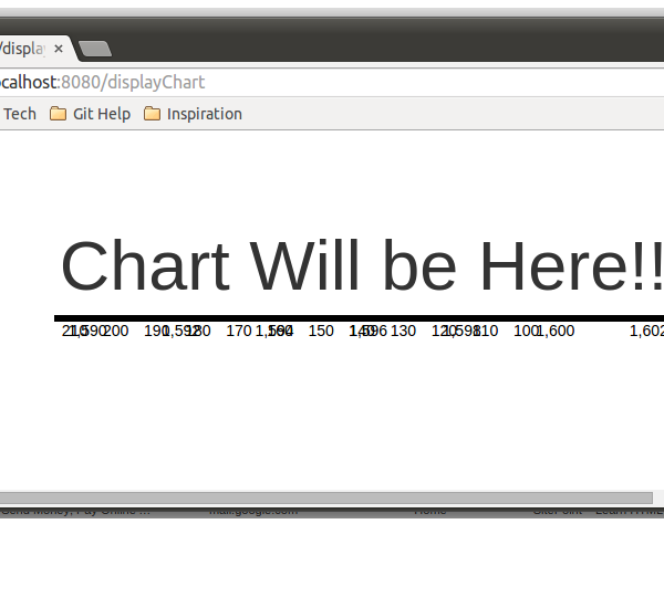
If you take a look at the above screen, it looks like a mess. Our two axes are there, but they seem to be overlapping each other. Let's get that corrected first.
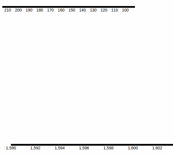
In order to separate both the overlapping axes, what we'll do is move the X axis downwards. We'll use a property called transform to move the X axis down. There are different types of transforms that are available. We'll use the translate specific transformation to move it downwards. Using translate transform we can move the axes based on coordinates. While using translate, we need to specify the X and Y coordinates to which the axis needs to be moved. Since we want the X axis to move downwards, we specify only the Y coordinate and leave the X coordinate at 0. Here is how it looks like after adding the transform attribute.
vis.append("svg:g")
    .attr("transform", "translate(0," + (HEIGHT - MARGINS.bottom) + ")")
    .call(xAxis);
Save the changes and restart the server. Point your browser to http://localhost:8080/displayChart and you should see the below screen.
Next, we need to change the orientation of the Y axis. We can specify the axis orientation using orient. So modify the yAxis as shown below to change its orientation.
yAxis = d3.svg.axis()
    .scale(yScale)
    .orient("left");
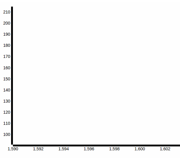
Now if you refresh the page you won't be able to see the Y Axis. It's because the orientation of the Y axis has been changed and it has gone outside the view to the extreme left. To change that we'll apply transform to the Y axis as shown.
vis.append("svg:g")
    .attr("transform", "translate(" + (MARGINS.left) + ",0)")
    .call(yAxis);
As you can see from the above code, we simply moved the Y axis along the X coordinate (20 from the left) to bring it into the picture. Save the changes and refresh the page and you should see the below screen.
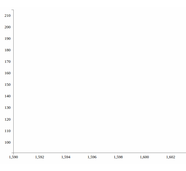
So here we have our X axis and Y axis, although they look a bit ugly. Let's apply some styles and make them look good. Include the following CSS styles:
.axis path {
fill:none;
stroke:#777;
shape-rendering:crispEdges;
}

.axis text {
font-family:Lato;
font-size:13px;
}
Add the following CSS styles to the axes using the CSS attribute property.
vis.append("svg:g")
    .attr("class", "x axis")
    .attr("transform", "translate(0," + (HEIGHT - MARGINS.bottom) + ")")
    .call(xAxis);

vis.append("svg:g")
    .attr("class", "y axis")
    .attr("transform", "translate(" + (MARGINS.left) + ",0)")
    .call(yAxis);
Refresh the page and you should see the below screen:
3. Scaling the X and Y Axes Dynamically
Until now, we hard-coded the minimum and maximum values for the domain, which makes it static and useless when data gets dynamic. So, we need to change it and make it dynamic so that the graph scales dynamically.
D3.js provides functions called d3.min and d3.max to get the minimum and maximum values from an array. We can use these functions to get the maximum and minimum values for our domain, based on the sample dataset. Suppose we have an array called data. Using d3.min we can get the minimum value.
d3.min(data, function(d) {
    return d.value;
})
Similarly, to get the maximum value:
d3.max(data, function(d) {
    return d.value;
})
Now we modify the xScale and yScale to make the domain values dynamic.
xScale = d3.scale.linear().range([MARGINS.left, WIDTH - MARGINS.right]).domain([d3.min(data, function(d) {
        return (parseInt(d.year) - 5);
    }),
    d3.max(data, function(d) {
        return parseInt(d.year, 10);
    })
]);


yScale = d3.scale.linear().range([HEIGHT - MARGINS.top, MARGINS.bottom]).domain([d3.min(data, function(d) {
        return (parseInt(d.count) - 5);
    }),
    d3.max(data, function(d) {
        return parseInt(d.count, 10);
    })
]);
Wrapping It Up
In this tutorial, we saw how to get started with the JavaScript visualization library D3.js to make our visualization app. We created the axes for our graph and also made it dynamic so that it scales with the data accordingly.
In the next part of this series, we'll use the actual data fetched from Google BigQuery to scale the graph axes and also get started with plotting the data on the graph.
Code from this tutorial is available on GitHub.

Comments