Introduction
In this tutorial, I will talk again about Material Design. Google I/O 2015 was an important event for every Android developer and design was of course part of the discussion.
Google has realized that backward compatibility is the trickiest part of the material design implementation. Sure, support libraries, such as appcompat-v4 and appcompat-v7, are part
of the solution. However, Theme.AppCompat doesn’t implement every material item
used in Google’s official applications. One of the features that is not
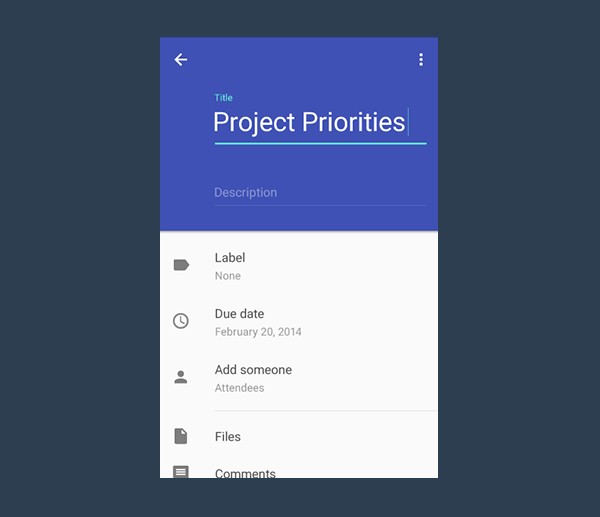
present in the AppCompat theme is the possibility to position a floating label on
top of an EditText widget. You can see what I mean in the below example.
During
Google I/O 2015, the Android team released a brand new support library, the Design
Support Library. It comes in very handy for this kind of problem. This tutorial
will show you how to use the new TextInputLayout widget that's included in the Design Support Library.
1. Implementing TextInputLayout
Step 1: Create a New Project
In Android Studio, choose New > New project from the File menu. Enter the required information to configure the project and create the project. In my
example, I targeted the project to API 7, which is the minimum API level supported by the Design Support Library. By targeting such a low API level,
your app will run on almost every Android device. I've named the main activity LoginActivity and its layout file activity_login.xml.
After setting up the project, remove in the main activity the onCreateOptionsMenu and onOptionsItemSelected method that are automatically generated by Android Studio. The login screen we're about to create doesn’t need a menu so it's fine to delete these methods. Remember also to delete the XML menu file that lives in the res/menu folder.
Step 2: Import the Support Libraries
To
use the TextInputLayout widget, you have to import two libraries. The first one is
appcompat-v7, which ensures that the material styles are backward compatible. The second one is the Design Support Library.
In your project's build.gradle file, add the following lines in the project's dependencies:
dependencies {
    compile fileTree(dir: 'libs', include: ['*.jar'])

    compile 'com.android.support:design:22.2.0'
    compile 'com.android.support:appcompat-v7:22.2.0'
}
If Gradle doesn’t automatically ask you to synchronize your project, choose Make module 'app' from the Build menu or press F9. By doing so, the Android Studio build system will automatically fetch the necessary resources and you will be able to import any required classes.
Step 3: Design the User Interface
The user interface of this project is very simple. It shows a welcome label (which can be easily replaced by a logo if you have one) and two EditText elements, one
for the username and one for the password. The layout also includes a button that triggers the login sequence. The background color is a nice, flat, light grey.
Another important detail worth remembering is the correct setting of the inputType attribute of the EditText elements. The inputType of the first EditText element should be set to textEmail while that of the second one should be set to textPassword. This is what the layout should look like.
<LinearLayout xmlns:android="http://schemas.android.com/apk/res/android"
    xmlns:tools="http://schemas.android.com/tools"
    android:background="#e3e3e3"
    android:layout_width="match_parent"
    android:layout_height="match_parent"
    android:padding="@dimen/activity_horizontal_margin"
    tools:context=".LoginActivity"
    android:orientation="vertical">

    <RelativeLayout
        android:layout_width="match_parent"
        android:layout_height="wrap_content"
        android:layout_weight="0.5"
        android:orientation="vertical">

        <TextView
            android:layout_width="match_parent"
            android:layout_height="wrap_content"
            android:layout_centerInParent="true"
            android:gravity="center"
            android:text="Welcome"
            android:textSize="30sp"
            android:textColor="#333333"/>

    </RelativeLayout>


    <LinearLayout
        android:layout_width="match_parent"
        android:layout_height="wrap_content"
        android:layout_weight="0.5"
        android:orientation="vertical">

        <EditText
            android:id="@+id/username"
            android:layout_width="match_parent"
            android:layout_height="wrap_content"
            android:inputType="textEmailAddress"/>

        <EditText
                android:id="@+id/password"
                android:layout_width="match_parent"
                android:layout_height="wrap_content"
                android:inputType="textPassword"/>

        <Button
            android:id="@+id/btn"
            android:layout_marginTop="4dp"
            android:layout_width="match_parent"
            android:layout_height="wrap_content"
            android:text="Login"/>

    </LinearLayout>

</LinearLayout>
You may also want to get rid of the app bar, previously known as the action bar, by editing the style.xml file as shown below.
<style name="AppTheme" parent="Theme.AppCompat.Light.NoActionBar">
</style>
Step 4: Using TextInputLayout
We have finally
arrived at the most interesting part of this tutorial. A TextInputLayout widget behaves
exactly as a LinearLayout does, it’s just a wrapper. TextInputLayout only accepts
one child element, similar to a ScrollView. The child element needs to be an EditText element.
<android.support.design.widget.TextInputLayout
    android:id="@+id/usernameWrapper"
    android:layout_width="match_parent"
    android:layout_height="wrap_content">

    <EditText
        android:id="@+id/username"
        android:layout_width="match_parent"
        android:layout_height="wrap_content"
        android:inputType="textEmailAddress"
        android:hint="Username"/>

</android.support.design.widget.TextInputLayout>
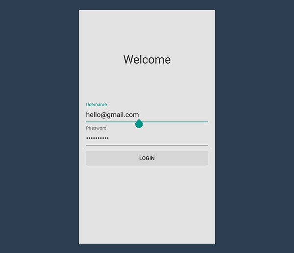
Note that I
specified another parameter in the EditText item, a hint. As you already know,
this attribute allows you to show a custom hint when there’s no content in the
EditText. Once the user starts typing, the hint disappears. This isn't great, because they lose context of the information they are entering.
Thanks to
TextInputLayout, this won’t be a problem anymore. While the EditText alone will
hide the hint after the first character is typed, when wrapped in a
TextInputLayout the hint will become a floating label above the EditText. A nice material animation is included too.
Next, let's do the same for the password field.
<android.support.design.widget.TextInputLayout
    android:id="@+id/passwordWrapper"
    android:layout_width="match_parent"
    android:layout_height="wrap_content"
    android:layout_below="@id/usernameWrapper"
    android:layout_marginTop="4dp">

    <EditText
        android:id="@+id/password"
        android:layout_width="match_parent"
        android:layout_height="wrap_content"
        android:inputType="textPassword"
        android:hint="Password"/>

</android.support.design.widget.TextInputLayout>
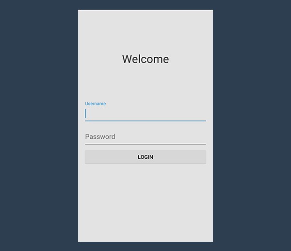
If you run
the application now, nothing will happen. Sure, the EditText hint attribute
will behave as expected. However, there's no material animation and no floating labels. Why is that? We're still missing some code to make everything work.
Step 5: Setting Hints
Below the setContentView method, initialize the references to the
TextInputLayout views.
final TextInputLayout usernameWrapper = (TextInputLayout) findViewById(R.id.usernameWrapper);
final TextInputLayout passwordWrapper = (TextInputLayout) findViewById(R.id.passwordWrapper);
To
animate the floating label, you just need to set a hint, using the setHint
method.
usernameWrapper.setHint("Username");
passwordWrapper.setHint("Password");
And you’re done. Your login screen now properly follows the material design guidelines. Run the application to see your beautiful login screen.
2. Handling Errors
Another
nice feature of TextInputLayout is the way it can handle errors. By validating the input, you prevent users from misspelling their email address or
entering a password that is too short.
With input validation, incorrect credentials would be processed by the backend, errors would be generated and sent to the client, and shown to the (waiting) user. A
considerable loss of time and a poor user experience. You should check the user's input before sending it to the backend.
Step 1: Implementing the onClick Method
You first have to handle the button click. There are plenty of ways to
handle button clicks. One of them is by writing a custom method and specifying it in
your XML file via the onClick attribute. I prefer setOnClickListener, but it’s
really just a matter of personal taste.
btn.setOnClickListener(new View.OnClickListener() {
    @Override
    public void onClick(View v) {
        // STUB
    }
});
We know
that if this method is called, the user doesn’t need the keyboard anymore.
Unfortunately, Android doesn't hide the virtual keyboard automatically, unless
you tell it to. Call hideKeyboard in the onClick method body.
private void hideKeyboard() {
    View view = getCurrentFocus();
    if (view != null) {
        ((InputMethodManager) getSystemService(Context.INPUT_METHOD_SERVICE)).
            hideSoftInputFromWindow(view.getWindowToken(), InputMethodManager.HIDE_NOT_ALWAYS);
    }
}
Step 2: Validating Input
Before setting the error labels, we need to define what's an error and what isn't. We're assuming that the username must be an email address and we want to prevent users from entering an invalid email address.
Validating an email address is a little bit complex. We have to rely on regular expressions. You can use the Apache Commons library too if you wish.
I've written the following regular expression, using the guidelines suggested by Wikipedia about email validity.
/^[a-zA-Z0-9#_~!$&'()*+,;=:."(),:;<>@\[\]\\]+@[a-zA-Z0-9-]+(\.[a-zA-Z0-9-]+)*$/
The meaning
of this regular expression is quite simple. It's comprised of three capturing groups. The first one matches the letters of the alphabet (upper and lower case), numbers, and a series
of accepted symbols. Because of the + quantifier, this group matches a string
that’s composed of at least one character.
Next, there’s the @ symbol, which is of course required in every email address. The second group accepts only letters, numbers, and hyphens. The length also needs to be at least one (]+).
Finally, there's the last group, which contains a dot and whose purpose is matching subdomains and the TLD. Its quantifier is a star, *, which means that this
group looks for a string whose length can be zero or more. In fact, email addresses with a domain, but no TLD, are actually valid.
Since we
want to validate a String, we have to rely on
Pattern and Matcher classes, included in the java.util.regex package. Import
these classes in your activity and then implement the following method:
private static final String EMAIL_PATTERN = "^[a-zA-Z0-9#_~!$&'()*+,;=:.\"(),:;<>@\\[\\]\\\\]+@[a-zA-Z0-9-]+(\\.[a-zA-Z0-9-]+)*$";
private Pattern pattern = Pattern.compile(EMAIL_PATTERN);
private Matcher matcher;

public boolean validateEmail(String email) {
    matcher = pattern.matcher(email);
    return matcher.matches();
}
The validation of the password field is much simpler. Most organizations implement different policies for password validity, but everyone imposes a minimum length. A reasonable rule of thumb is that the password should never be shorter than six characters.
public boolean validatePassword(String password) {
    return password.length() > 5;
}
Step 3: Retrieving Data
As I said, TextInputLayout
is just a wrapper, but unlike LinearLayout and ScrollView, you can get its child
element using a specific method, getEditText. There's no need to use findViewById.
If TextInputLayout doesn't contain an EditText, getEditText returns null so be careful of a NullPointException.
public void onClick(View v) {
    hideKeyboard();

    String username = usernameWrapper.getEditText().getText().toString();
    String password = usernameWrapper.getEditText().getText().toString();

    // TODO: Checks

    // TODO: Login
}
Step 4: Showing Errors
TextInputLayout error handling is easy and fast. The required methods are setErrorEnabled and setError.
setError
sets a red error message that will be displayed below the EditText. If the parameter
passed is null, the error message is cleared. It also changes the color of the
whole EditText widget to red.
setErrorEnabled enables the error
functionality. This directly affects the size of the layout, increasing the
lower padding to make room for the error label. Enabling this functionality
before setting an error message via setError means that this layout will
not change size when an error is displayed. You should do some tests combining these two methods so that you actually see what I am talking about.
Another
interesting fact is that if the error functionality has not been enabled yet
and you call setError passing a non-null parameter, then setErrorEnabled(true)
will be automatically called.
Now that we
have defined what’s right and what’s wrong, and we know how to retrieve
data and display possible errors, the implementation of the onClick method becomes
trivial.
public void onClick(View v) {
    hideKeyboard();

    String username = usernameWrapper.getEditText().getText().toString();
    String password = usernameWrapper.getEditText().getText().toString();
    if (!validateEmail(username)) {
        usernameWrapper.setError("Not a valid email address!");
    } else if (!validatePassword(password)) {
        passwordWrapper.setError("Not a valid password!");
    } else {
        usernameWrapper.setErrorEnabled(false);
        passwordWrapper.setErrorEnabled(false);
        doLogin();
    }
}
I've added a doLogin method, but it's currently empty since this is beyond the scope of this tutorial.
public void doLogin() {
    Toast.makeText(getApplicationContext(), "OK! I'm performing login.", Toast.LENGTH_SHORT).show();
    // TODO: login procedure; not within the scope of this tutorial.
}
3. Styling
You might
want to do one last thing, changing the color of the TextInputLayout widget. By
default, the AppCompact theme sets it to green, but quite often this color conflicts
with your color palette.
Google wrote the Design Support Library very well. Every
widget’s color is drawn directly from the theme’s colors, specified in your
style.xml file. Just open it and add the colorAccent item to your active theme to change the form's color scheme.
<style name="AppTheme" parent="Theme.AppCompat.Light.NoActionBar">
    <item name="colorAccent">#3498db</item>
</style>
Conclusion
In this tutorial, we saw how to implement the new layout item TextInputLayout, thanks to the just introduced Design Support Library.
The design paradigm that this widget implements allows users to never never lose context of the information they are entering and it was actually introduced by Google last year, along with Material Design.
At that time, there was no support library giving developers the possibility to put this widget into action in their projects, until Google I/O 2015. Now, if your application expects some sort of data input, you will finally be truly material design compliant.

Comments