In this series, you'll learn how to use React Native to create page layouts commonly used in mobile apps. The layouts you'll be creating won't be functional—instead, the main focus of this series is to get your hands dirty in laying out content in your React Native apps.
If you're new to laying out React Native apps or styling in general, check out my previous tutorial:

To follow along with this series, I challenge you to try recreating each screen by yourself first, before you read my step-by-step instructions in the tutorial. You won't really benefit much from this tutorial just by reading it! Try first before looking up the answers here. If you succeed in making it look like the original screen, compare your implementation to mine. Then decide for yourself which one is better!
In this second part of the series, you'll create the following calendar page:
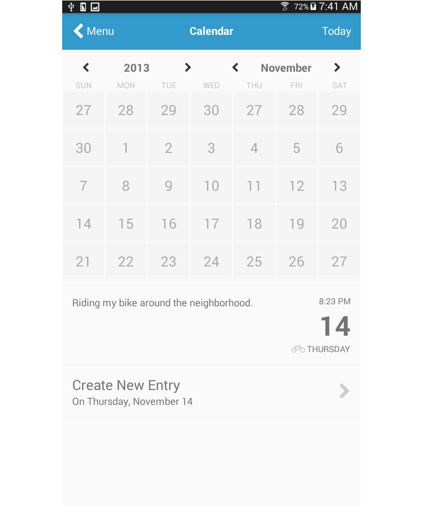
Calendar apps are used to track events and appointments added by the user. You'll find different variations in the wild, but most of them will have the same elements as a physical calendar would: the current month and year, the days in the month, and the events or appointments added by the user.
Here are a couple of examples of this type of layout:

Project Setup
The first step, of course, is to set up a new React Native project:
react-native init react-native-common-screens
Once the project is set up, open the index.android.js file and replace the default code with the following:
import React, { Component } from 'react';
import {
  AppRegistry
} from 'react-native';

import Calendar from './src/pages/Calendar';

export default class ReactNativeCommonScreens extends Component {

  render() {
    return (
      <Calendar />
    );
  }

}

AppRegistry.registerComponent('ReactNativeCommonScreens', () => ReactNativeCommonScreens);
Create a src/pages folder and create a Calendar.js file inside it.
You'll also need the react-native-vector-icons package. This is specifically used for the navigation icons as well as other icons that will be needed in the page.
npm install --save react-native-vector-icons
Open the android/app/build.gradle file and add a reference to the package:
dependencies {
    //rest of the dependencies are here at the top
    compile project(':react-native-vector-icons') //add this
}
Do the same with the android/settings.gradle file by adding the following at the bottom:
include ':react-native-vector-icons'
project(':react-native-vector-icons').projectDir = new File(rootProject.projectDir, '../node_modules/react-native-vector-icons/android')
Open android/app/src/main/java/com/react-native-common-screens/MainApplication.java and import the package:
import java.util.Arrays;
import java.util.List;

import com.oblador.vectoricons.VectorIconsPackage; //add this
Lastly, initialize the package:
@Override
protected List<ReactPackage> getPackages() {
  return Arrays.<ReactPackage>asList(
      new MainReactPackage(),
      new VectorIconsPackage() //add this
  );
}
Creating the Calendar Page
Okay, now that you've tried to code the layout yourself (no cheating, right?), I'll show you how I built my implementation.
At first, I thought this would be the most difficult one to implement, but trust me, it's really not that complicated as long as you already know the basics. There are a couple of opportunities here to use JavaScript code to help with rendering.
Start by including all the components and packages that you'll need:
import React, { Component } from 'react';

import {
  StyleSheet,
  Text,
  View,
  ScrollView
} from 'react-native';

import Icon from 'react-native-vector-icons/FontAwesome';
import { range } from 'lodash';
import Button from '../components/Button';
This time there's a new package which you haven't installed yet, and that is lodash. You won't really need the whole lodash library, just the range function. This is used for generating an array of numbers based on a specific range. You can install just this function by executing npm install --save lodash.range on your terminal.
Add the boilerplate code for creating pages:
export default class Calendar extends Component {
    render() {
    	return (
			<ScrollView style={styles.container}>
			    ...
			</ScrollView>
		);
	}
}

const styles = StyleSheet.create({
	container: {
		flex: 1
	}
});
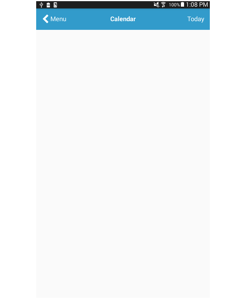
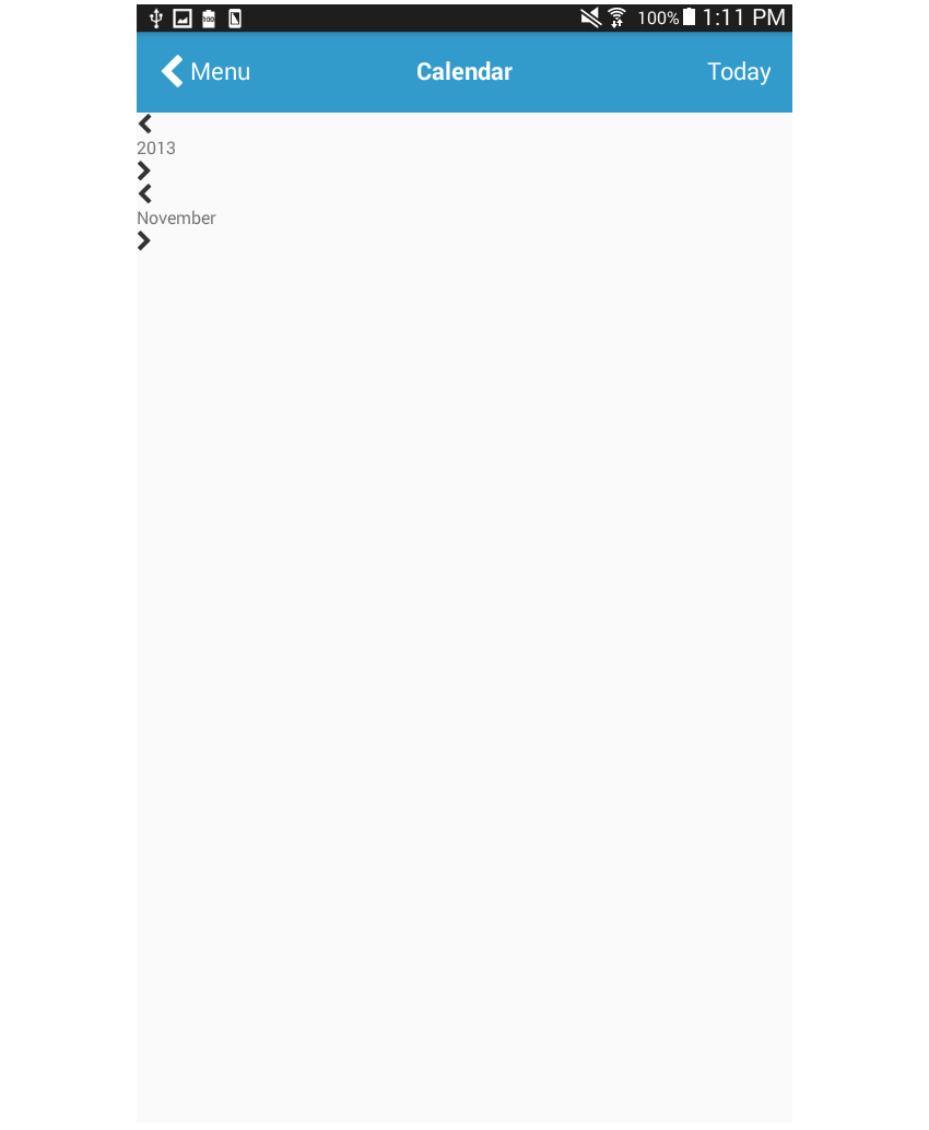
The header has three elements in it: the button for going back to the previous page, the title of the current page, and the text showing a human-friendly representation of the currently selected date.
<View style={styles.header}>
    <Button
		noDefaultStyles={true}
		onPress={this.press.bind(this)}
		styles={{button: styles.header_item}}
	>
        <View style={styles.header_button}>
        	<Icon name="chevron-left" size={30} color="#FFF" />
        	<Text style={[styles.header_text]}> Menu</Text>
        </View>
    </Button>
    <View style={styles.header_item}>
    	<Text style={[styles.header_text, styles.text_center, styles.bold_text]}>Calendar</Text>
    </View>
	<View style={styles.header_item}>
    	<Text style={[styles.header_text, styles.text_right]}>Today</Text>
    </View>
</View>
header has a flexDirection of row so that each header_item is stacked horizontally. The same flex value is assigned to each of them so they consume equal amounts of space. text_center and text_right are used to align the text inside of those header_items to the center and right. This is done because by default they're aligned on the left-most side of their container.
header: {
    backgroundColor: '#329BCB',
	flexDirection: 'row',
	padding: 20
},
header_item: {
	flex: 1
},
header_button: {
	flexDirection: 'row'
},
text_center: {
	textAlign: 'center'
},
text_right: {
	textAlign: 'right'
},
header_text: {
	color: '#fff',
	fontSize: 20
},
bold_text: {
	fontWeight: 'bold'
},
Once the styles have been added, it should now look like this:
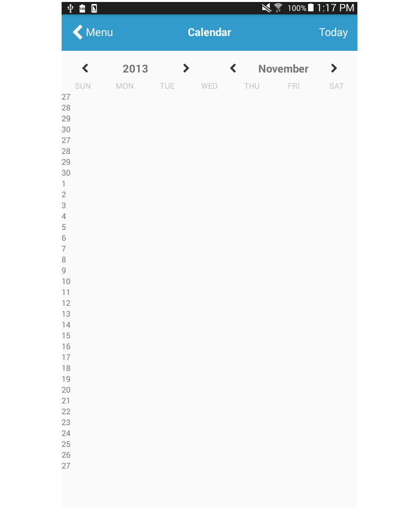
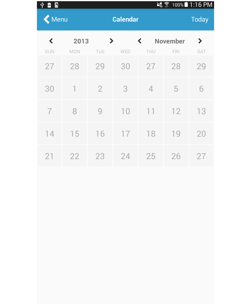
Next is the actual calendar, which is divided into three parts: the header, the days of the week, and the calendar days:
<View>
    <View style={styles.calendar_header}>
        ...
    </View>
    <View style={styles.calendar_weekdays}>
        ...
    </View>
    <View style={styles.calendar_days}>
        ...
    </View>
</View>
The calendar header allows the user to change the year and month.
There are at least two ways this can be implemented. The first method is to treat each element as a single item and apply justifyContent: 'space-between' to its container. The second method is to group all the elements that have to do with the year and group those that have to do with the month.
The second method is the one that's applied below. Semantically speaking, this makes much more sense because the button for navigating back a year, the year itself, and the button for navigating forward are all related, so you can treat them as a single thing by putting them in the same container. The same is true with the month controls.
<View style={styles.calendar_header}>
    <View style={styles.calendar_header_item}>
        <Button
    		noDefaultStyles={true}
    		onPress={this.press.bind(this)}
    	>
            <Icon name="chevron-left" size={18} color="#333" />
        </Button>
    	<Text style={styles.calendar_header_text}>2013</Text>
    	<Button
    		noDefaultStyles={true}
    		onPress={this.press.bind(this)}
    	>
            <Icon name="chevron-right" size={18} color="#333" />
        </Button>
    </View>

    <View style={styles.calendar_header_item}>
    	<Button
    		noDefaultStyles={true}
    		onPress={this.press.bind(this)}
    	>
            <Icon name="chevron-left" size={18} color="#333" />
        </Button>
    	<Text style={styles.calendar_header_text}>November</Text>
    	<Button
    		noDefaultStyles={true}
    		onPress={this.press.bind(this)}
    	>
            <Icon name="chevron-right" size={18} color="#333" />
        </Button>
    </View>
</View>
From there, you can apply the same technique to those two groups of components in the same line. To add spaces between the two buttons (back and forward) and the label, we use justifyContent: 'space-between'. We use alignItems: 'center' to nudge all the elements inside it towards the center. Finally, we add left and right padding to add more space between the two groups.
calendar_header: {
    flexDirection: 'row'
},
calendar_header_item: {
	flex: 1,
	flexDirection: 'row',
	justifyContent: 'space-between',
	alignItems: 'center',
	paddingTop: 20,
	paddingRight: 40,
	paddingLeft: 40
},
calendar_header_text: {
	fontWeight: 'bold',
	fontSize: 20
},

Next are the weekdays. We use a function to render these because it's best to use some JavaScript code to render all the elements.
<View style={styles.calendar_weekdays}>
    { this.renderWeekDays() }
</View>
So instead of having seven View or Text components rendering each day of the week, you can just have an array containing the days of the week. You can then iterate through those days using the Array.map() function. For each iteration, render a Text component that shows the day.
renderWeekDays() {
    let weekdays = ['sun', 'mon', 'tue', 'wed', 'thu', 'fri', 'sat'];
	return weekdays.map((day) => {
		return (
			<Text key={day} style={styles.calendar_weekdays_text}>{day.toUpperCase()}</Text>
		);
	});
}
Note that in the code above, the toUpperCase() function is used to convert all the letters of each day to uppercase. React Native doesn't come with the text-transform CSS property, so this is the only way to achieve uppercase letters aside from manually using uppercase strings.

Here's the styling for the calendar header:
calendar_weekdays_text: {
    flex: 1,
	color: '#C0C0C0',
	textAlign: 'center'
},

The calendar days also uses a function for rendering the days:
<View style={styles.calendar_days}>
    { this.renderWeeks() }
</View>
The renderWeeks() function uses the range() function in lodash to generate an array containing the days from the last month and the days of the current month. Those two arrays are then merged together.
However, you can't directly use the resulting array as the data source for the calendar days. That's because if you simply loop through the items and output a Text component for each day, there won't be any distinction between each week. You already know that to make each calendar day inline, you need to apply flexDirection: 'row' to its container. So applying it to a single container would result in having all the calendar days placed in a single line.
This means you need to have a separate container for each week. The question is how. Again, there are at least two ways to accomplish this.
The first method is to have a variable store how many days are currently outputted and then add a conditional statement that will render an opening <View> every time the variable contains 0 and a closing </View> every time it's 7. Once it's 7, reset it back to 0. This is the most straightforward method.
But I'll use a different method here. Below, the getWeeksArray() function is used to implement it. This function accepts the array of days and groups them into arrays containing seven days each. From there, you can loop through each of those arrays to render the week container. Then for each iteration, you again loop through the days inside the week to render the days. This is what the renderDays() function does.
renderWeeks() {
    let past_month_days = range(27, 31);
	let this_month_days = range(1, 30);

	let days = past_month_days.concat(past_month_days, this_month_days);
	let grouped_days = this.getWeeksArray(days);

	return grouped_days.map((week_days, index) => {
		return (
			<View key={index} style={styles.week_days}>
				{ this.renderDays(week_days) }
			</View>
		);
	});
}
Here's the getWeeksArray() function:
getWeeksArray(days) {
    var weeks_r = [];
	var seven_days = [];
	var count = 0;
	days.forEach((day) => {
	  count += 1;
	  seven_days.push(day);
	  if(count == 7){
	    weeks_r.push(seven_days)
	    count = 0;
	    seven_days = [];
	  }
	});
	return weeks_r;
}
And here's the renderDays() function:
renderDays(week_days) {
    return week_days.map((day, index) => {
		return (
			<Button
				label={day}
				key={index}
				onPress={this.press.bind(this)}
				styles={{button: styles.day, label: styles.day_text}}
				noDefaultStyles={true}
			/>
		);
	});
}
Add the styling for each week (week_days) and day (day and day_text):
week_days: {
    flexDirection: 'row'
},
day: {
	flex: 1,
	backgroundColor: '#F5F5F5',
	padding: 17,
	margin: 2
},
day_text: {
	textAlign: 'center',
	color: '#A9A9A9',
	fontSize: 25
},
Next is the note added by the user for the currently selected day and the selected date and time. Again, it's better to group elements according to their purpose rather than how they're placed in the page. Certainly all these elements are related, so we'll place them inside the same container. But on a closer look, you'll start to see that you can group them further: the actual note and the selected date. With that in mind, here's the markup that you'll end up with:
<View style={styles.notes}>
    <View style={styles.notes_notes}>
		<Text style={styles.notes_text}>Riding my bike around the neighborhood.</Text>
	</View>
	<View style={[styles.notes_selected_date]}>
		<Text style={styles.small_text}>8:23 PM</Text>
		<Text style={styles.big_text}>14</Text>
		<View style={styles.inline}>
			<Icon name="bicycle" size={20} color="#CCC" />
			<Text style={styles.small_text}> THURSDAY</Text>
		</View>
	</View>
</View>
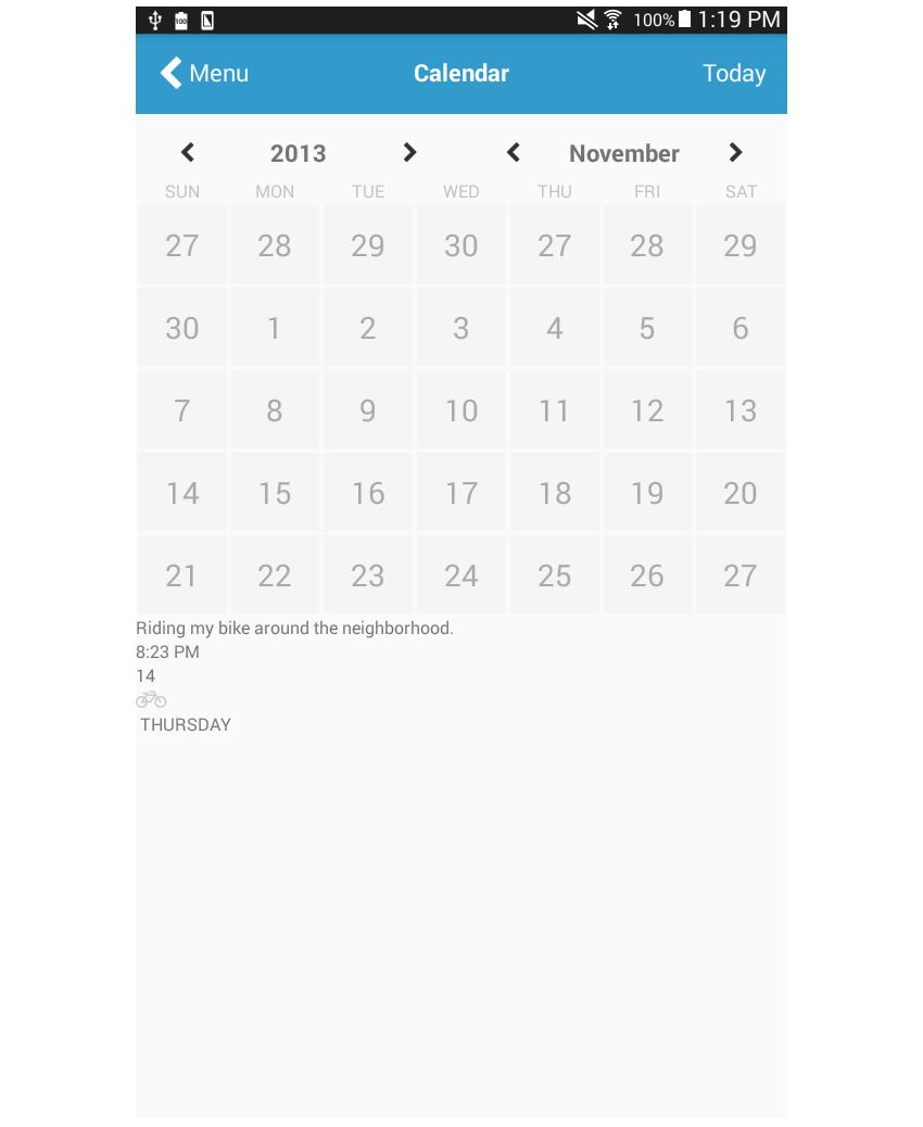
The selected date occupies less space than the note, so you have to apply a bigger flex value to the notes. flex: 3 and flex: 1 are used in this case, which means that the notes consume 3/4 of the available space and the selected date consumes 1/4. You can also use decimals (0.75 and 0.25) if that makes more sense to you. What's important is to pick a standard and stick to it. alignItems: 'flex-end' is used on notes_selected_date so that all its children will be aligned to the right. This is needed because by default they're aligned to the left.
notes: {
    marginTop: 10,
	padding: 20,
	borderColor: '#F5F5F5',
	borderTopWidth: 1,
	borderBottomWidth: 1,
	flexDirection: 'row',
	backgroundColor: '#FAFAFA'
},
notes_notes: {
	flex: 3
},
notes_text: {
	fontSize: 18
},
notes_selected_date: {
	flex: 1,
	alignItems: 'flex-end',
	flexDirection: 'column'
},
small_text: {
	fontSize: 15
},
big_text: {
	fontSize: 50,
	fontWeight: 'bold'
},
inline: {
	flexDirection: 'row'
},
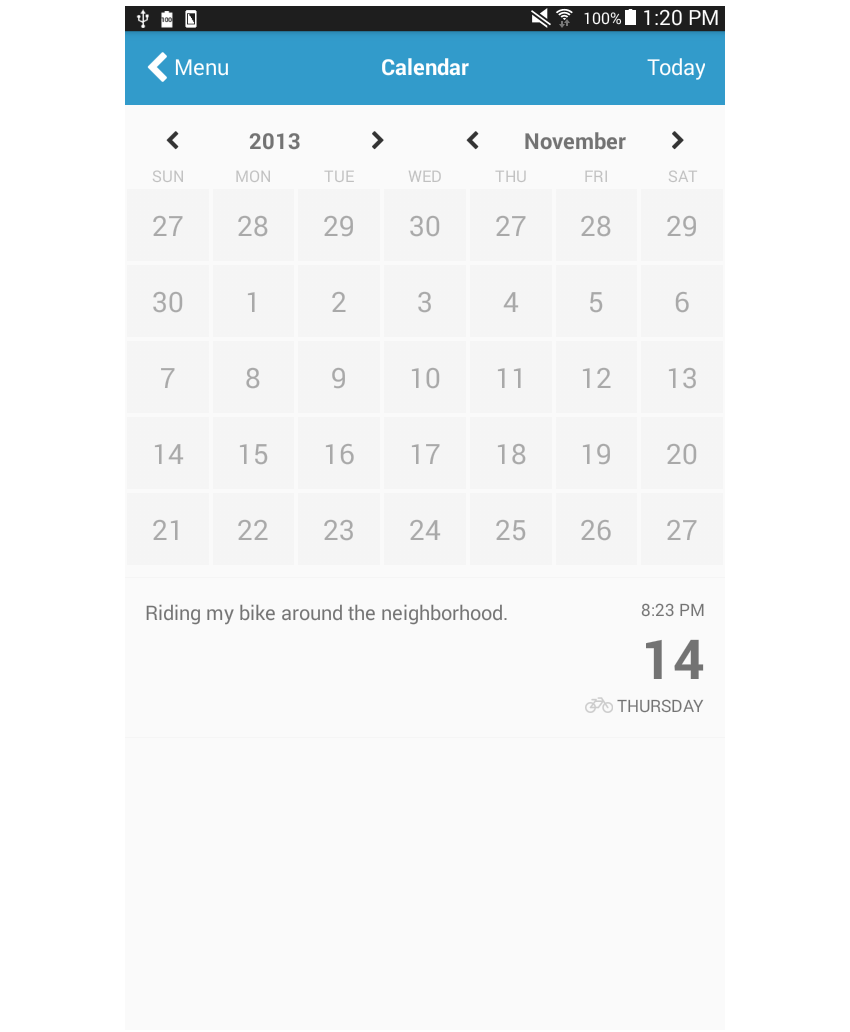
Lastly, we add the logs, which are very similar to those in the previous tutorial, so I'll leave it to you to figure out how the layout is achieved!
<View style={styles.logs}>
    <View>
		<Text style={styles.log_text}>Create New Entry</Text>
		<Text style={styles.log_subtext}>On Thursday, November 14</Text>
	</View>
	<Button
		noDefaultStyles={true}
		onPress={this.press.bind(this)}
	>
		<Icon name="chevron-right" size={30} color="#CCC" />
	</Button>
</View>
Here are the styles:
logs: {
    flexDirection: 'row',
	justifyContent: 'space-between',
	alignItems: 'center',
	padding: 20,
	borderColor: '#F5F5F5',
	borderBottomWidth: 1
},
log_text: {
	fontSize: 25
},
log_subtext: {
	fontSize: 18
}
Conclusion
That's it! In this tutorial you've created a calendar page. We've made a nice calendar layout for an app, and I've shown you how JavaScript code can be used to compensate for some of the limitations of Flexbox.
As you have seen, we needed a way to limit the number of days in a row to just seven days. Flexbox doesn't have a way to specify this, so we used JavaScript to reconstruct the original array of days in such a way that they're divided into groups containing seven days each. From there, all we had to do was to wrap each group inside a View and then apply flexDirection: 'row' to make each of them render in their own row.
In an upcoming tutorial, you'll learn how to implement the layout commonly used in gallery pages. In the meantime, check out some of our other tutorials on React Native and Flexbox.


Comments