When building a website, you have a few ways to approach doing so.
You can start by creating the most advanced version of the site with all of the scripts, styles, and so on, and then have it render in older browsers via graceful degradation, you may opt to ignore older browsers, or you can start with a basic page and add scripts and styles such that it becomes more functional via progressive enhancement.
In this series, we're going to take a look at the latter.
Now that we've covered the theory of progressive enhancement, we can create a simple page to illustrate the approach. The site we will be creating will be just a simple information site: a few links, some text, images, and a contact form.
We will use the widely adopted F layout (if you don't know what it is take a look at this great article on Web Design Tuts+: Understanding the F-Layout in Web Design).
Step 1: Basic HTML
Start by creating the index.html file with this HTML code:
<!DOCTYPE html>
<html>
    <head>
        <title>Example Website</title>
    </head>
    <body>
    </body>
</html>
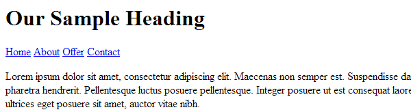
Step 2: Heading and Menu
Now let's create a heading for our website. To comply with the rules, we will just use the <h1> tag for it:
<h1>Our Sample Heading</h1>
After that, we can create the menu. Usually, you would use the <ul> tag for it, but since the page has to look decent without CSS, we will use the <nav> tag and place anchors in it:
<nav>
    <a href="index.html">Home</a>
    <a href="about.html">About</a>
    <a href="offer.html">Offer</a>
    <a href="contact.html">Contact</a>
</nav>
Note that even if you don't use indentation in your code (and you should to make it more readable), you have to do it here, because without CSS, the spaces between the links are the only thing that will separate them when viewing the page. Of course, you will not notice it since the browser has a default CSS for them.
Here is how our page should look:

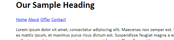
Step 3: Example Content and Footer
To get some sample text, you can go to http://www.lipsum.com/ and generate a few paragraphs. Remember the rules: we will not put the content in any special container <div>. It has to be semantic, so we will use the HTML5 <main> element. Put the text in the <p> tags just below the menu.
<main>
    <p> Lorem ipsum dolor sit amet... </p>
    <p> Nam aliquet tempor turpis... </p>
</main>
Now add the footer using the <footer> tag:
<footer>Copyright © 2014 SomeNonExistent Company. All rights reserved.</footer>
The page should now look like this:
You can create the About and Offer pages in the same way—they will not have anything special in them (you can add their names as <h2> tags just above the content).
Step 4: The Contact Form
The last thing to do in HTML is the contact page. Copy the contents of your index.html to contact.html and remove the contents of the <main> element.
Now add the heading for the form (into the <main> tag):
<h2>Contact Us</h2>
After that, we can add a <form> element with appropriate fields for the user to fill (since the server side of things stays pretty much the same I will not cover it here, so if you want to test your form you will have to write the back-end yourself):
<form method="POST">
    <p>
	    <label for="name">Your name:</label>
		<input id="name" name="name">
	</p>
	<p>
		<label for="email">Your email:</label>
		<input id="email" name="email">
	</p>
	<p>
		<label for="message">Your message:</label>
		<textarea id="message"></textarea>
	</p>
	<button type="submit" value="Send">Send</button>
	<button type="reset" value="Reset">Reset</button>
</form>
The <p> tags do not break the semanticity rule because the label and input combo is actually a paragraph. The contact page should look like this:

The CSS
Now that our page is working, we can start to make it look a bit better. Create a file and name it style.css. Now add this line to the <head> section of your document:
<link rel="stylesheet" href="style.css">
Step 5: Base Styles
The first thing to do would be to change the fonts and overall shape of the page:
* { font-family: Calibri, sans-serif; }
body { width: 900px; margin: auto; }
Two lines of CSS and you can see that the page looks a bit better as it's no longer using the default fonts.
Step 6: The Header
Now let's add some looks to the header: space it a bit, change the font size, and add the background:
h1 {
    padding: 100px 10px 20px;
    margin: 0;
    background: #dfdfdf;
    font-weight: normal;
    font-size: 3em;
}
Notice how we changed the font size — we used em instead of any other unit. This is because of the last of the rules explained in the first part of this series: Users can change the base size of the font and if we had, for example, used px, their settings would not be respected by our stylesheet.
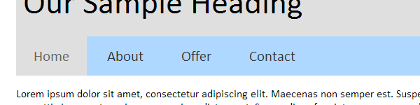
Step 7: The Menu
After fixing the header's appearance, we can get on with the menu. We will also change the font size of the anchors, remove their underline, and add a background when they are hovered over or when they have an active class:
nav { background: #aed8ff }
nav a { text-decoration: none; font-size: 1.3em; color: #333; padding: 15px 25px; display: inline-block; }
nav a:hover, nav a.active { background: #dfdfdf; color: #666; }
Now add the active class to the appropriate anchors in your files so they are appear "pressed" when the page is loaded:
<a href="index.html" class="active">Home</a>
Here is how it should look like now:
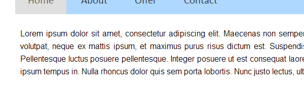
Step 8: The Content
Here, we will aim just improve the readability by increasing the line height (don't forget about users' settings—we can change the size of purely visual elements like headers and buttons, but users set their default font size for a reason). We'll also change the font and add some padding:
p {
    font-family: Helvetica, Arial, Sans-Serif;
    line-height: 1.6;
    text-align: justify;
    padding: 10px;
}
Here is the result. Notice how the readability improved with such a small change:
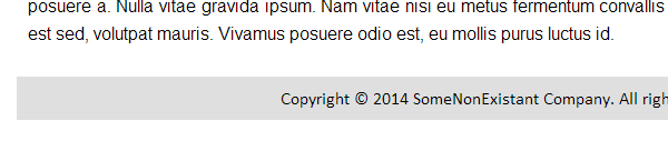
Step 9: The Footer
This will also be just a small cosmetic change: background, padding, and centered text:
footer { padding: 10px; background: #dfdfdf; text-align: center; }
Here is how the footer looks like now:
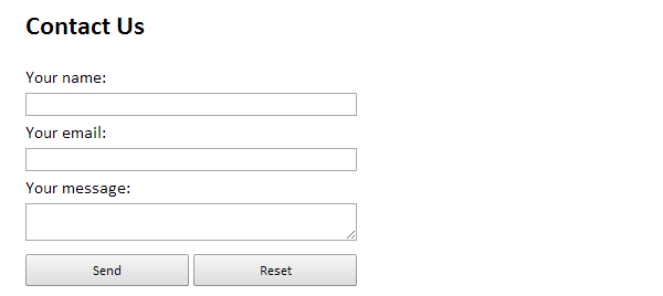
Step 10: The Form
The last thing to do is to fix the appearance of the contact form. First, let's remove the padding and margin of the <p> elements:
form p { margin: 0; padding: 0; }
Now let's set the width of the <input> elements and <textarea> to be the same. We also set display: block on them to line them up nicely:
form input, form textarea { width: 300px; display: block; }
Finally we change the <button>s to take up half of the form's width:
form button { margin: 10px 0; padding: 5px; width: 148px; }
This is the final result:
![]() Conclusion
Conclusion
In the next article, we will use some JavaScript (specifically, jQuery) to add some interactive elements to our website.
For those of you who are more advanced developers, you may find that this tutorial didn't teach anything you didn't know about HTML or CSS. Since we're working this strategy from the perspective of a beginner, that is to be expected.
Alternative, look at it this way: We created a design that is based on its content and not based on a pre-existing design. Of course, it's simple and straightforward, but it helps to demonstrate the point without including a large amount of CSS and other assets on the page.
If you remove the stylesheet from the document, you should see the point that we're trying to demonstrate: The page's layout stays the same and you can still use the page without issue.
Before the next article, please leave your questions, comments, and feedback in the form below.

Comments