In this tutorial, I'm going to show you how to create a 3D slideshow using only HTML and CSS. No JavaScript required! Fire up Safari and let's get started!
Theory
Before we dive into building our slideshow, it's important to understand our approach. We'll be using the new 3D transforms that are part of the CSS3 specification. You've probably seen other tutorials on how to use these transforms to build objects and animate them in a 3D space. Usually when creating a slideshow, we'd rely on JavaScript to trigger those transforms. JavaScript would detect a click event and update one of our HTML elements (typically by adding a class). The updated element would then receive new CSS styles.
What's different about this tutorial is that we will bypass JavaScript by using only CSS to trigger click events and update our element's styles. Jeffrey Way's recent Quick Tip, Mimic a Click Event with CSS, describes a way of doing this using the :target pseudoclass. Here, we'll use the :focus pseudoclass and the HTML5 element <figcaption>, but the idea is the same.
This method isn't necessarily "better" than using JavaScript, but simply a neat alternative that takes advantages of the newest HTML5 elements.
Step 0: Getting Started
Let's start by creating an index.html and style.css. We'll also create an images folder.
Our 3D object will be a rectangular box with four 940px by 400px faces and two 400px by 400px faces. I've included six images in the source files. Place these, or your own versions, in the 'images' folder.
Step 1: The HTML
Below is our base HTML. We'll be wrapping everything with a container and our slideshow, naturally, will be located within a div element called slideshow.
<!DOCTYPE HTML>
<html lang="en-US">
<head>
	<meta charset="UTF-8">
	<title>CSS 3D Slideshow</title>

	<link rel="stylesheet" type="text/css" href="style.css"/>

</head>

<body>
	<div id="container">
		<div id="slideshow">
		</div>
	</div>
</body>
</html>
Within slideshow add the following code for our six images:
<figure id="box">
<img src="images/face1.jpg"/>
<img src="images/face2.jpg"/>
<img src="images/face3.jpg"/>
<img src="images/face4.jpg"/>
<img src="images/face5.jpg"/>
<img src="images/face6.jpg"/>
</figure>
Note that our images (the six faces of our 3D object) are wrapped in a <figure> with the ID of box. This element is what we will rotate when animating our slideshow.
The Trick
Now comes the trick that allows us to use only CSS to detect click events. We will wrap box with six other <figure> elements. Each one will represent a different rotation of our 3D object. The attribute tabindex allows these elements to receive the pseudoclass :focus.
Each <figure> will also need a <figcaption> element inside of it. These captions will serve as our buttons. When clicked they will trigger the parent <figure> to receive :focus. That will allow us to use six different CSS transforms on box.
It might sound a bit complicated right now, but it'll make sense once we get to the CSS. For now, just wrap box with six <figure> elements and give each a unique tabindex and ID. Then include a <figcaption> for every <figure>.
Final HTML
The final markup in index.html should look like this:
<!DOCTYPE HTML>
<html lang="en-US">
<head>
	<meta charset="UTF-8">
	<title>CSS 3D Slideshow</title>

		<link rel="stylesheet" type="text/css" href="style.css"/>

</head>

<body>
	<div id="container">
		<div id="slideshow">
			<figure tabindex=1 id="fig1">
			<figcaption>Side 1</figcaption>
			<figure tabindex=2 id="fig2">
			<figcaption>Side 2</figcaption>
			<figure tabindex=3 id="fig3">
			<figcaption>Side 3</figcaption>
			<figure tabindex=4 id="fig4">
			<figcaption>Side 4</figcaption>
			<figure tabindex=5 id="fig5">
			<figcaption>Side 5</figcaption>
			<figure tabindex=6 id="fig6">
			<figcaption>Side 6</figcaption>
				<figure id="box">
					<img src="images/face1.jpg"/>
					<img src="images/face2.jpg"/>
					<img src="images/face3.jpg"/>
					<img src="images/face4.jpg"/>
					<img src="images/face5.jpg"/>
					<img src="images/face6.jpg"/>
				</figure>
			</figure>
			</figure>
			</figure>
			</figure>
			</figure>
			</figure>
		</div> <!-- End Slideshow -->
	</div> <!-- End Container -->
</body>
</html>
Step 2: Basic CSS
First, let's open up style.css and paste some reset code in, just for good measure. (Removing any outlines that :focus might cause is important.)
/* RESET */
html, body, div, span, applet, object, iframe,
h1, h2, h3, h4, h5, h6, p, blockquote, pre,
a, abbr, acronym, address, big, cite, code,
del, dfn, em, font, img, ins, kbd, q, s, samp,
small, strike, strong, sub, sup, tt, var,
b, u, i, center,
dl, dt, dd, ol, ul, li,
fieldset, form, label, legend,
table, caption, tbody, tfoot, thead, tr, th, td {
	margin: 0;
	padding: 0;
	border: 0;
	outline: 0;
	font-size: 100%;
	vertical-align: baseline;
	background: transparent;
}
body {
	line-height: 1;
}
ol, ul {
	list-style: none;
}
blockquote, q {
	quotes: none;
}
blockquote:before, blockquote:after,
q:before, q:after {
	content: '';
	content: none;
}
:focus {
	outline: 0;
}
/* HTML5 tags */
header, section, footer,
aside, nav, article {
	display: block;
}
Next, we'll give our page a nice gradient background:
html {
 width: 100%;
 height: 100%;
 background-color: #FFFFFF;
 background-image: -moz-linear-gradient(top, #FFFFFF, #b3b3b3);
 background-image: -webkit-gradient(linear,left top,left bottom,color-stop(0, #FFFFFF),color-stop(1, #b3b3b3));
 filter:  progid:DXImageTransform.Microsoft.gradient(startColorStr='#FFFFFF', EndColorStr='#b3b3b3');
 -ms-filter: "progid:DXImageTransform.Microsoft.gradient(startColorStr='#FFFFFF', EndColorStr='#b3b3b3')";
}
The background-image code includes the Mozilla and WebKit vender prefixes. In case you want a version of the slideshow to work with Internet Explorer, the filter and -ms-filter will create a gradient in IE6, 7 and 8. (I generated this code on the useful site www.css3please.com.)
Now, let's add some code for our container, slideshow, and box:
#container {
 width: 960px;
 margin: 0 auto;
}

#slideshow {
 width: 900px;
 margin: 50px auto 0 auto;
 padding: 50px 0 0 0;
}

figure {
 display: inline;
}

#box {
 position: relative;
 display: block;
 width: 900px;
 height: 400px;
}
Our container will have a width of 960px and be centered with margin: 0 auto. The slideshow div will be 900px wide, centered, and pushed down 50px from the top of the page. We're also giving it 50px of padding at the top. This padding area will contain our slideshow buttons, the <figcaption> elements, once we position them.
The element which actually contains our slideshow, box, is set to the same size as our images. It's also important to set position to relative as we'll be absolutely positioning some of its children. Our other <figure>s are set to display: inline, but box must be a block element.
Now, set the following styles for our six images:
#box img {
 position: absolute;
 top: 0;
 left: 0;
}
We position our images absolutely so they will all stack directly on top of each other at the top left corner of box. (By default, top and left are set to 0. It's been included for the sake of clarity.)
Right now, our slideshow looks like this:

Let's add some styling for our <figcaption> buttons:
figcaption {
 display: inline-block;
 width: 70px;
 height: 35px;
 background: rgba(0,0,0,0.6);
 border: 1px solid rgba(0,0,0,0.7);
 -moz-border-radius: 20px;
 -webkit-border-radius: 20px;
 border-radius: 20px;
 text-align: center;
 line-height: 35px;
 color: #ffffff;
 text-shadow: 1px 1px 1px #000000;
 cursor: pointer;

 position: relative;
 top: -50px;
 left: 150px;
 margin: 0 30px 0 0;

 -moz-transition: all 0.1s linear;
 -o-transition: all 0.1s linear;
 -webkit-transition: all 0.1s linear;
 transition: all 0.1s linear;
}
The first section of these styles is purely aesthetic. It makes the buttons semi-transparent and rounded and the text centered and shadowed. It also changes the mouse cursor to a pointer, so that users know they can click.
The second section positions our buttons above the images, centers them, and spaces them out.
Make sure you position the buttons outside the boundaries of the six
<figure>elements. Otherwise, clicking on the button will actually register as a click on the innermost<figure>instead of the one corresponding to that button.
The last bit of code adds transitions. That's because we're about to add styling to the <figcaptions> hover state:
figcaption:hover {
 background: rgba(0,0,0,0.8);
}
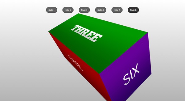
Our styled buttons should look like this:

Step 3: The 3D Box
The first thing we need to do is tell the browser we'll be working in a 3D space. We do this by using the perspective property on a parent element. Let's apply it (with the WebKit vender prefix) to slideshow:
#slideshow {
 width: 900px;
 margin: 50px auto 0 auto;
 padding: 50px 0 0 0;
 -webkit-perspective: 800; /* triggers a 3D space */
}
The value of perspective determines how many pixels the "viewer" is from the 3D object. The lower the value the more exaggerated the 3D effect.
We also need to preserve the 3D space throughout all our child elements. To do this we'll add the property transform-style: preserve-3d to all our <figures>s. (Again, we'll be using the WebKit vender prefix.)
figure {
 display: inline;
 -webkit-transform-style: preserve-3d; /* maintains 3D space */
}
Alright, now it's time to transform the individual faces (our six images) to build a 3D box. We'll target each image using the nth-child() pseudoclass, but giving each <img> a specific ID would also work. Make sure you add this code underneath the current styles in the stylesheet.
Here's the code, I'll explain it below:
#box img:nth-child(1) {
 -webkit-transform: rotateX(0deg) translateZ(200px);
}

#box img:nth-child(2) {
 -webkit-transform: rotateX(180deg) translateZ(200px);
}

#box img:nth-child(3) {
 -webkit-transform: rotateX(90deg) translateZ(200px);
}

#box img:nth-child(4) {
 -webkit-transform: rotateX(-90deg) translateZ(200px);
}

#box img:nth-child(5) {
 -webkit-transform: rotateY(-90deg) translateZ(200px);
}

#box img:nth-child(6) {
 -webkit-transform: rotateY(90deg) translateZ(700px);
}
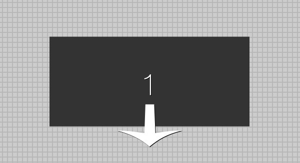
Okay, so here is what's going on: The first image is not rotated at all, but it is translated forward (toward the viewer) 200 pixels on its Z-axis.
The second image is rotated around its X-axis by 180 degrees so that it is facing away from the viewer. It is then pushed away from the viewer 200 pixels on its Z-axis.
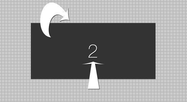
Notice that the order of transformations matter -- the rotation changes the object's origin and then the translation occurs along a new axis.
Our third and fourth images are each rotated around the X-axis to face up and down, respectively. Then both are translated 200 pixels along their new Z-axes.
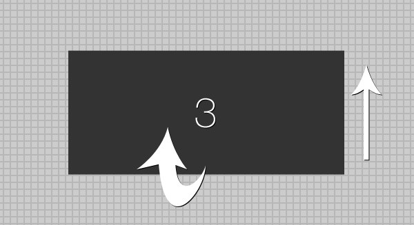
Remember, our box is 900px wide by 400px high by 400px deep. The four sides (the 940px by 400px faces) must be 400 pixels away from each other. That's why we translate them all 200 pixels in opposite directions. The two ends (the 400px by 400px faces) we will translate 900 pixels away from each other.
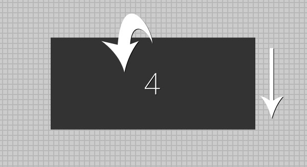
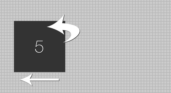
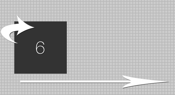
The fifth and sixth images are currently on the left side of box and not centered. Because of this, our fifth and sixth images receive different translations. They both have their origin 200 pixels to the right of the left end of box. The fifth image must be rotated -90 degrees around the Y-axis to face left and then translated 200 pixels along its new Z-axis. This places it on the left end of our 3D object. The sixth image is rotated 90 degrees around the Y-axis to face right and then translated 700 pixels along its new Z-axis. This places it on the right end of our 3D object.
The best way to get a sense of what we've done is to look at the current arrangement of images. If you preview the slideshow in Safari you'll currently see this:

Let's hide the front face -- just so we can see if our other images are positioned correctly:
#box img:nth-child(1) {
 -webkit-transform: rotateX(0deg) translateZ(200px);
 display: none; /* temporarily hide */
}
Now we can see the inside of our box:
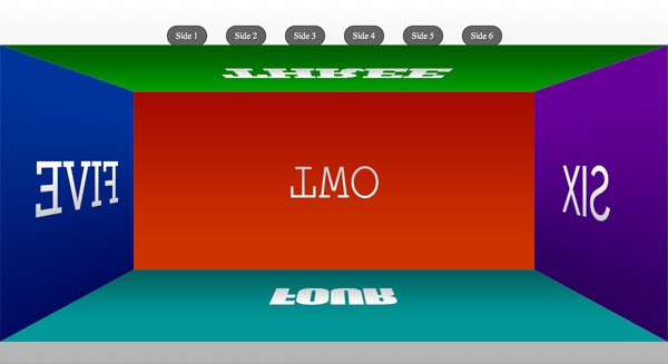
Now, remove the display: none from our first image. You might have noticed that the box is bigger on the screen -- closer to the viewer -- than it should be. The front face especially looks overly large and stretched.
To correct for this we need to move the entire 3D object away from the viewer by 200 pixels. Add -webkit-transform: translateZ(-200px) to the styles for box. While we are at it we should also add the transition property:
#box {
 position: relative;
 display: block;
 width: 900px;
 height: 400px;
 -webkit-transform: translateZ(-200px); /* Pushes 3D object back into place */
 -webkit-transition: -webkit-transform 1s;  /* Enables transitions for transforms */
}
With all that set, we are ready to animate our box.
Step 4: Animation
Paste in our final block of styling. This will add our animations. I'll explain in more detail below.
#fig1:focus #box {
 -webkit-transform: translateZ(-200px) rotateY(0deg);
}

#fig2:focus #box {
 -webkit-transform: translateZ(-200px) rotateX(-180deg);
}

#fig3:focus #box {
 -webkit-transform: translateZ(-200px) rotateX(-90deg);
}

#fig4:focus #box {
 -webkit-transform: translateZ(-200px) rotateX(90deg);
}

#fig5:focus #box {
 -webkit-transform: translateZ(-450px) rotateY(90deg);
}

#fig6:focus #box {
 -webkit-transform: translateZ(-450px) rotateY(-90deg);
}
When each of our <figure> elements receives the pseudoclass :focus we rotate box to display the correct side. Notice that the box rotations are all the opposite of the rotations we used on each individual face. For example, the fourth image was rotated negative 90 degrees around the X-axis. To bring it into view we must rotate the entire 3D object positive 90 degrees around the X-axis. The translations ensure that the side of the 3D object we're viewing is always the correct distance away.
That's it! Check out the slideshow in Safari to make sure everything is working.
Final CSS
The final styling in style.css should look like this:
/* RESET */
html, body, div, span, applet, object, iframe,
h1, h2, h3, h4, h5, h6, p, blockquote, pre,
a, abbr, acronym, address, big, cite, code,
del, dfn, em, font, img, ins, kbd, q, s, samp,
small, strike, strong, sub, sup, tt, var,
b, u, i, center,
dl, dt, dd, ol, ul, li,
fieldset, form, label, legend,
table, caption, tbody, tfoot, thead, tr, th, td {
	margin: 0;
	padding: 0;
	border: 0;
	outline: 0;
	font-size: 100%;
	vertical-align: baseline;
	background: transparent;
}
body {
	line-height: 1;
}
ol, ul {
	list-style: none;
}
blockquote, q {
	quotes: none;
}
blockquote:before, blockquote:after,
q:before, q:after {
	content: '';
	content: none;
}
:focus {
	outline: 0;
}
/* HTML5 tags */
header, section, footer,
aside, nav, article {
	display: block;
}

html {
 width: 100%;
 height: 100%;
 background-color: #FFFFFF;
 background-image: -moz-linear-gradient(top, #FFFFFF, #b3b3b3);
 background-image: -webkit-gradient(linear,left top,left bottom,color-stop(0, #FFFFFF),color-stop(1, #b3b3b3));
 filter:  progid:DXImageTransform.Microsoft.gradient(startColorStr='#FFFFFF', EndColorStr='#b3b3b3');
 -ms-filter: "progid:DXImageTransform.Microsoft.gradient(startColorStr='#FFFFFF', EndColorStr='#b3b3b3')";
}

#container {
 width: 960px;
 margin: 0 auto;
}

#slideshow {
 width: 900px;
 margin: 50px auto 0 auto;
 padding: 50px 0 0 0;
 -webkit-perspective: 800; /* triggers a 3D space */
}

figure {
 display: inline;
 -webkit-transform-style: preserve-3d; /* maintains 3D space */
}

#box {
 position: relative;
 display: block;
 width: 900px;
 height: 400px;
 -webkit-transform: translateZ(-200px); /* Pushes 3D object back into place */
 -webkit-transition: -webkit-transform 1s;  /* Enables transitions for transforms */
}

#box img {
 position: absolute;
 top: 0;
 left: 0;
}

figcaption {
 display: inline-block;
 width: 70px;
 height: 35px;
 background: rgba(0,0,0,0.6);
 border: 1px solid rgba(0,0,0,0.7);
 -moz-border-radius: 20px;
 -webkit-border-radius: 20px;
 border-radius: 20px;
 text-align: center;
 line-height: 35px;
 color: #ffffff;
 text-shadow: 1px 1px 1px #000000;
 cursor: pointer;

 position: relative;
 top: -50px;
 left: 150px;
 margin: 0 30px 0 0;

 -moz-transition: all 0.1s linear;
 -o-transition: all 0.1s linear;
 -webkit-transition: all 0.1s linear;
 transition: all 0.1s linear;
}

figcaption:hover {
 background: rgba(0,0,0,0.8);
}

#box img:nth-child(1) {
 -webkit-transform: rotateX(0deg) translateZ(200px);
}

#box img:nth-child(2) {
 -webkit-transform: rotateX(180deg) translateZ(200px);
}

#box img:nth-child(3) {
 -webkit-transform: rotateX(90deg) translateZ(200px);
}

#box img:nth-child(4) {
 -webkit-transform: rotateX(-90deg) translateZ(200px);
}

#box img:nth-child(5) {
 -webkit-transform: rotateY(-90deg) translateZ(200px);
}

#box img:nth-child(6) {
 -webkit-transform: rotateY(90deg) translateZ(700px);
}

#fig1:focus #box {
 -webkit-transform: translateZ(-200px) rotateY(0deg);
}

#fig2:focus #box {
 -webkit-transform: translateZ(-200px) rotateX(-180deg);
}

#fig3:focus #box {
 -webkit-transform: translateZ(-200px) rotateX(-90deg);
}

#fig4:focus #box {
 -webkit-transform: translateZ(-200px) rotateX(90deg);
}

#fig5:focus #box {
 -webkit-transform: translateZ(-450px) rotateY(90deg);
}

#fig6:focus #box {
 -webkit-transform: translateZ(-450px) rotateY(-90deg);
}
Final Thoughts
There is probably no way to justify using a bunch of nested <figure>s and<figcaption> elements as buttons under the current CSS3 recommendations. Nor does this experiment respect the distinction of HTML for content, CSS for style, and JS for behavior. And since these transforms currently only work in Safari, this slideshow is by no means ready to actually be used in client projects. But the purpose of this experiment is to both showcase and push the limits of the new HTML5 and CSS3 features.
If you are interested in adapting this slideshow for browsers with less support, here are some helpful tips:
- Use Modernizr. Seriously!
- Only Safari supports the 3D transforms but you could create a nifty slideshow using 2D transforms and support a much wider range of browsers.
- The
opacityproperty would make a great fading slideshow and work in nearly every browser. (You'd needfilterfor IE). - The
<figcaption>buttons will break in Firefox if they are absolutely positioned. It's weird, I know. Just make sure you use relative positioning.
I hope you guys enjoyed this tutorial. I'm looking forward to your comments and thank you so much for reading!

Comments